Craft Brand Co.
For my project I am doing a logo design for Craft Brand Co. Originally my plan was to create a hand drawn logo type for my own branding, but a few days before this class started I was hired to do this project. Due to time constraints on this design, and the fact that it fit perfectly with this class, I have chosen this instead.
The client is looking for a classic and potentially gritty design that is masculine but appeals to a wide audience. They are a new company that will focus on helping local craft brewing companies market and expand in order to grow the overall craft market and compete with some of the big guns in the beer industry. The owners have a track record for success already, so this is a very exciting project to work on.
Both this company and myself are really into an old but classic looking design with just a bit of texture and style. It will be a 1 or 2 colour design, most likely black and grey on a kraft paper stock.
Craft beer companies are really about passion, taste, style, and a love for their craft. There are many hours spent testing and through trial and error, coming up with the perfect tasting beer. I want to convey all of those things in this brand. Well, except for taste, I don't think this is healthy to eat.
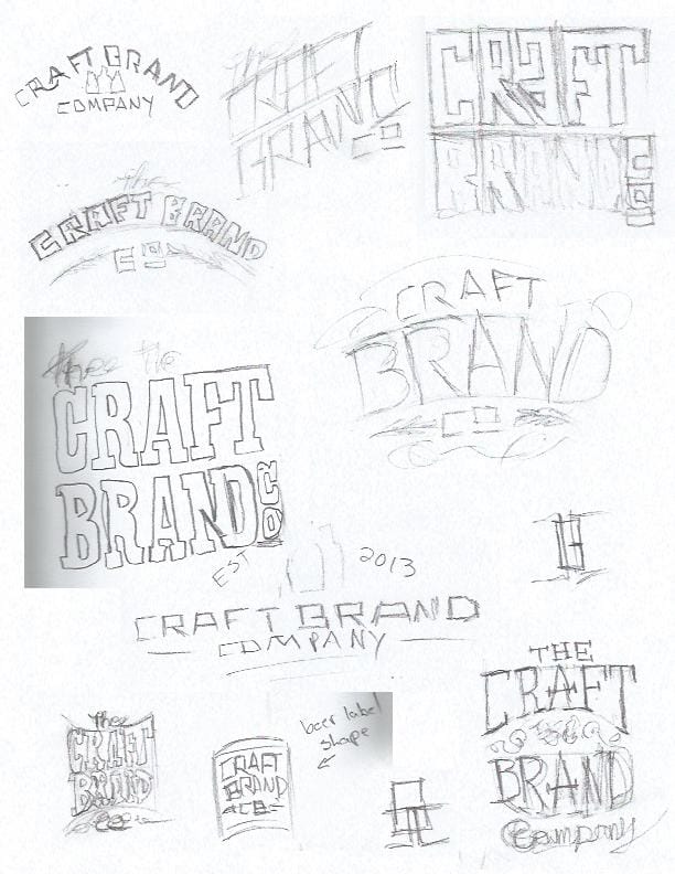
I don't like to spend too much time on any concept sketch. I just want to get enough of the idea down that I'll remember what I was thinking when it comes to the next phase of production. Because of that a lot of these are rough. Really rough. That being said I got some of the ideas down that I wanted. For example the idea of potentially combining the 'N' and 'D' in 'Brand' or making the shape match what a beer label looks like on the bottle, or possible adding some flourishes that resemble wheat or hopps. I also like the idea of using a unicase font and combining a lower case 'A' although I did not upload any of my ideas for that in this post. This is just a small collection to get started.
What do you guys think? Questions, comments, suggestions?
_________________________________________________________________________________________
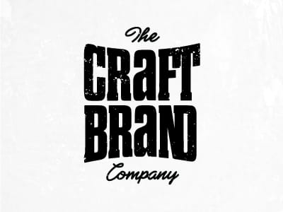
Phase 2: Vectorization & 1st Round of Proofs
As you will see there are some imperfections and things that I would need to fix in each design. But this way a great starting point to send to my client. Normally I'd narrow it down to 2 or 3, but this client is a marketing director and used to seeing the behind the scenes of projects anyway, so I trusted they would appreciate seeing extra variations and options.
_________________________________________________________________________________________
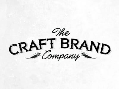
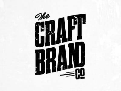
Phase 3: 2nd Round of Proofs
I got back some suggestions and came up with some refinements to get the proofs to this point:
_________________________________________________________________________________________
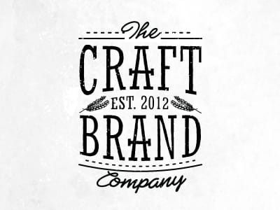
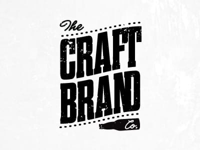
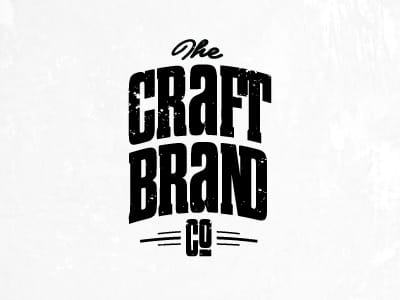
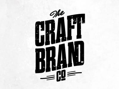
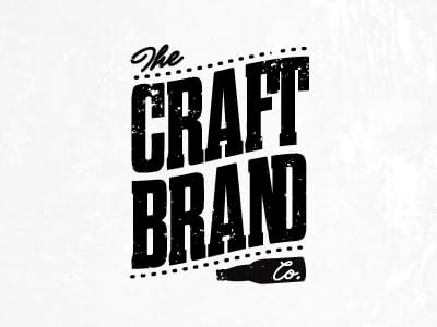
Phase 4: 3rd Round of Proofs
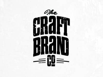
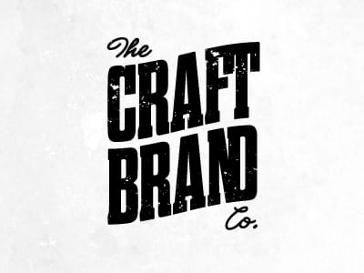
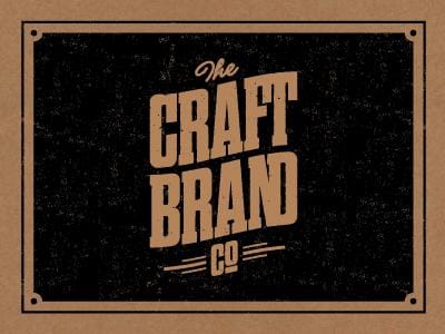
The client and I both agreed the best option was #3 with the Co. centred under the design. They actually loved the design with the bottle under it, but since they will be working with spirit and wine companies, they didn't want people to get the wrong impression and think they were exclusive to beer.
Here are the very refined versions along with a hint at what the branding could be (we had discussed this look from the very beginning, but I didn't want to get too caught up in it at first).
Would love to hear any suggestions or comments! I'm getting very close to finalizing the design with the client, so if you have any suggestions I'd love to hear some outside opinions or ideas.
Thanks!
_________________________________________________________________________________________
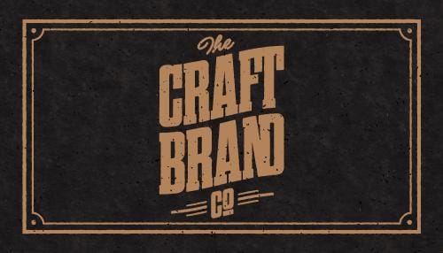
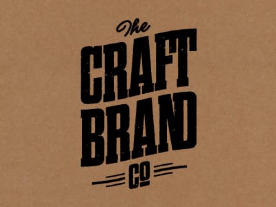
Phase 5: 4th Round of Proofs (Logo Finalized?)
Well I'm really close I believe. The client and I have all but finalized the logo so I have worked on the texture, roughness and the faded black background. I really want this to have that old classic and hand crafted look. I'm loving how it's come along.
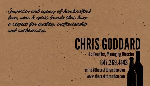
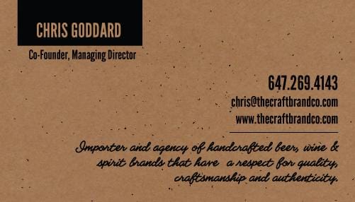
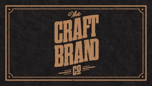
Here is the front of the business card. I haven't decided between the vertical or the horizontal. I'm leaning horizontal though as I think the logo is so big and bold that it is unneccary for it to be big on the card. What do you guys think?
_________________________________________________________________________________________
April 21st:
So I brought back the unicase 'a' on Evan's suggestion. After some time the client decided they preferred the uppercase. I think I preferred the unicase, but not by a ton. Also, this project has gone so well and the client has really trusted me to create everything the way I wanted, so a little give and take is always needed!
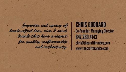
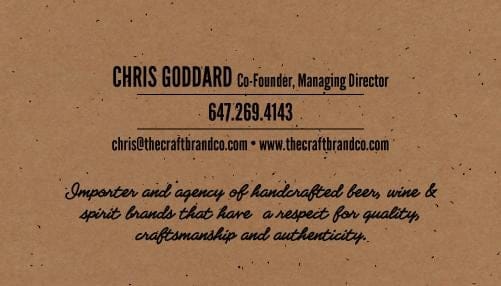
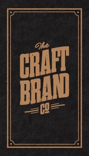
Here is the final front of the business card. After printing it I realized I needed to scale back the texture in the logo a bit. I also came up with a few new options for the back of the card. I think I prefer the last one, just waiting to hear back from the client. As always, I'd love to hear your thoughts!