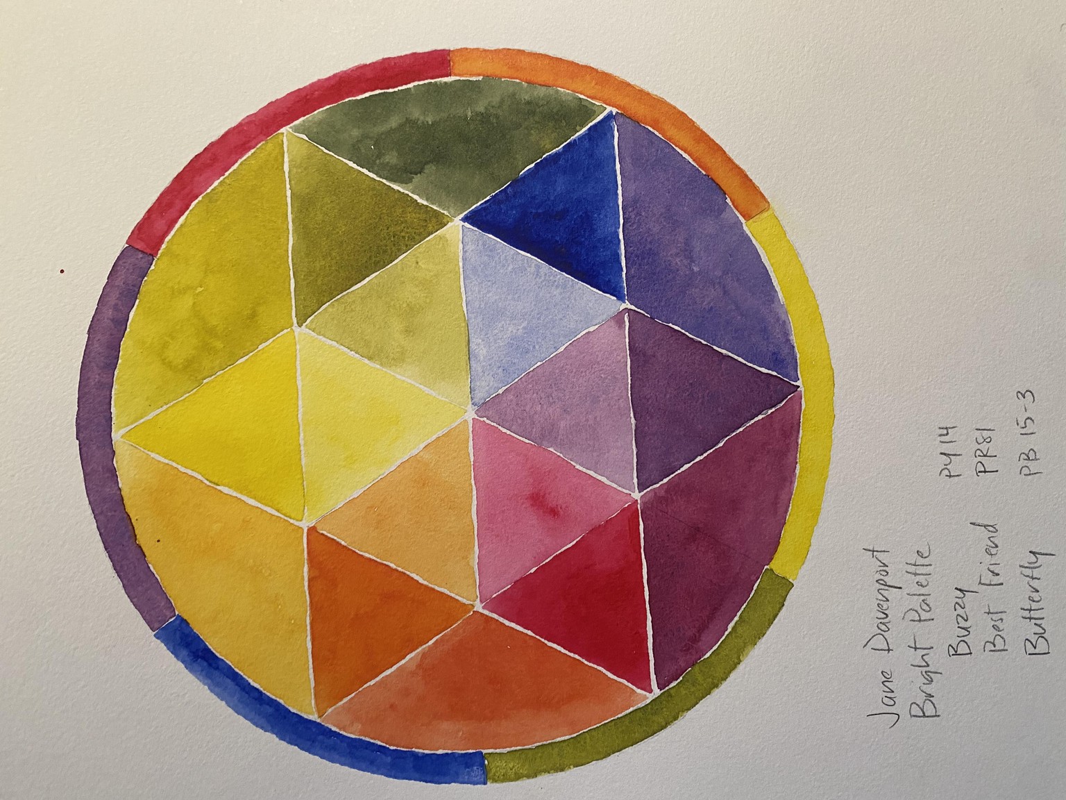
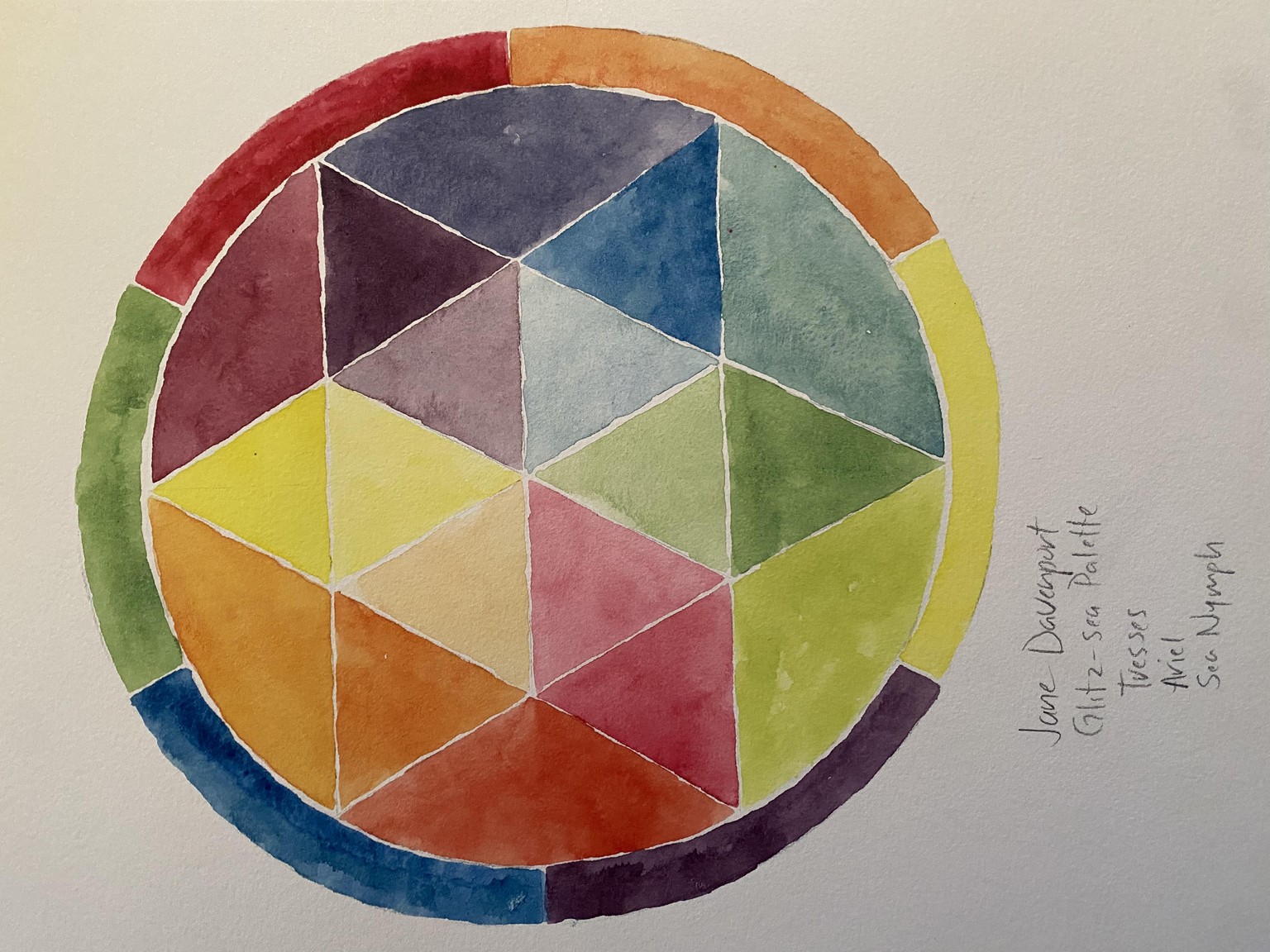
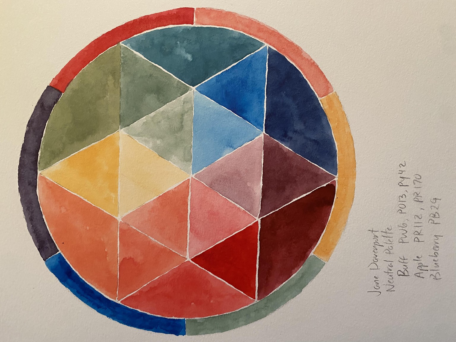
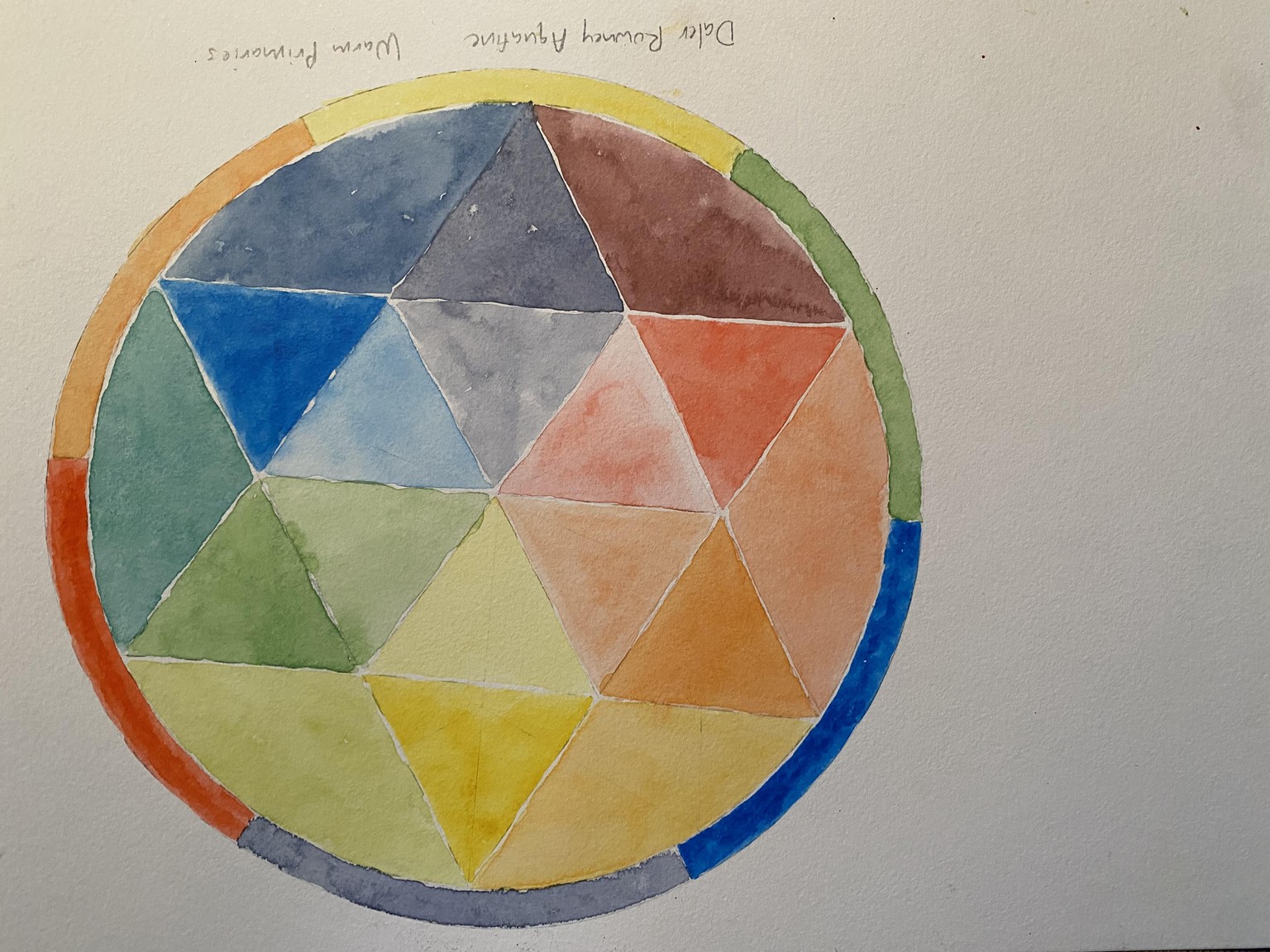
Color wheel mandalas I
I have been using my pan sets for daily prompts in my sketchbook, so I wanted to compare each set’s primaries to help me decide which to take with me on trips. I could tell immediately that one set was significantly less vibrant than the others. I forgot to add black ink to my drawing, but I still like the end result. These were done on Canson XL watercolor (cellulose) paper. My favorites are the Bright palette (the red and blue pigments separate when they are mixed) and the Neutral palette for the peachy tones produced from the Buff color (it’s a combination of yellow, red, and white pigments). I placed the purples and greens in the wrong parts in one of the mandalas because I wasn’t paying attention, but it still turned out fine. Overall, great class! It’s easy to get obsessed with doing these and the projects from the other students are so interesting and gorgeous!