Color Palletes
I started this class because I was having trouble working with color to show the atmosphere, and I would say this class helped me work on that problem.
The words I used to create was carefree, calm, and eccentric.
Carefree:
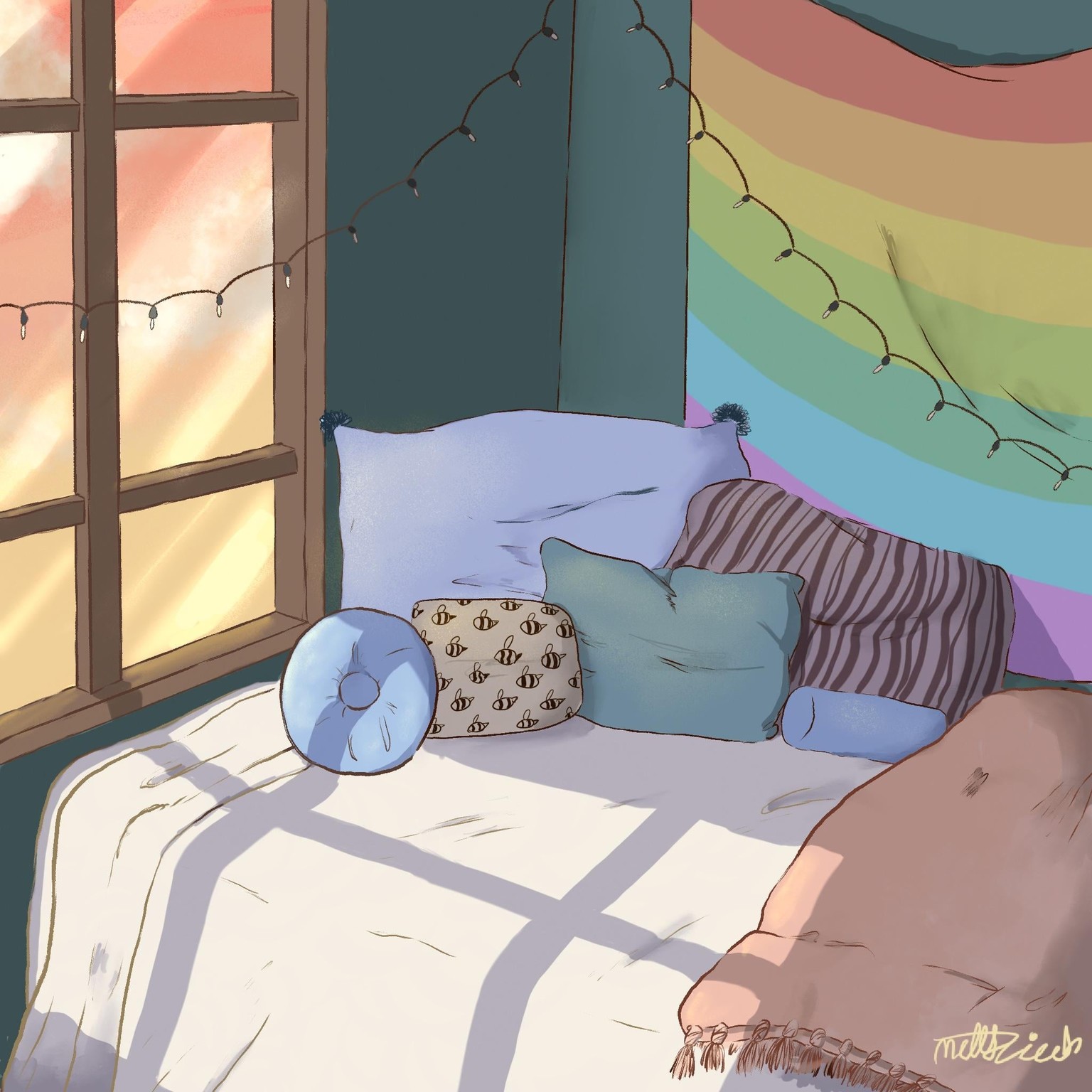
The color palette I used to create a carefree tone was mostly made of warm pastels, the cooler colors I used were mostly desaturated. I believe using the colors helped create a warm welcoming atmosphere.
Calm:
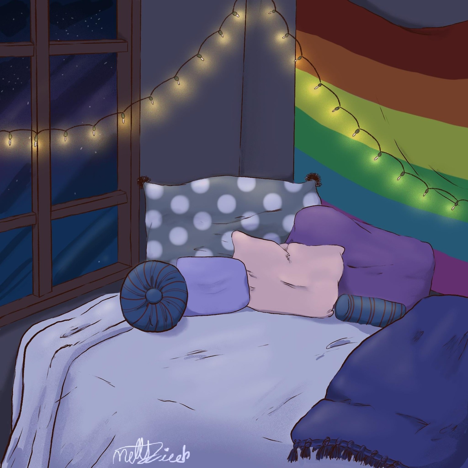
The color palette I used to produce the overall tone was saturated blues and purples, mixed a few desaturated and lighter warm blues and a few pinks.
Eccentric:
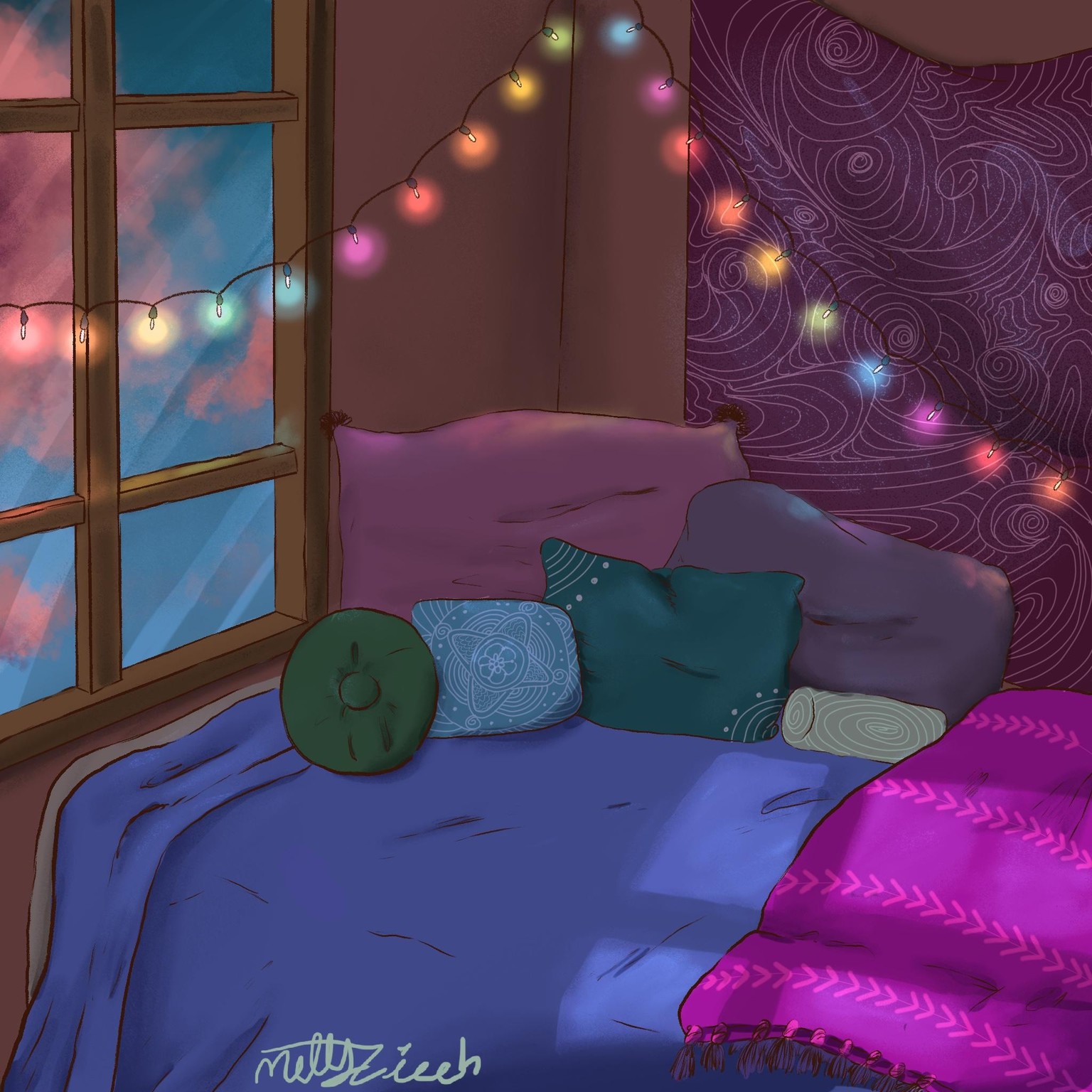
For the word eccentric, I knew I wanted to go out of my comfort and use bold and saturated colors. I ended up using rich blues, jewel-tone greens, some bright magentas, and some warm desaturated browns and purples.
In the end, my favorite color palette was the one I used on carefree. I think that the pastels and warm coral and oranges set my favorite atmosphere. It was nice seeing how using the same lineart but coloring it different changed the whole drawing.