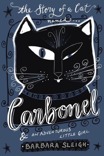
Carbonel
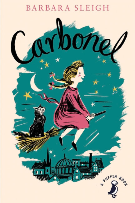
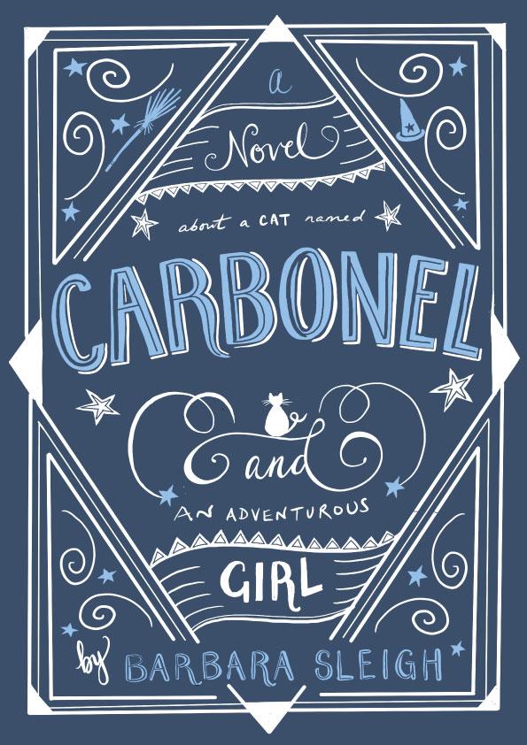
I wanted to illustrate a kids' book and had fond memories of reading this when I was around 8 years old - so I downloaded it and am halfway through. I think this illustration is so cute but I planned to follow along with Jessica and design something more of a Collector's edition.
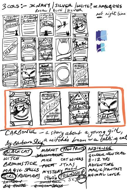
Admittedly my notes are a little sparse but they sum up what I consider to be the important points of the story. That said, I note I circled 'friendship' as important but seem to have lost that notion along the way!. I found I was tending towards 'not doing lettering' so forced myself back on track with the help of the notes...
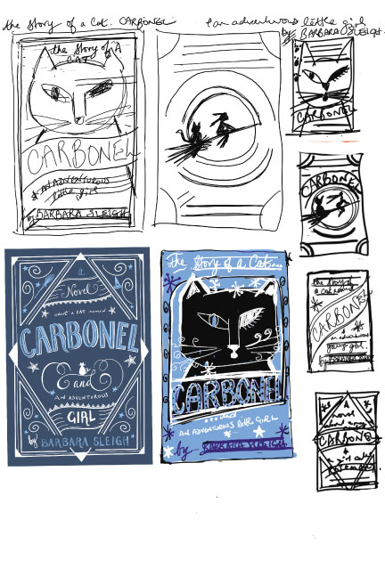
I found this quite a challenge and there are elements I like about my final cover - but I could go back and do it over again, if I had time. I would definitely slant the title from left up to right to give more space - I could only fit a condensed version in there and it feels a bit cramped. Overall, I learned from Jessica the vital importance of doing the layout in broad terms before tackling anything else! Had I done this, I think the title would be more dominant as it should be and the geometry would be tighter. I particularly enjoyed adding the final details and swirls and seeing my cover taking shape. I do feel that I've learned some valuable skills by taking this masterclass - thanks Jessica for being an amazing tutor and lettering artist.
I couldn't resist doing the illustrated cat - so here it is! What do you think? (it's supposed to be winking btw)