Botanical Design Exploration
With the full update of this class, I am excited to share some examples you see in the all-new video lessons and share additional insights about my design process — that will hopefully give you some creative ideas and help you better choose the way to approach your own project!
Happy Birthday Card
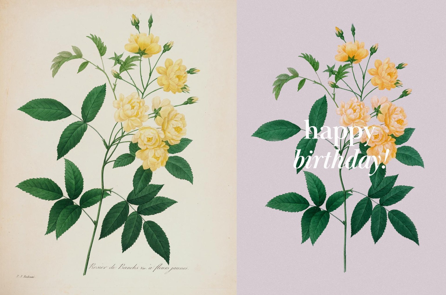
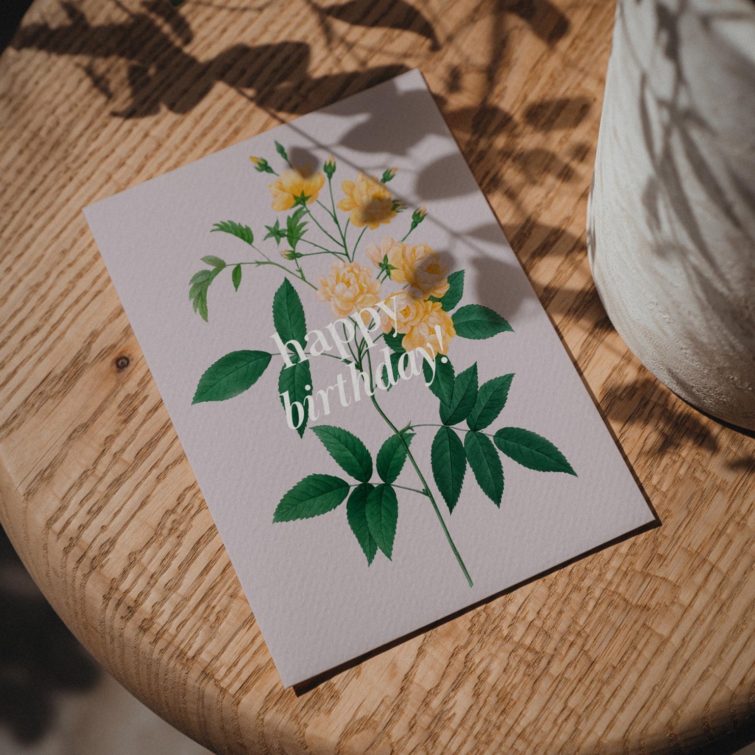
The most basic card design I have created that only required a bit of colour adjustment and typesetting the text over the image and the background. No complex cutting or masking involved, and there is just enough contrast to keep the whole design light but make the message clearly readable.
Just Because Card
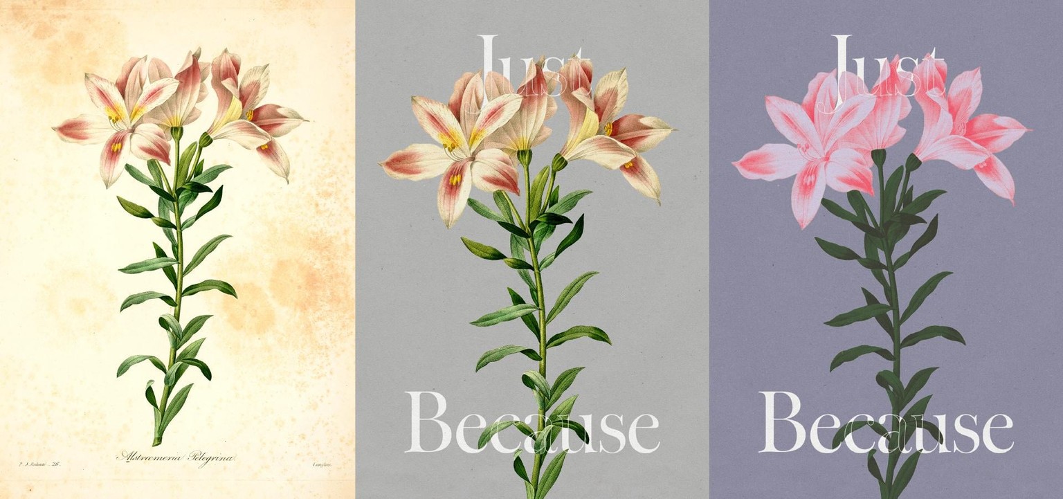
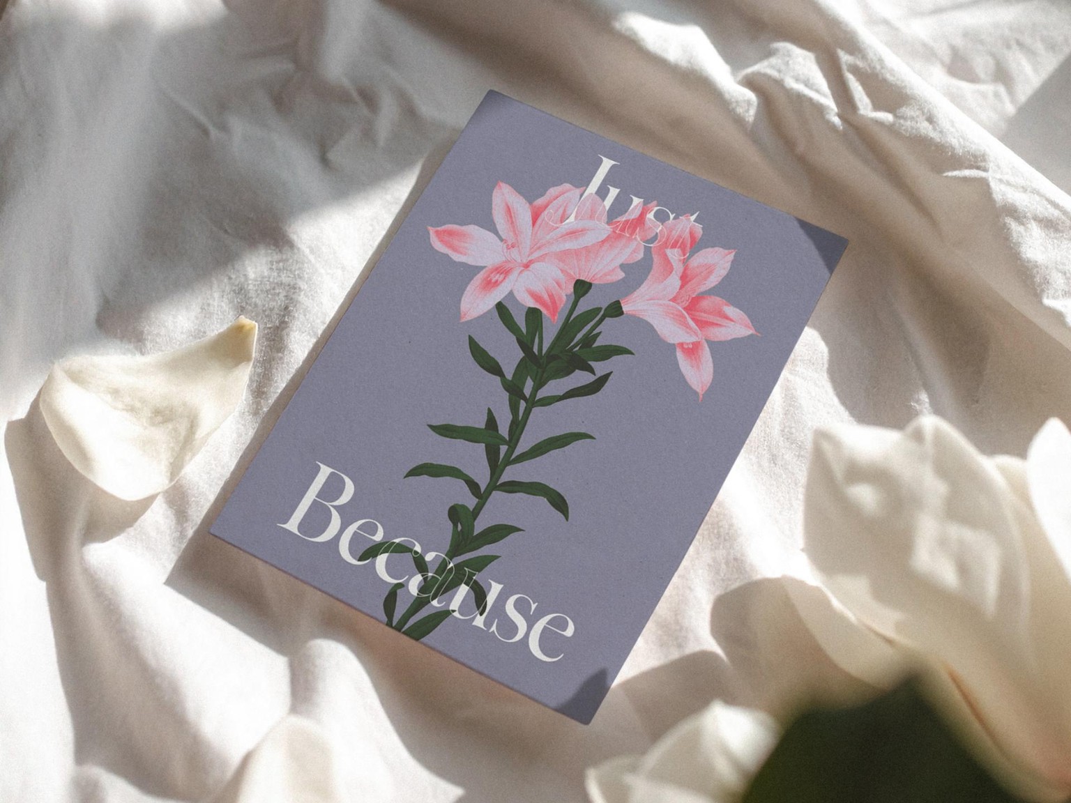
Played with separately recolouring parts of the illustration to add more variety and colour contrast to this design — and it turned out to be my absolute favourite because of the colours, composition and the typeface choice!
Isolating this source image from the background was also really easy with the Quick Selection tool, and I simply quickly revisited the mask after creating the design composition to tidy up some of the edges.
Thank You Card (Class Demo)
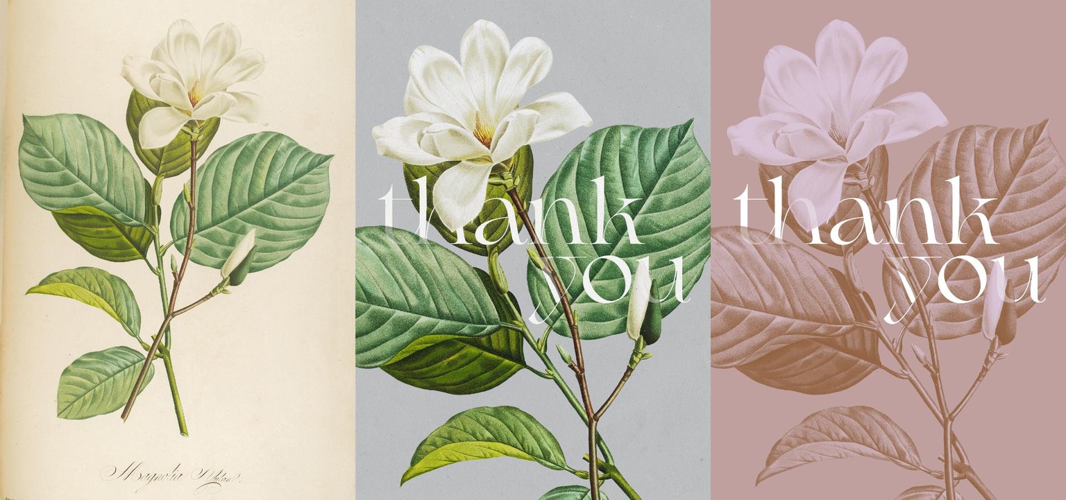
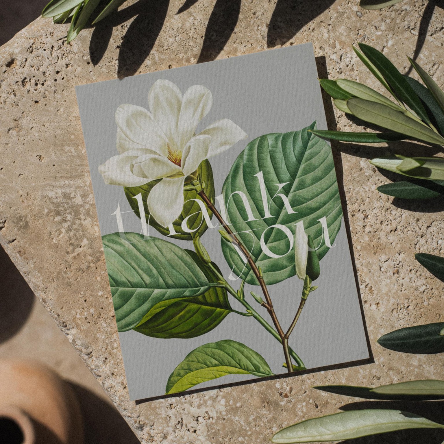
I love the relationship and contrast between the magnolia illustration and this typeface, and going for a lowercase composition really helped to make it look more relaxed and intimate, whilst still looking sophisticated.
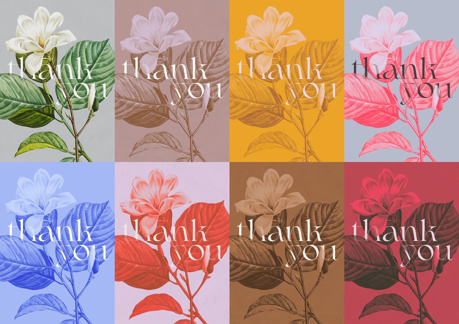
After recording the class demo, I kept on coming back to this card and recoloured it in a few other ways — and I don’t think I’ll stop experimenting with colours in this design any time soon! What spoke to me a few month ago (original illustration colours and the pink/beige/brown variant) have now been superseded by the brighter and warmer yellow, orange-ish and red variants, and I’m intrigued to see what other colour variants I create when the seasons change again!
Merci Greeting Card
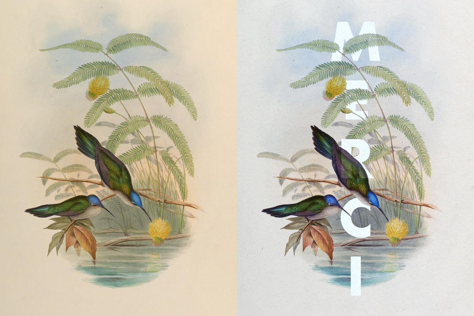
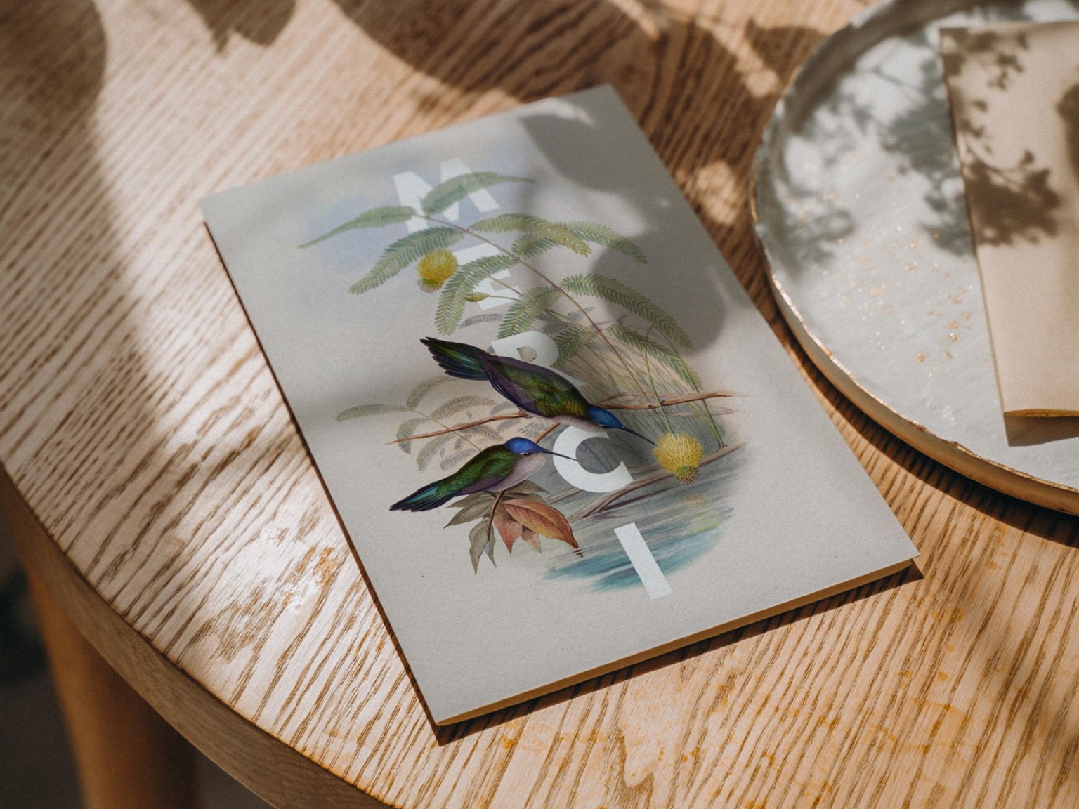
Sometimes you really should just take an illustration and simply layer your message on top or quickly mask it behind some of the elements in the image!
This image with really complex details, textures and colour washes would lose a lot of its character and quality when cut out of the background and placed over a different background — so layering the text over it, masking it a little and making some colour adjustment to the image to create enough contrast did the trick in this case.
Here I have also experimented with vertical type (which definitely works better with shorter words, hence I chose “Merci”) to emphasise the vertical axis in the composition.
Initials Card (Wedding Stationery)
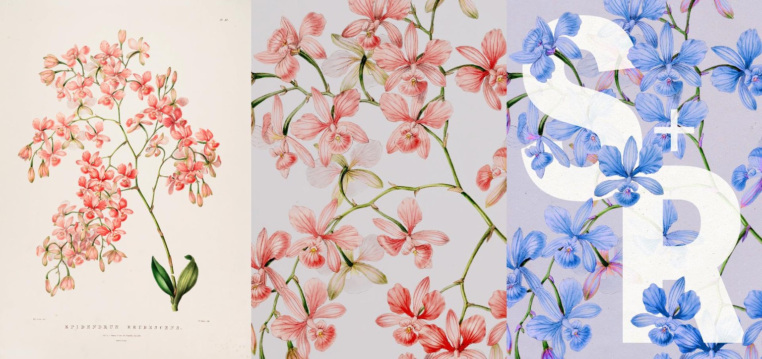
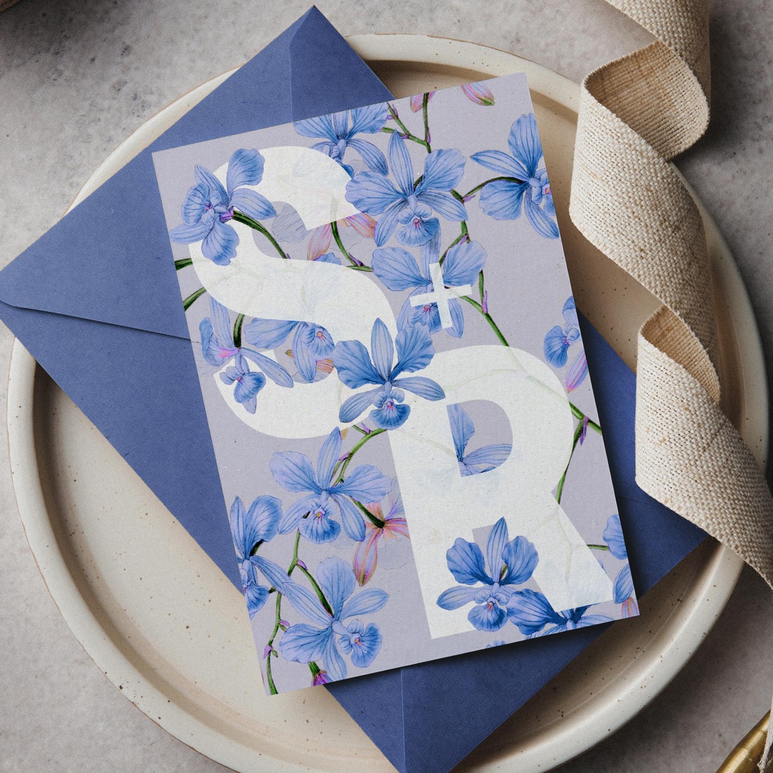
Playing with contrast between the shapes of the letterforms and delicate elements in the illustration which was scaled and cropped considerably to make all of the details more visible. Recolouring the flowers helped to shift the mood of the card and make it more unexpected and airy.
Olive Oil Packaging Label
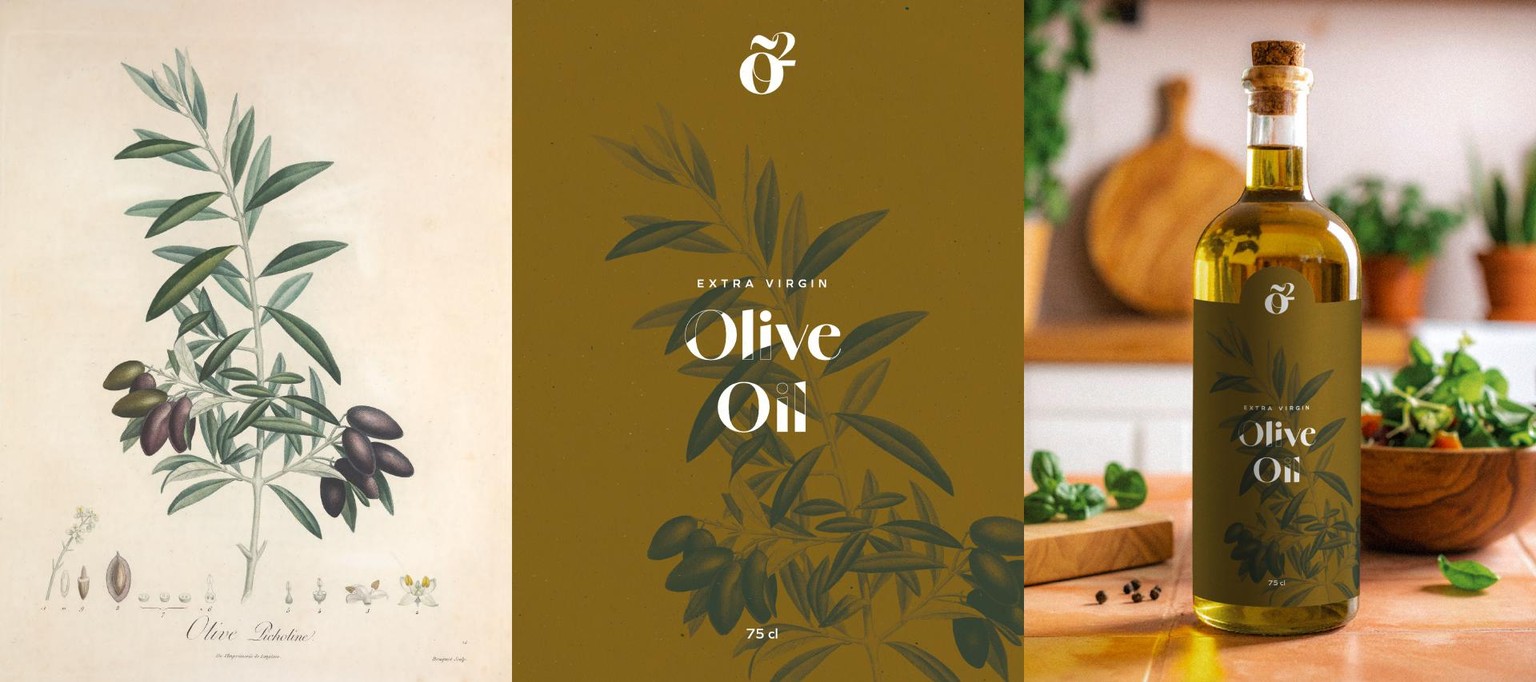
A really quick experiment with using a beautiful vintage print of an olive branch in a pretty minimal premium olive oil packaging label design.
Experiments with Using Large Letterforms and Creating A Pattern Using A Single Illustration
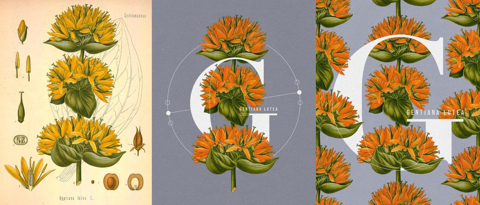
I loved the look of this vintage illustration and decided to simply stretch the muscles and experiment with the composition a little — and generally create something else rather than a greeting card, so that I could play around with typographic contrast between a single large letterform treated almost as a decorative shape and a small sans-serif inscription of the plant name.
It’s interesting to see how modern these designs look because of the colour treatment and composition, even though the typefaces (Linotype Didot + Monotype Grotesque) were carefully researched and picked based on what was often used in the botanical atlases over a century ago — but these modern digital versions (particularly Monotype Grotesque) have a few characteristics which are different from the original typefaces.
#blastfromthepast — Original 2016 Class Demo Summer Vibes Card
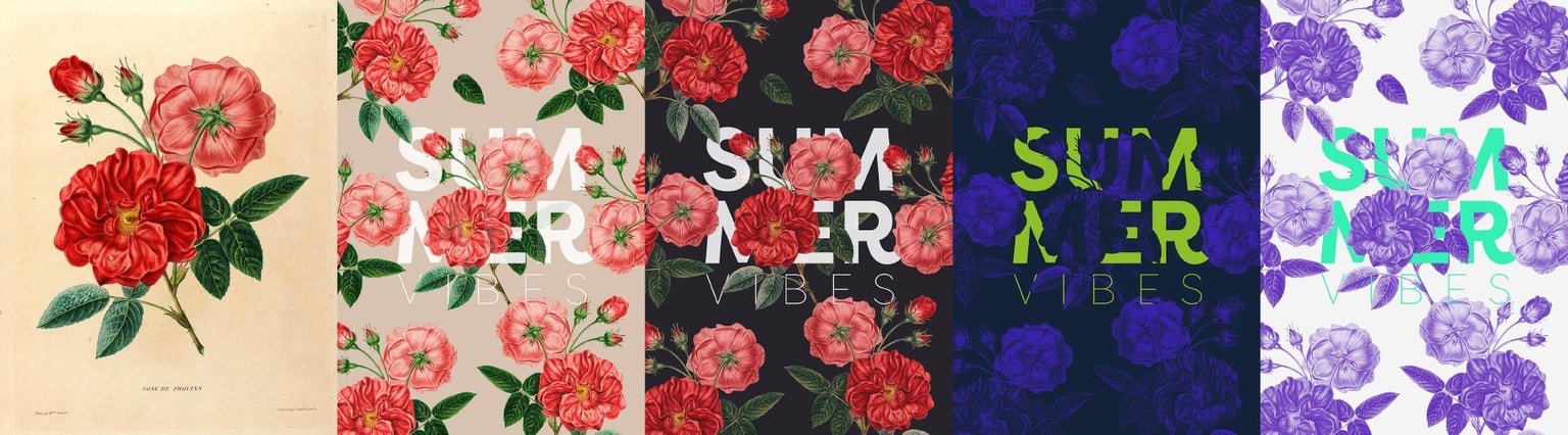
I thought it would be fun to pay homage to the original version of the class and include the old examples from 2016… I still like the pattern composition, but the message, colour treatments and typesetting are definitely not really representative of my current style (and roses aren’t my vibe either right now).
That's it for now! Thanks a lot for watching and reading!
I’m always excited to read your feedback — and see your projects and experiments in the project gallery!
—Evgeniya