Blush Skincare Logo
 Pretended that the client wanted something different from all the other skincare brands out there.
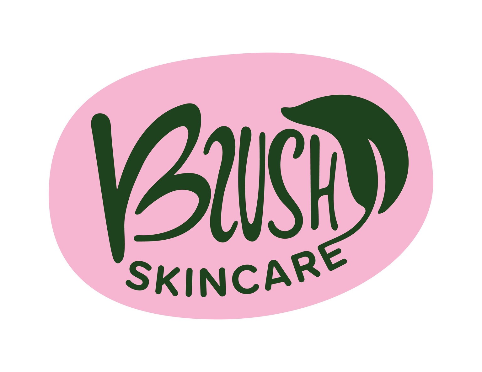
Hand-lettered "blush" for an organic, quirky feel.
B has hidden butterfly wings, keeping with beauty and nature theme.
Leaf is meant to tie the word "blush" and "skincare" together, and suggest a natural product.
Chose proxima nova round for the word "skincare" to provide a contrast to the word "blush." Wanted it to read cleanly, and not look too harsh.
Organic oval shape represents skin blush.
Experimented with different colors: 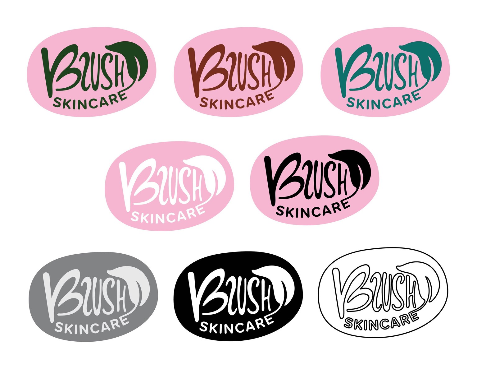
It looks like the top three color versions work the best, as well as the white on black version. The line art version is the least readable.
Overall, maybe it's not the most refined logo, but it was good practice for completing work in a short time, all while reviewing the principals of good logo design.
Thank you for putting this class together, Ketan!