Be Yourself
This class was really easy to follow and was lots of fun!
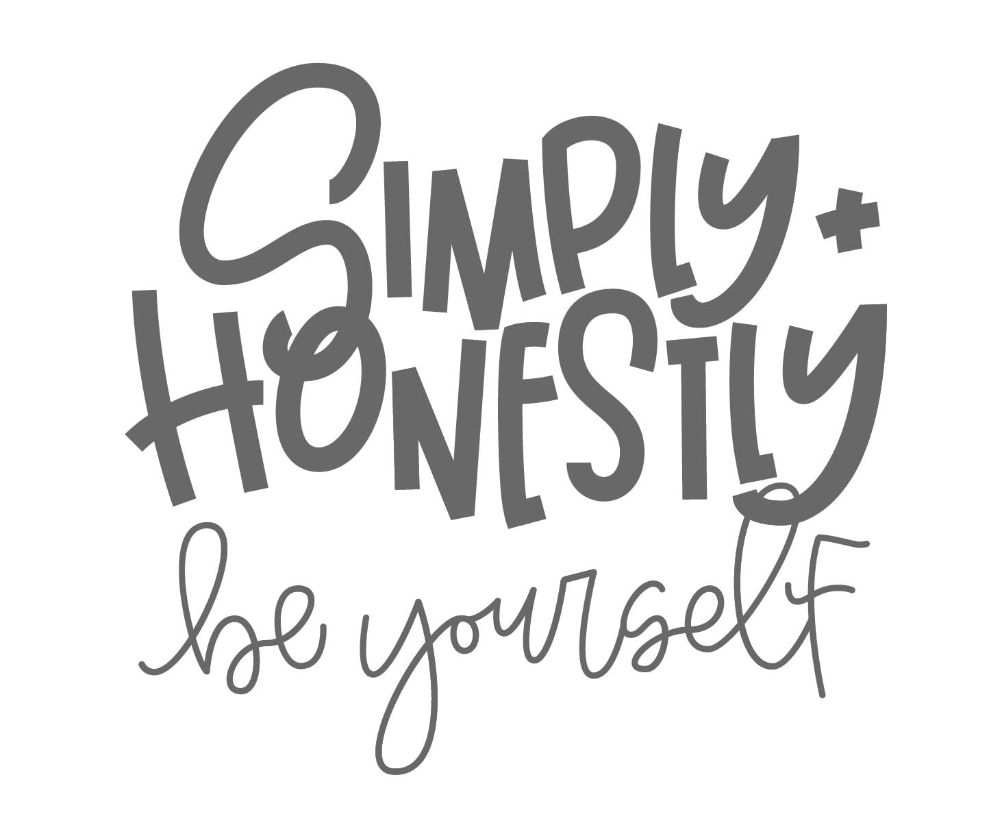
Here is the initial drawing of my lettering before I added color or shading:
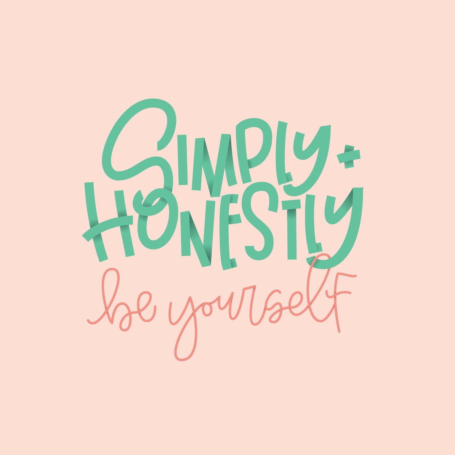
I decided I didn't want to add texture to the gradients because it seemed to flow better as just a regular radial gradient for this specific piece.
I did try the texture just to do it and practice it, and was having trouble with it for a while. It was creating really jagged and pixelated white edges around my letters and the texture looked so bad. I was working in a 6 inch square artboard. I increased it to a 30 inch square artboard and tried the texture again and it worked perfectly. So I don't know if some of my settings are weird, or if the grain texture just works best on a larger scale.
But anyway, here is my finished piece. I had a blast making it! Thanks Jamie :)