Balance
This is an extensive outline of my three-shot sequence, I've also gone into this detail within lesson 3 with some more explanation. Please check it out along with the rest of the class, it's also here if you aren't interested in taking the full class. For your own class projects, you do not need to go into this amount of detail (although it is welcome!), my class project was multipurpose and used for teaching as well.
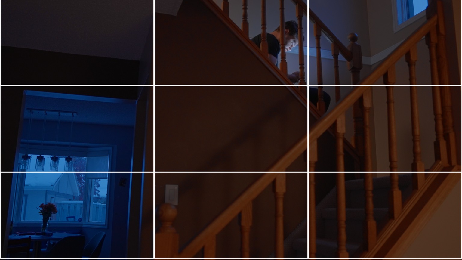
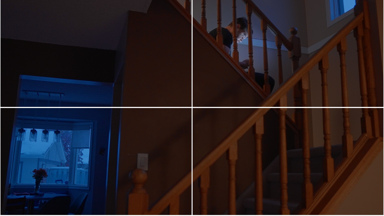
Basically, I was intrigued by the bars on the railing in our house and thought about ways I could use this location to better explain visual communication. It was tough to film myself so my acting doesn't really do this justice, but I could imagine this being a smaller scene in a larger film that could illustrate the theme of feeling trapped by finances. This was my intention, and I did my best to use the vertical bars to represent a prison of sorts.
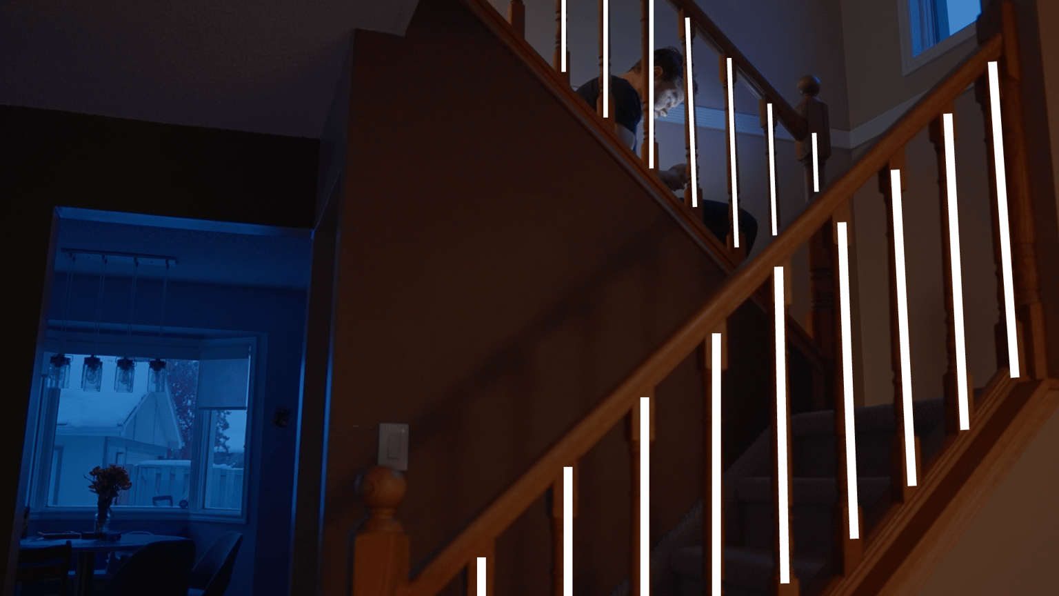
Look out for these types of lines within your imagery. These leading lines can help guide your eye through the frame. Diagonal lines are dynamic and tend to be more energetic or eye-catching than vertical or horizontal ones.
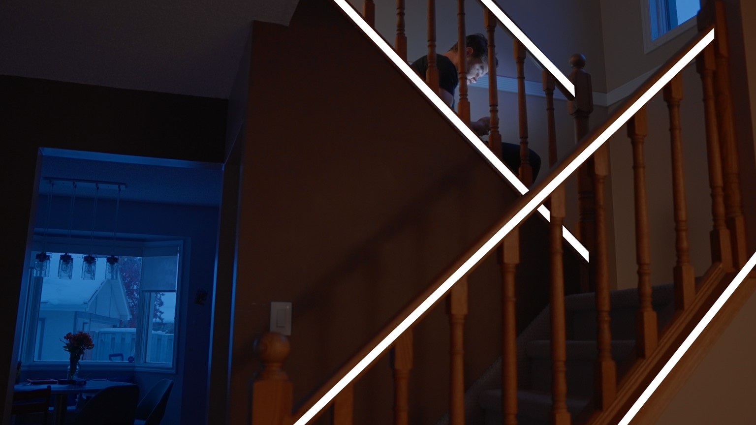
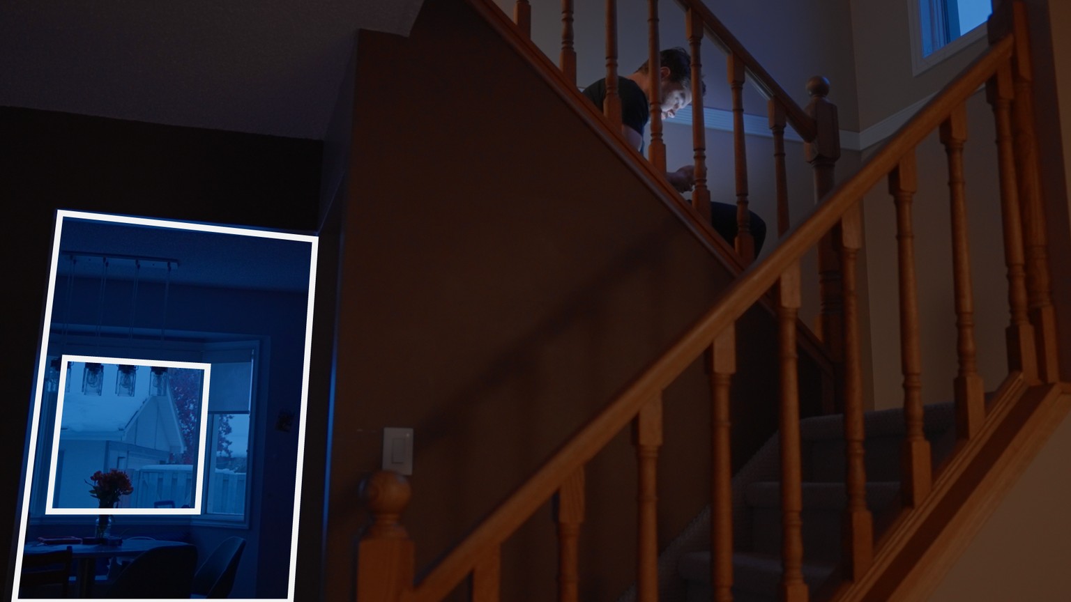
Our eye is also typically drawn to easily identifiable shapes such as the rectangle and square created by the doorway and window.
When organizing the composition (lesson 5) I wanted to keep the background with the table and windows in the shot to help create context and be a secondary point of interest to help solidify the theme. You may also notice that I'm placed high up in the frame with little headroom. This lack of headroom and closer to the edge of frame placement can create a sense of tension for the viewer (lesson 8).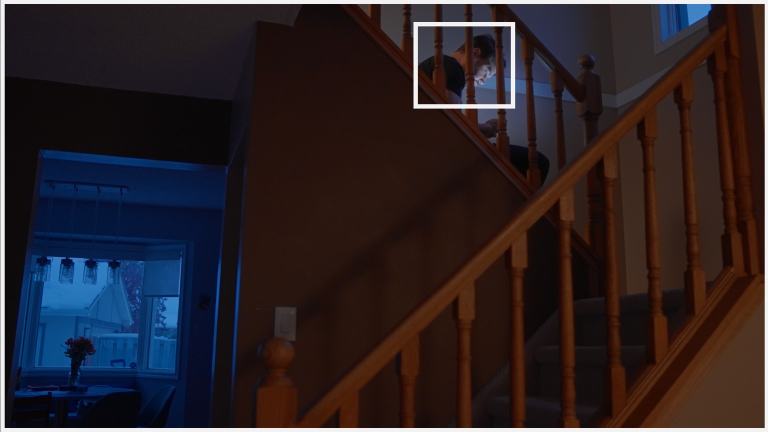
Speaking further on point of interest, this does not always need to be some ground-breaking thing. The point of interest can be very practical like in the case of our closeup shot of the bank balance. This shot clearly communicates the amount within the account.

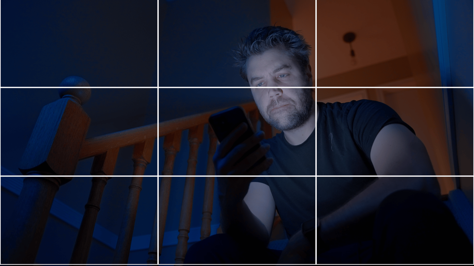
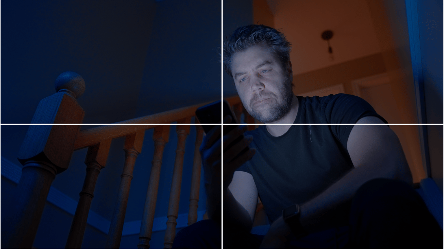
The colour contrast created by the warm and cool tones and keeping myself in the cooler ones was meant to create a bleak outlook. This contrast was also practically used to create visual depth (lesson 10). Warm tones tend to be visually heavier than cool tones (lesson 7). Cool tones tend to recede and warm ones pop out.

The flowers just happened to be on the table which can also create some practical symbolism. In this class, I only speak about the "line of action" in the context of lighting (lesson 11) rather than visual continuity... But in this sequence, we broke the 180-degree rule which can be visually jarring in terms of visual continuity. I don't find it jarring here and this doesn't really bother me too much because if others find it jarring this could contribute to the story on the screen. The advantage of telling a story through a sequence over a single image is the meaning you can create through the context, placement, and timing of each individual shot within that sequence.
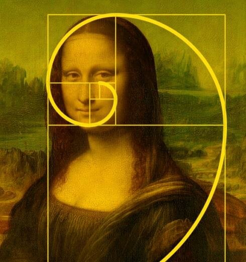
And, for fun, I've decided to see where the rule of thirds, lands on these compositions. I did not use the rule of thirds or phi grid, or any type of grid to compose my shots, and encourage you to not lean on these rules (lesson 5 and 6). They can be more of a crutch than helpful in my opinion and the goals that they are meant to achieve do not require you to use them.

Ok, but here's the kicker... These compositions might not fit the rule of thirds, but perhaps they suit quadrants!?

 "But Sean! Didn't you say not to lean on grids to create compositions?" Yes, I did. In most cases, you can justify any grid to fit your composition whether it was intended to fit or not... For me, the point is not to fit your story within a grid but to tell the story through framing and composition.
Some people like to force compositional rules onto images... This may be to try to justify the rule or to make sense of photography.
Focus on using compositional techniques to tell stories, remember, the story is your guide. Thanks for taking the class!