Aslan: The Great Lion
Hi Skillshare! My name is Christopher Vinca, or better known as @handletteredlogos on the inter-webs/instagram.
First off I'd like to say thank you to Martina for sharing your process. So far I've taken 40 classes on skillshare, yet this will be my first project. I was inspired by your techniques in this course and your approach to drawing scripts, and found myself implementing them into my own process. With that said, here's my project: (I hope you all enjoy!)

The idea behind choosing the name Aslan came from a masterpiece Jake Weidmann just finished. (It's breathtaking right?) I've been following his work for sometime, and as a Chronicles of Narnia fan, it just made sense to combine the two.
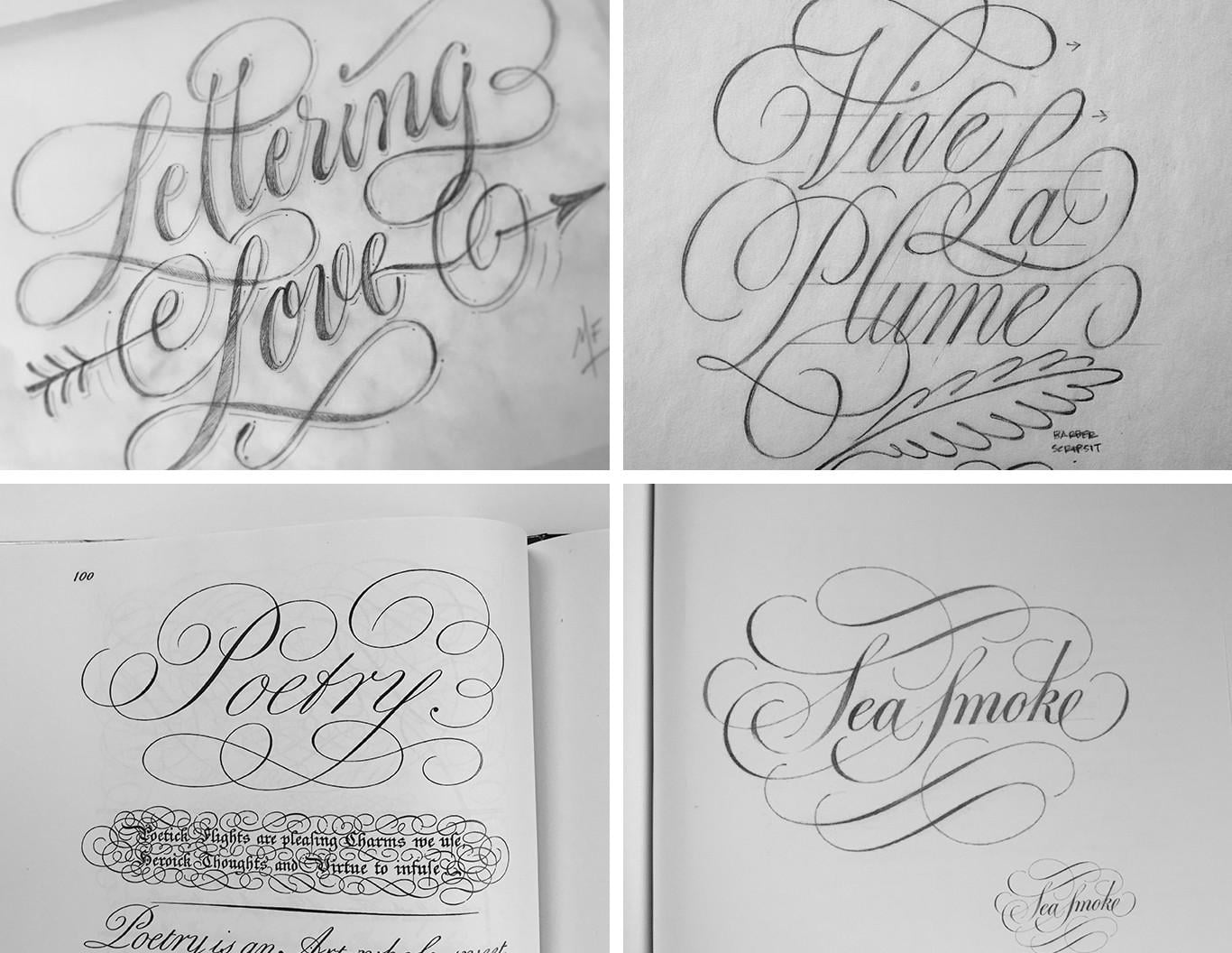
Along with work from Martina, Ken Barber, George Bickham, (and of course) Doyald Young; I found an elegant script style as inspiration for my project.
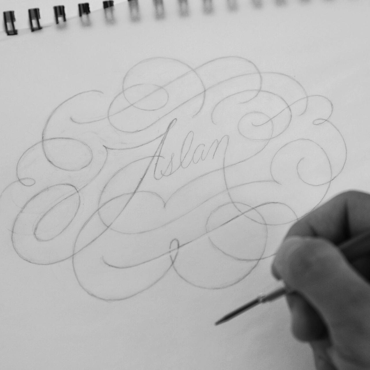
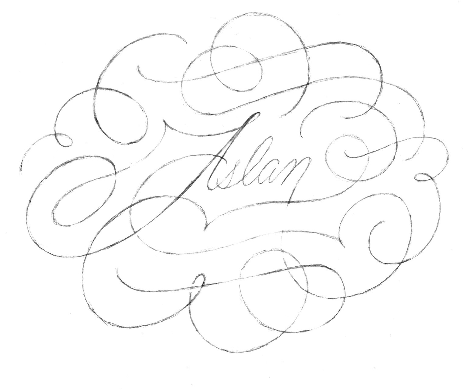
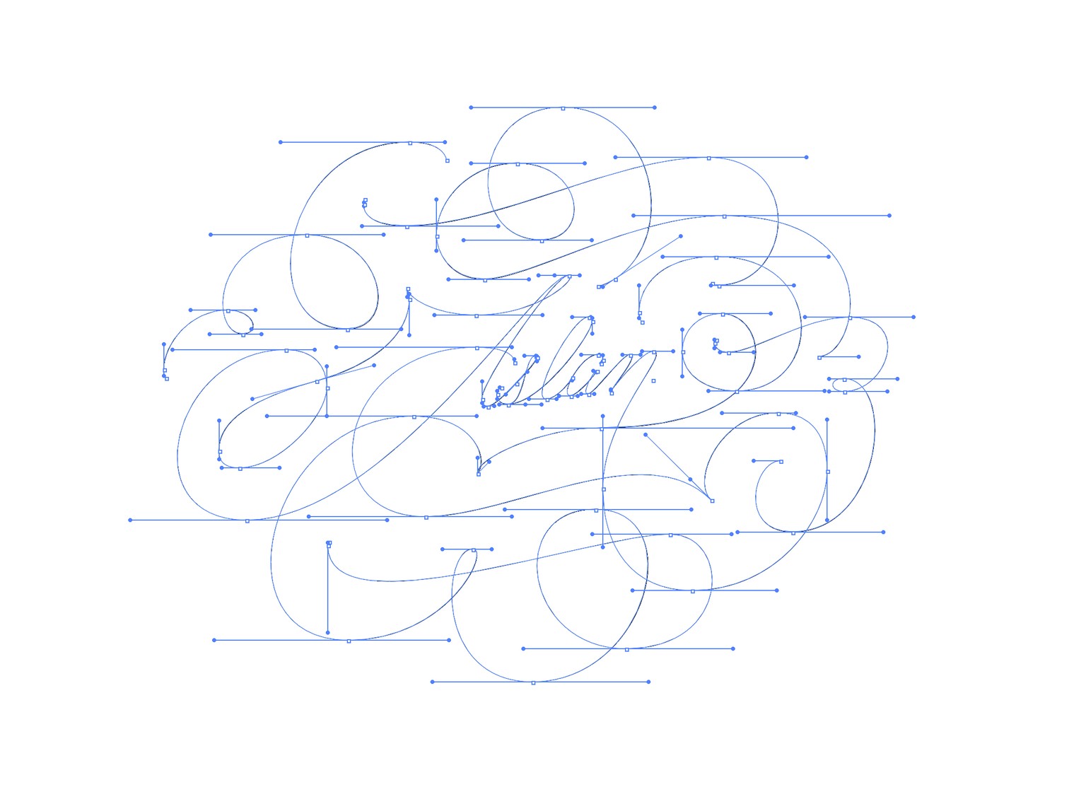
Here is my sketch progression
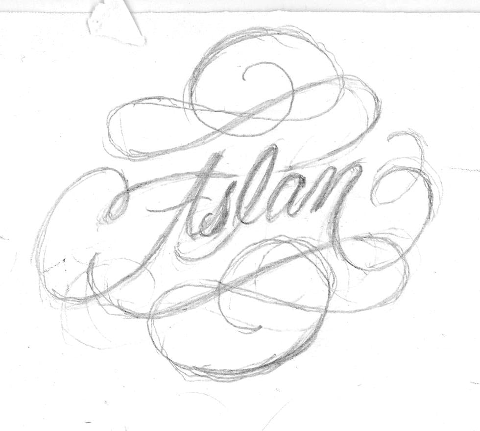
thumbnail sketch
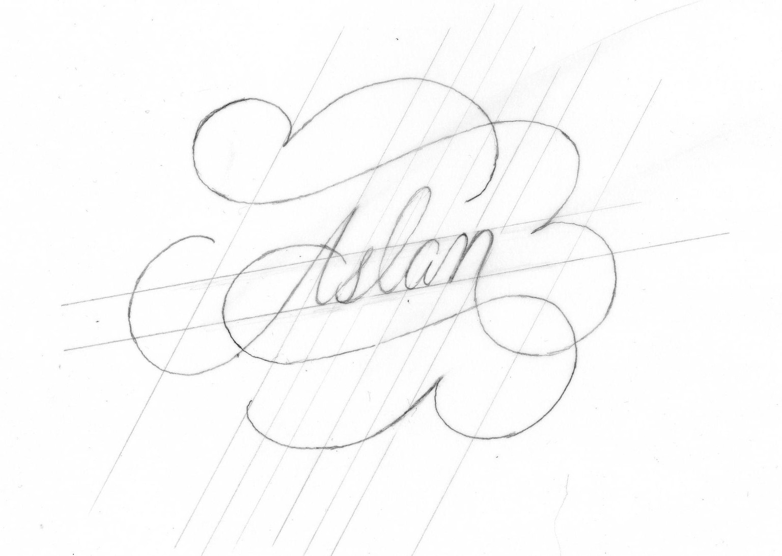
Using this as a starting point, I decided to explore more flourishes and finally came up with this one:
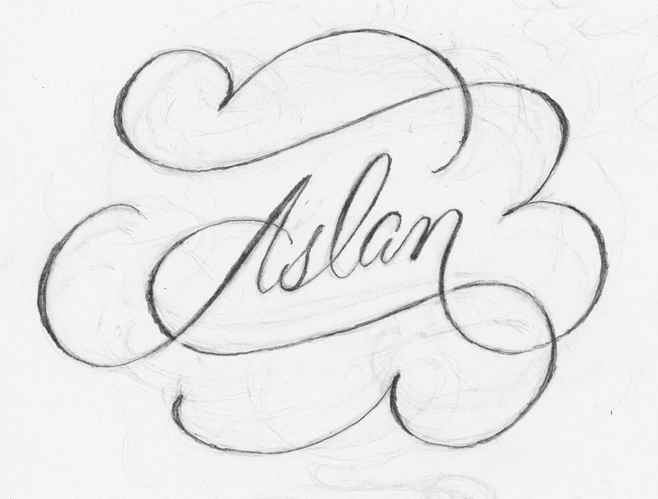
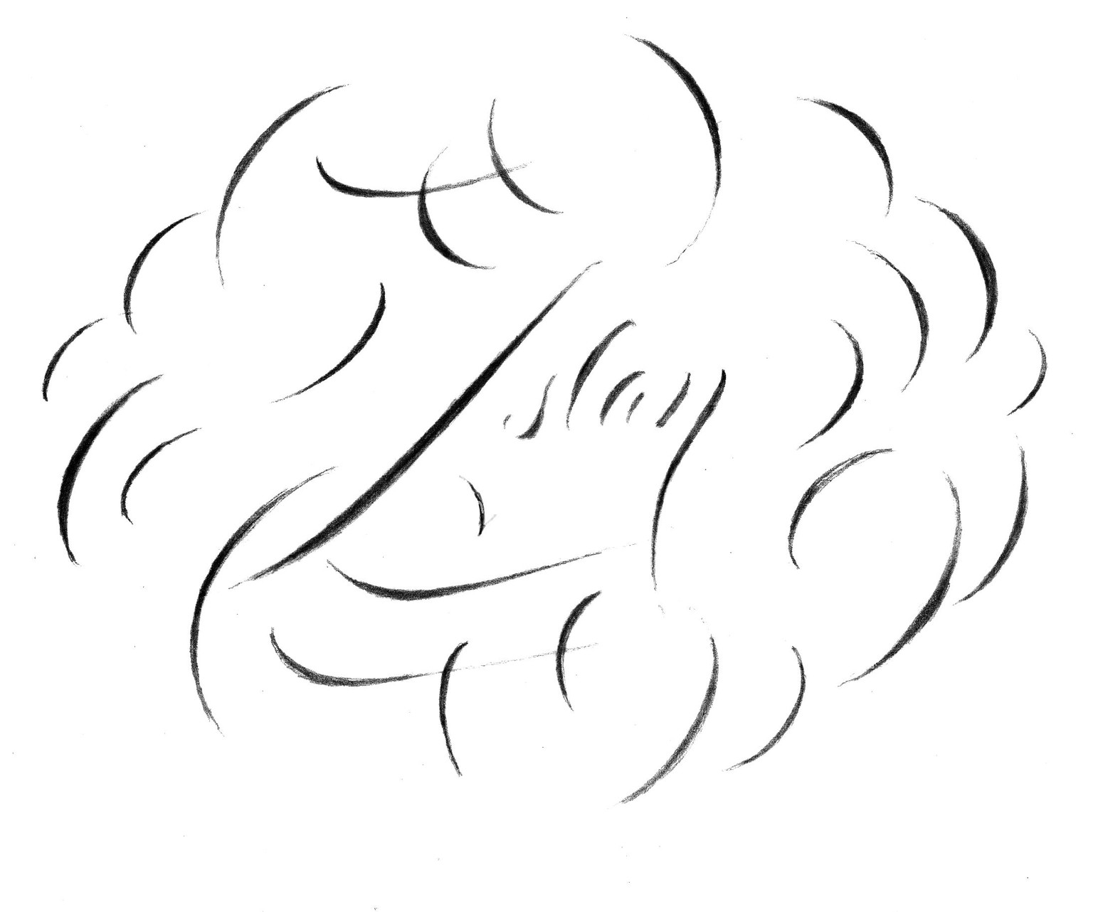
After endlessly refining the curves, I used a separate sheet of tracing paper to add in weight (the technique taught in the lesson).
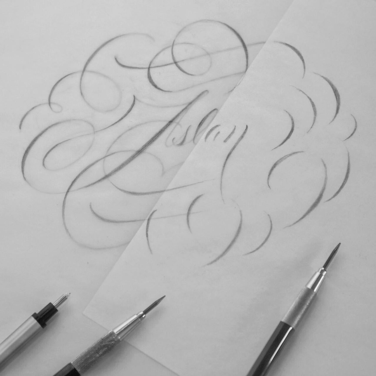
From here I scanned in the two layers and jumped into Illustrator.
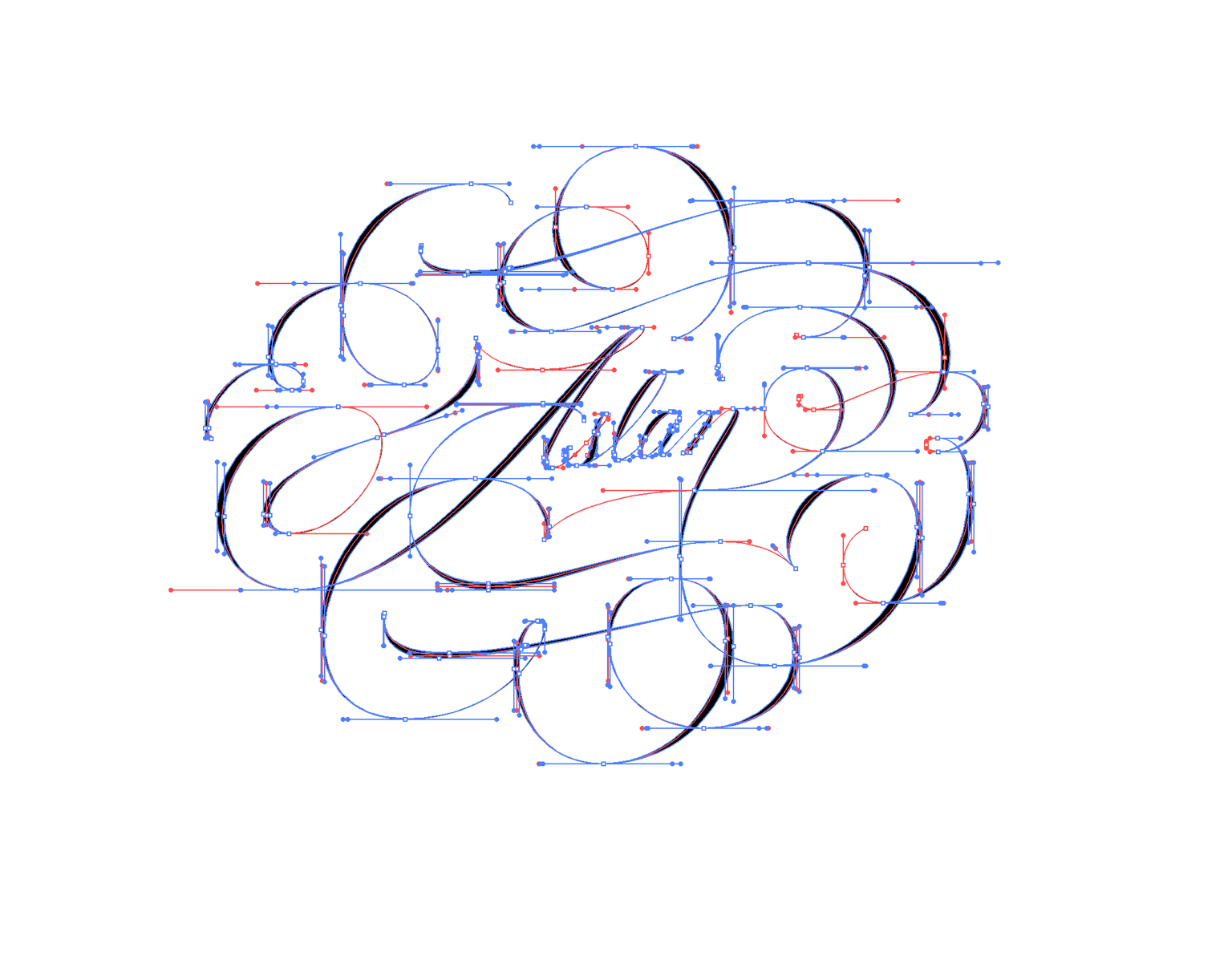
I found using a skeleton layer to create the weight layer really helps to keep the curves consistent.
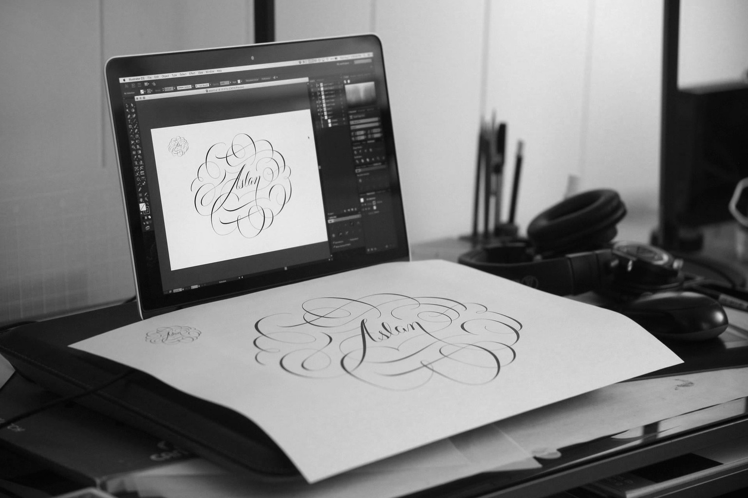
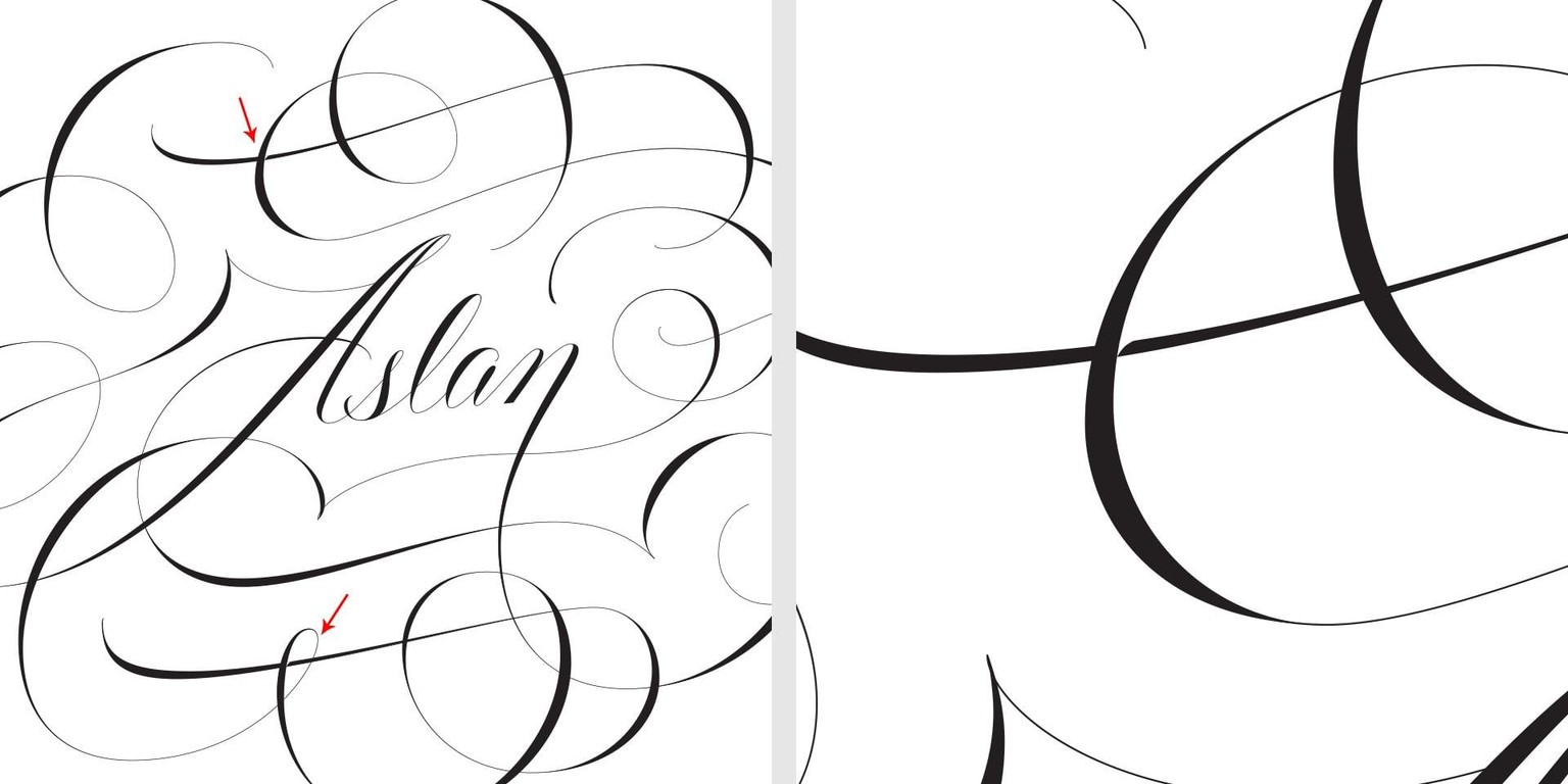
Here's a test print to double check any small mistakes I may have missed.
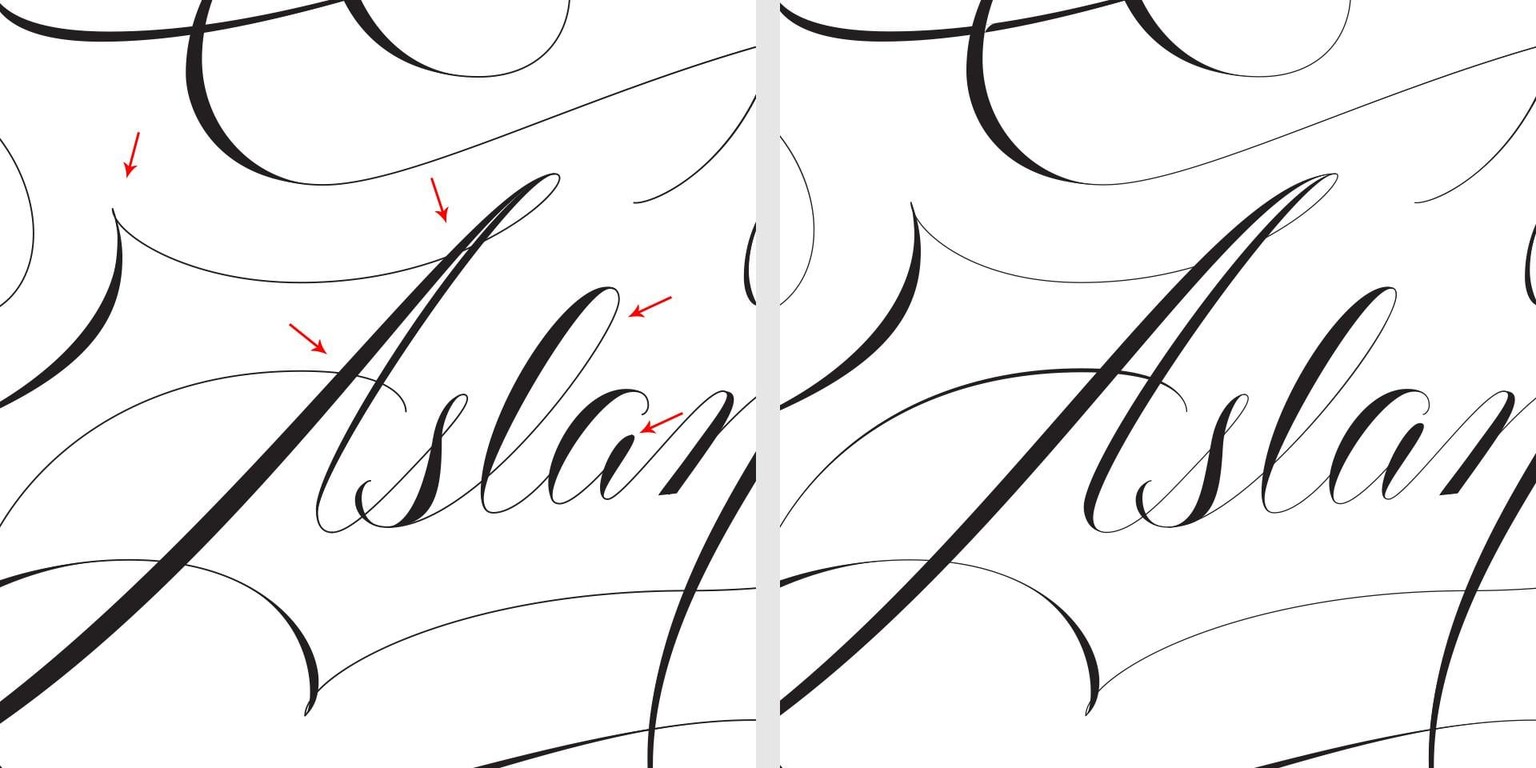
The arrows mark where I made changes. I realized that from far away, it was really hard to read the "A", so I opened up the white space, and thickened the weight on the second stroke. I also added weight to the cross bar for legibility. For the "l" I closed up the loop, and for the "a" I increased the height of the stem.
A small but helpful adjustment was adding a white shadow to help the eye determine hierarchy between two similar weighted flourishes.
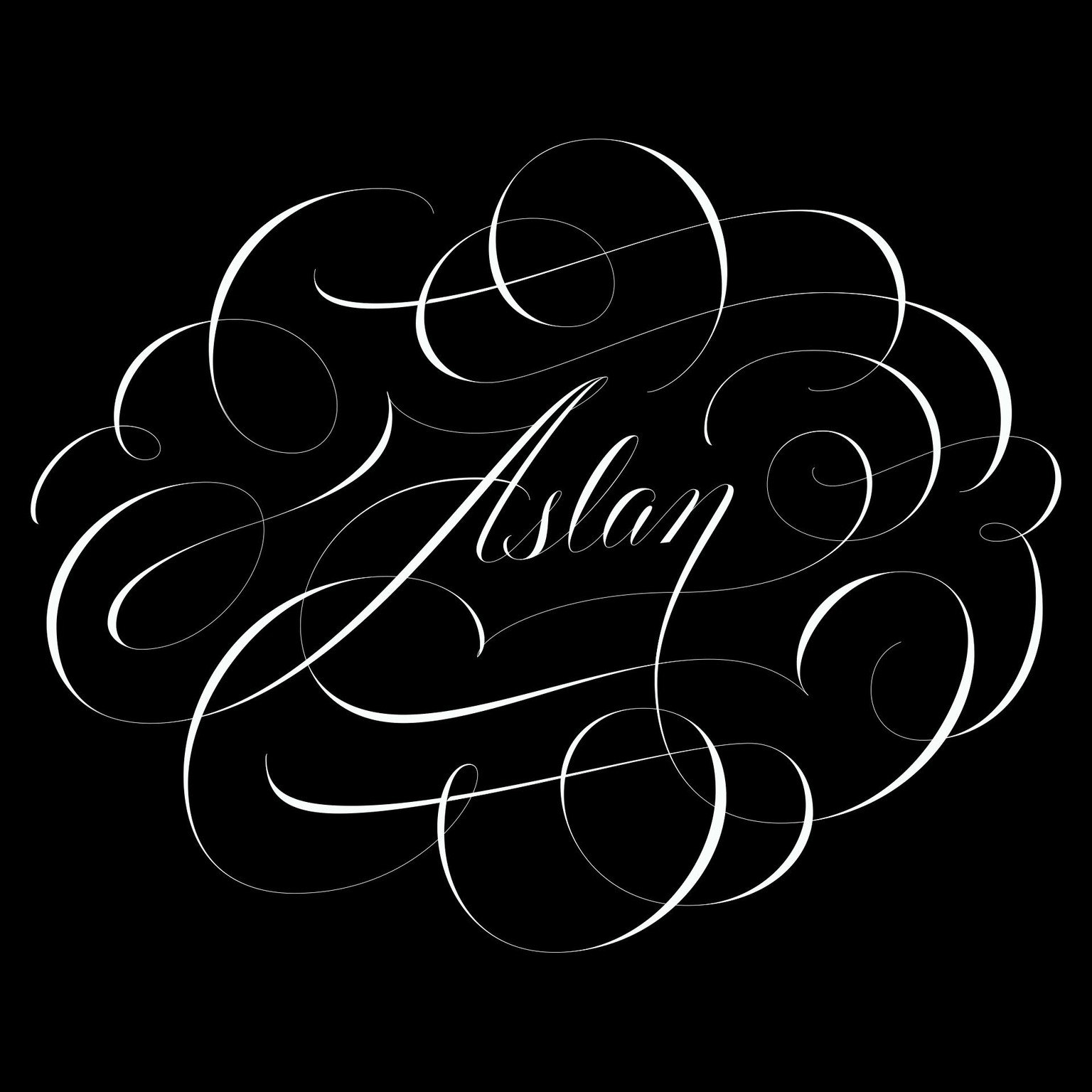
Here's the final piece reversed on black.
Thank you all for viewing my project and everyone who left the kind words—I had a lot of fun with this class!