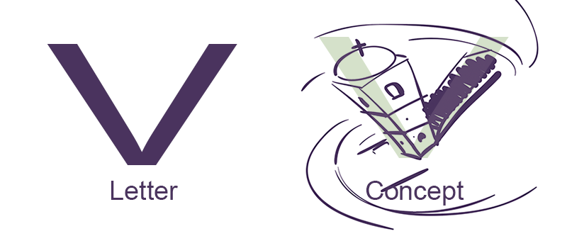
Alphabet Movie Posters
Great tips! Illustrator can definitely be mysterious and confusing; just knowing what's possible and how easy some of these techniques are is very empowering. I've been following DKNG for a while and have definitely improved my Illustrator hustle with these classes.
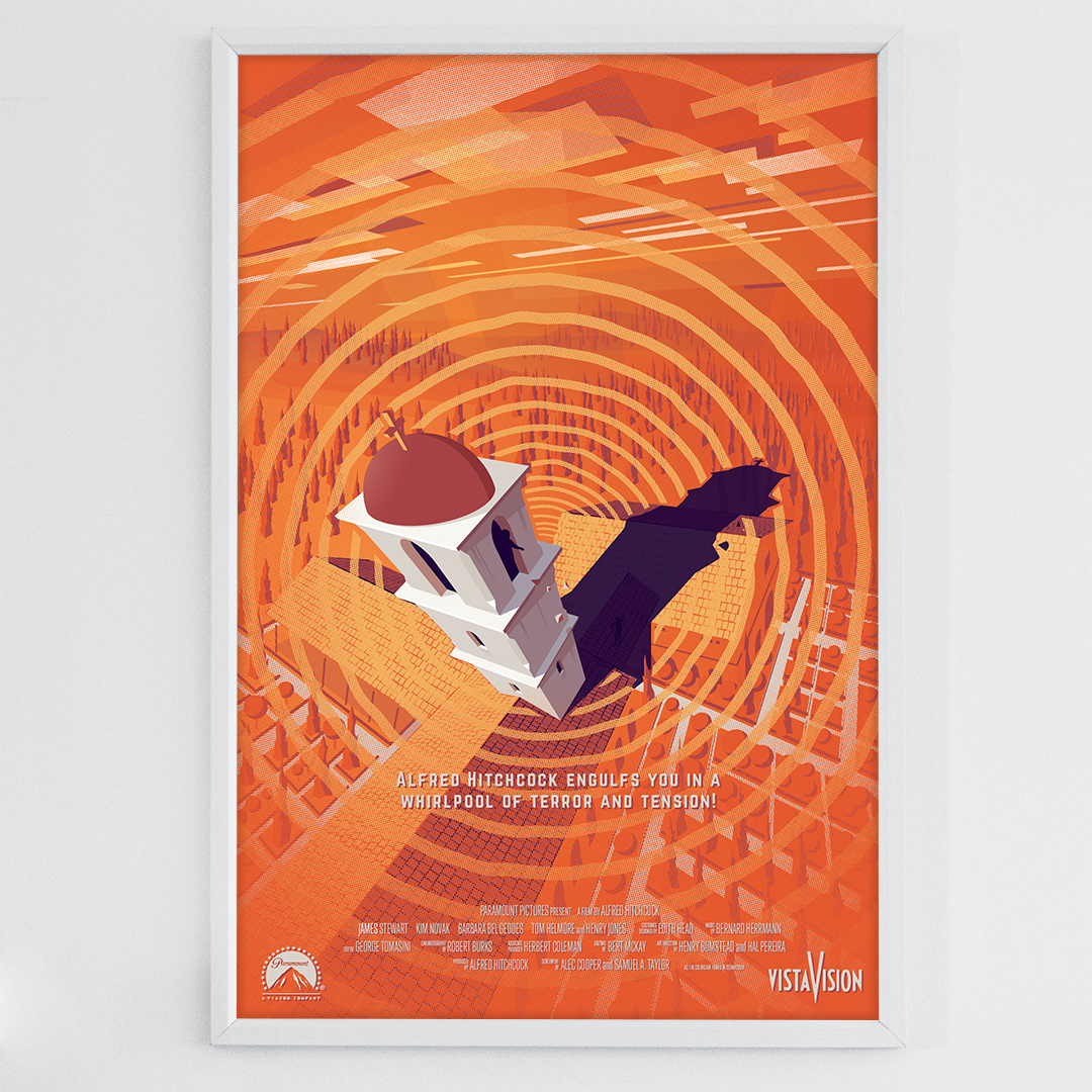
Just for funsies I started making a collection of movie posters, using only use the first letter of the movie's name as the central design element. This poster covers a few of the techniques from this class (as well as other Illustrator tricks from DKNG, and others). I won't even mention the name of this movie. Hopefully it should be obvious :)
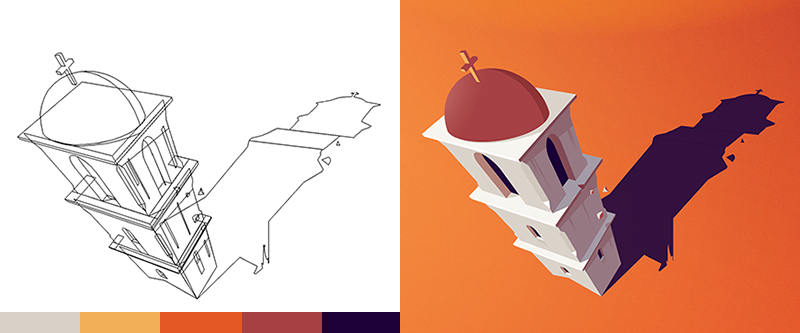
As always, I start with a really bad concept sketch. Most of my sketches are usually decent, but this one is just plain awful:
Used a little gradient mesh, and some 3D perspective grid to create the building and background. The colors are all globals which can easily be changed later:
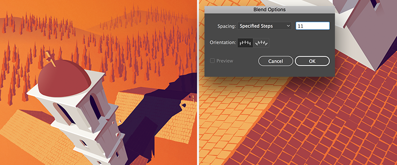
The trees and terra cotta roof tiles are both custom brushes. The trees are a scatter brush and the roof tiles are a stepped blend with a really low setting. I envelope distorted the tile patterns to fit the building roof structures:
Final step was creating all the textures and a vignette to bring the focus back towards the center:
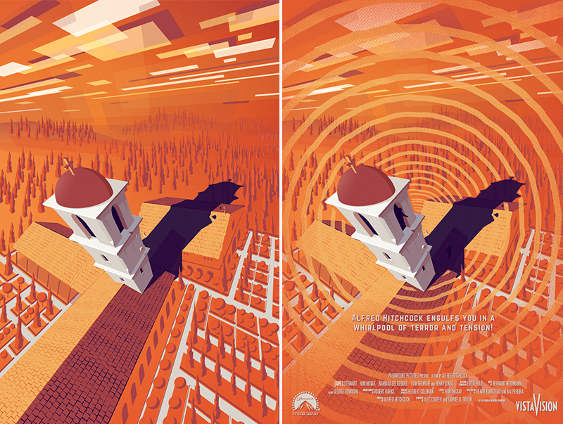
Finished poster:
Check my Instagram (in my profile) to see the other movie alphabet posters I'm working on. All of those use a mixed bag of tricks from DKNG and more. I also live stream designing these on Twitch every week, so if you are interested in watching the process — and struggle :) — you can catch all the videos and archives there (twitch.tv/mattgyvertv).
Thanks for reading!