Accessibility audit and fixes
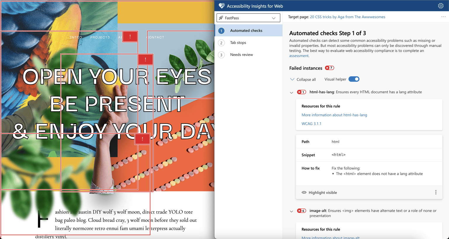
1. Stared by running accessibility checks with Insights for the web. Next, I checked the Tab order and inspected it on different screen sizes. As a last step, I looked into the code both HTML and CSS. Identified the following errors:
- Missing Lang attribute for HTML tag
- Missing proper HTML5 semantics, and when it was used it was not used correctly like section class="row" in one place but then div class="row" in another.
- Missing alt tags, or inappropriate alt tags not properly describing the image.
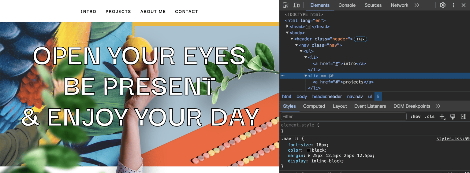
- Insufficient contrast in a few places mainly navigation. Images covering text on small screen sizes.
- Navigation is difficult to use on small screen sizes.
- Using br instead of word-break
- Adding no animation line for users with preferred reduced motion.
Here is my Before and After
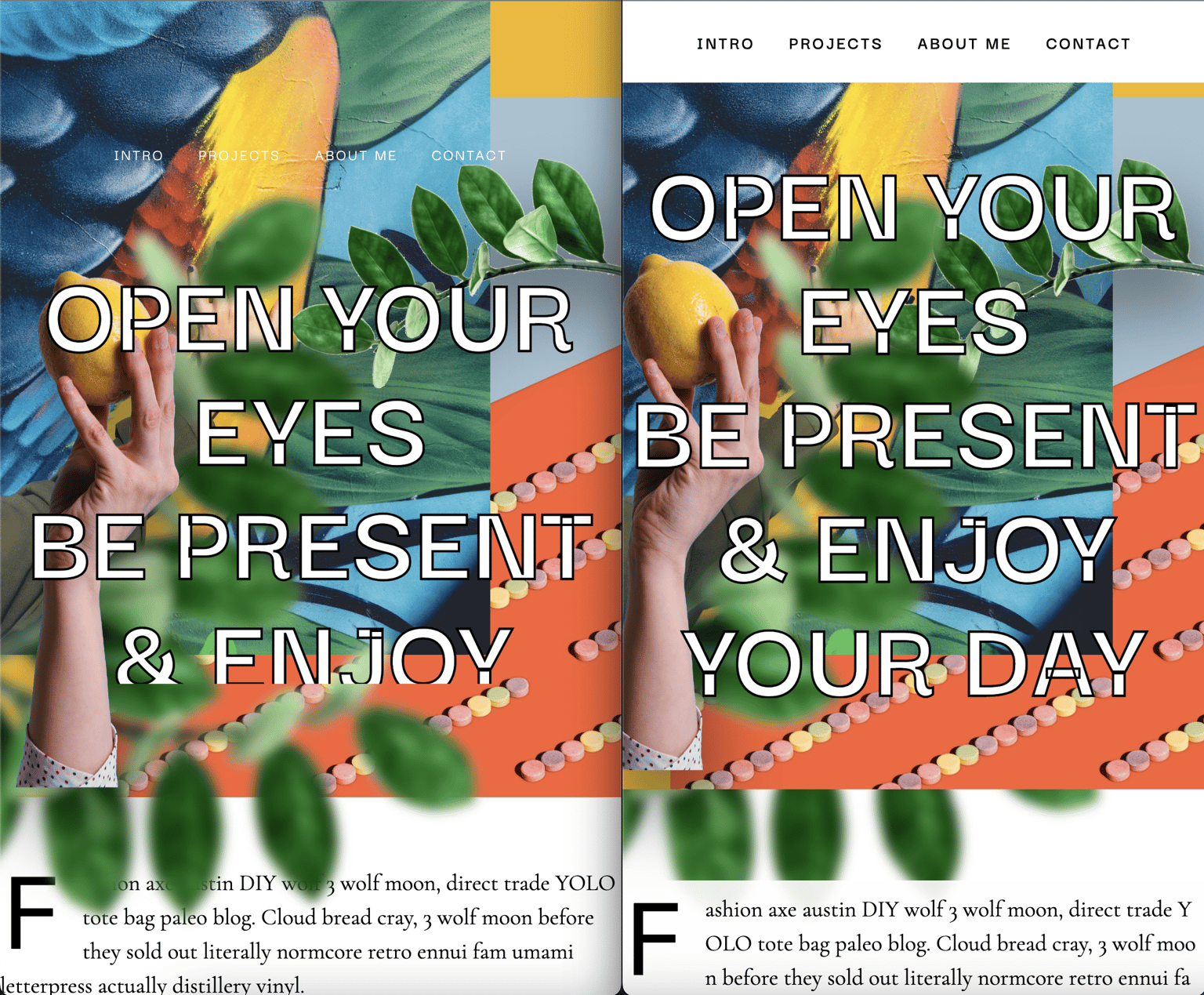
Fixed navigation on mobile and images covering text. Also looked into how the heading title is cropped on mobile and fixed that.
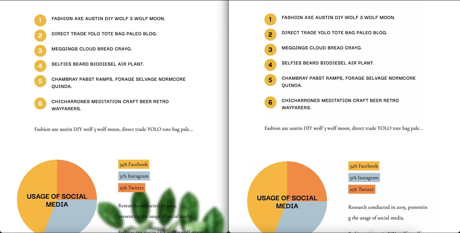
Fixed insufficient contrast for numbered list. Fixed image covering text on mobile.
More examples of images covering text.
Adding proper HTML5 semantics through the site.
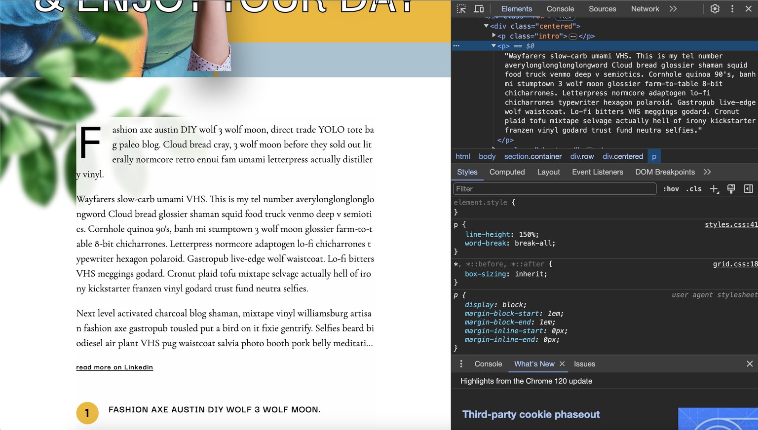
Fixing br use to break a long word by adding word-break: break-all to paragraph.
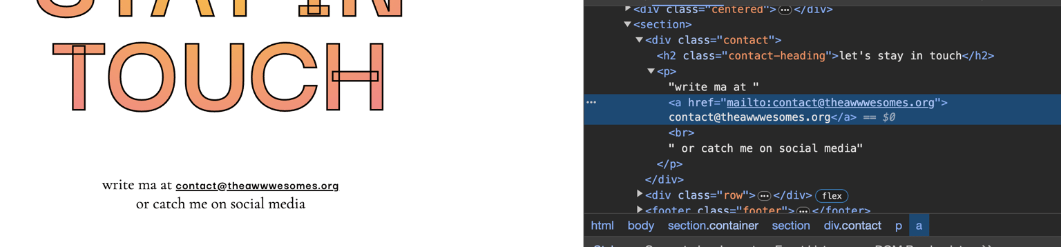
Adding appropriate mail link.
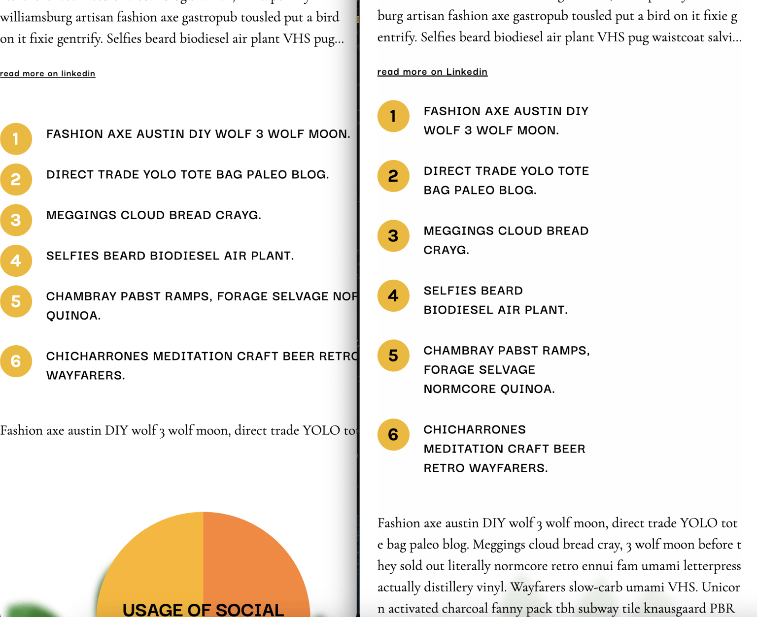
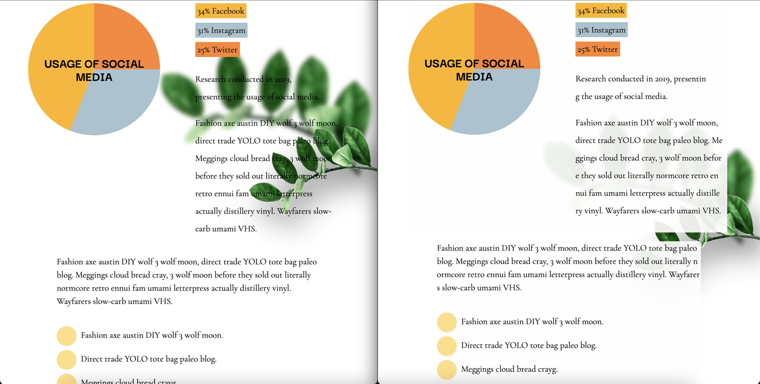
Fixed this numbered list, that does not wrap on small screen size. Fixed the paragraph under it which disappears instead of wrapping on a small screen.
Finally added much-needed left and right padding to the site.