Abstract Landscapes
Hi, In this course I got carried away. Denise, you always recommend doing more than one sample and in this course I created three sets of three.
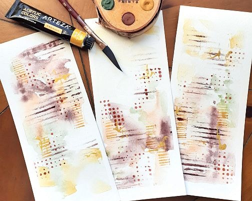
In the first sample, I painted along with you using the Kuretaki watercolours but I was not patient enough to let them dry between layers so I was not happy with the blending of the colours. Here is my first attempt. I used similar stencils to achieve the dots, lines and the horizontal elements.
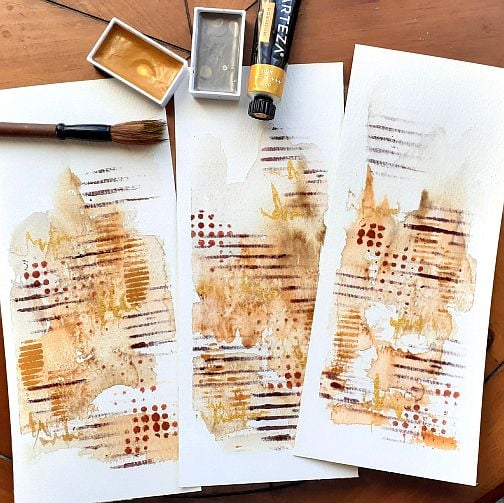
In my second attempt, I chose to use my new Beam earth tone paints. The colours are Mars Violet, Harvest Wheat, Green Earth, Brown Clay and Bread.
Again I feel that I did not wait long enough between layers as I can see a lot of blending. I used the same paper, and stencils.
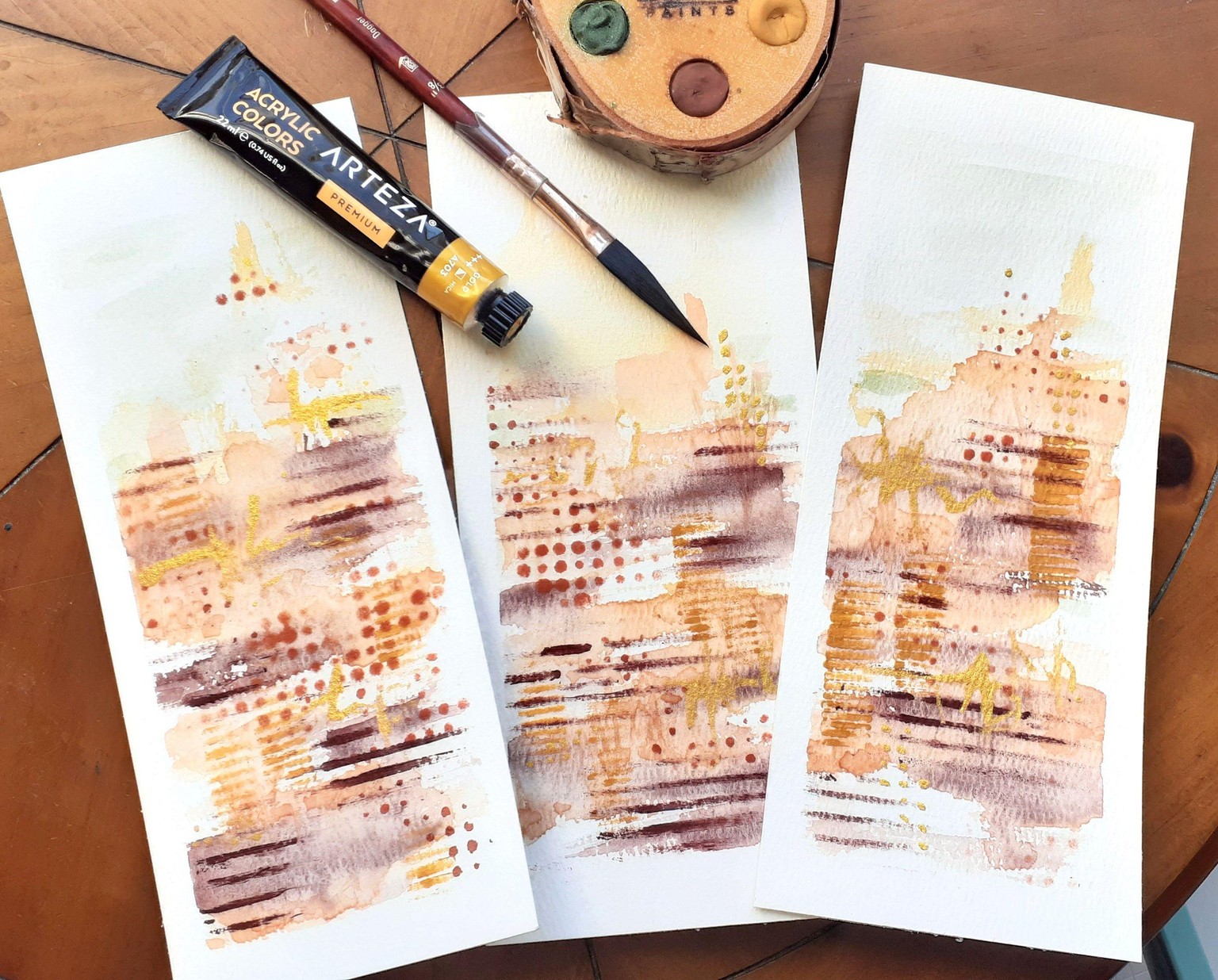
So for the third try, I used the same Beam paints but tried to also go lighter with the pigments. The colours are more subtle and the overall feel is lighter and more spacious. I like these ones the best. The earth green is much lighter than you would think looking at the palette and it works so well with the mars violet. I used acrylic paint in gold and bordeaux red for the stenciled layers.