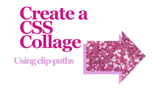
A simple version using the HTML and CSS provided
CSS:
*,
*::before,
*::after {
box-sizing: border-box;
}
body {
margin: 0;
font-family: 'Georgia', sans-serif;
display: flex;
justify-content: center;
align-items: center;
height: 100vh;
}
section {
position: relative;
}
h1 {
text-transform: none;
margin: 50px;
letter-spacing: -6px;
font-size: 120px;
line-height: 80%;
color: mediumvioletred;
margin-top: 70px;
width: 500px;
}
h3 {
text-transform: none;
margin: 10px;
letter-spacing: -6px;
font-size: 60px;
line-height: 100%;
color: plum;
width: 500px;
}
.glitter {
width: 400px;
height: 340px;
background-image: url(../images/glitterPink.gif);
background-size: 800px;
position: absolute;
bottom: -100px;
left: 500px;
background-color: ;
background-blend-mode: screen;
z-index: 10;
clip-path: polygon(0% 20%, 60% 20%, 60% 0%, 100% 50%, 60% 100%, 60% 80%, 0% 80%);
-webkit-clip-path: polygon(0% 20%, 60% 20%, 60% 0%, 100% 50%, 60% 100%, 60% 80%, 0% 80%);
}
.glitter-shadow {
width: 400px;
height: 340px;
left: 500px;
bottom: -100px;
position: absolute;
}
.glitter-shadow::before {
content: '';
position: absolute;
width: 100%;
height: 100%;
background: plum;
z-index: 0;
left: -20px;
top: 20px;
clip-path: polygon(0% 20%, 60% 20%, 60% 0%, 100% 50%, 60% 100%, 60% 80%, 0% 80%);
-webkit-clip-path: polygon(0% 20%, 60% 20%, 60% 0%, 100% 50%, 60% 100%, 60% 80%, 0% 80%);
}
HTML:
<!DOCTYPE html>
<html lang="en">
<head>
<meta charset="utf-8">
<meta http-equiv="X-UA-Compatible" content="IE=edge">
<meta name="viewport" content="width=device-width, initial-scale=1">
<link href="styles/styles.css" rel="stylesheet">
</head>
<body>
<section>
<div class="glitter"></div>
<div class="glitter-shadow"></div>
<div class="text-container clearfix">
<h1 class="heading">Create a CSS Collage</h1>
<h3>Using clip-paths</h3>
</div>
</section>
<svg height="0" width="0">
<defs>
</defs>
</svg>
</body>
</html>