A Tree Grows in Brooklyn
I enjoy coming of age novels and this book makes my favorite top 5! Although set in the 20’s through the 40’s, the story is still very relevant today. The book covers in the world today, however, look dated and uninspiring so I wanted to find a way to modernize it.
I envisioned a “ Book Club” special edition for a book store. I especially wanted other women to see this book and want to pick it up. My messy notes below.
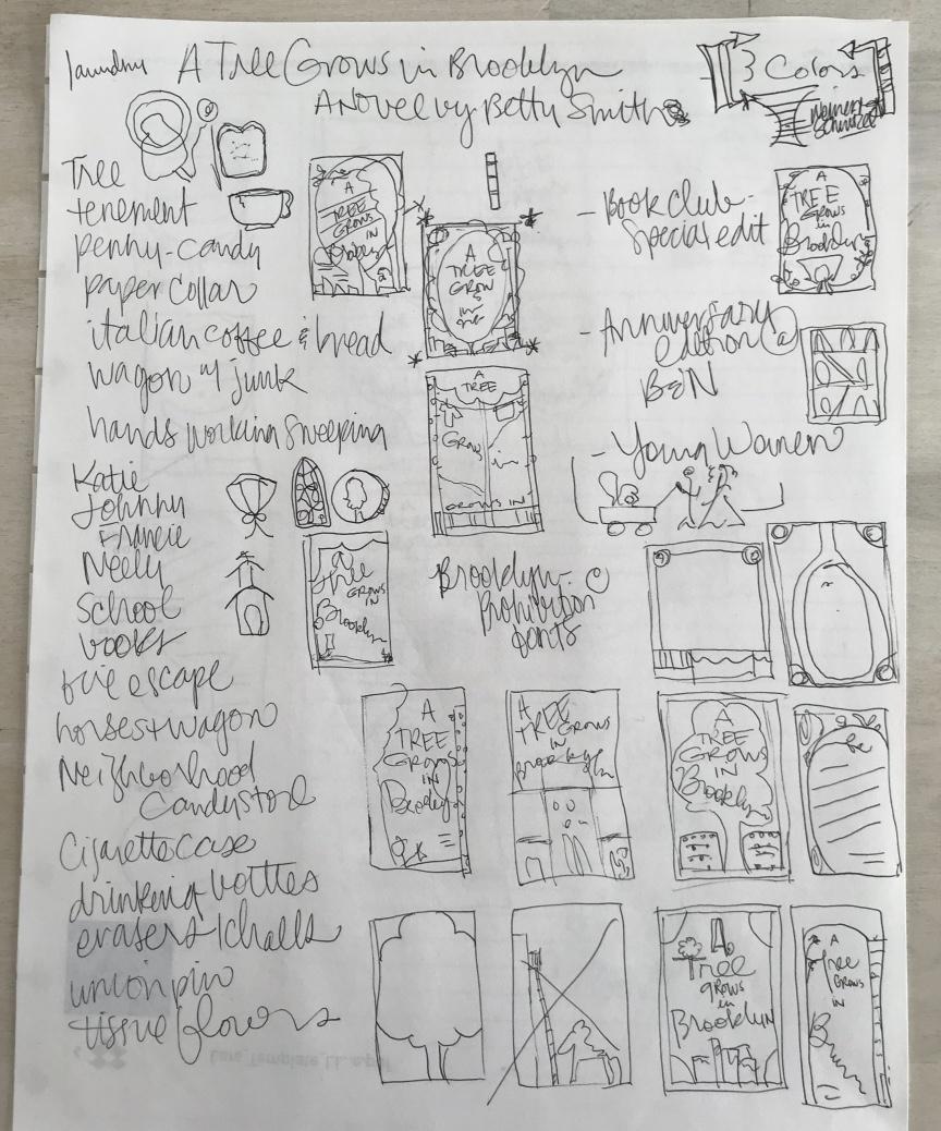
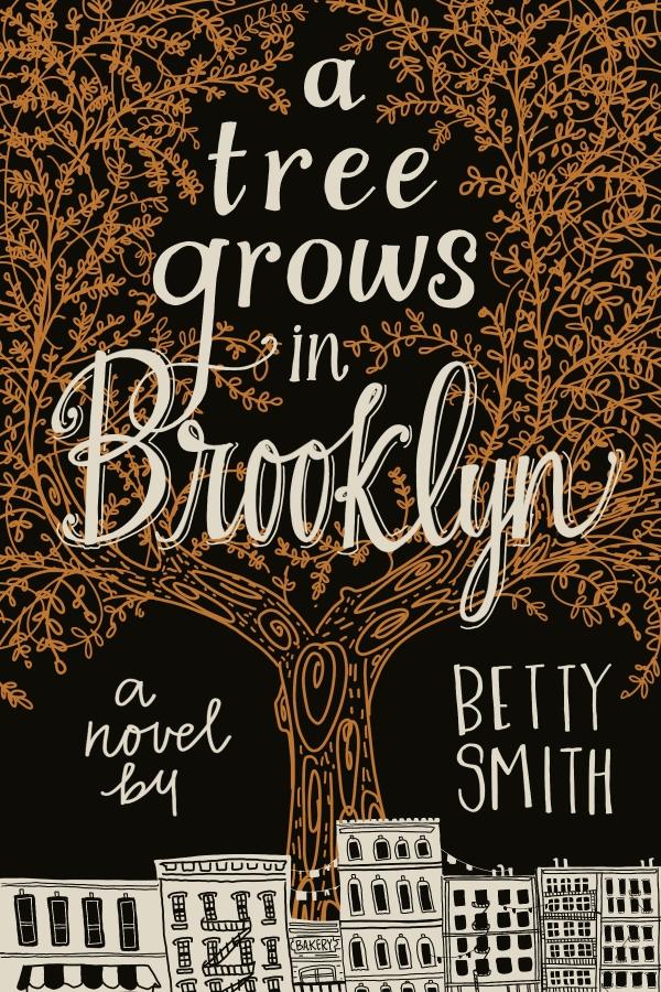
Since the book spans so many years, there were a ton of images to choose from. Brooklyn itself is a character in this book and I knew I wanted to include the buildings and neighborhoods that the author gave life to. Also,” Home”, where it was or where the characters dreamed it could be, was a theme throughout the novel.
I, too, struggle with the “use every color in the crayon box”, so I appreciated the constraints of 3 colors for this project.
I thought the starred layout would work best for a “ Book Club” Annversay edition.
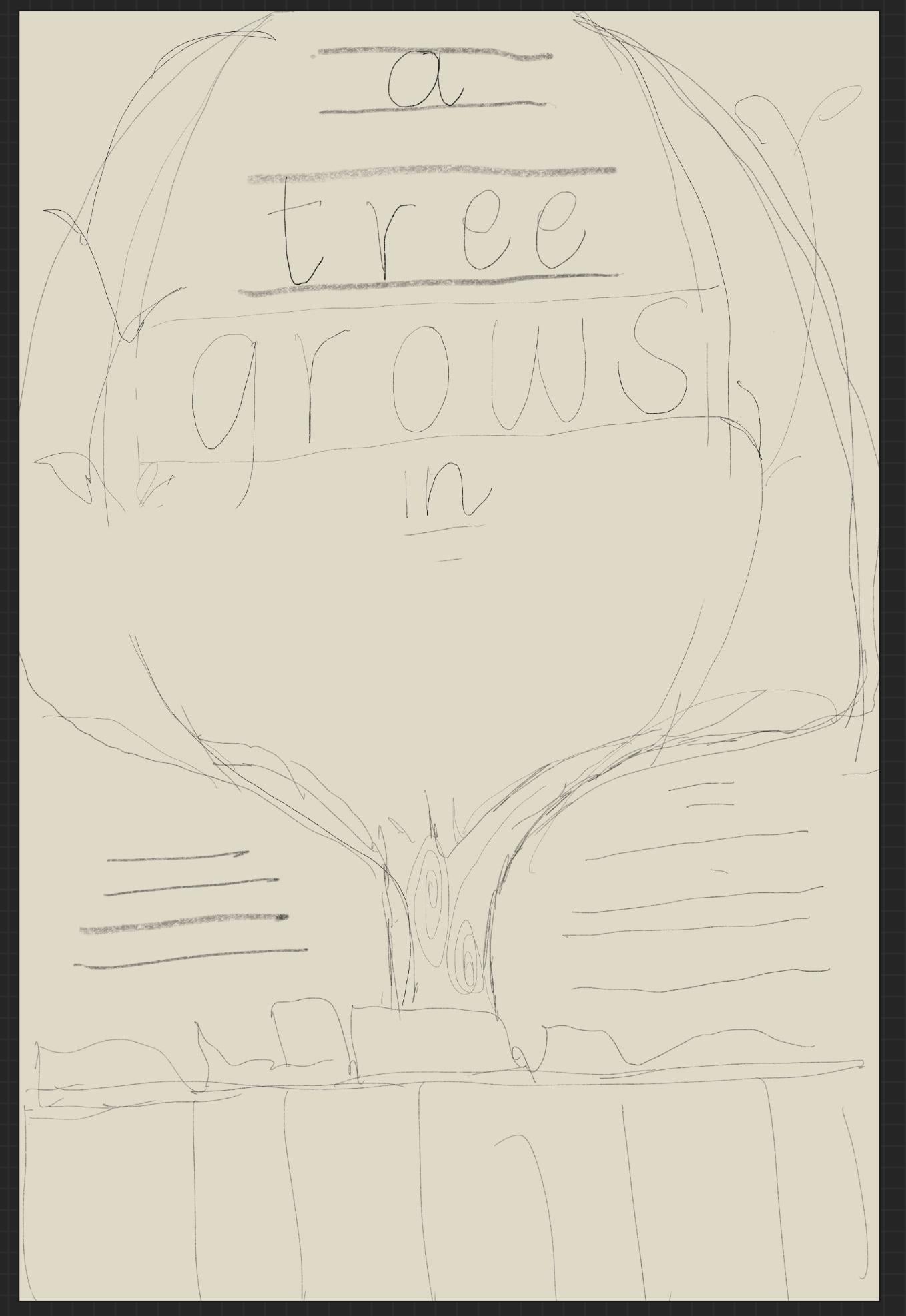
I wanted the Tree to be the central image, so I sketched a few text layouts. I appreciated this brainstorming work as I usually just want to just get down to business; making style choices before planning.
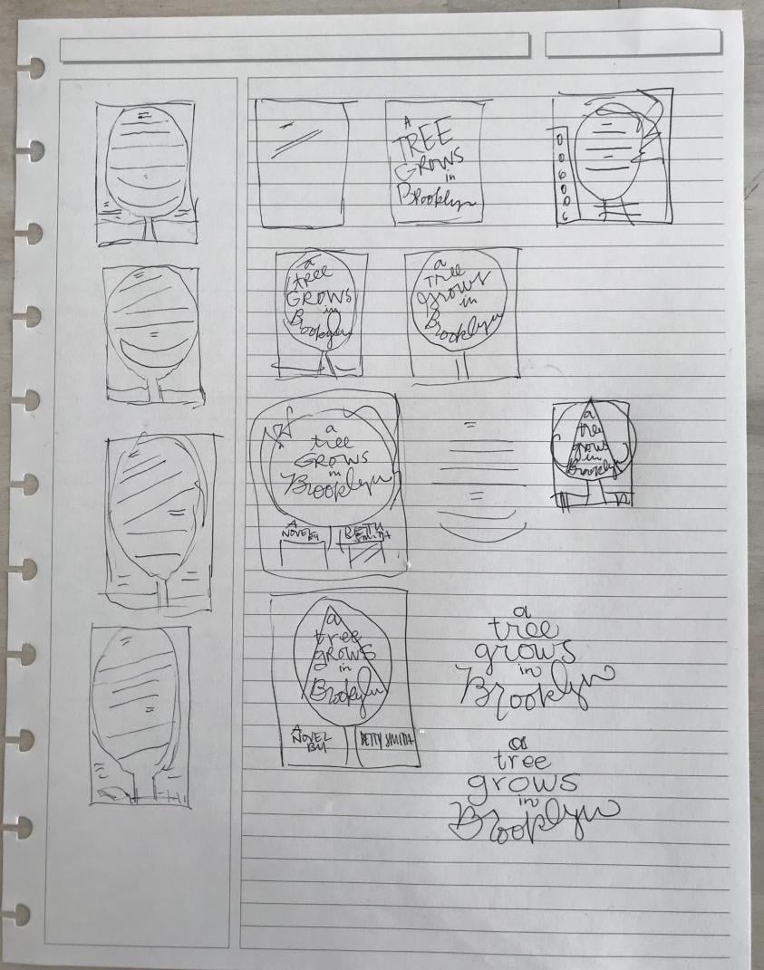
The rough Procreate layout below:
Style choices:
- I wanted to use a lowercase alphabet to symbolize “school”; Francie’s struggles and successes on her road to getting an education.
-I also knew one of the colors would be black to symbolize a chalkboard. The tree in all it’s glory foiled in gold. A testament to survival in a never perfect environment.
the final book cover: