A Cheesy Poster
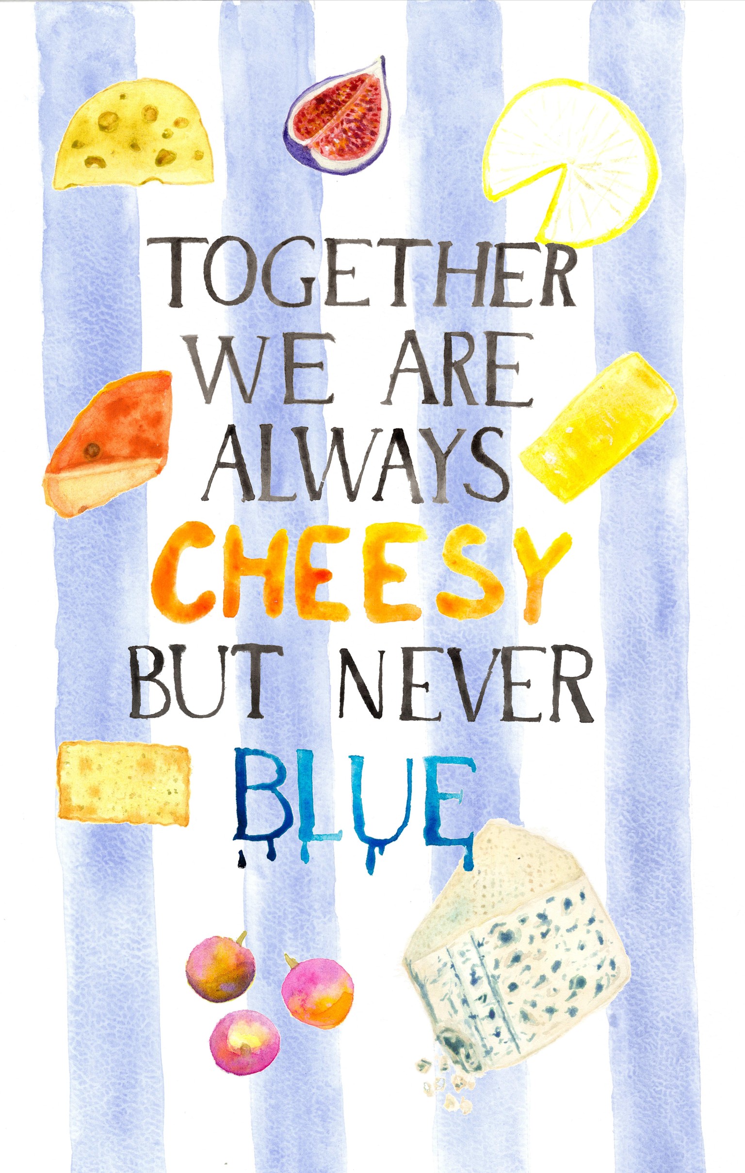
I really enjoyed the whole process - concepts, brainstorming, sketches, painting, scanning and editing. I had like 15 ideas (not all of them were good, of course). In the end I decided to do this quote with kind of French vibe illustration. Blue cheese, blue color, the type, all of that. And the word "cheesy" contrasts the elegance and lightness. At least that was what I was going for, don't know whether it works or not, this is my first project of this kind.
The hardest part was the lettering - I had to watch some classes and even after the second attempt it looks very shaky and uneven. But maybe it compliments the whole concept after all. I did not trace the letters (maybe should have done that) and I know I need more practice. But I am OK with the result. I would like to do at least two more to create a set and to be able to make the process faster, this one took me a lot of time.