Logo Redesign
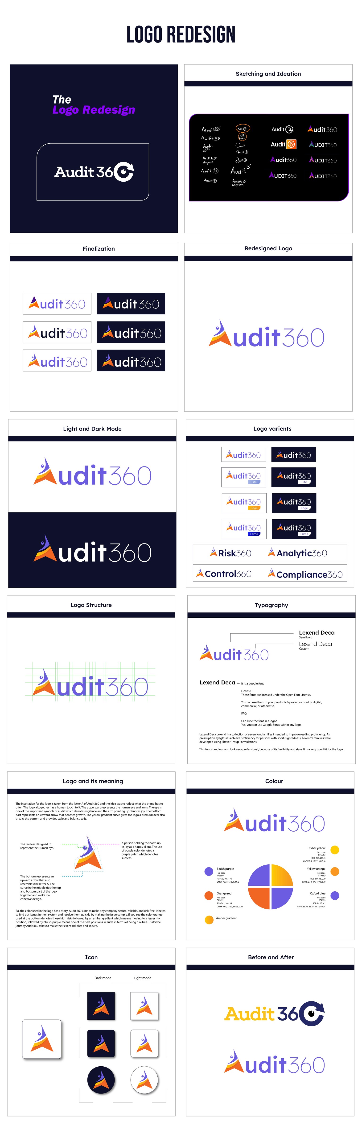
Embark on a captivating visual journey with the redesigned logo for Audit360, an IT company focused on building trust through human relations. Infused with vibrant branding colors, this logo redesign breathes life into the brand, leaving a lasting positive impression. Inspired by the letter "A" in Audit360, the logo showcases a unique blend of symbolism and storytelling.
The logo design cleverly incorporates the human eye, representing vigilance—an essential quality in the audit process. The upper part of the logo features a joyful, upturned arm, signifying the satisfaction of a happy client. A striking upward arrow in the bottom half symbolizes growth and progress. With a premium feel and a carefully crafted color palette, the logo takes viewers on a visual journey from high-risk scenarios (depicted in orange) to progressively safer positions (represented by amber gradients and bluish-purple hues).
Discover how Audit360's commitment to security, reliability, and risk mitigation is expertly conveyed through this engaging redesign.