2Great Clothing Co.
1) Sketching
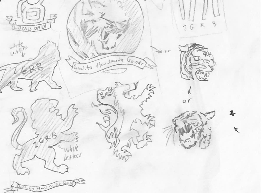
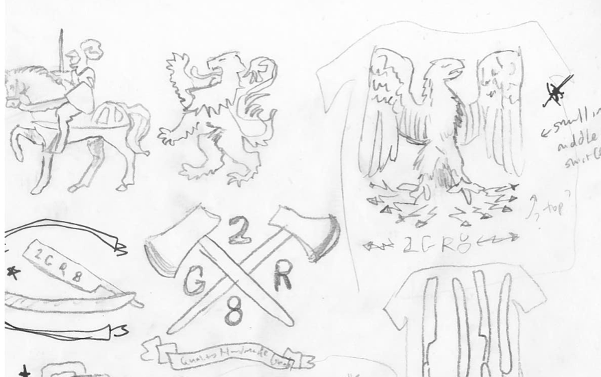
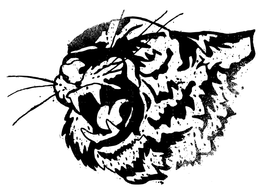
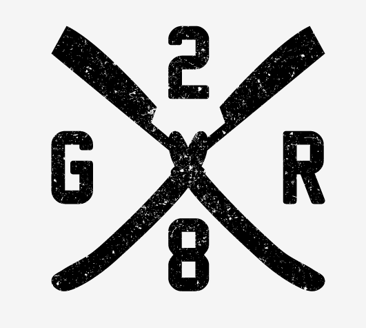
I got the call back in October. A client was looking for someone to help brand his new t shirt company. There were a few initial ideas regarding symbols and typeface. The desired aethsetic was vintage and hand made, and some of the original elements included lions, razorblades and axes. These were explored through sketches and entire t shirt designs.
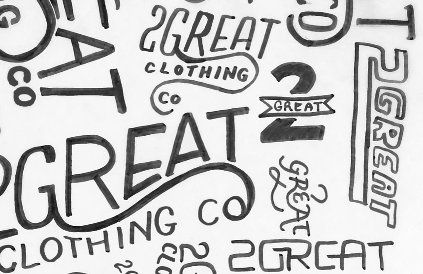
As we further developed the look and style of the company, I began to explore other options for the actual logo. The client wanted it to be a hand drawn font, and some of the original sketches include straight, vectorized designs, as well as scripted, ornate lettering.
We left this style, and explored other options as I continued to create t shirt designs. Some of the ideas included monograms, stamps, and more symbolism. I began to spend more time in Illustrator, and less time on paper, since we weren't getting anywhere with our sketches. There was little direction, and with a launch date of March, it felt like we had enough time to explore. Honestly, it was too much time.
So close, and yet so far. Be began to develop a unanimous direction, and eventually agreed that we should use a comibination of hand drawn elements and existing typefaces.
2) Digitizing
It's hard for me to limit myself to one project at a time. Especially if there's money involved. Even when my plate is full, I'll find ways to make each individual project even more complicated. For the first time ever, that turned into a good thing.
I decided to step away from the logo for a while, and focus on some other ideas that the client was looking for. Hangtags, t shirt designs, webbanners; these outlets allowed me to use more symbolism and expression than the logo we were designing. I even broke out the paintbrush for good measure.
I started playing more with textures, hand drawn type and empty space. I constantly referenced examples from Jon Contino, Dan Cassaro, and BMD Design. I adopted new techniques for adding texture and utilized some great online assets, especially tutorials featured here, on Skillshare, and Method and Craft.
My brain started firing on all cylinders, and the more brainstorming I did the more the client would say, "YES! THAT! That is what I want the logo to look like. Use that style to guide you." So I did. And now, we're getting closer.
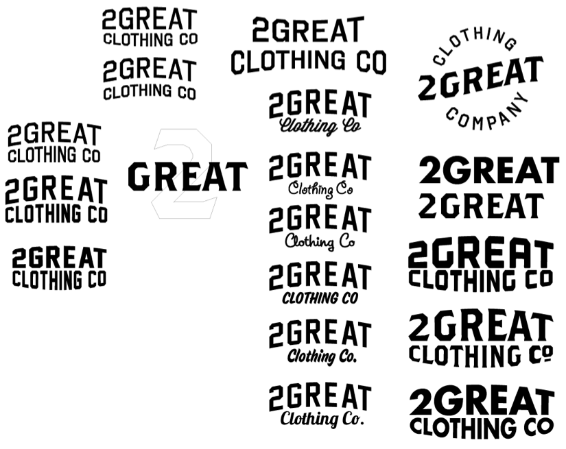
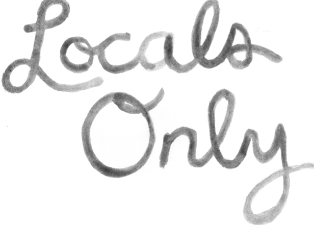
I used the client's direction and some feedback from the class to work in a few different ideas. First, a simple outline of the letters, their location, and texture possibilities.
Next, a hand drawn font, based off of the same outline with a lot of texture.
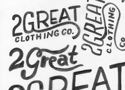
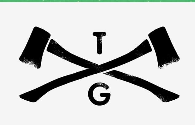
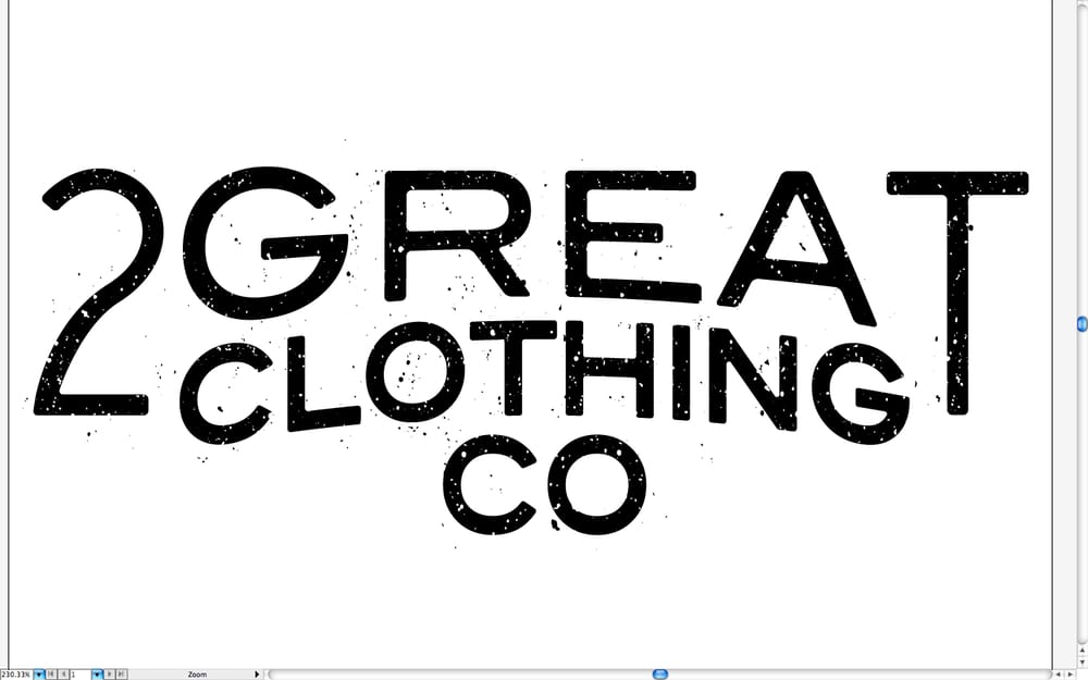
Based off of the comments from my previous sketches, I knew I wanted to use Brother. I liked the idea of the logo standing alone as a sticker or a stamp, so I added a border and some extra accoutrements to make it stand out. It became the frontrunner, combining a couple of my favorite fonts.
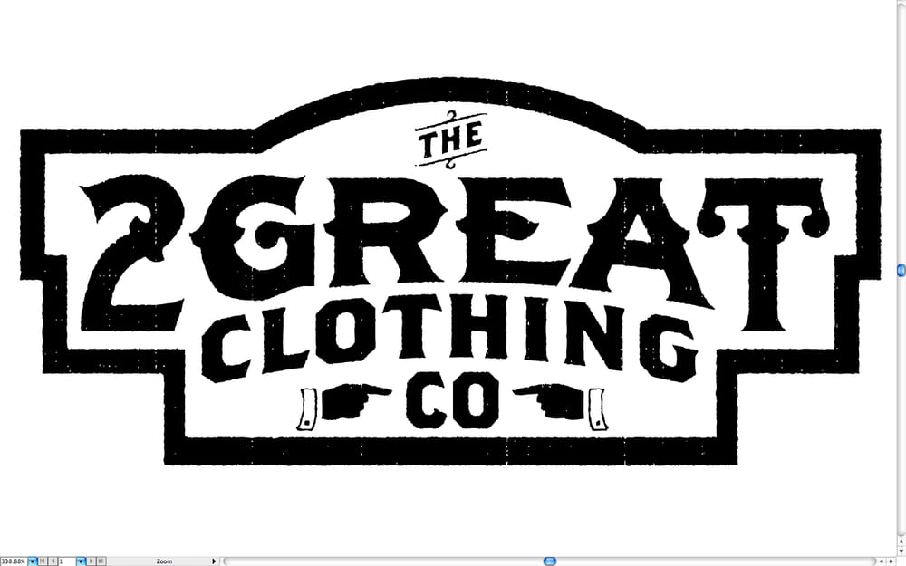
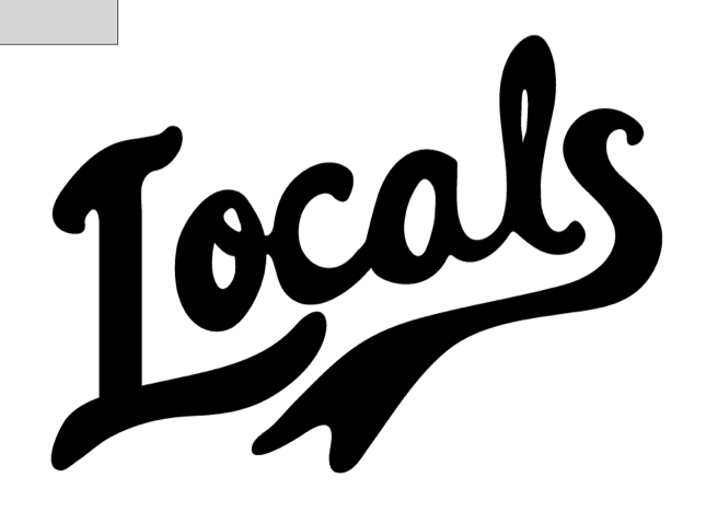
The client wasn't as excited about the use of empty space. We decided to remove the border, "the", and the hands in an effort to keep the logo simple.
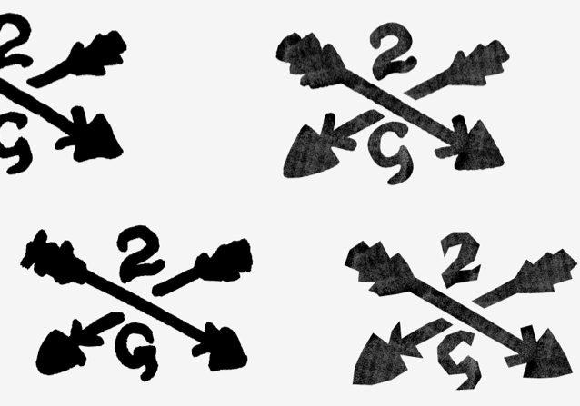
We have a few items to change, but I'm excited about the direction we're headed. Probably the most frustrating part is scrapping so many ideas (the axes, circular logo, etc), however I'm hoping that we can use some of those as variations or even full t shirt designs as we finalize the look of this brand.
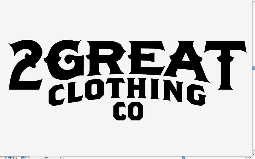
3) Finalizing
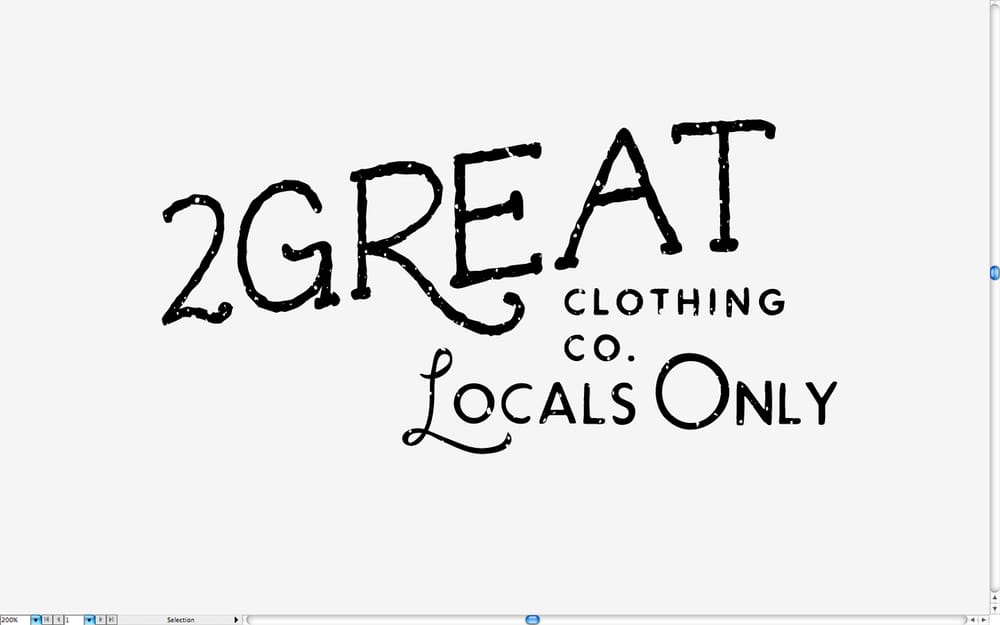
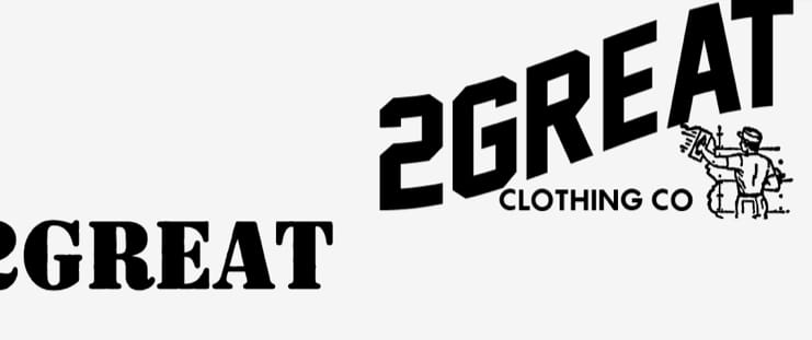
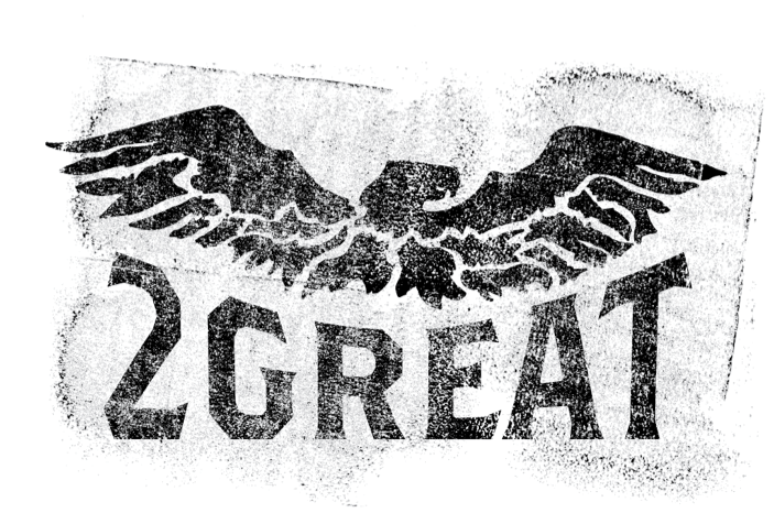
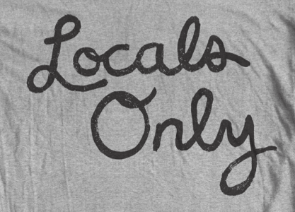
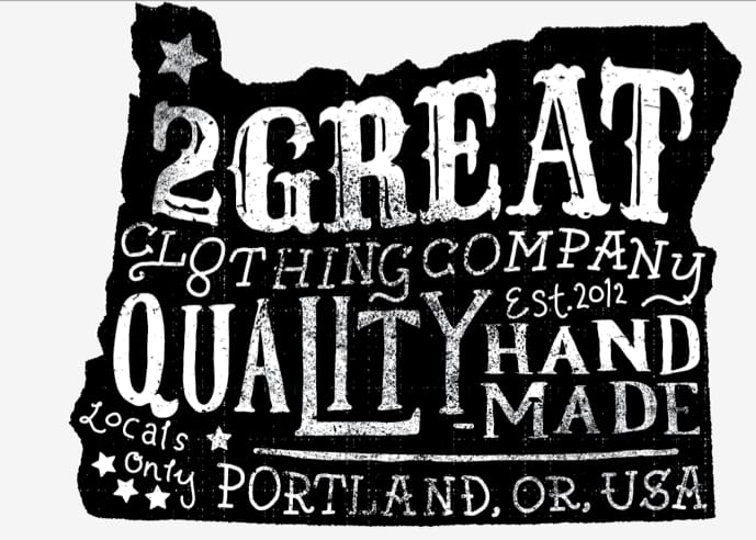
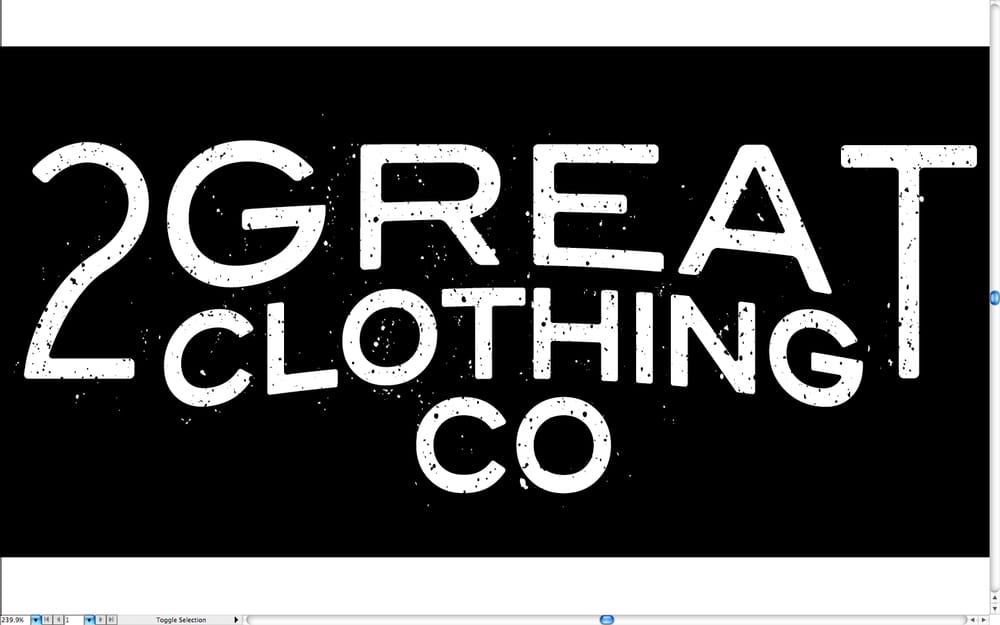
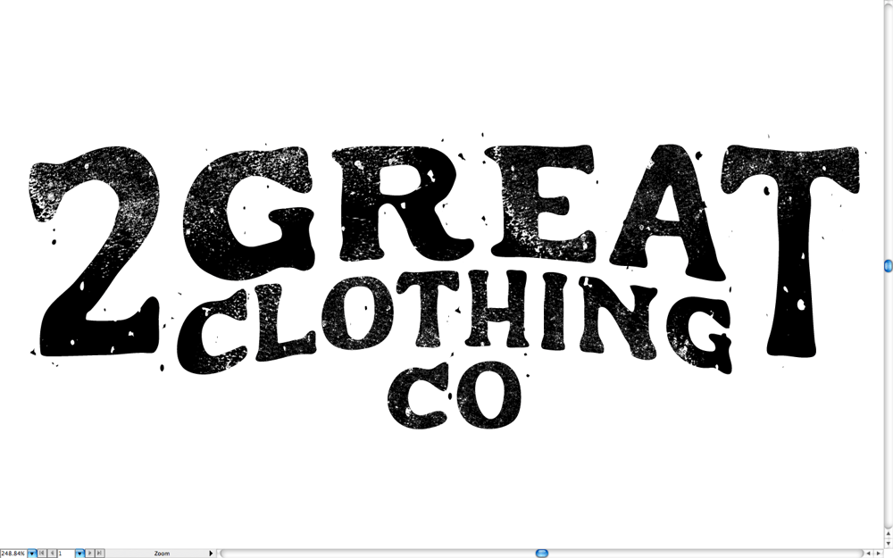
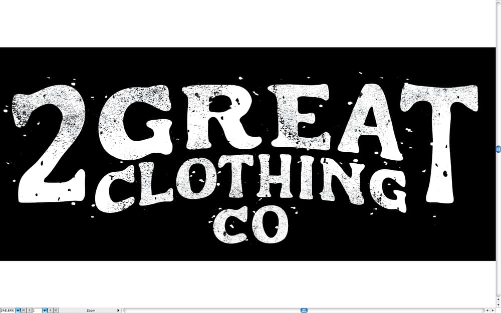
Although it's nowhere near the place we started, we finally finished our logo. Keeping with the layout of the last digital image, I tweaked a few serifs and added some texture. I also ran over the outlines with my pencil tool, to give it more of a hand drawn look.
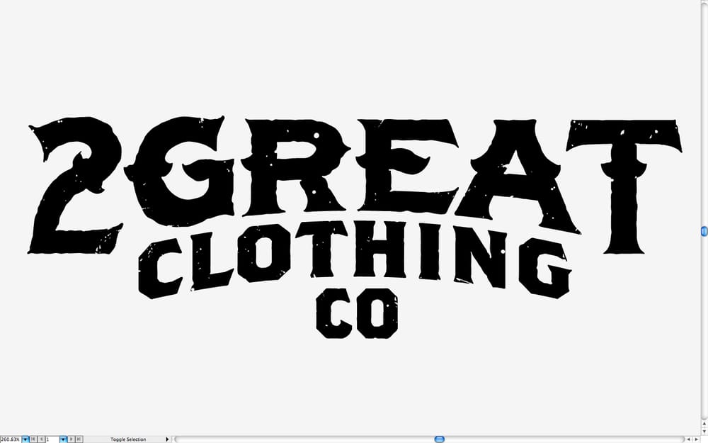
The client asked for more texture, and to fill some of the blank space. So I did.
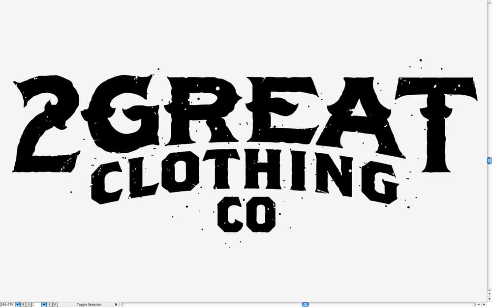
But it was too much. So we balanced it out.
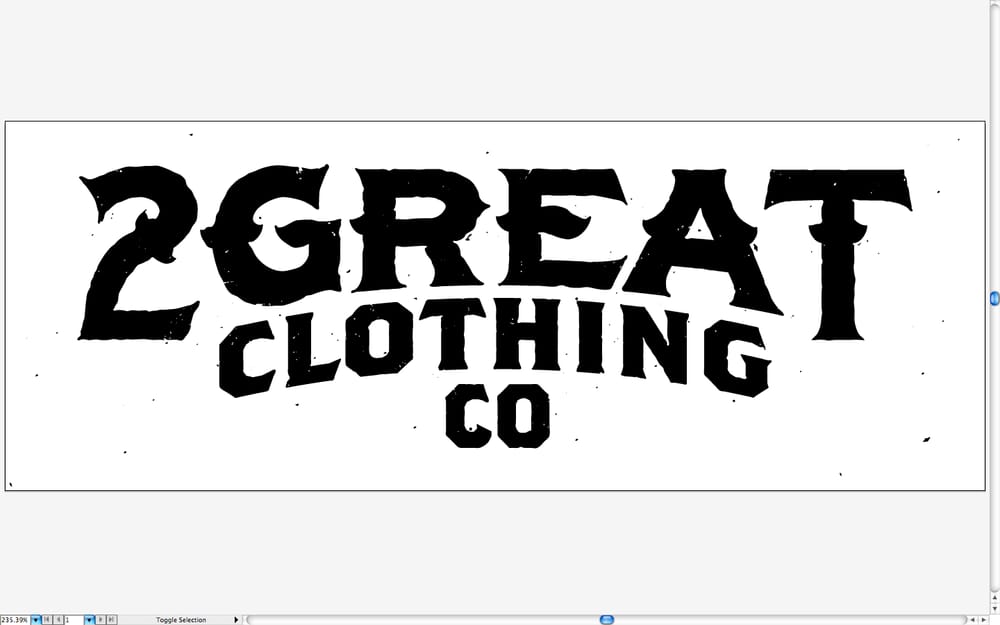
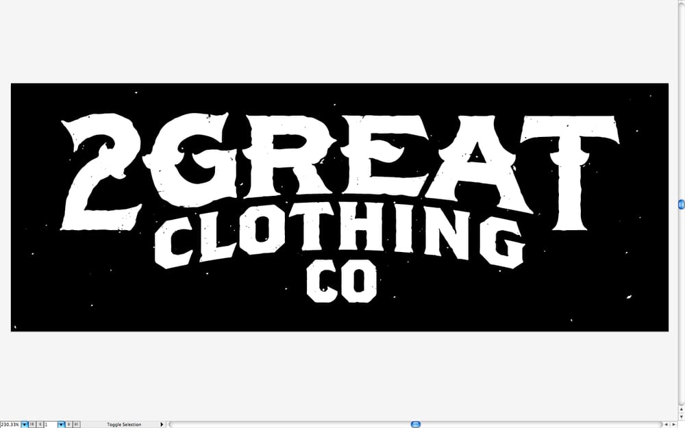
This project was complicated and took up way more of my time than most clients are willing to pay for, but I'm really happy with the result. It felt like every time I came up with something I—or anyone else—really liked, the client wanted something different. At the same time, whenever I would scrap my draft and shoot off in a different direction, I feel like I made something I was even more proud of.
Needless to say, this really stretched me; I feel like I've grown as a designer throughout this class. My work may not demonstrate that to you, but I feel like I've gained more than I've given. My thanks to Evan, my fellow students, and Skillshare. Hope you've enjoyed my process. Let's be friends!