2 Geometric Color Plays
The idea of paper-weaving appealed to me. I learned to love textiles as a child when my mom taught me to sit and do lady-like embroidery. I learned to sew and followed instructions to make my own cardboard loom. I didn't experct to go where I went on this project.
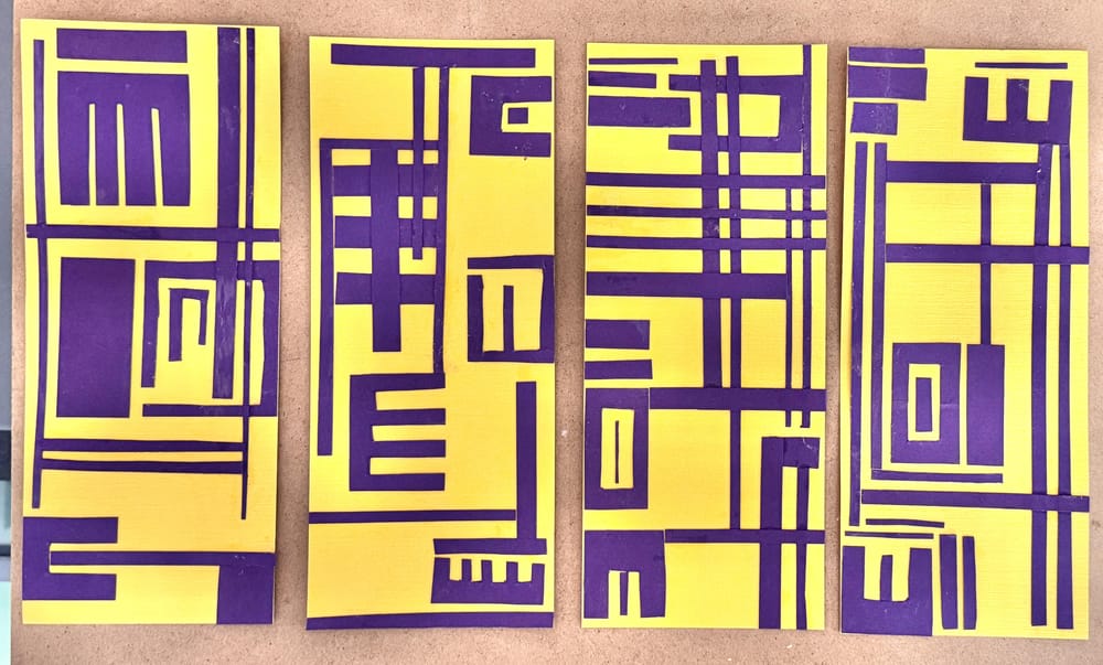
Elisabeth empghasized the complexity of the projects, not the actual weaving, that we were invited to do geometric color-blocking. As I watched the class, my enthusiasm rose. AH-HA -- It was color impact that mattered, not pigment-mixing.
Purple and yellow called to me. The names of the colors are "Crushed Curry" and "Elegant Eggplant." They begged for color play as two favorite complimentary colors I normally don't mix with paint. The geometric shapes and substrate are card stock. Each piece is 3.5" x 8.5". (After getting started, I pondered if the height was too ambitious.)
I am still eager to do an actual paper weaving, Meanwhile, here's my creative surprise that looked so awful in the photo, I had to color-adjust it.
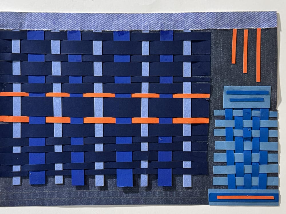
NEXT DAY --> Here's the other weaving added that I said I wanted to do. I chose a monochromatic look: blue denim background with navy blue and light blue to get both light and dark values. I also had a "baby blue" and another blue, both of which looked too green-tinted next to the other blues, but they looked blue enough together or alone, so they got their spot in the corner. Still, I wasn't happy with the bigger weaving. The navy looked too blackish.
SOMETHING was needed. Bingo! With a hint of blue's complementI thought it popped out the bland blues. The bigger weaving looked more blue next to the whispers of orange. Then I tried to balance out the orange a bit. Did this trick with blue's complement work? Or is it my imagination?
Judy W-B