petal creek and 3 recolors
Thought this was a good opportunity to lighten up a pattern I had made in dark blue. I really like dark blue, but think I should strive to have lighter pieces available in my portfolio.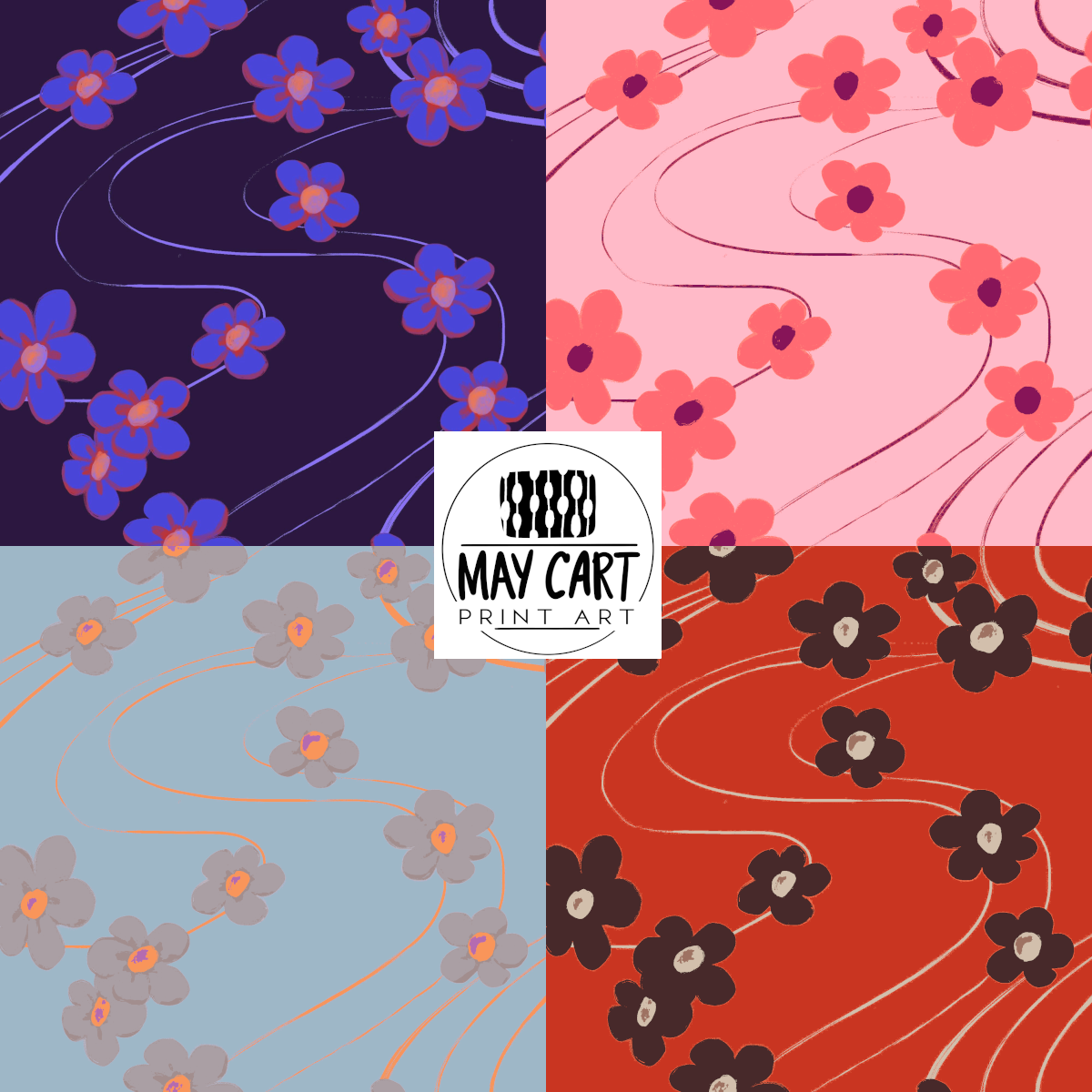 I think the pink is the most successful here, although it lost quite a bit of the handmade feel/texture because I mapped it to a rather limited palette. The light blue and grey palette had 6 or 7 colors in it and turned out the same if I used the tool or worked each layer. As for the red, well, it's red. I do like the bold contrast in it, but it changes the mood of the piece drastically.
Thanks for a fun class and exercise, Faye.