light studies
I darkened parts and lifted parts. I'm getting the techniques. I've learned that I like the results better where I leave white paper showing instead of lifting so in future I will try to simplify in this way. I'm pleased that I was able to lift so much of the very dark part in center foreground where the 2 white trunks are. For now, I'm setting this one aside and starting a new extreme painting. Below this is a simplified practice.
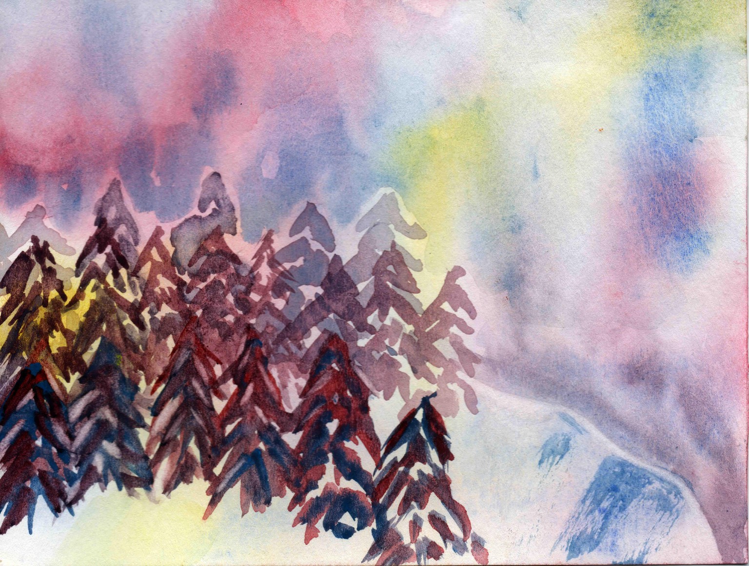
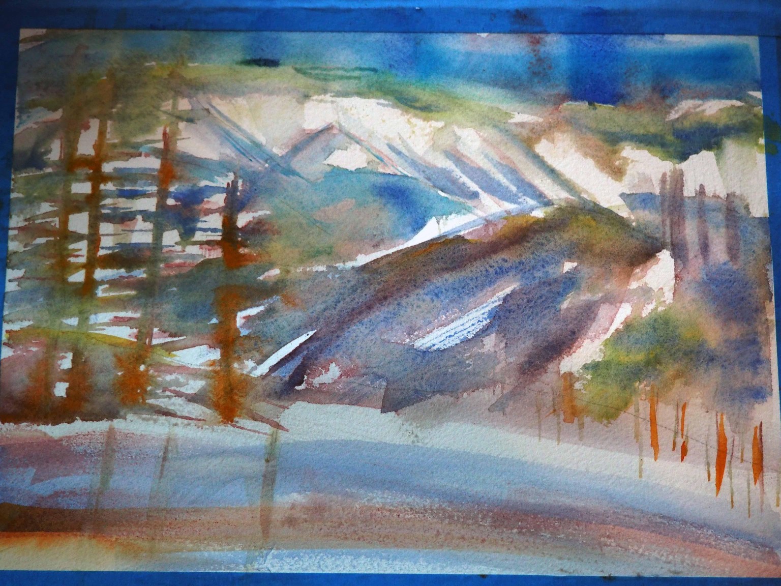
In the painting below I used a quarter of a sheet of Canson 140 so try out the techniques for snow and mountain dominance or height. I found a small precise brush for lifting paint to show snow on the edge of the mountain and some trees on the left. I tried a dry brush for the blue thrusts on the ridge. I started out soaking the paper and then adding paint and letting it mix on page, like you recommended, Ron. After it was dry I added trees in background with more water than pigment, let it dry and kept putting in trees moving forward with less water in each set so the foreground is darkest. I added sky color by wetting the sky and then dropping in color along the skyline and then tilting the paper so paint flowed toward the top. I like the violet effect on the right above the snow. I really like the surreal colors in both these paintings. I think I am beginning to see my "style" showing up.
Jan. 5, 2017 - That was so exhilarating! I've found my extreme art! At first I thought it was too warm for my paint to slush up and freeze at 18 degrees F with 56% humidity on a sunny day. But no! My brushes froze, too. What a blast!
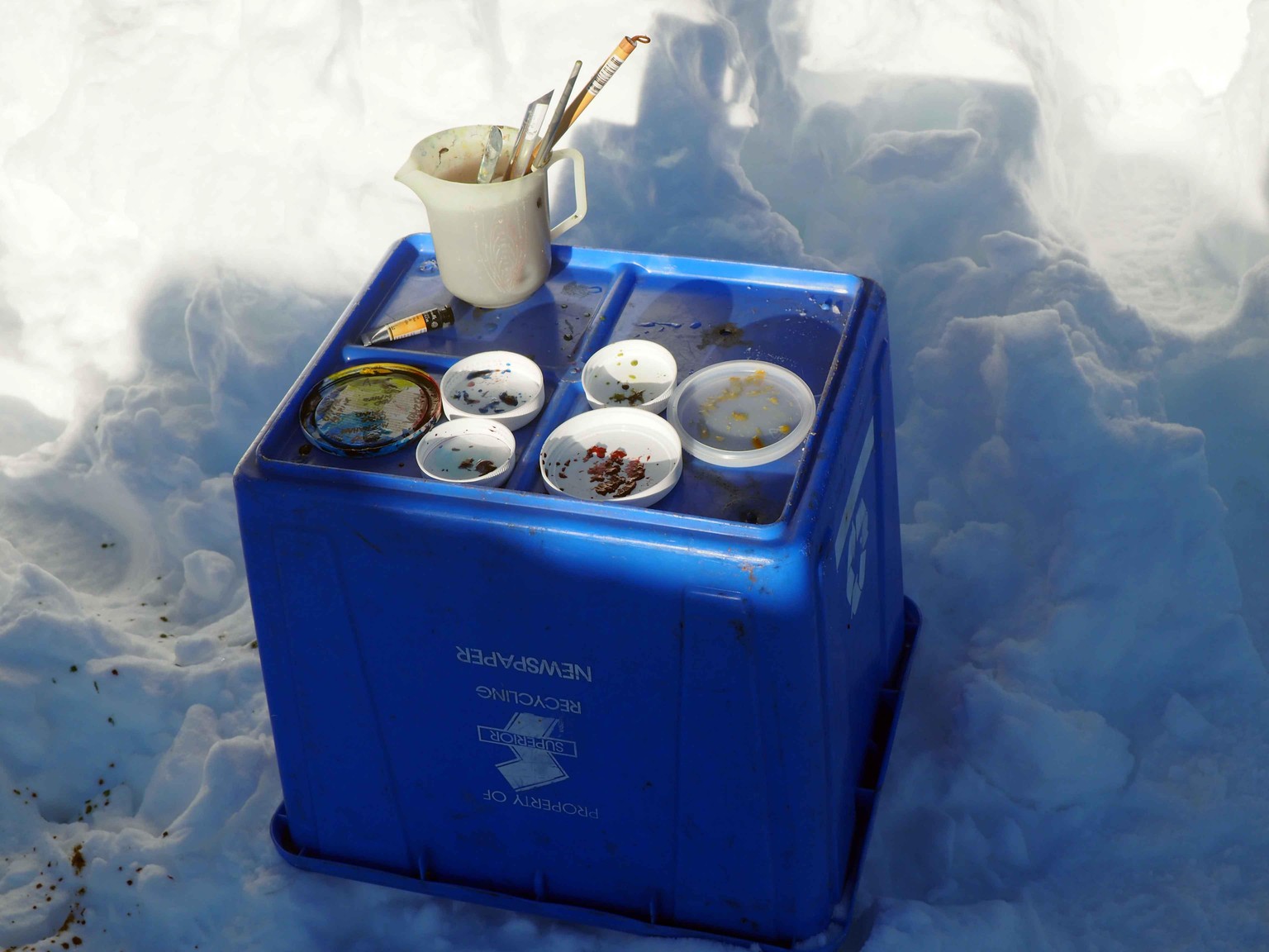
Look at that frozen heap of Alizarin crimson!
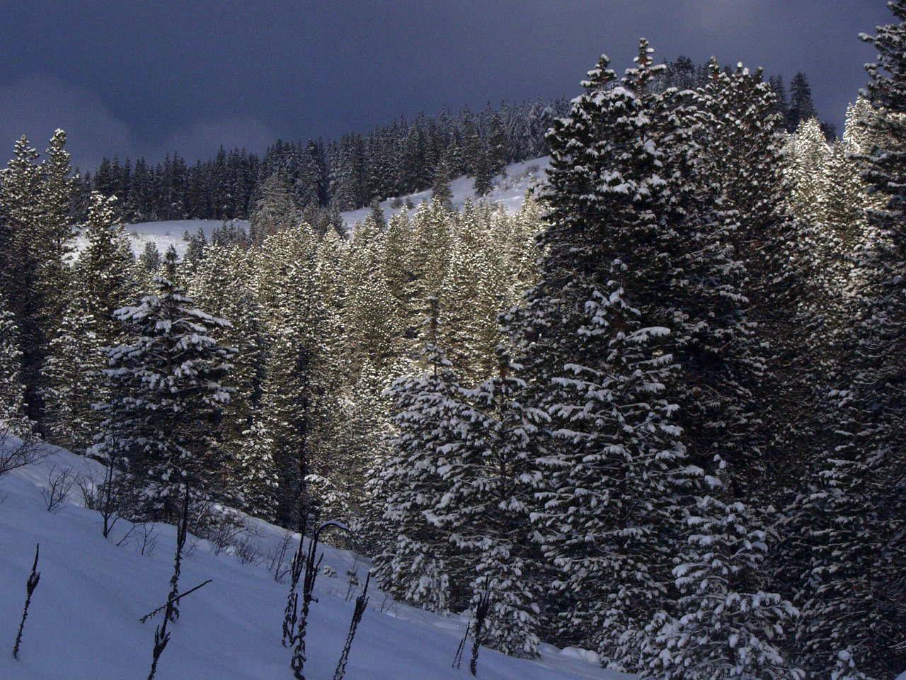
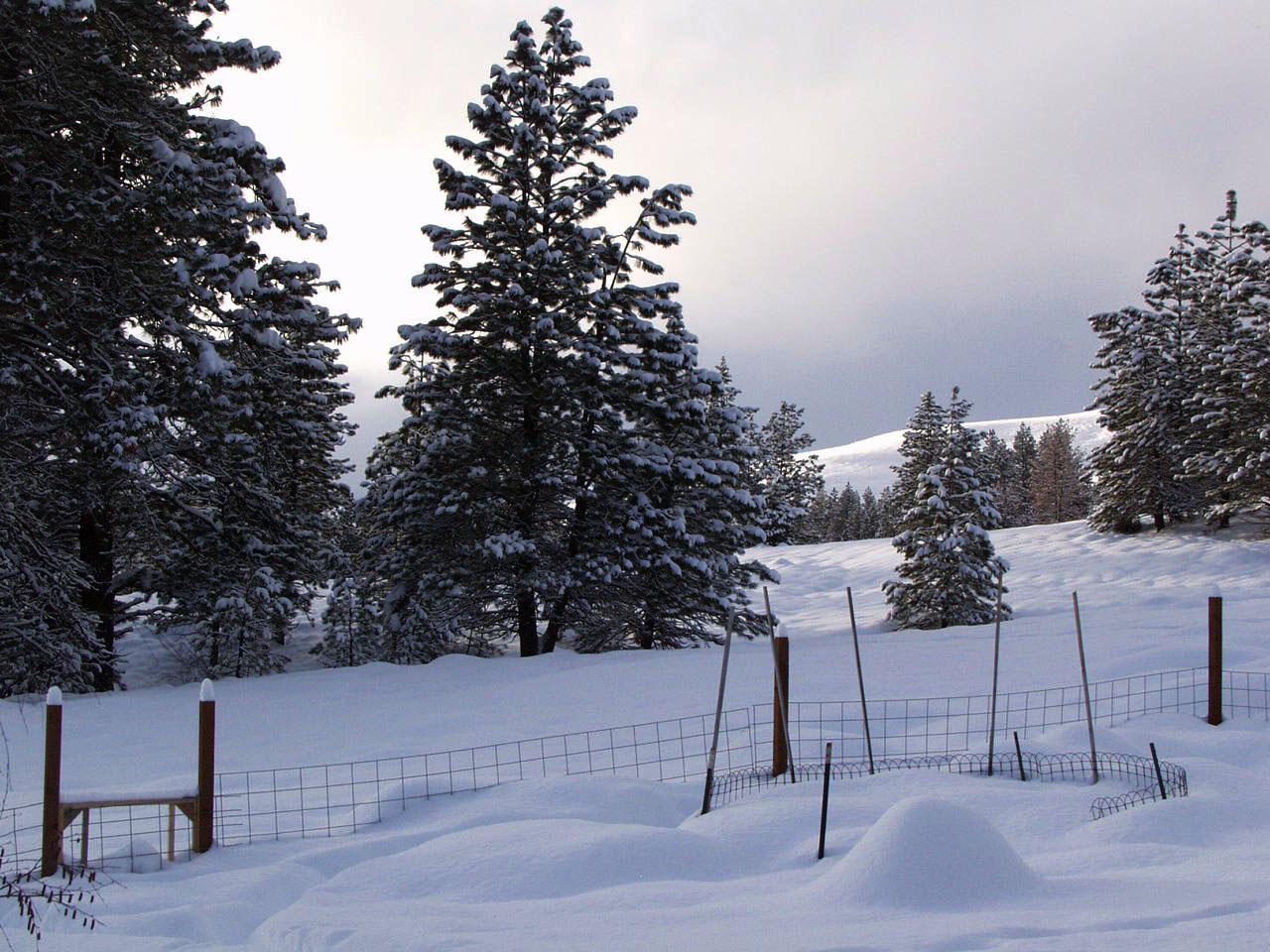
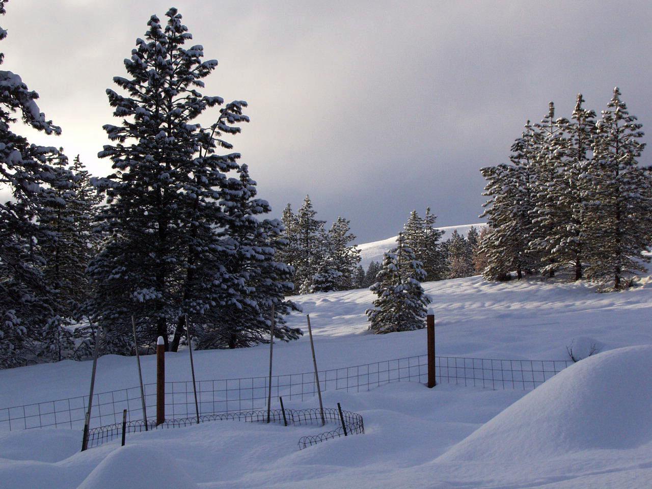
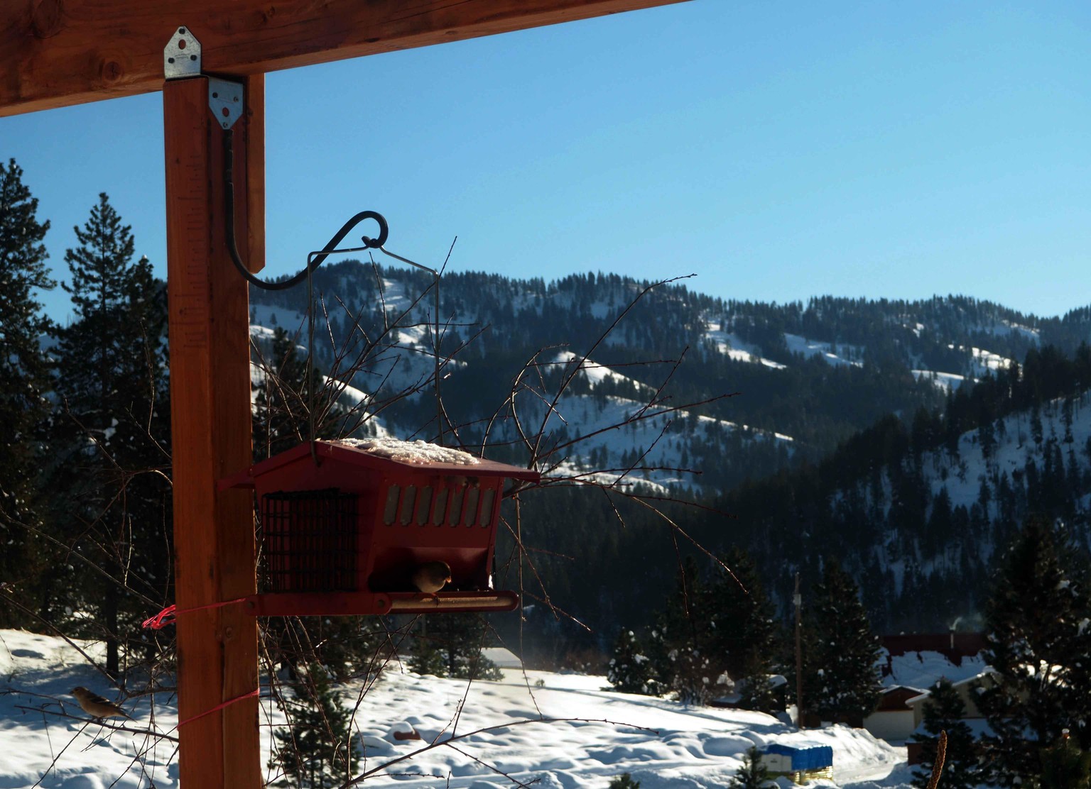
Below is my reference mountain. Kind of washed out at 3 PM Mountain Time light. There is a line of grayish trees along the river that are hard to see in this. They are below the power lines and above the white field. I'd like to put in the river or its trees to indicate it. Omit the house and structures.
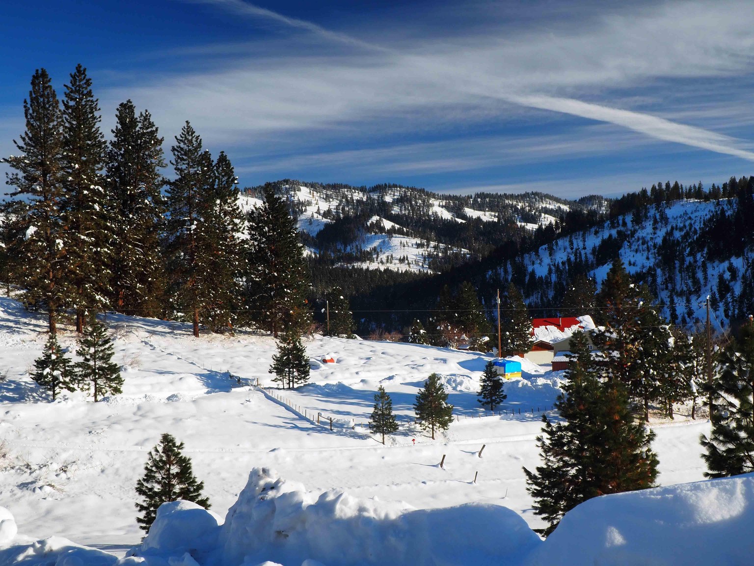
Contours show a tad better below. It's a laid back mountain, but steep just the same.
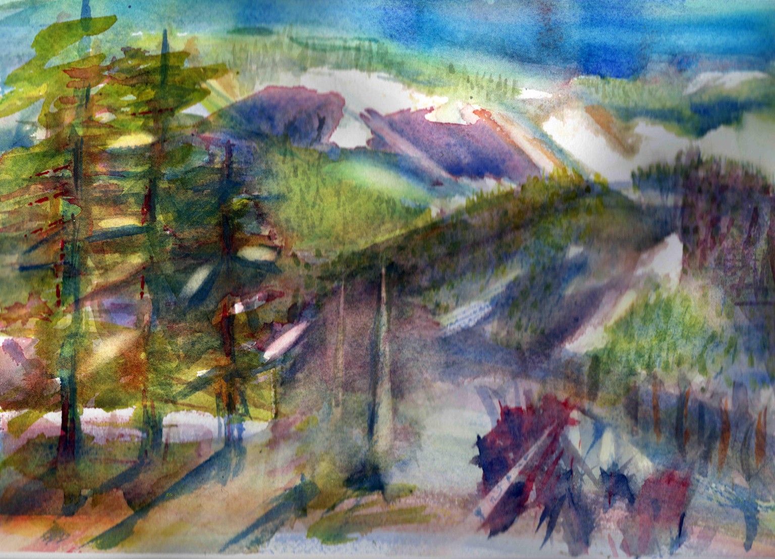
I was too timid to put on too much color outdoors, afraid I'd lose the white, and I didn't take out my phone or tablet to paint along with your video. I didn't get the bold hues I wanted while outside today . Here's where I finished outdoors and the picture is frozen. The hand that was holding the board while painting got really cold, too. The picture is standing vertical. You can see some pencil lines bottom right for the river and some trees.
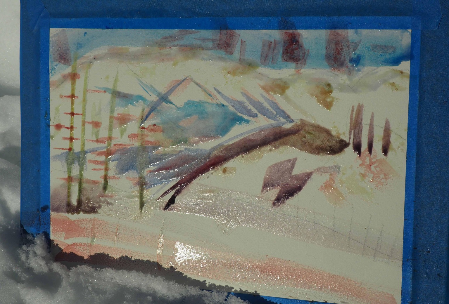
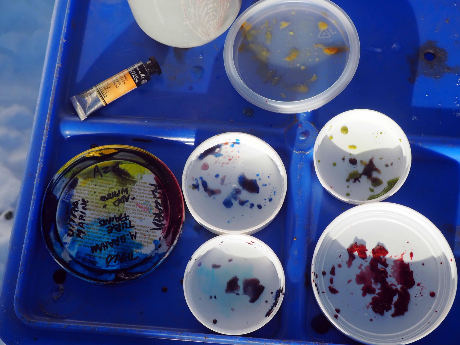
Look at that frozen paint! Indoors it's starting to melt but not mixing like I thought it would and I like a surprise. The sky is mixing nicely but I thought it would give me violet. Top of the mountain greens softened nicely.
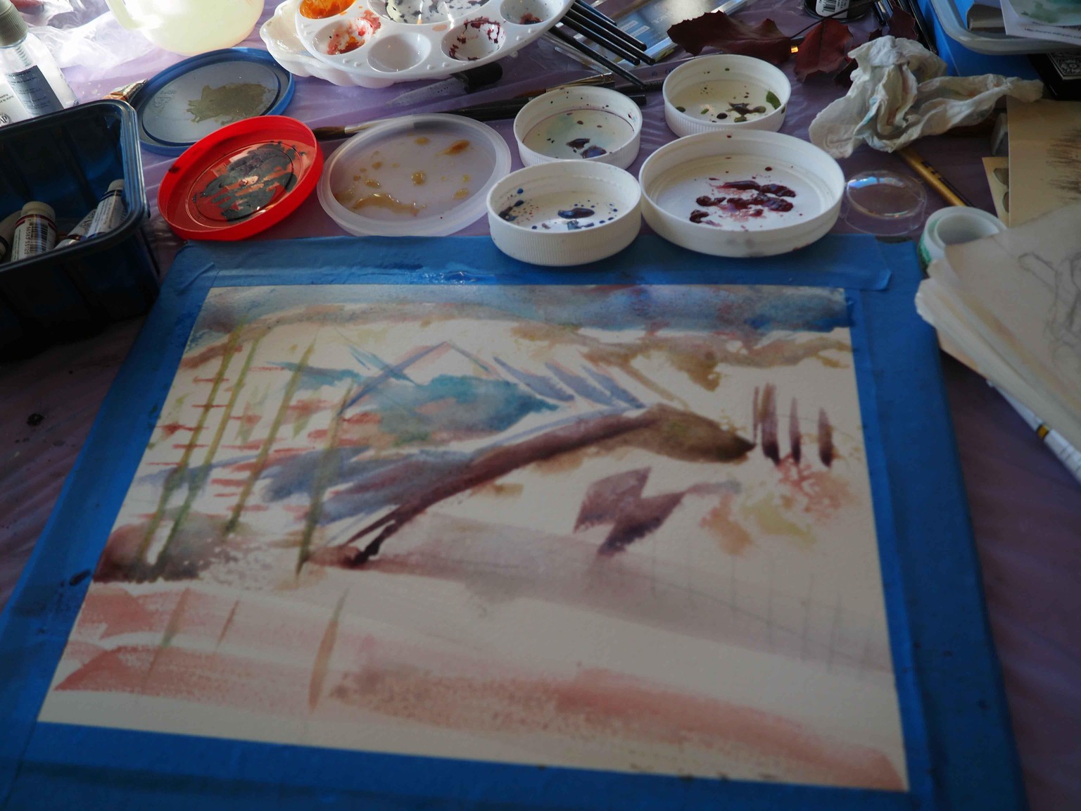
I didn't photograph the quick touch up I did as the paint was thawing.
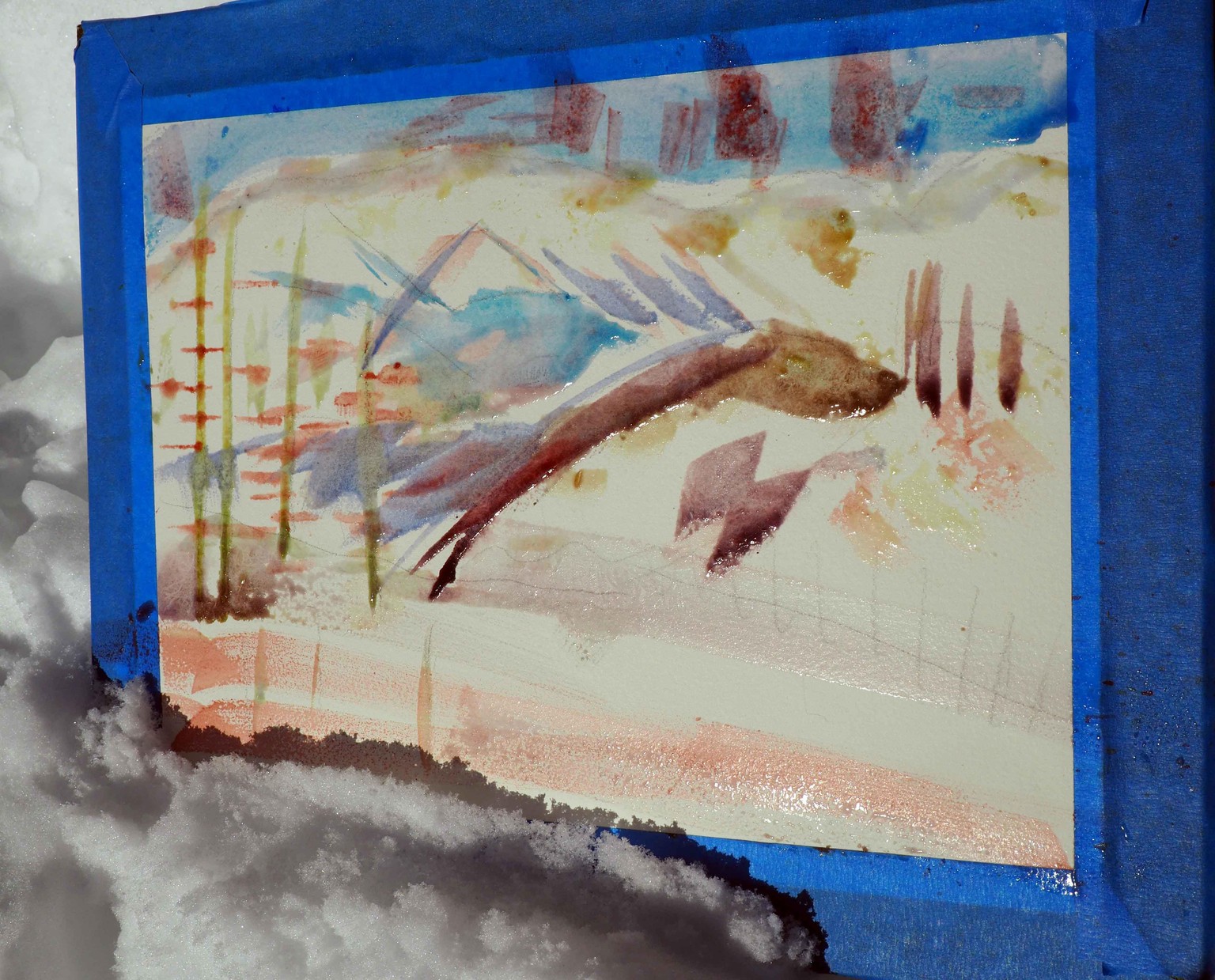
Below is how I left it to dry. I'm feeling like it looks pretty messy and next needs whites enhanced and foreground textures & hues and I could darken shadows and trees on the mountains to make the contours stand out. I feel like I have a long way to go on this one but, hey, I started! I committed to staying home this week until Sat. when I teach a ski lesson so I'm working with the mountains I see every day. Georgia O'Keefe painted the same thing 100 times. I don't think it would hurt for me to follow her example.
The dry painting is much lighter than this image. I posted it on FB and already people are liking the bold colors, thanks to your bold instruction, Ron. :) I think I could really widen the Ponderosa Pine tree trunks on the left and make it 3 trees instead of 4. I watched your studio videos again and I'll work through them tomorrow a little at a time. In the studio I should have watched your plein air video before I went to the studio video. Today I'll look at that one again to get the foundation before I go further. I'm super stoked for this class!!
.
Below are some photos I can use for reference. I made 2 other sketches outdoors before I started the painting. I need to practice drawing landscapes.