Wine Venture Ads Study
Hi Linsay,
Firstly thank you for creating such great classes. I love it.
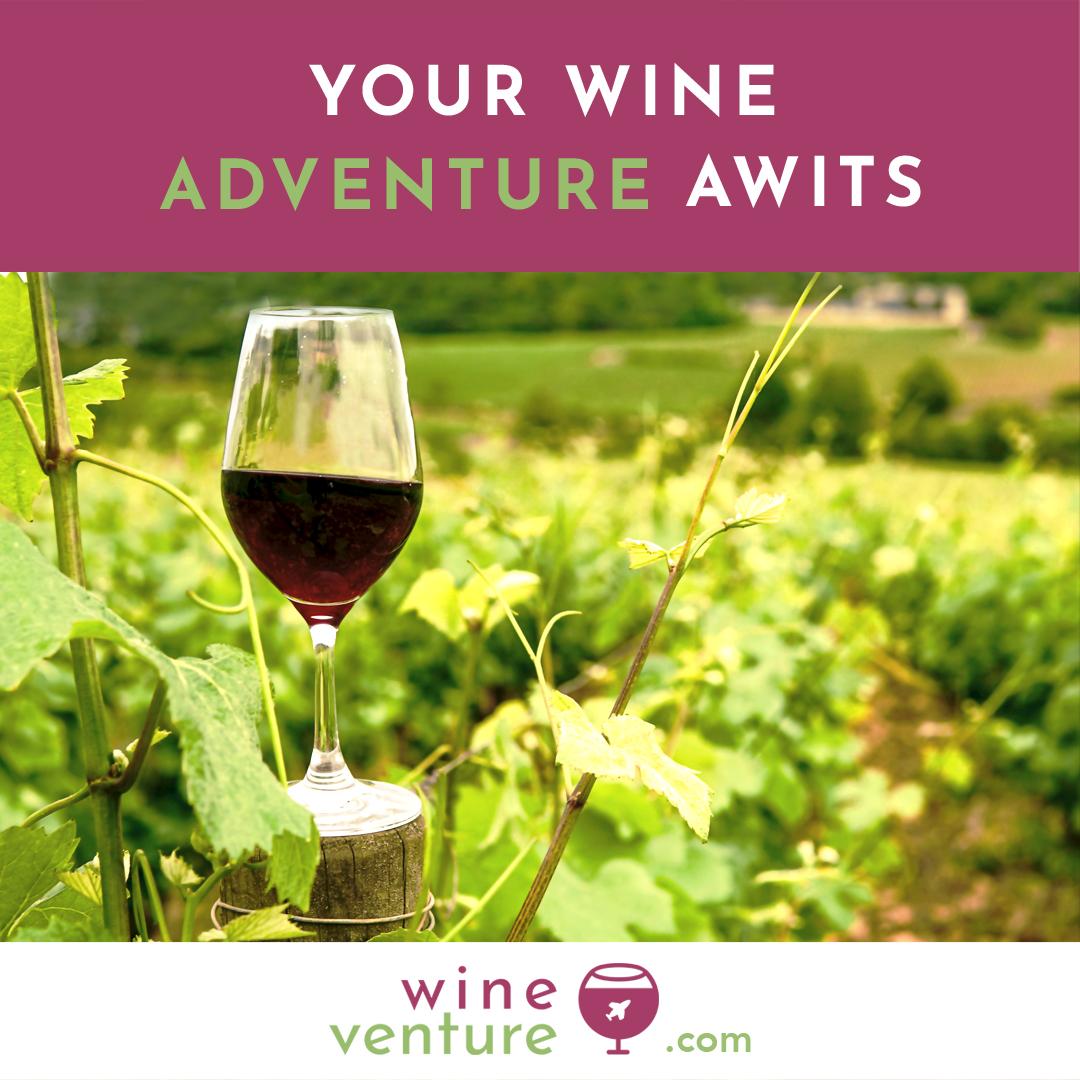
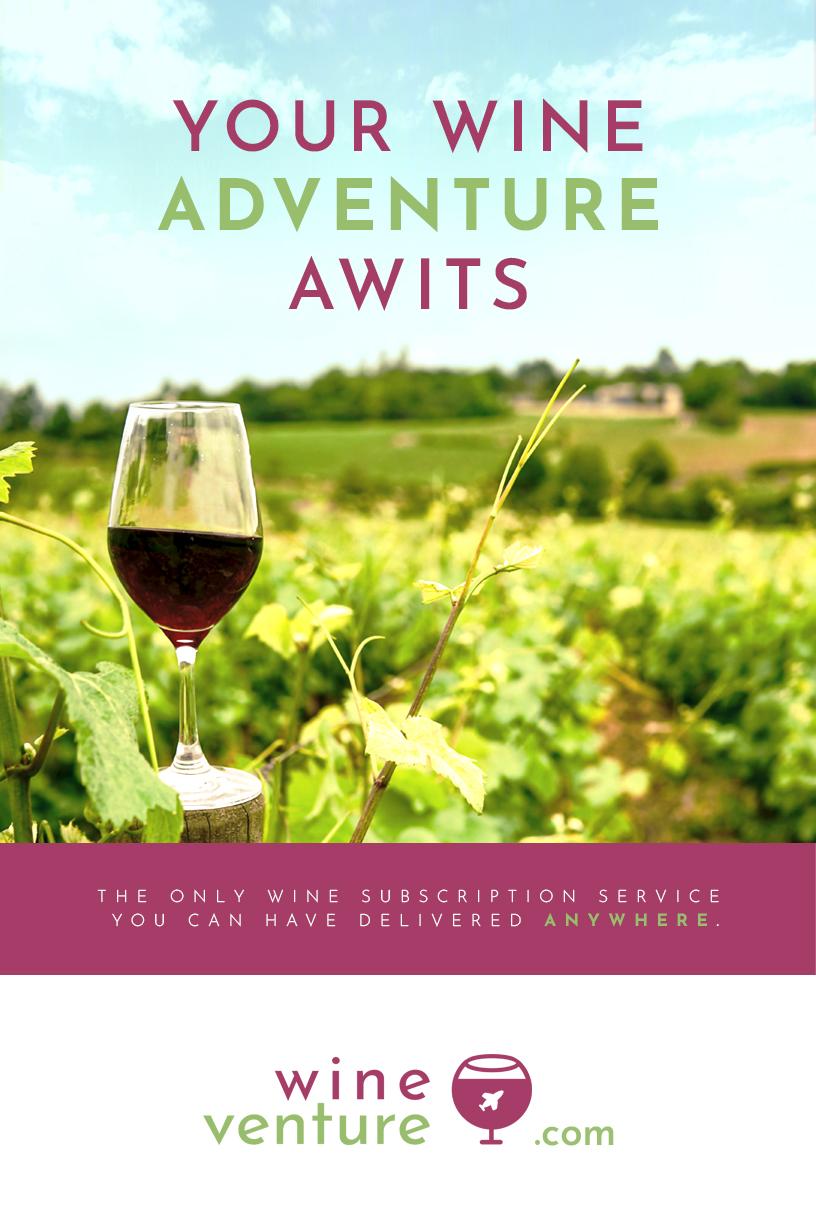
Colour scheme:
I selected the main colour scheme as maroon and olive green, representing grapes.
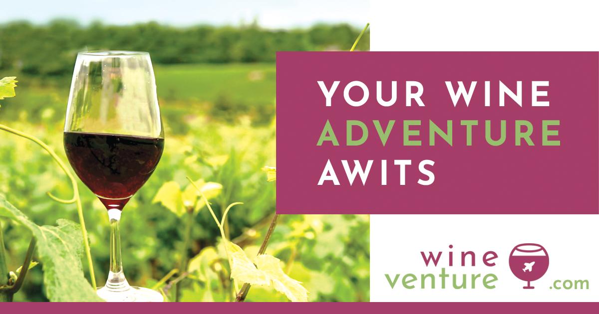
Photo:
The main photo matches those colour scheme as well. I picked a picture that has a focal point. Before I find this photo, I selected a photo with three objects and a lot lighter colours with not much contrast. It made me feel a bit overwhelmed as my eyes didn't find where to focus. Luckily I found a better photo which is this one.
Composition:
I've created similar styles. I liked the idea of having the headline on the sky background, which evoke the feeling of openness and excitement. I could've pushed down the photo a little on the Instagram size as not much breathing area on the top. However, I had set a time to do this practice. So I did not have time to fix it, unfortunately.
Typeface:
The typeface used here is Josephin Sans which has a good selection of family. I liked the shape of small "e". Looks like a rolling barrel.
Logo:
I created this logo very quickly. But the theme was to combine travelling (plane) + wine. So by using a circle to create a shape of a wine glass (rather than creating an actual wine glass shape) creates a similar image to the image of a plane flying around the earth (globe).
Note:
I usually use Illustrator to create ads. But I've used photoshop this time, and it was a good practice.
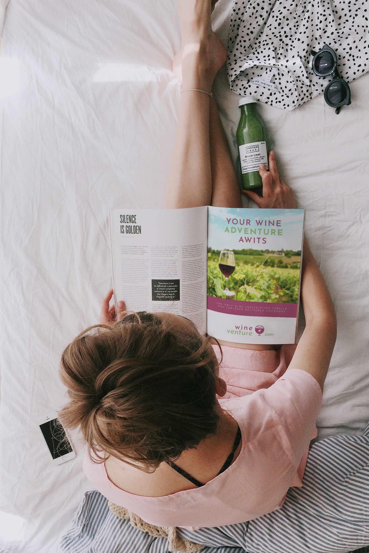
Mock-up (Magazine)
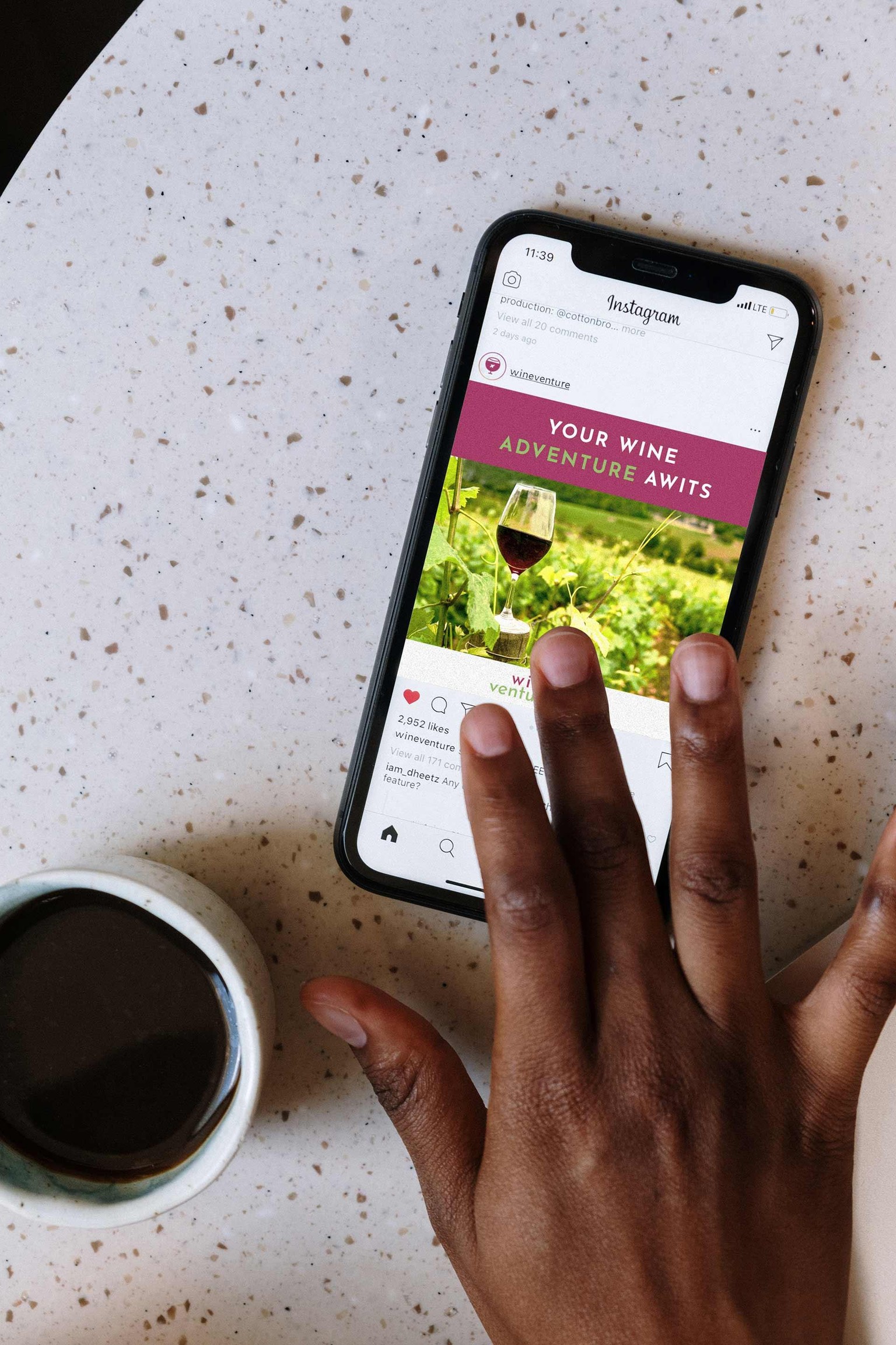
Mock-up (Instagram)
11x17 inch
FaceBook size
Instagram size