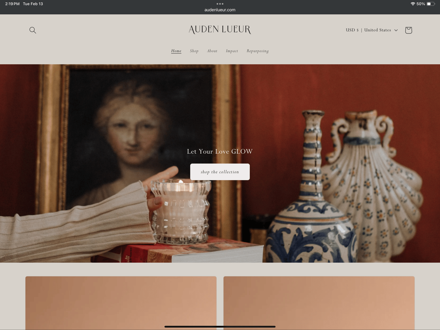
Website Inspiration Screenshot
For my website inspiration I chose Auden Lueur, which is a luxury candle company.
Structure
I like that the main menu is centered under the brand name, and therefore easy to find a navigate. There are links further down in the page that also allow for easy navigation if you chose to scroll. I like a few of the highlighted products show on the main page, but that if you click on shop, you get a separate page loaded to see their full stock.
Color Scheme
The soft colors of this website make it really easy on the eyes, and produce a sense of calm. I compared this to some other brands, and found that a stark white background was too harsh by comparison to this color scheme. I also appreciate that when pure white is use, it is done so sparingly to highlight important information. I realize this could potentially make product photos a little more challenging.
Layout
I feel like the images are just a little overpowering. I like the statement image, and the larger product images, but I do feel like they overbalance the text. Especially a little further down the page, and on the about page, the images seem to be the focal point to the text’s detriment. I would prefer something a little more balanced. Not necessarily text heavy, but with the scale of the elements being a little more complimentary to each other.