US Temperature & Birthdays (in progress)
1. US Temperature
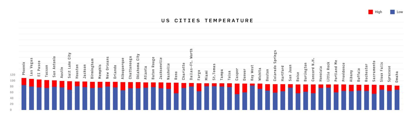
At first I simply visualised existing data with bar chart to represent the high and low temperatures of the cities, but it doesn't actually show any insights. Then I tried to sort the data by putting the highest temperature on top. I tried doing it in processing but I didn't find a way to create a new array with the index of the old(existing) array, so I did it in excel. (Anyone knows how to solve this problem?) The result:
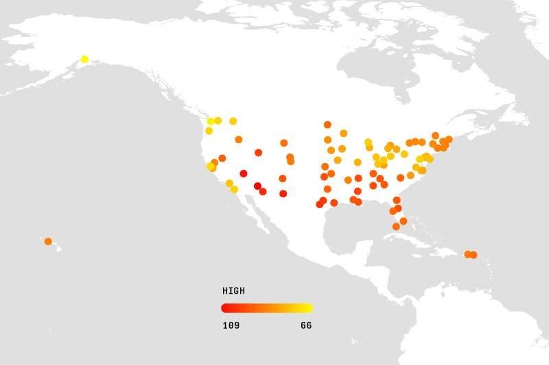
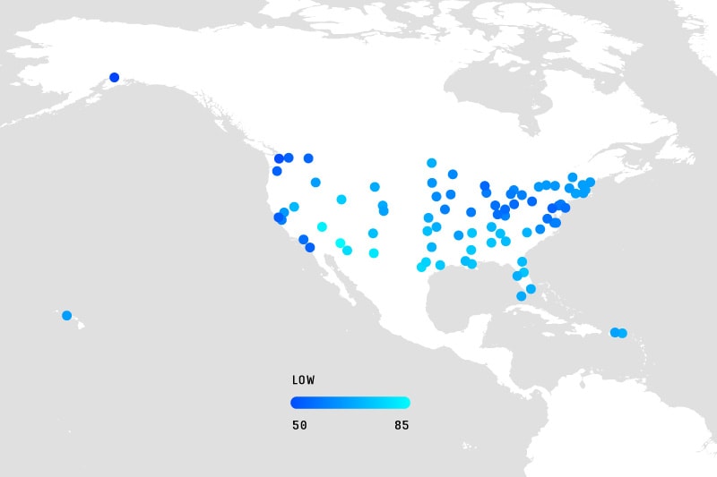
Next, I extended the data by looking up all the longitude and latitude of the cities, mapping it onto the world map that has been also used in Nicholas Felton's previous class "Designing Data Visualisations". The variation of the colours shows various degrees of temperature. In this way some patterns start to evolve as follows:
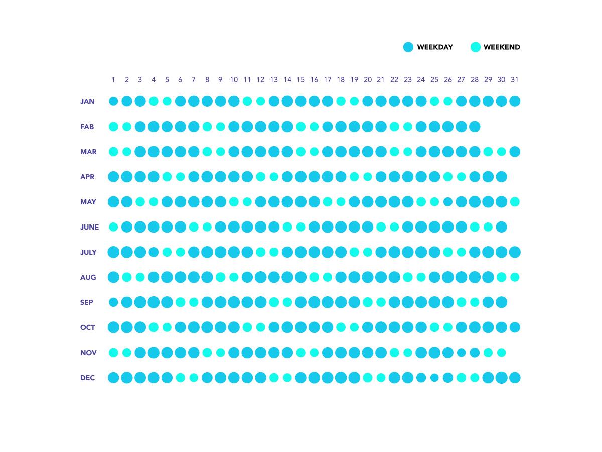
2. Birthday Trends -- Using circles to represent the number of people born each day.