There is No Substitute for Hard Work
UPDATE: July 10, 2014
I've had a couple requests for prints so I've uploaded this to my Society6 page. You can purchase prints here:
http://society6.com/JonathanBall
Thanks everyone for all the kind words!
PROCESS:
"There is no substitute for hard work."
The internet attributes this quote to Thomas Edison, but after a little digging (very little), I can't find anything to verify its source. Regardless, it's a wonderful phrase and one that I wholeheartedly agree with. There's no such thing as talent, just people that work harder than others.
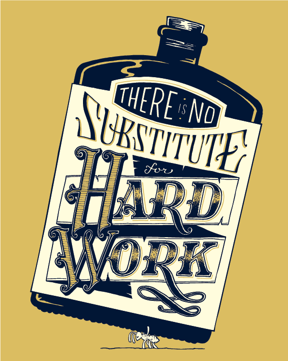
I spent a lot of time banging my head against the desk, brainstorming (working hard), to come up with a concept for my poster. I eventually came up with the concept of "Hard work in a bottle." The idea being that one can avoid hard work with a just a sip of a special drink, the type you might find in a traveling snake oil salesman's wagon during the 1800s.
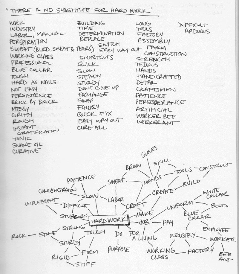
So, my plan is to render the phrase as curative tonic bottle, with the phrase being the label.
To reinforce the concept, I thought the type could be drawn in a victorian style, true to the timeframe- the industrial era- an time period synonomous with hard work.
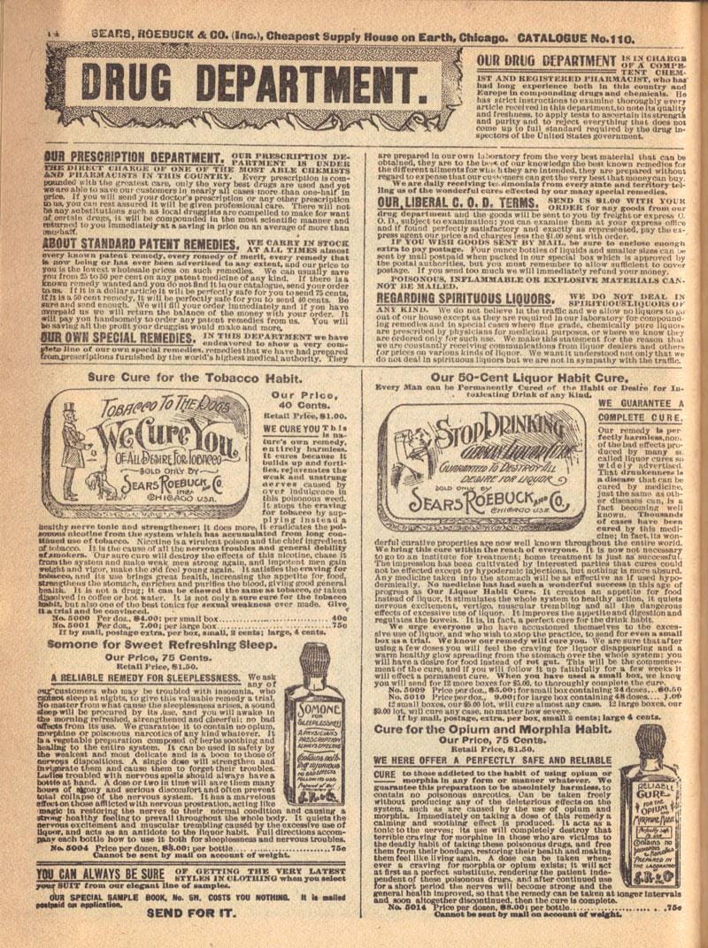
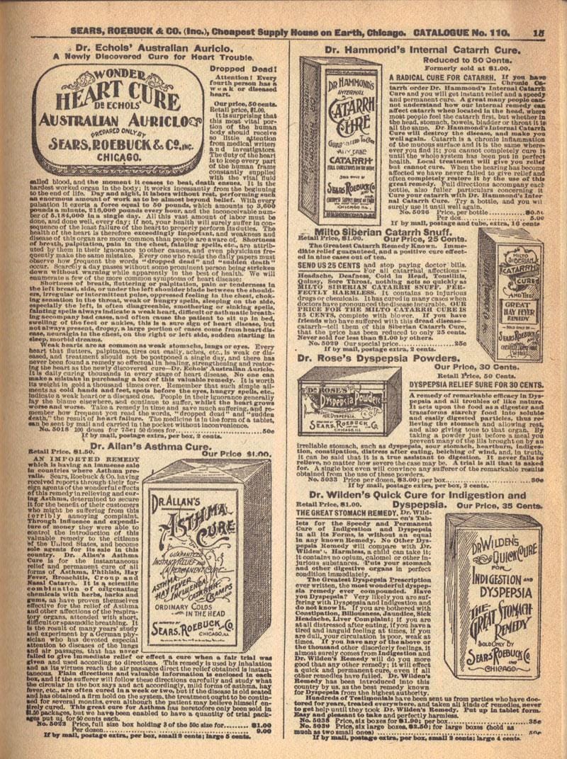
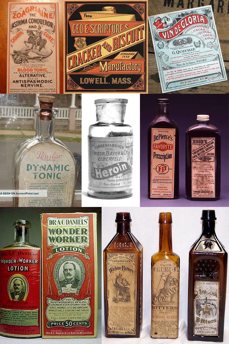
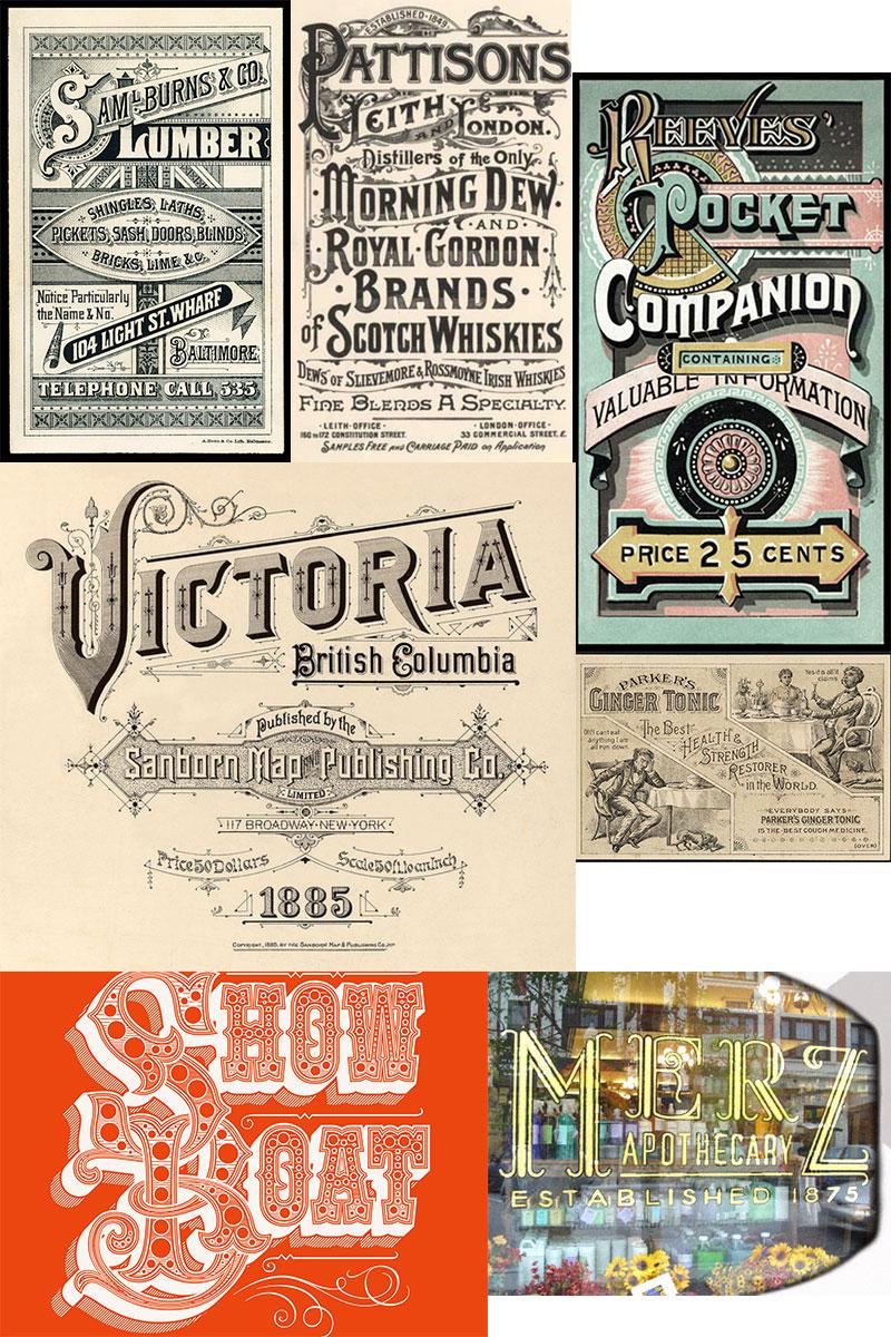
I've gone about the internet and my bookshelf and found some lovely examples/inspiration/reference.
Now, I'm off to begin sketching...
_____________________________________________________
UPDATE
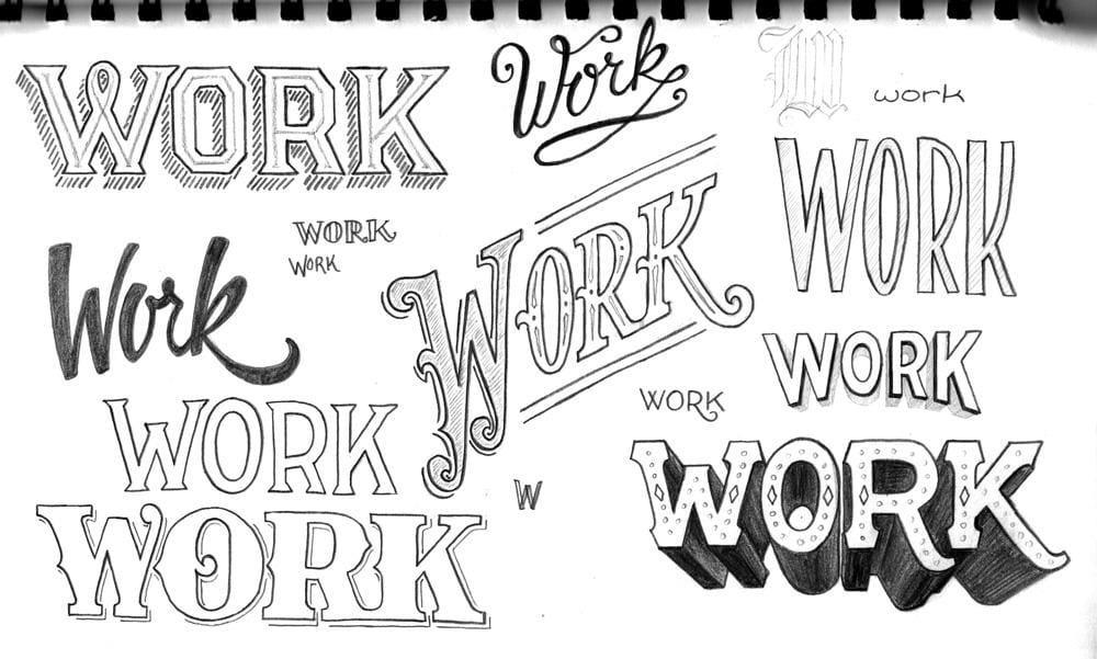
Some initial warm ups, some victorian(ish), others not:
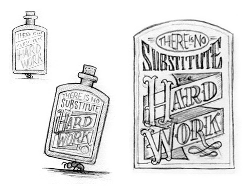
I've also been toying with the notion of adding an element to reinforce the idea of hard work. With the bottle, I have something that symbolizes a substitute, or quick solution, but I still need something to symbolize hard work. I considered using various inanimate objects, such as work gloves, boots, a uniform, or tools, but I think it would be better with a character.
So after a little more brainstroming, I came up with the idea of illustrating an ant carrying the bottle. There's no other creature I can think of that works any harder or longer. Plus, the emphasis can still remain on the phrase. I think it could add a little humor as well. Any thoughts?
_____________________________________________________
UPDATE
Thanks everyone for the wonderful feedback!
Now that my concept is finally fleshed out, I've begun doing what I really enjoy...drawing! Before tackling the type within the label of the bottle, I did some bottle shape explorations. Since the bottle shape will dictate the form of the composition:
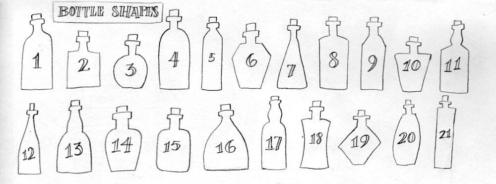
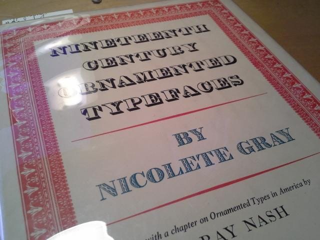
I ultimately decided to move forward with something along the lines of #2 or #4, then I played around with some thumbnail layouts. I also explored a few more letterforms. That lovely little "M" on the right is a sketch of a much nicer looking typeface found in an amazing book called Nineteenth Century Ornamented Typefaces. It proved to be a great source for some authentic inspiration.
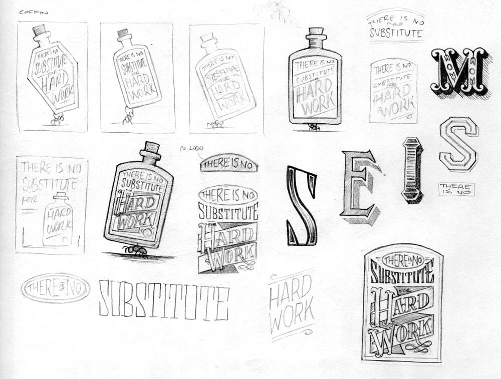
As you've probably guessed, I've decided to go with something along the lines of these, borrowing some of the type from my earlier warm up:
Now on to much larger drawings...
_____________________________________________________
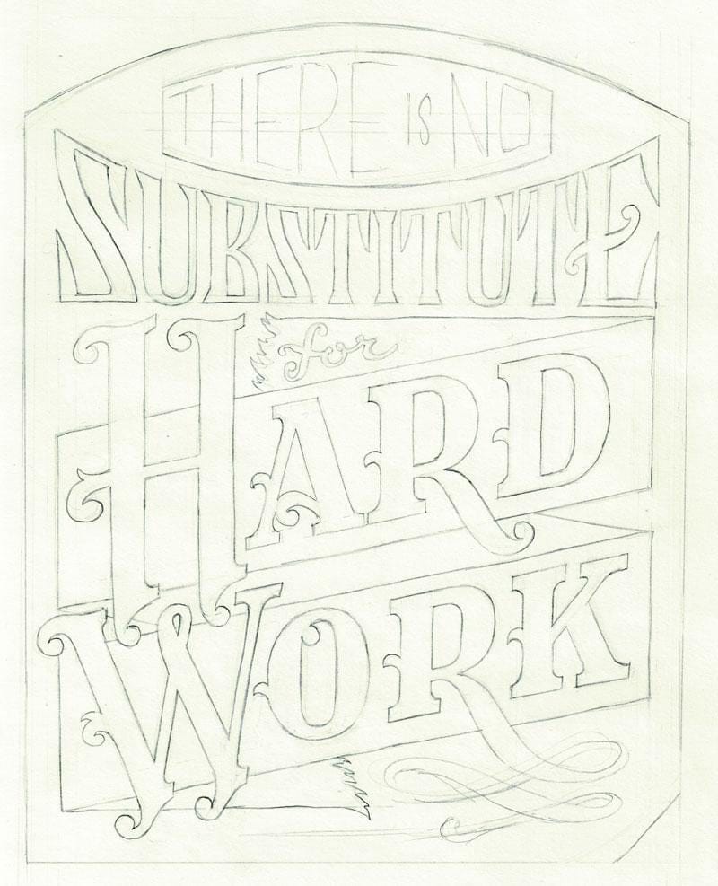
UPDATE: 10/24
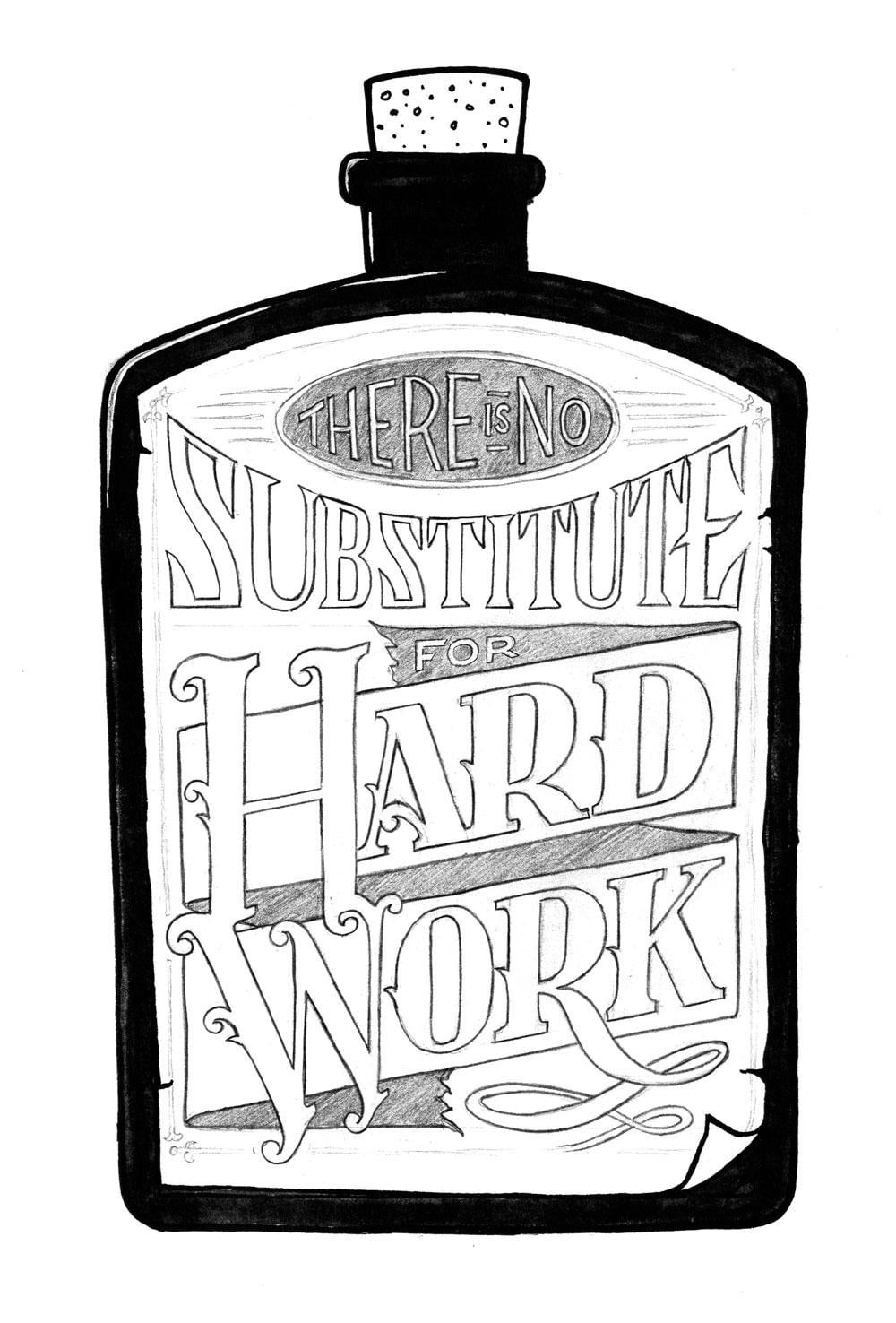
Thanks everyone for all the kind words and support! I really apprecaite the encouragement. I've gone ahead and drawn a much tighter comp of the bottle and label design. The word "substitute" still needs to be redrawn, but at least you can see where I am at so far. I plan on adding some ornamental details to the letters in the next version. Stay tuned.
_____________________________________________________
UPDATE: 10/26
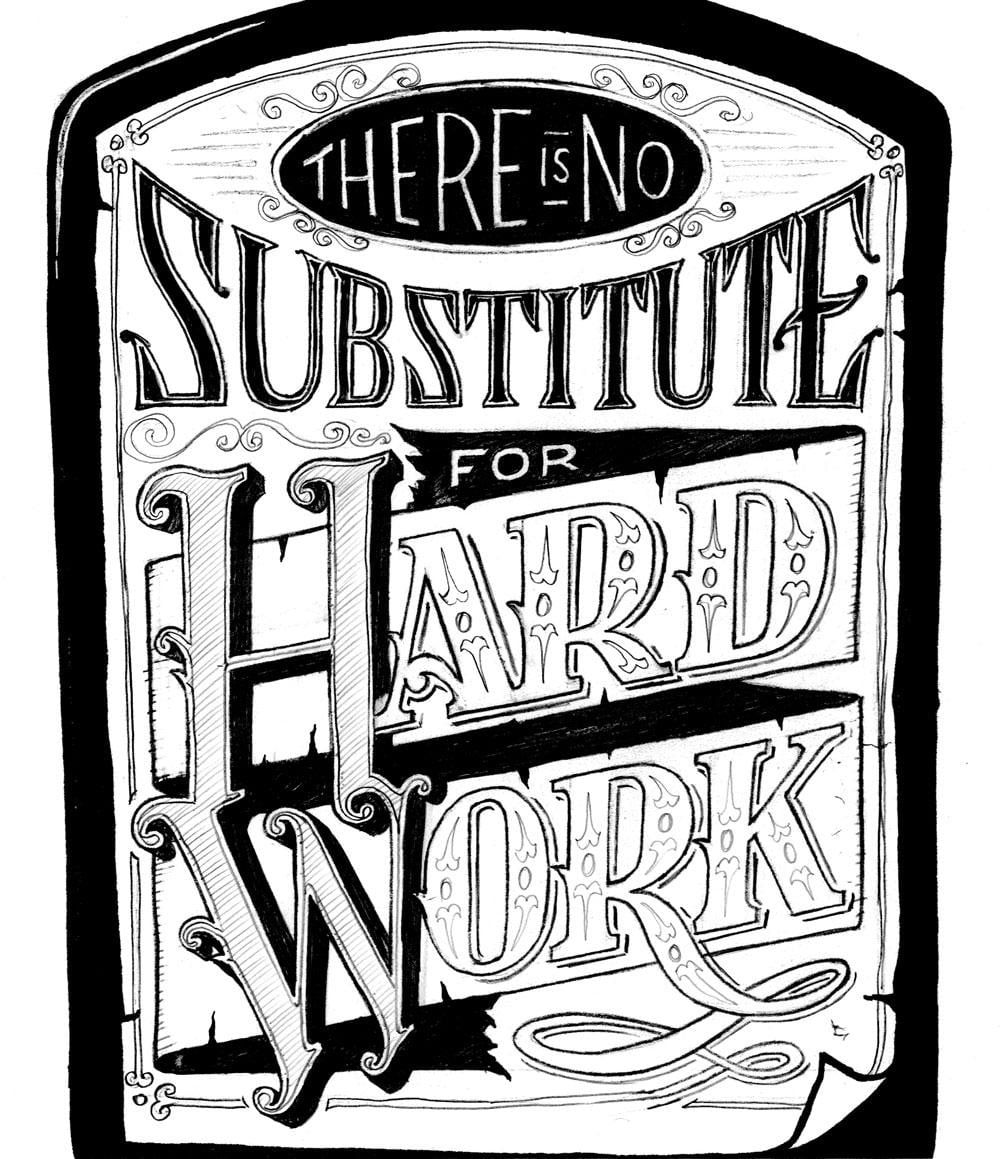
In the process of adding some ornamentation and detail before I move on to the final drawing...
_____________________________________________________
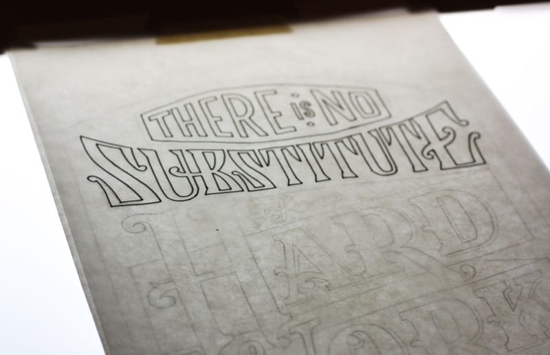
UPDATE: 11/04
Hey all! Thanks for all the wonderful comments! I've been kind of busy lately with work so I haven't had a chance to make any more progress til this evening.
I'm currently redrawing my layout before moving on to the inking phase. The previous drawing needed a little more breathing room between the letters. I also left room in the banner for some victorian embelishments and managed to balance the word "Substitute" a little better. Here's where I am so far:
Just a few more details to flesh out on this and then I can move onto inking.
_____________________________________________________
UPDATE: 11/05
Starting to ink...
I just have a few more details to add to "Hard Work," then I can work on the bottle and ant.
_____________________________________________________
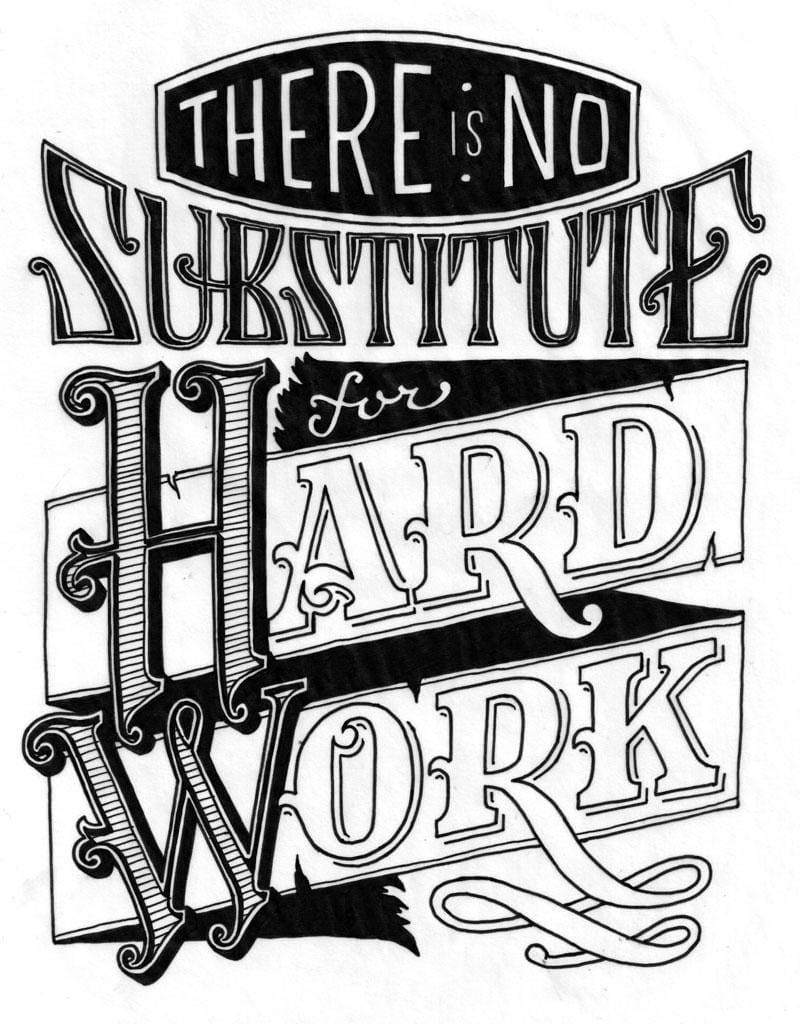
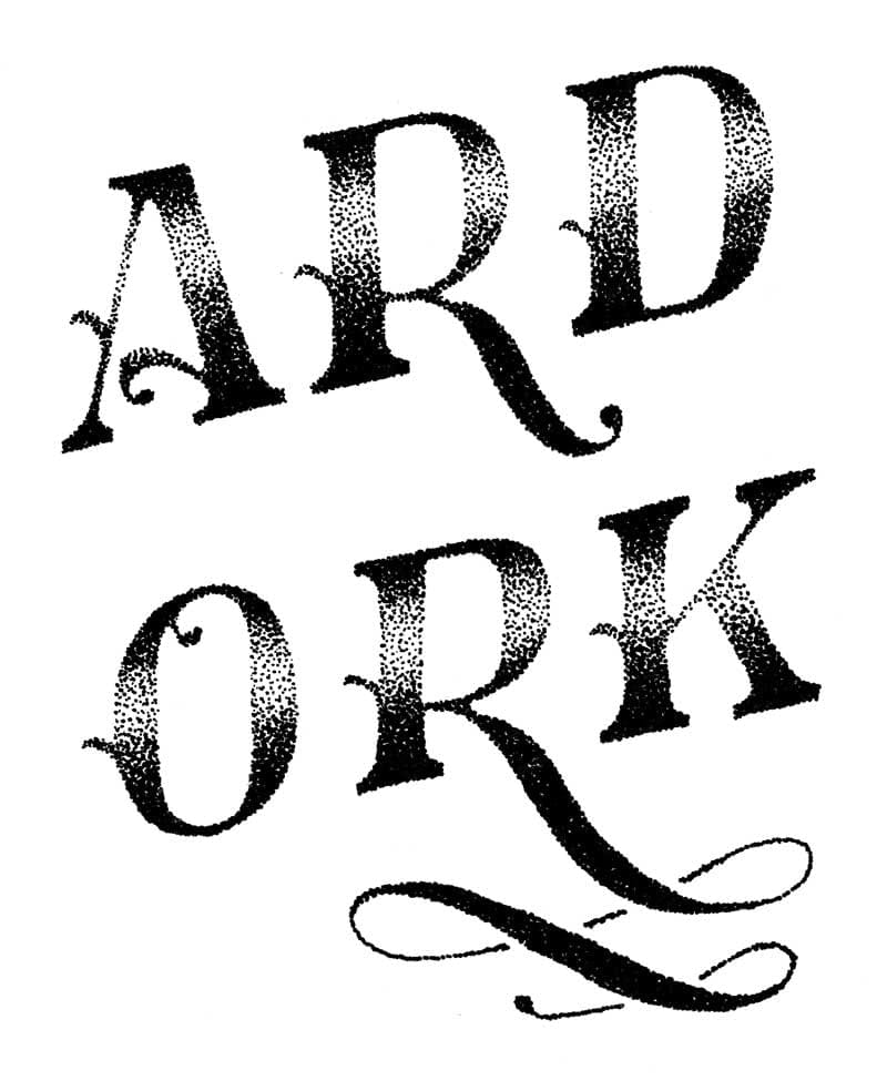
UPDATE: 11/08
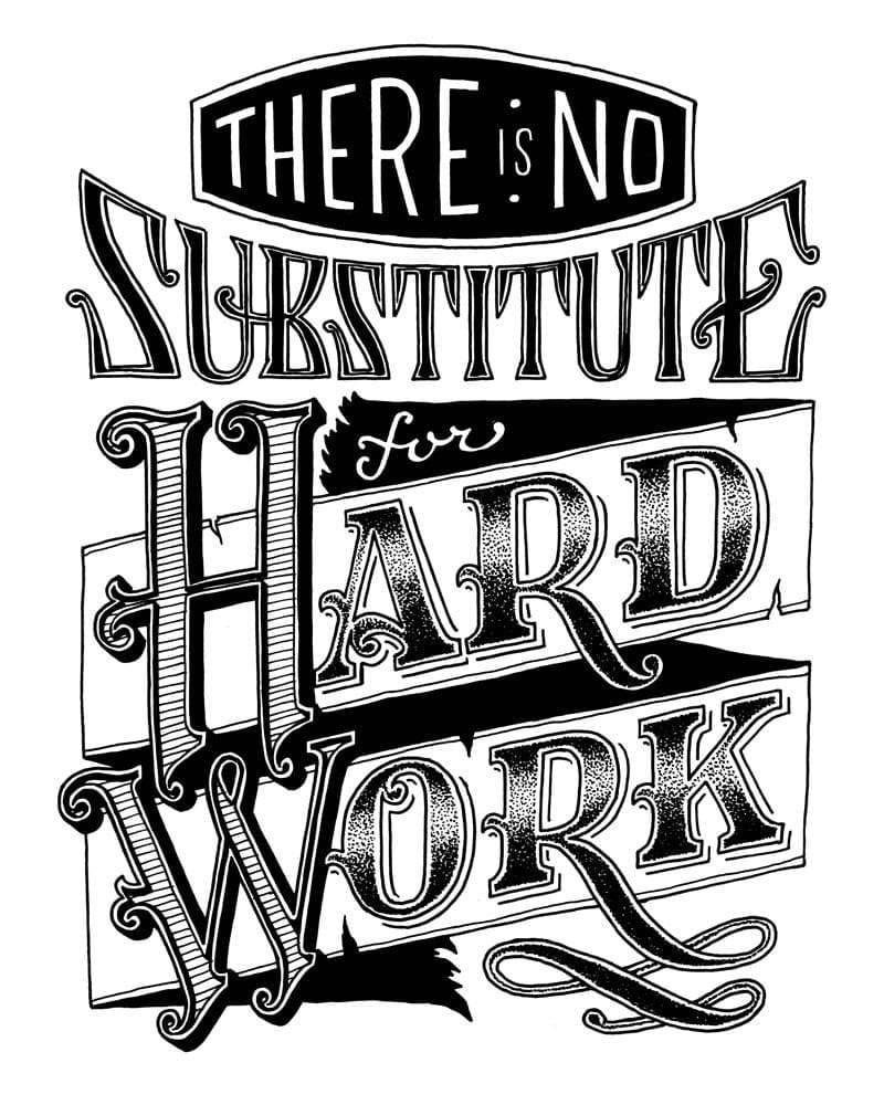
I've finished the lettering and details. Since I wasn't really sure what I wanted to do with the fill in "HARD WORK," I used tracing paper. I tried some stipplling and really liked the way it looked, so I decided to keep it. It actually looks really great by itself.
So I plugged that in and now I'm trying to make everything work within the context of the label/bottle. I worry that, with the level of detail I have now, that placing the lettering inside a few containers (label, then bottle) may diminish legibility. I may just leave it as is, but I'd prefer not to because it doesn't quite convey the concept I had in mind.
Oh well, I'll sort it out sooner or later, but this is where I'm at currently. Thanks for looking!
_____________________________________________________
UPDATE: 11/10
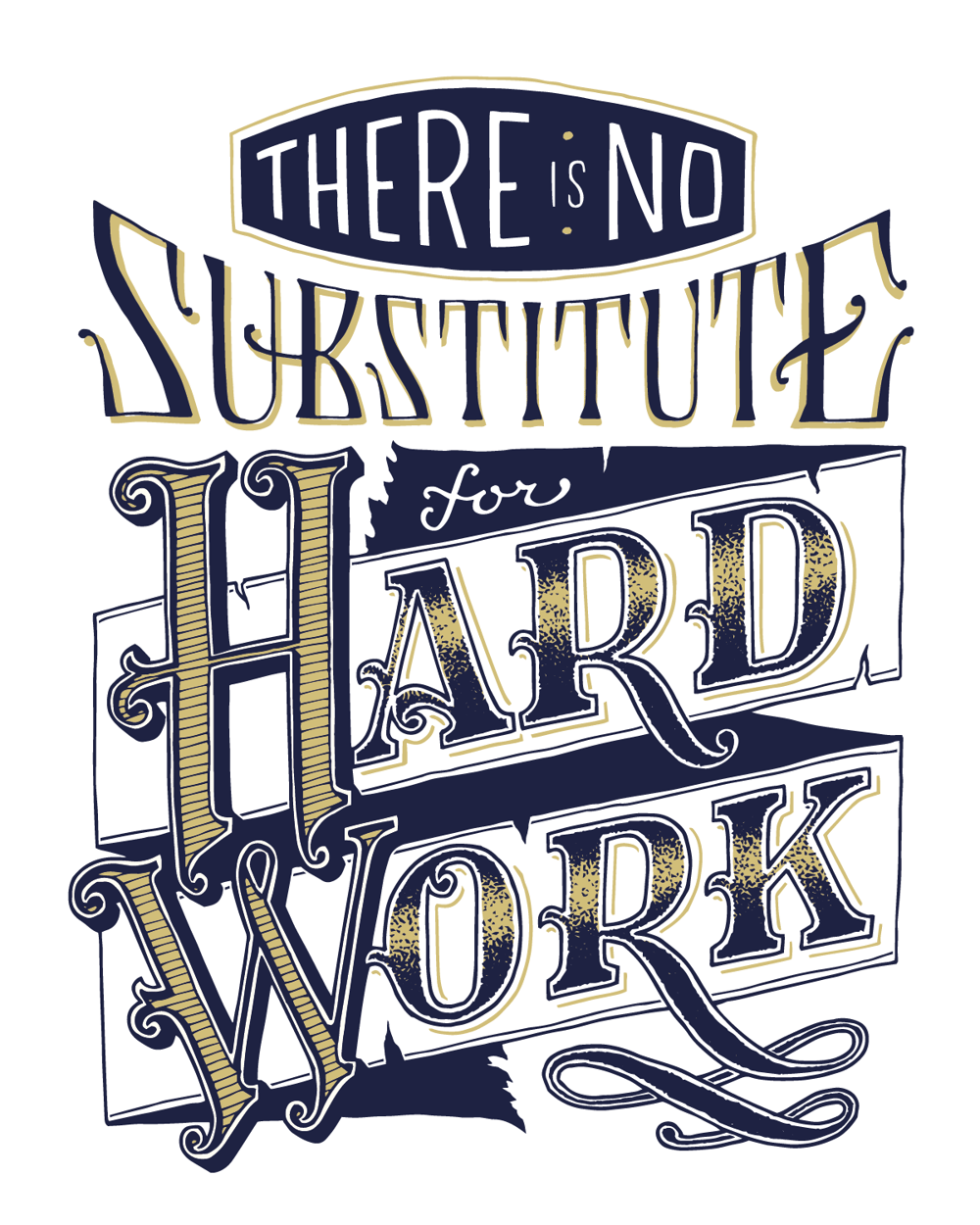
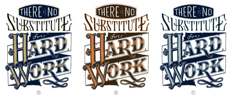
I've gone ahead and digitized it - the quick and dirty method - and cleaned it up a bit. The outline on the word substitute was a bit much, so I've removed it. I've also started some color studies. I'm most fond of the blue and gold (A), but what do you think?
_____________________________________________________
UPDATE: 11/26
After much frustration and a couple failed attempts, I've finally gotten the bottle to work. Taking some time away from this project definitely helped. Now, I think I'm finally ready to call it finished. Here's is the final piece:
Thanks everyone for all the wonderful feedback! And thanks Mary Kate for putting this class together. Your videos were awesome and the insight into your process has greatly benefited my own.