The Art of Typography
Quote: "Never settle for less than your best"
update: 7/20/13
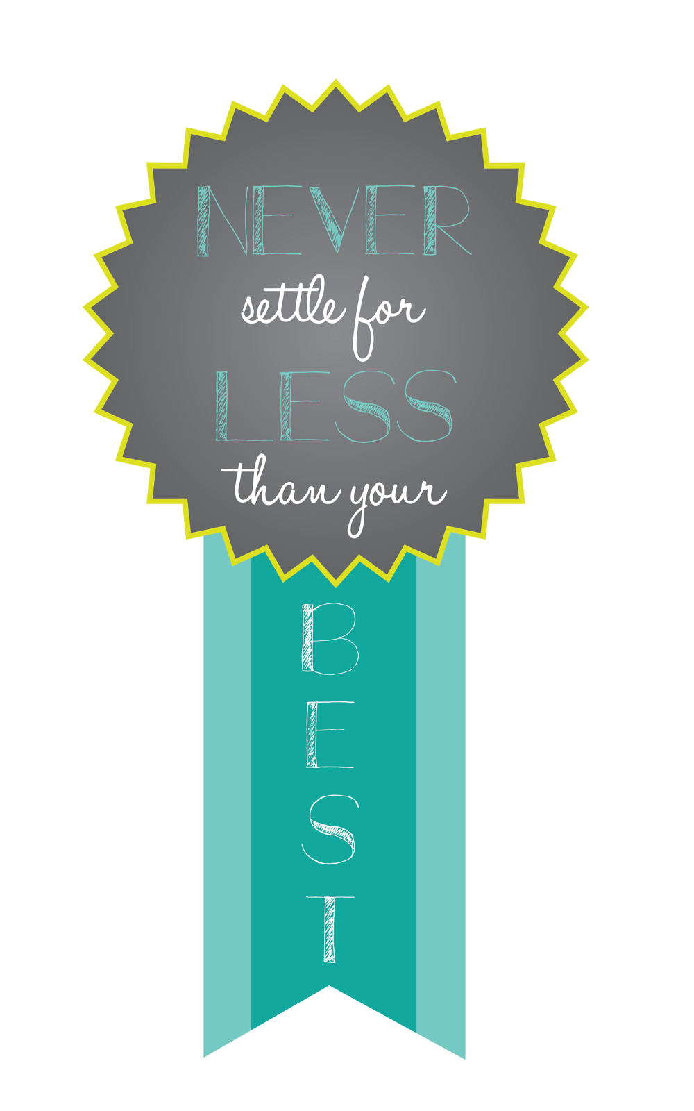
Decided to use the rosette idea instead of the books to illustrate my quote. Still kept the gray background to make the colors pop and look interesting.
7/4/13
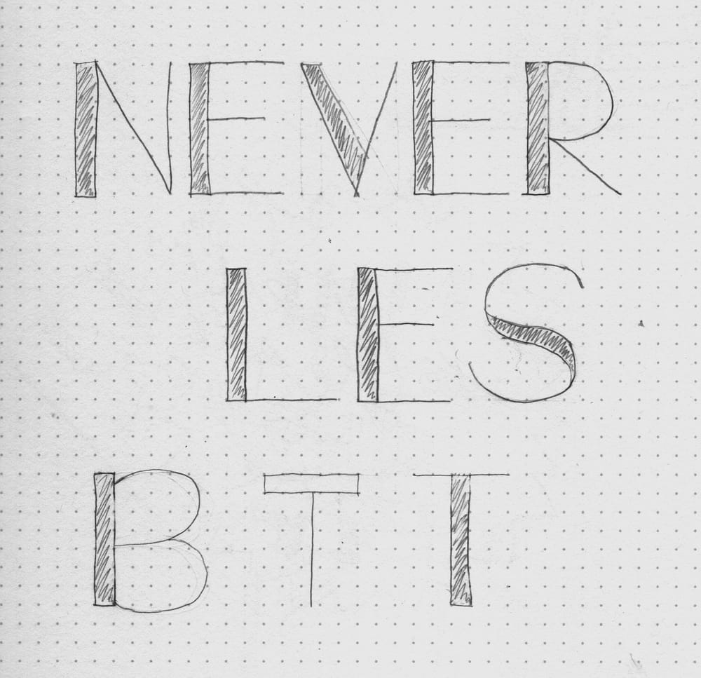
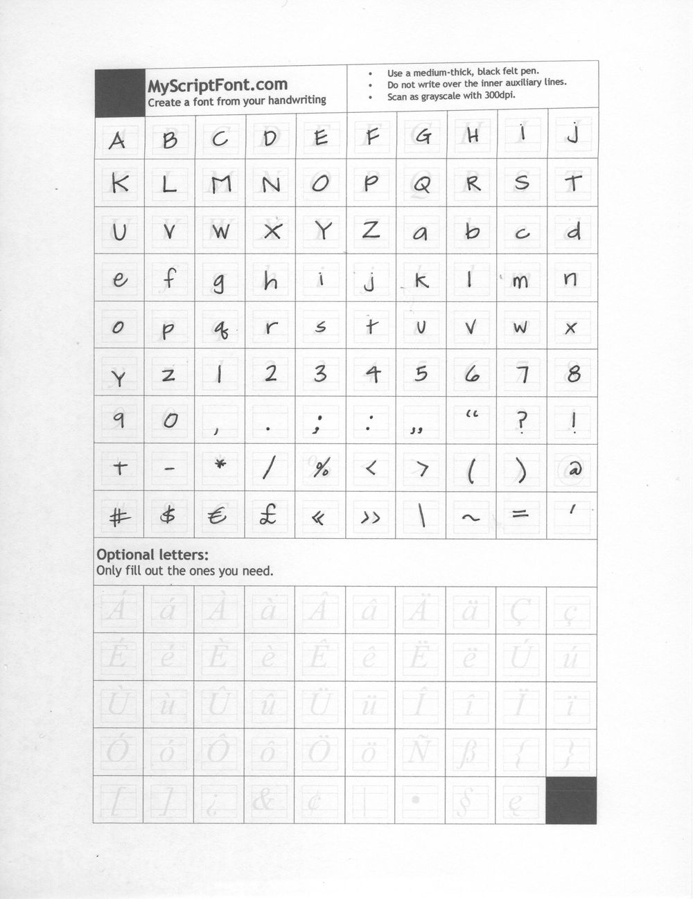
I decided to scan in my own font that I already had in mind, to create more of a handwriting feel:
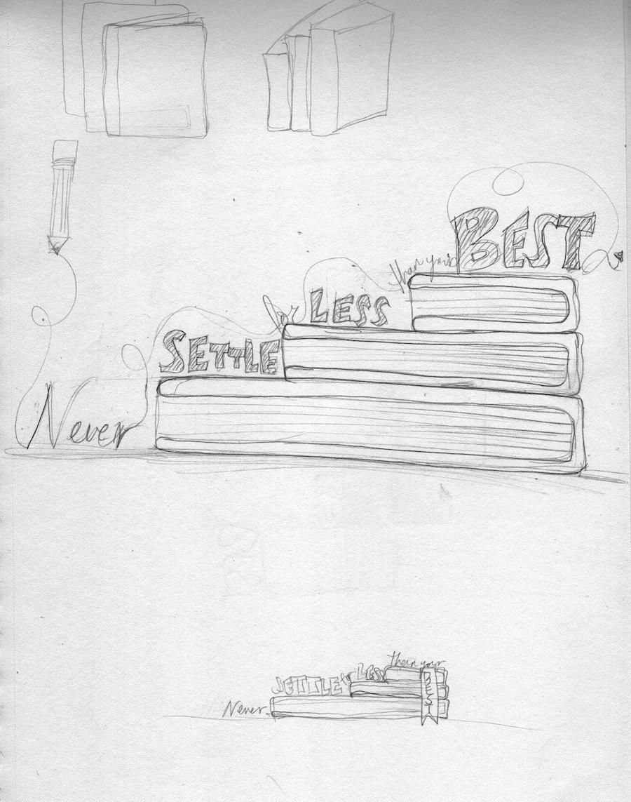
Started working on illustrator and having lots of fun! Decided to connect the words "settle for" and "than your". I drew in some books by hand and scanned it in, played around with the typography:
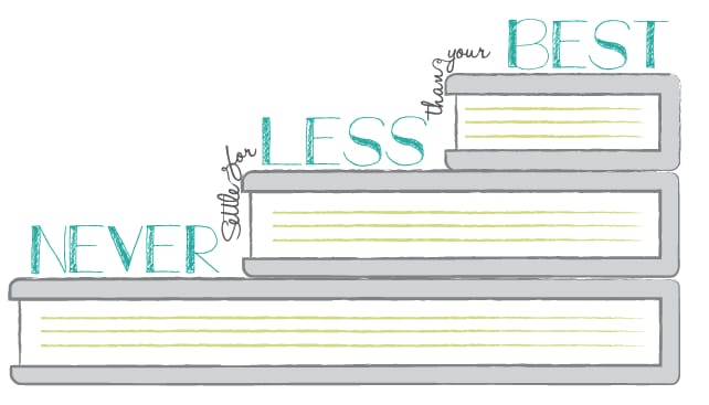
Decided I didn't like the books I drew and made it out of more perfectly straight lines on the computer haha. It looks much more neater. Played around with the brush strokes to get a chalk texture effect. I like it better because it still has that hand written feel:
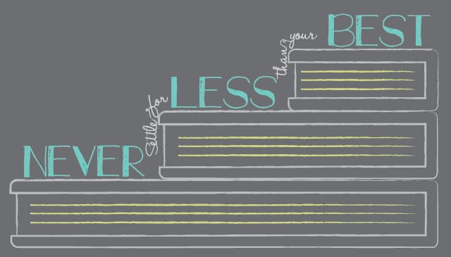
Added a dark chalk background to see how it would look, pretty neat:
Other possible options:
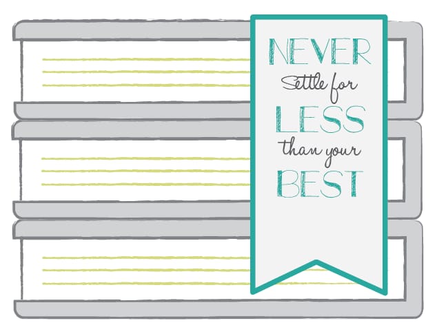
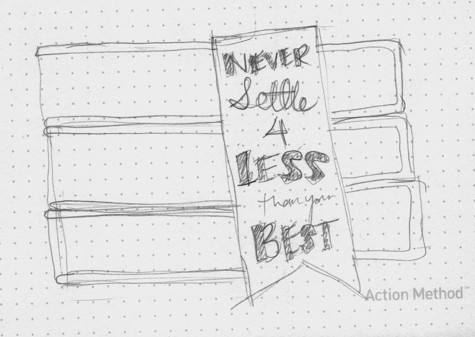
I also did a layout with a ribbon and stacked books:
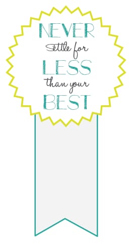
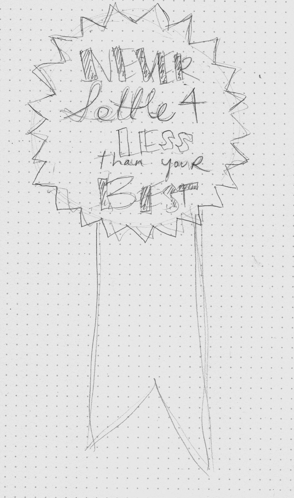
An award ribbon:
Which do you guys like better? I'm open to any constructive feedback to make it better. :)
7/3/13
Updated Sketches:
Here are some more ideas, I really like the ribbon idea. I'm wondering if I should use illustration or photography at the end to bring it all together. I'll focus on the typopgrahy for now on illustrator next. :
6/27/13
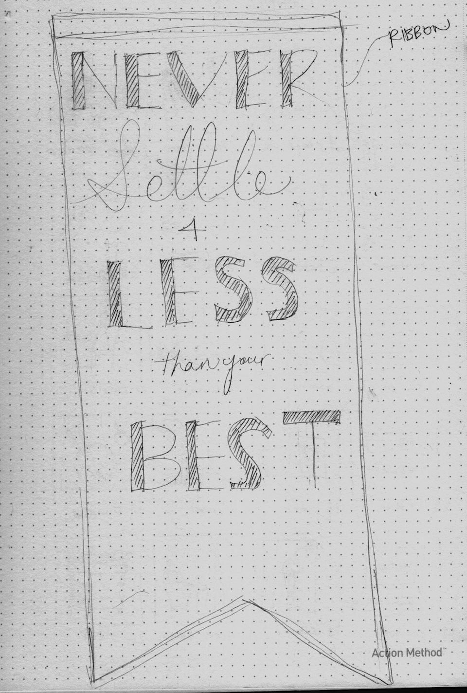
Quote Layout Sketches:
My Quote is "Never settle for less than your best". I've decided to emphasize the words "Settle" "Less" and "Best". But I'm wondering if I should have emphasized the word "Never" instead. So in the end its "Never" "Less" "Best".... I think that makes sense, but already started doodling! I think I'll change that for my final design. Nonethless below are my sketches!
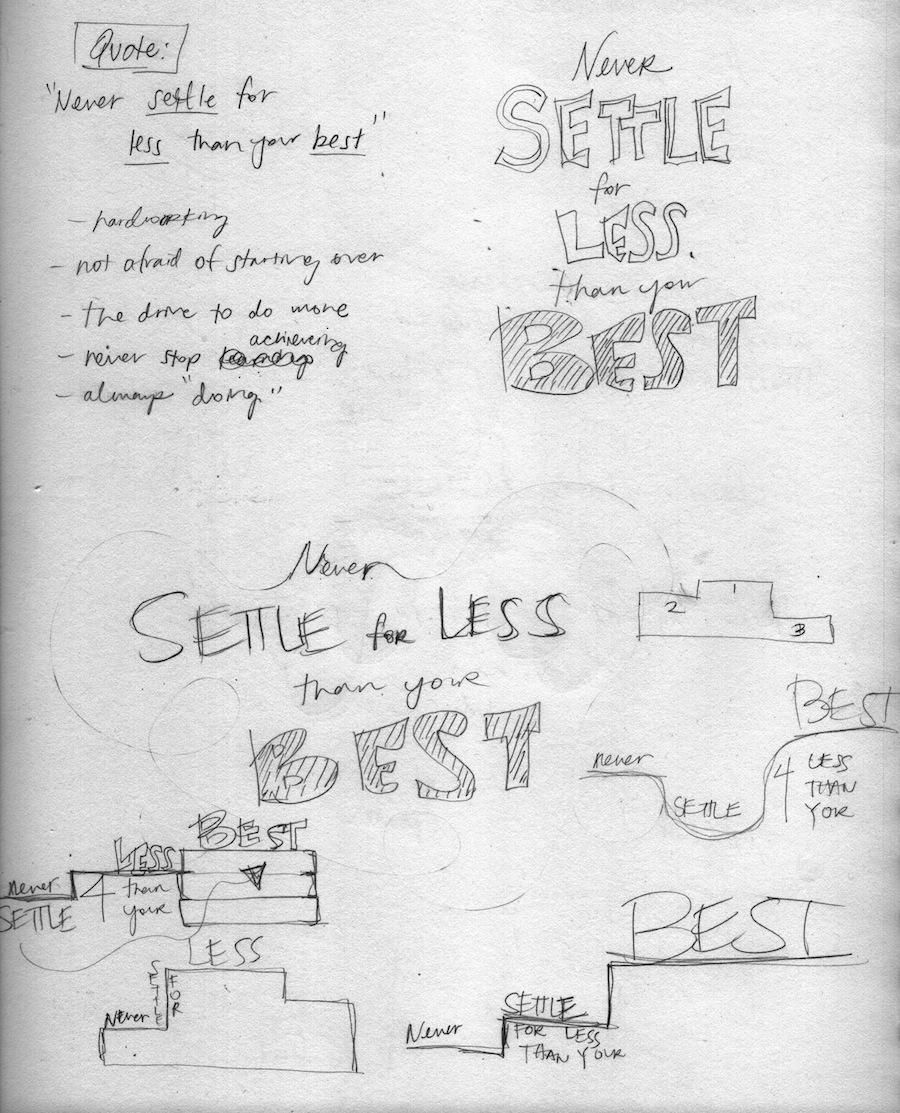
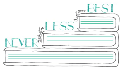
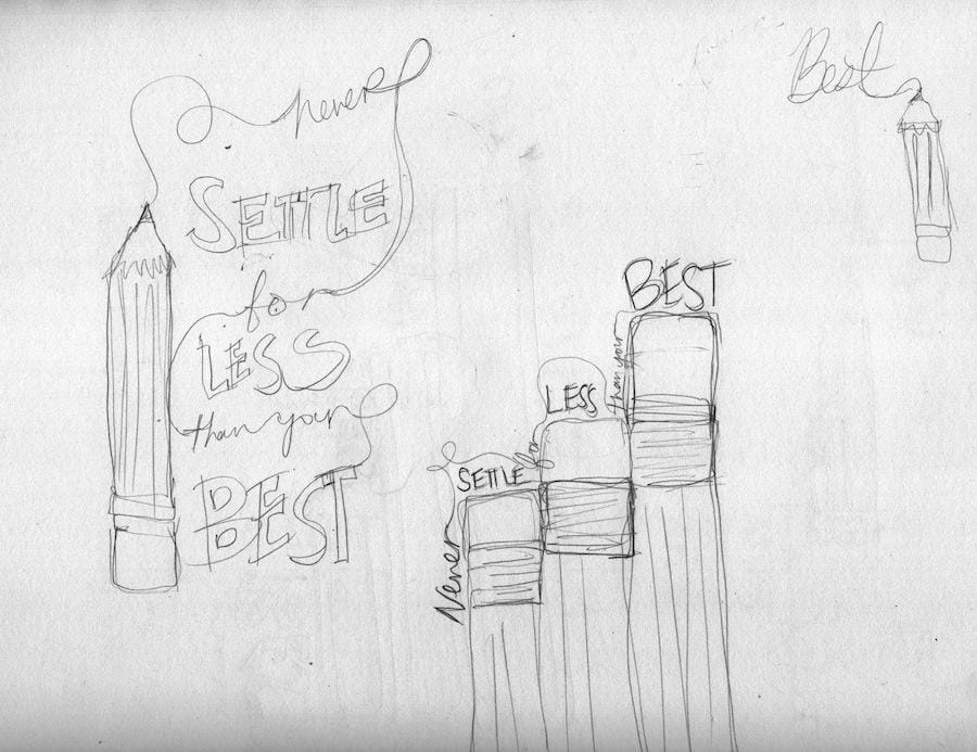
For the meaning of the quote, I thought about someone working hard at something and never stopping until its the best. So I thought of stairs and stacked books, a symbol of getting somewhere and reaching the top and not stopping in the middle. So I played around with the structure of stacked books and seeing how I can stack my typography on it.
Pencils also came up in my ideas :)
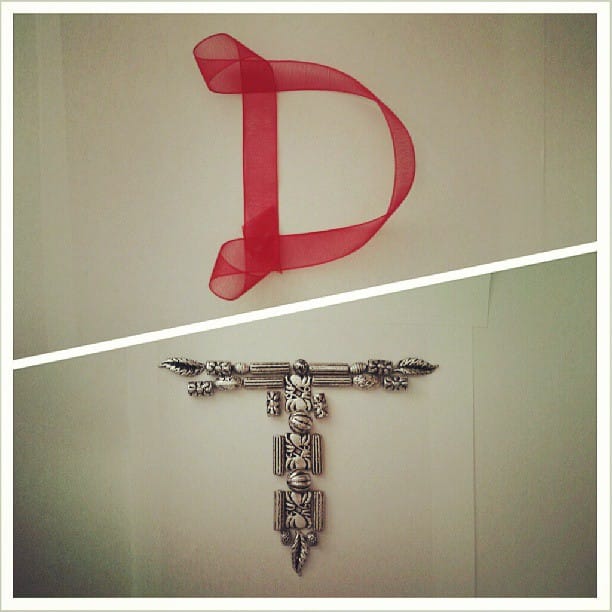
Create your Own Type:
I had a lot of fun with this! Used a ribbon and jewelry beads!
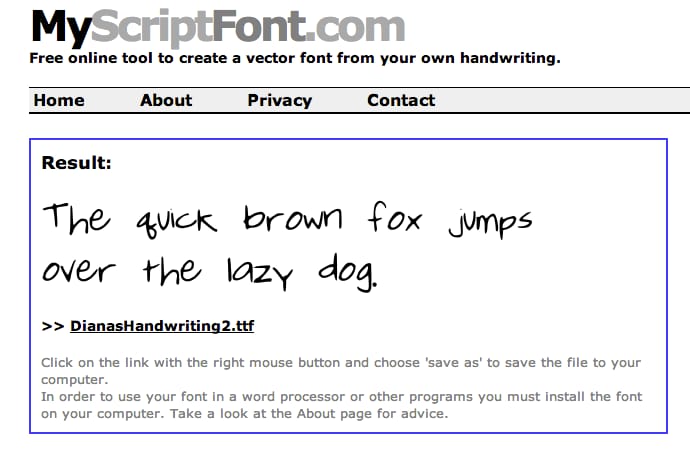
Made my own handwriting font! Man this is so cool:
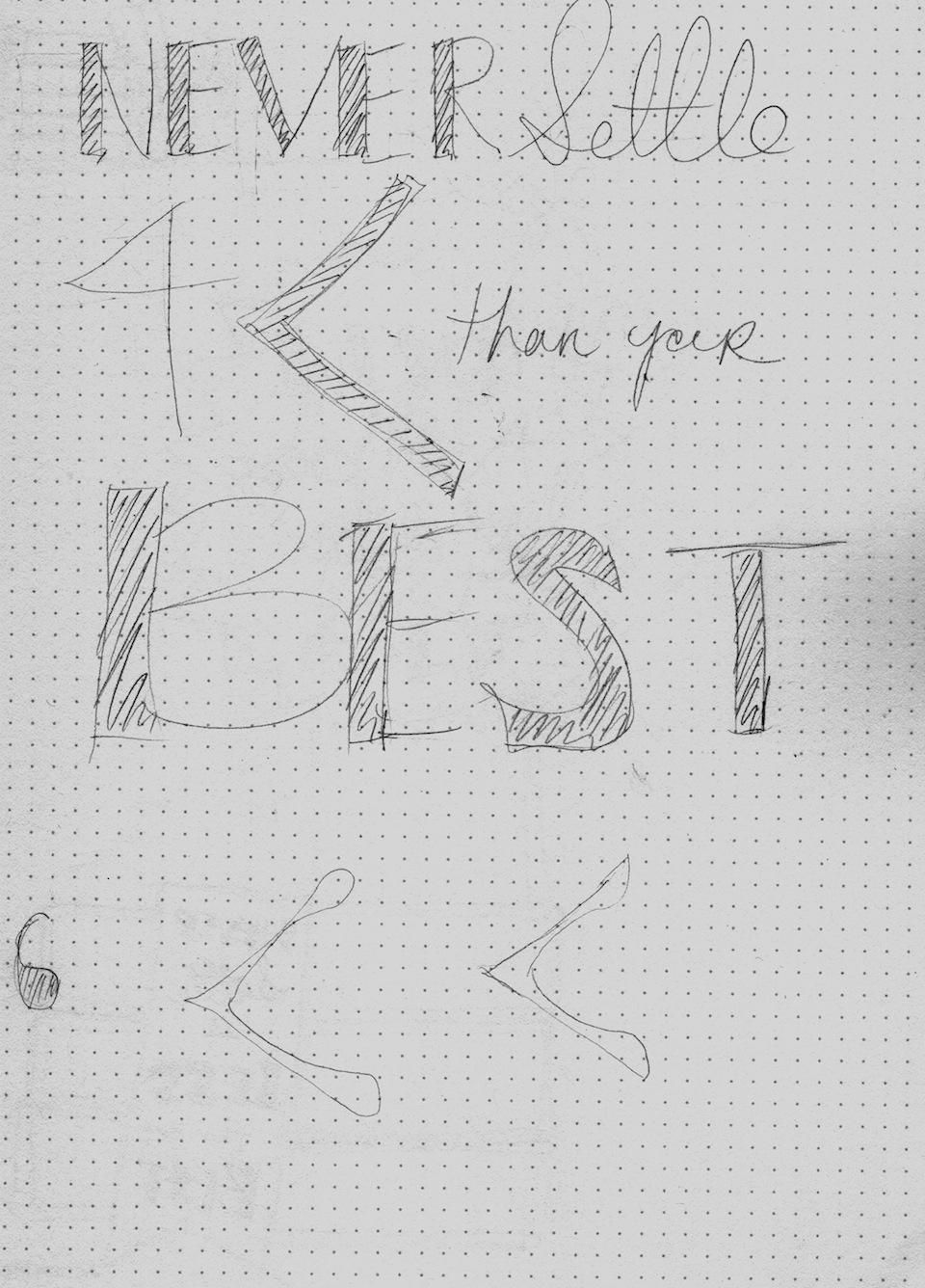
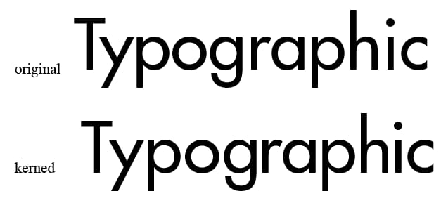
Kerning Practice:
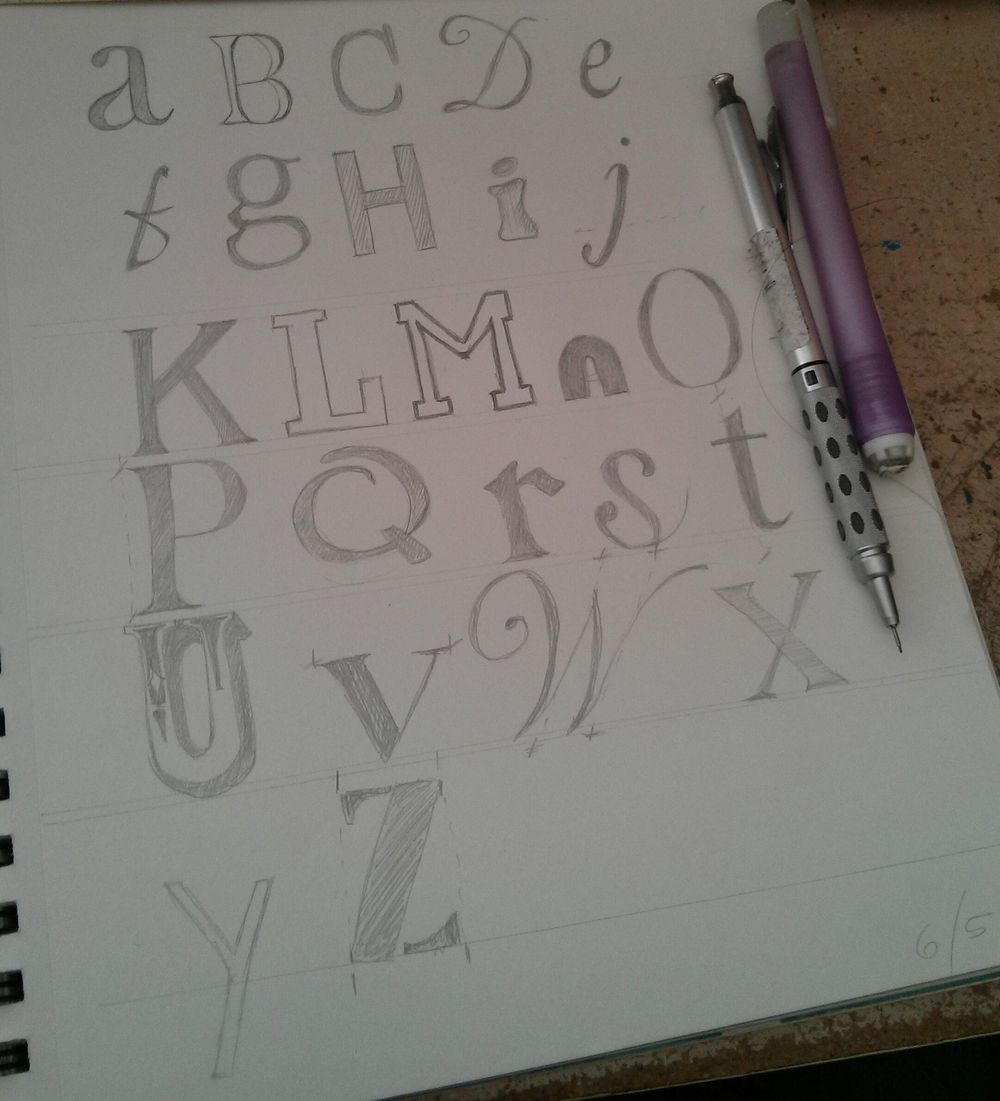
Copying the Alphabet:
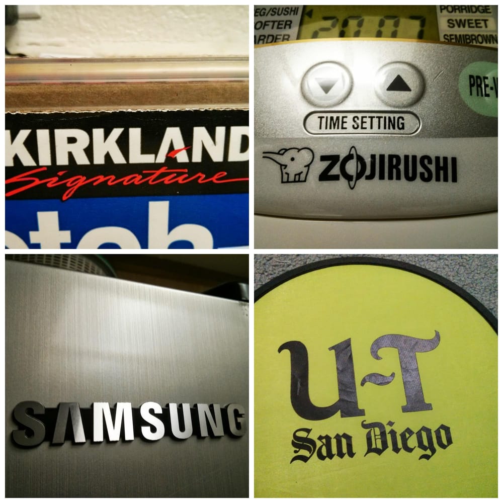
Brands:
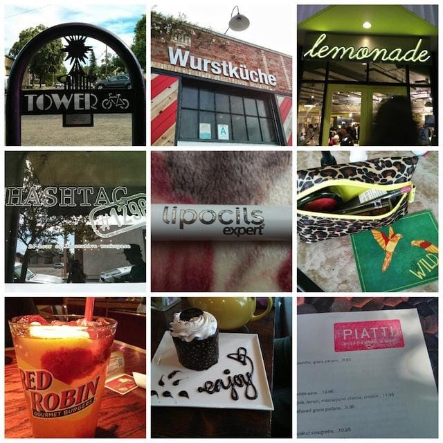
Typography Weekend photos:
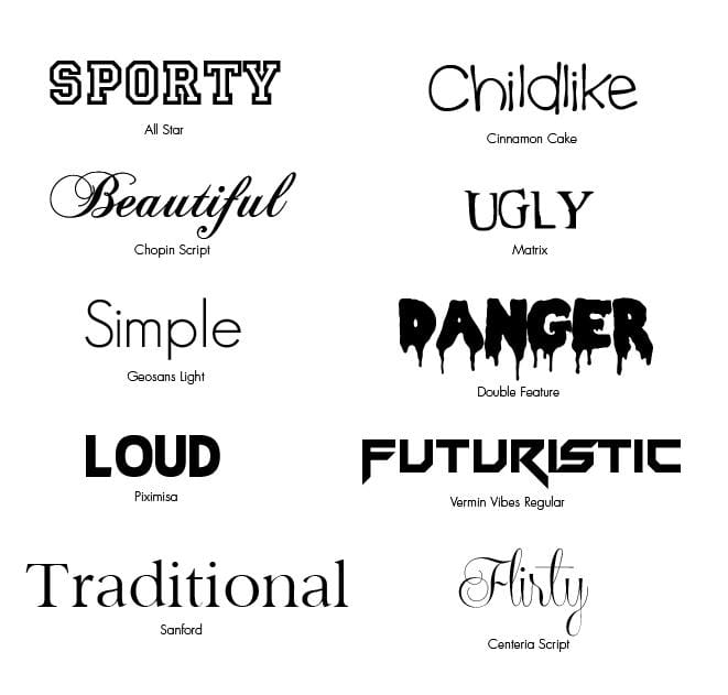
10 Words: