Tea Station Responsive Redesign
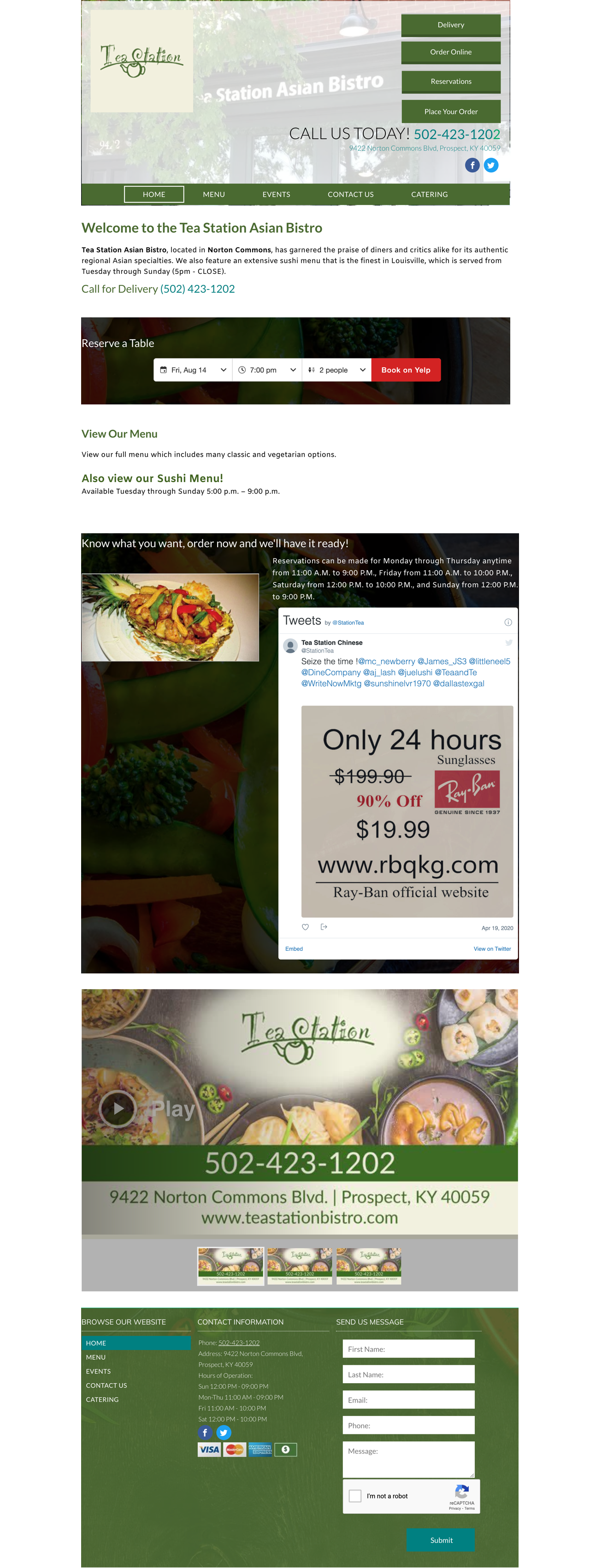
For my project, I used one of my favorite restaurants in Louisville, KY. Tea Station Asian Bistro's website is not responsive at all, which made me think it was a good choice for this activity. Here is the website's original layout.
In order to fit a grid, I cut the pieces of the website for resizing purposes. I then snapped them to the 12-column grid. In order to make the navigation fit, I reduced the number of elements from 5 down to 4.
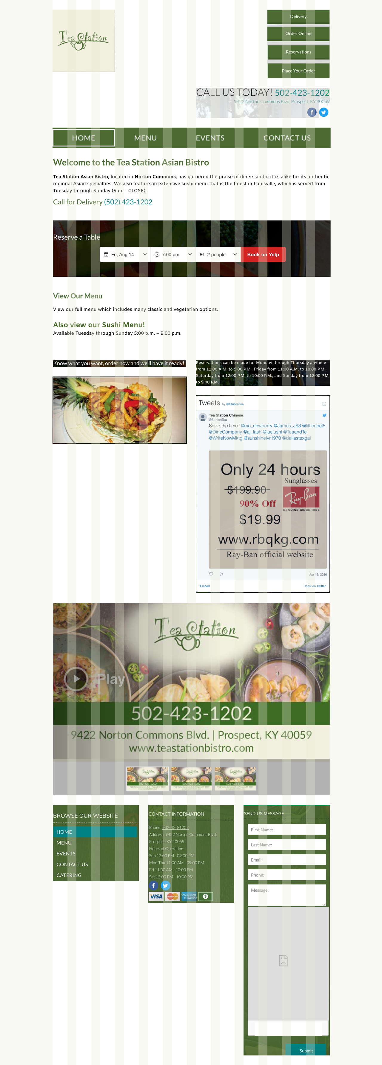
In the tablet version, I kept most of the same dimensions as the desktop version, but continued to resize to the new grid dimensions.
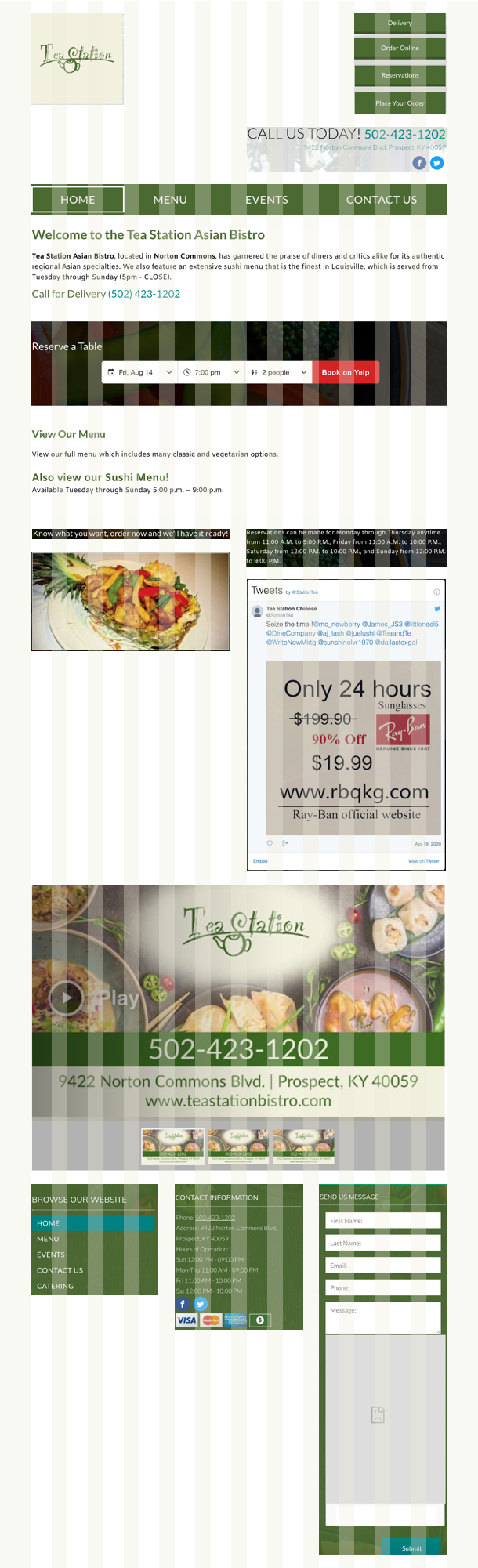
Mobile is where I made the most changes. I got rid of the navigation completely and replaced it with a hamburger menu icon. Due to the size of the elements, I used a 1-column layout for mobile. Had this been my own website, I probably would have also gotten rid of the "send us a message" text box, in favor of a simple button.

Thank you for reviewing my project! I hope you enjoyed it.