Squid Ink.
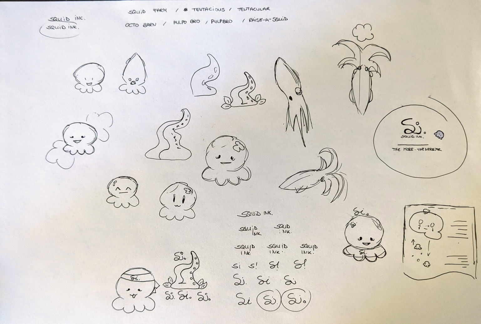
My idea based on this course was to create a brand/brand illustrations for an imaginary company that breeds and raises squids. Customers can buy their own squid and get squid packages containing photographs, processed ink, and eventually their squid incl. recipes.
I wanted the illustrations to be cute and thought about something similar to the Japanese mascot culture. Initially I experimented with the shape of real squids a bit, tentacles and how to combine them with symbols for growth and farming.
After a bit of brainstorming regarding the name "Squid Ink." stuck, so I tried working with its initials. In the end I decided for the wavy "Si." because the curves had something wiggly I associated with tentacles and waves, also spoken out it sounds like "Sea" while having it in written form it represents the Spanish word "Si" - which represents the motive and the positive message I wanted to be associated with the brand.
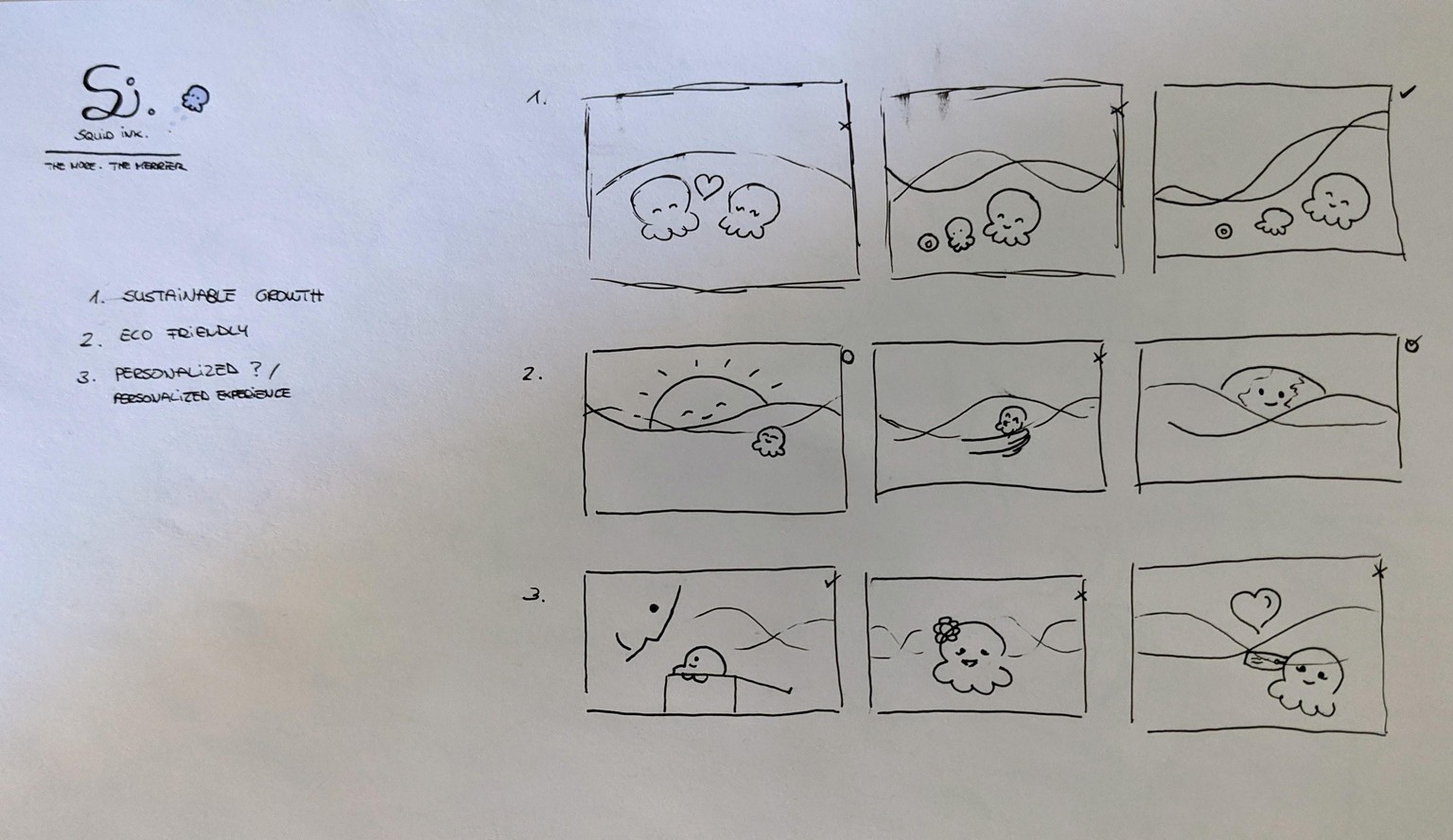
For the illustrations I was looking for something that represented the 3 core messages to "Squid Ink.'s" customers:
1. Sustainable growth
2. Eco friendly
3. Personalized experience
I really liked the idea of just two wavy lines representing water. Going with the whole "1 - lonely, 2 - couple, 3 - many" approach I decided for a three step design with growing curve on (1), planet earth peaking over the waves for (2) and a human with their squid for (3).
I really enjoyed the whole process and experience. Thanks a lot for this course - It was a lot of fun!