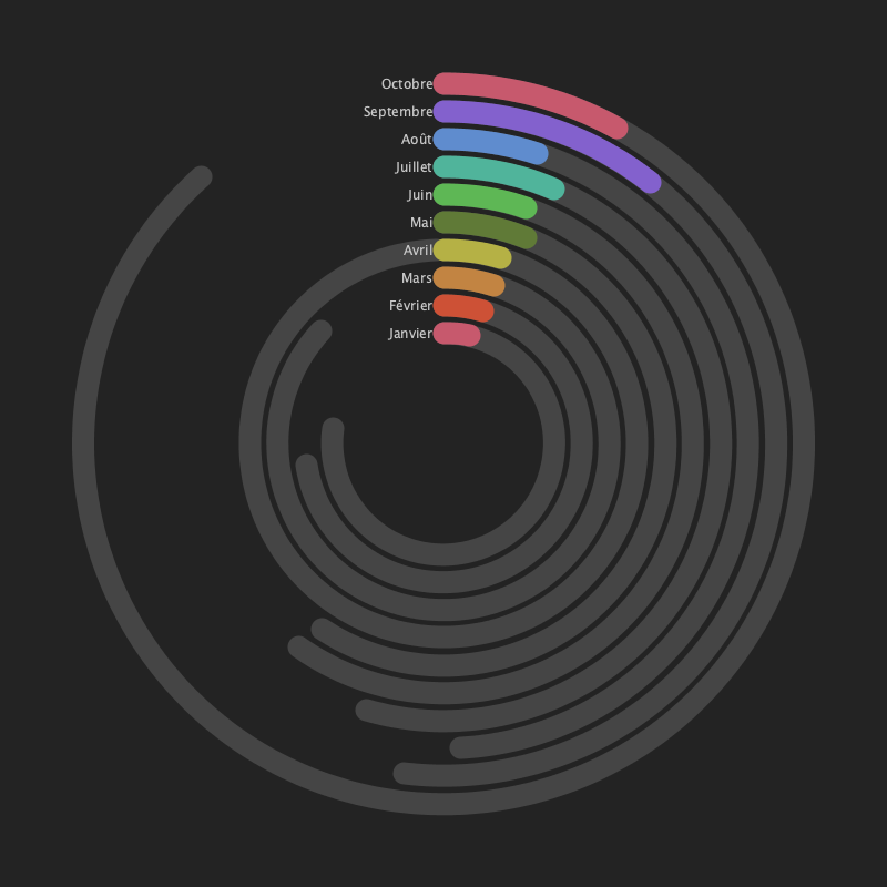
Spotify visualization
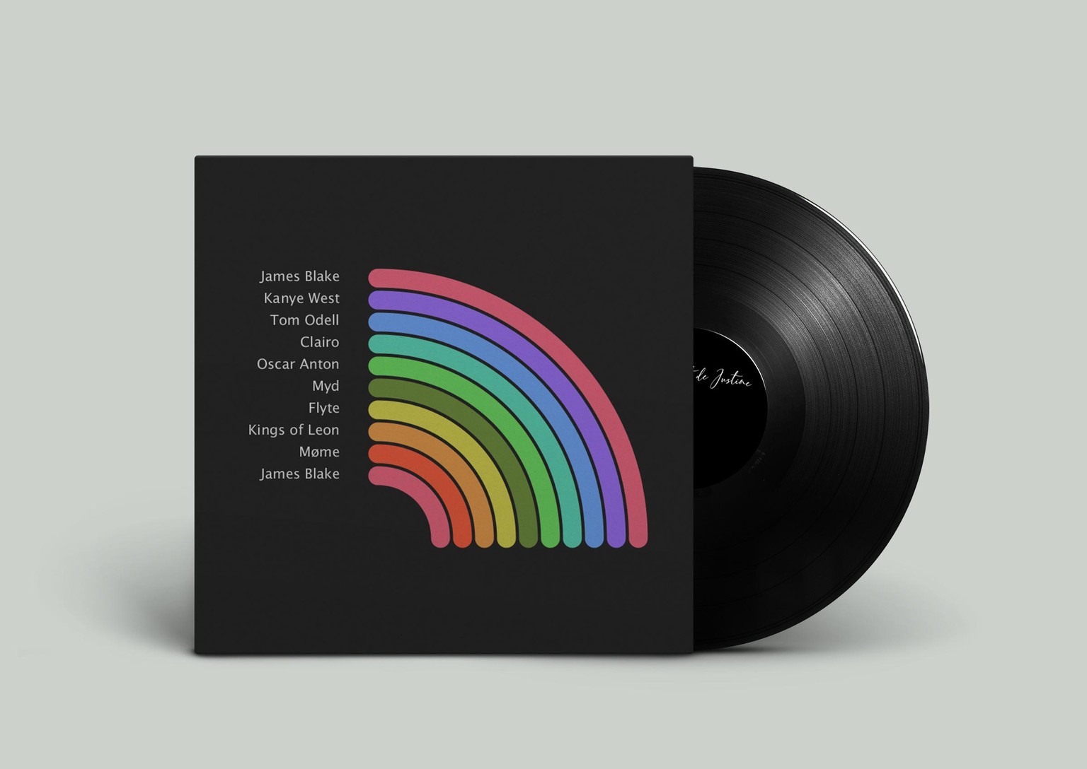
I had a lot of fun using data from a friend and music blogger. My goal was to represent cumulated hours of listening per months 2021 and the top artist per month. One cover side of the vinyl show figures per month, and the other side is the legend to match colors and top artists. I still need to update with latest months.
I use the arc example and implemented the json file recieved from Spotify.
Thanks a lot Nicolas for this great class :)