Space Camp
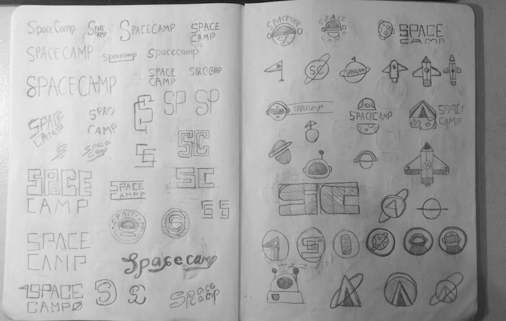
SKETCHES
I went for a simple logo mark revolving around space. I drew initial ideas in my head connecting certain objects like spaceships, astronaut helmets and planets.
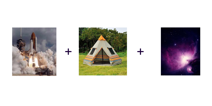
INSPIRATION
I kept it simple and broke down the logo into some images I found on google to get me going in the right direction.
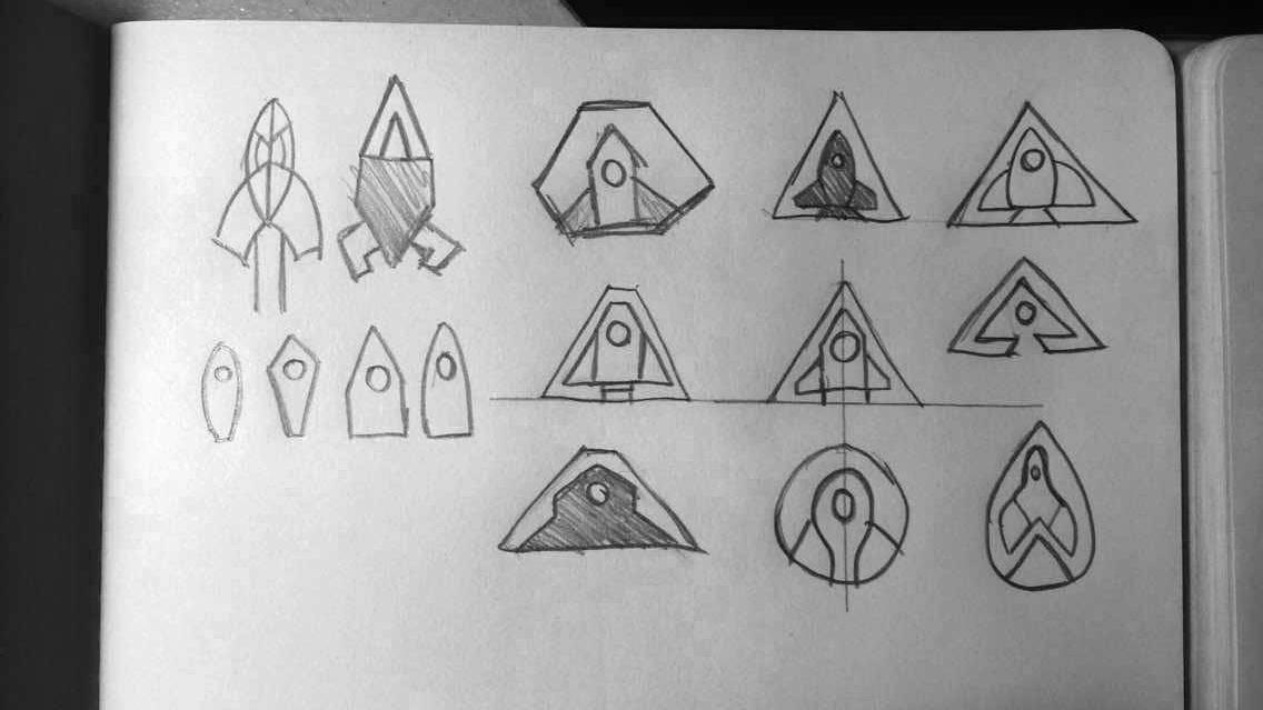
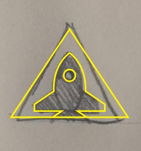
LOGOMARK
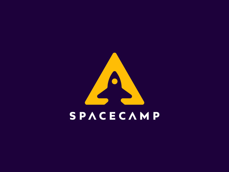
I wanted to go for a negative mark that was minimal. I used a triangular nested shape to encapsulate the rocket ship which turned out nice.
Here is the final mark with some type and color. The purple and yellow are complementary colors and I wanted high contrast. It kept the energy and mystery of the theme as well as was memorable.