So this is typography.
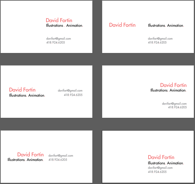
Hi everyone, for this class I'm trying to design a business card I could use. Shooting for a clean, minimalistic and positive card.
First time messing around with typography and I must admit I'm not really comfortable with it. Want to use color as hierarchy and have 3 levels.
PHASE 1: Sans + Structure
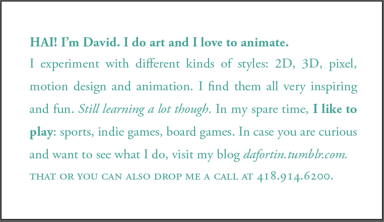
PHASE 2: Literary Typography
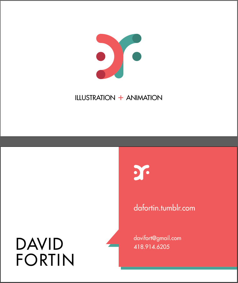
Been playing around with a logo and a different concept.
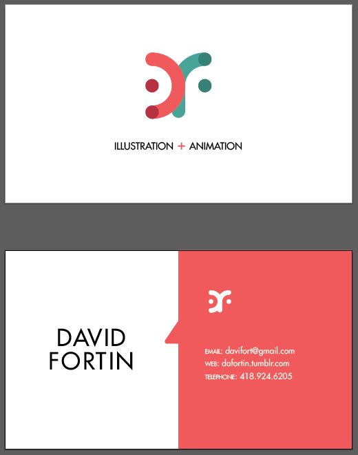
So I reworked it a little bit because after the feedback I received, I figured the speech bubble was not obvious enough. I also justified the name, bottom left, to emphasize the action of speaking. Finally, I further pushed the text hierarchy with my current blog being the 2nd most important element on this side. (Note that I don't have a site as of now so my blog that I started recently will do :))
PHASE 3: Customizing Type
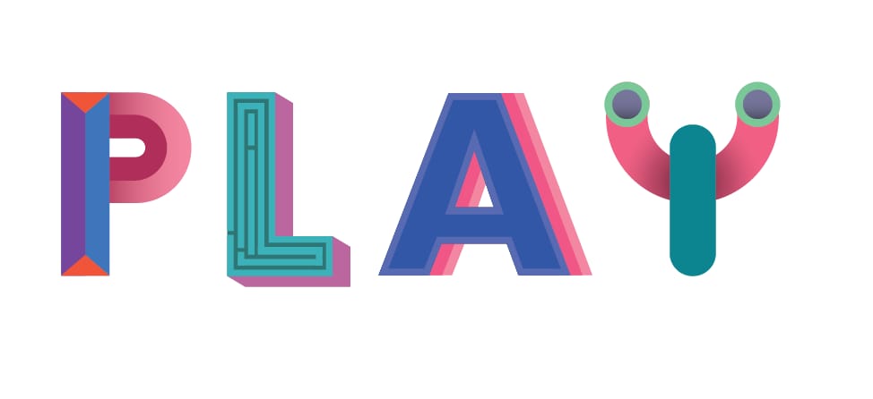
So I finally got to finish this project. Decided to have fun with the word PLAY and customized starting from this bold font and then modifying it:
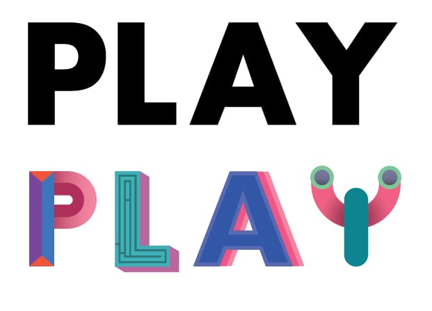
And just the final: