Six Design Lessons from Canadian Food Brand Websites
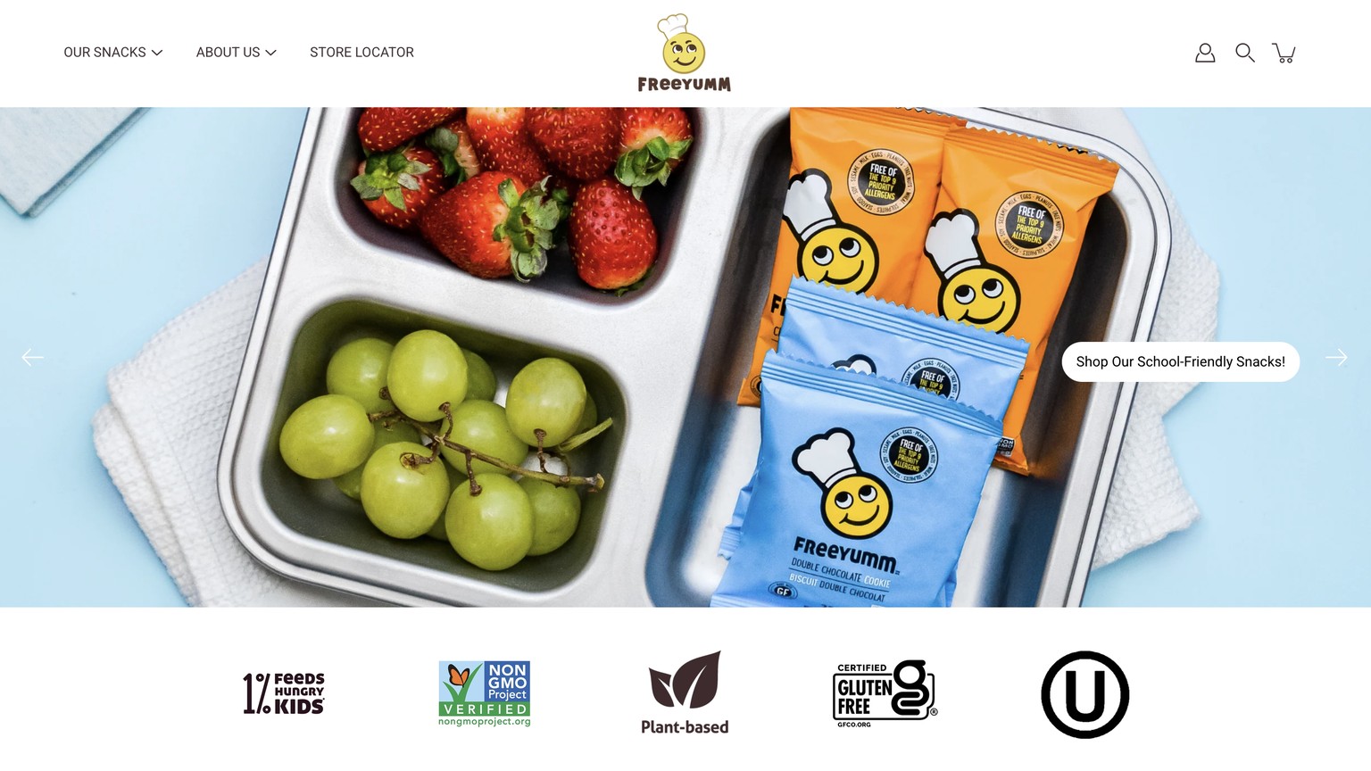
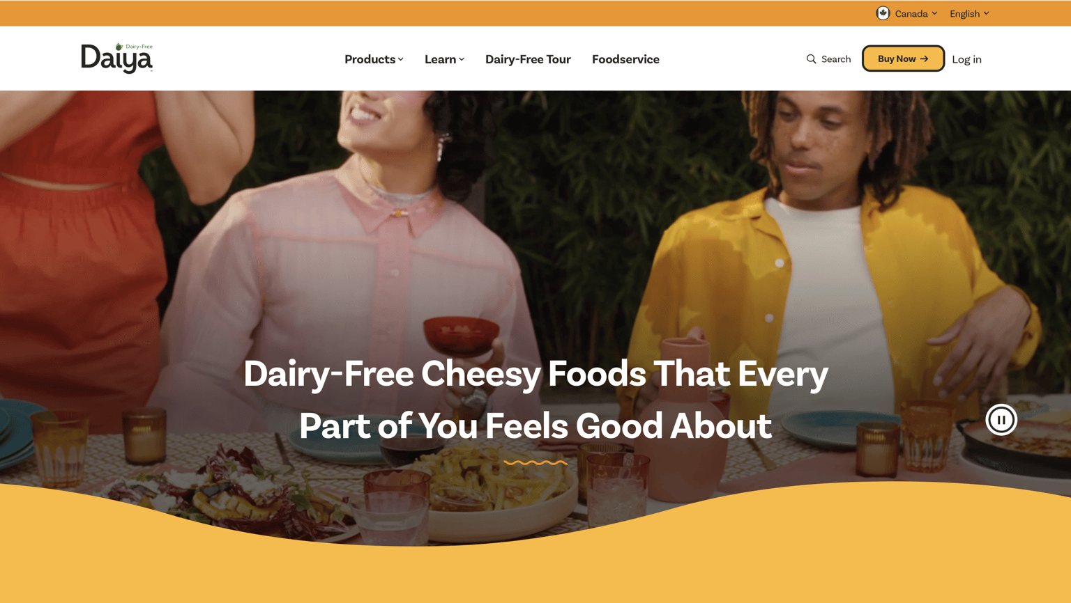
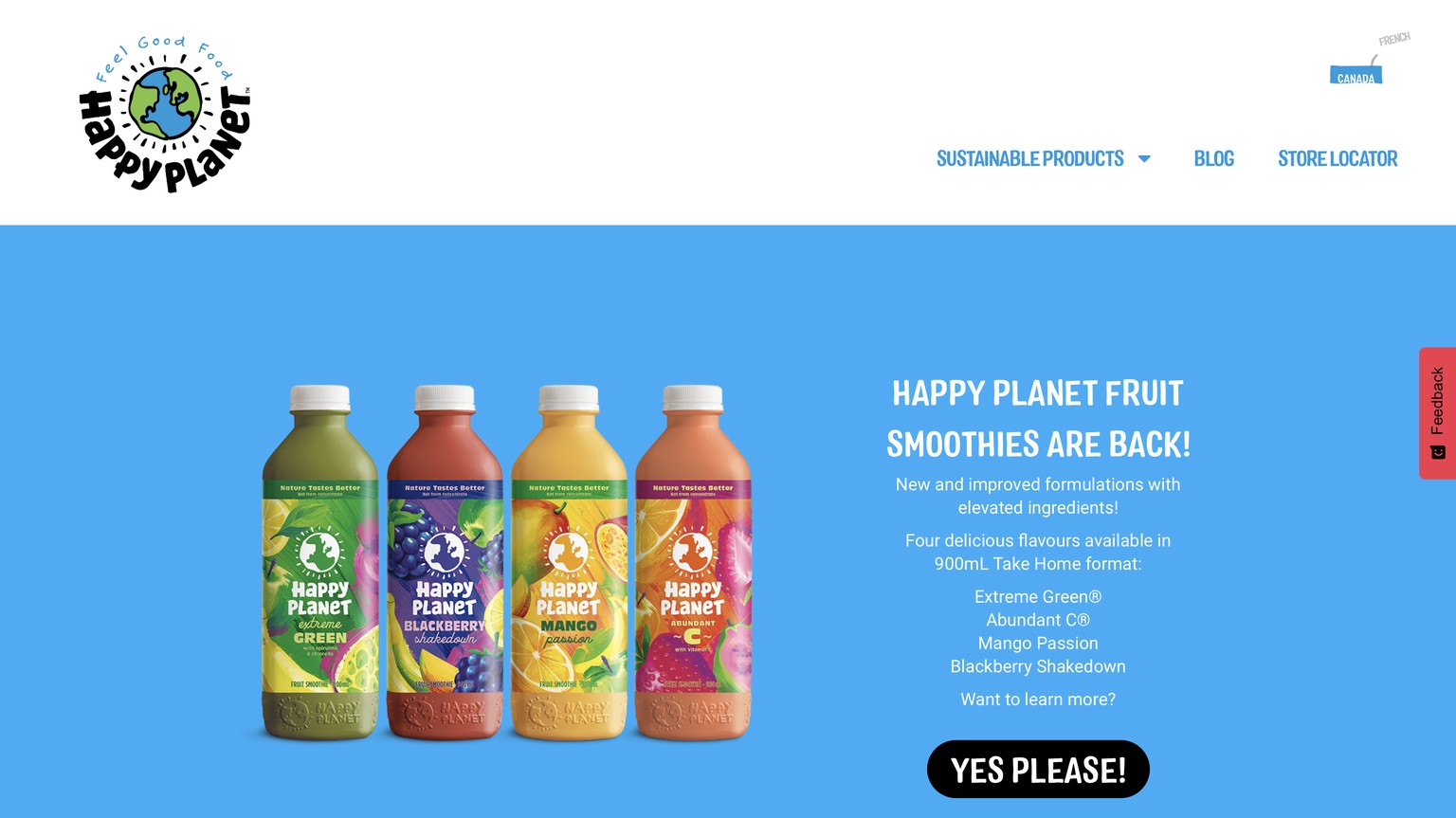
- Hero imagery does the heavy lifting — all three use bold, full-width food photography or video that immediately pulls you in before you read a single word
- Colour tells the brand story — FreeYumm mirrors its packaging colours, Daiya leans into warm gold, Happy Planet owns bright sky-blue; each palette feels intentional and appetite-friendly
- Less is more in the nav — every site limits navigation to 3–4 items max, keeping the focus on the product, not the menu
- Short, punchy CTAs — buttons and callouts are action-oriented and sometimes playful ("YES PLEASE!"), never generic or wordy
- Trust without clutter — certifications, mission statements, and brand values are woven in subtly (badge strips, taglines) rather than taking over the page
- Video and motion earn attention — Daiya's homepage video and FreeYumm's rotating carousel reward a few seconds of watching, making the site feel alive without being overwhelming