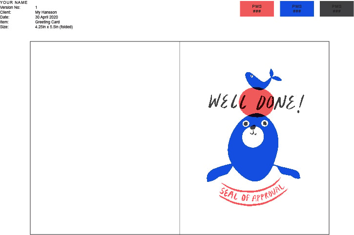
Seal of Approval
Hi Tom and fellow community! Impressed by yet another one of your rad classes - thank you. They’re fun, easy to follow, and I always seem to pick up something new for how to use the programs. After taking just a couple of your classes I already feel so much more comfortable using PS.
My daughter is currently in a ‘I love seals’ phase so here's my letterpress illustration of exactly that.
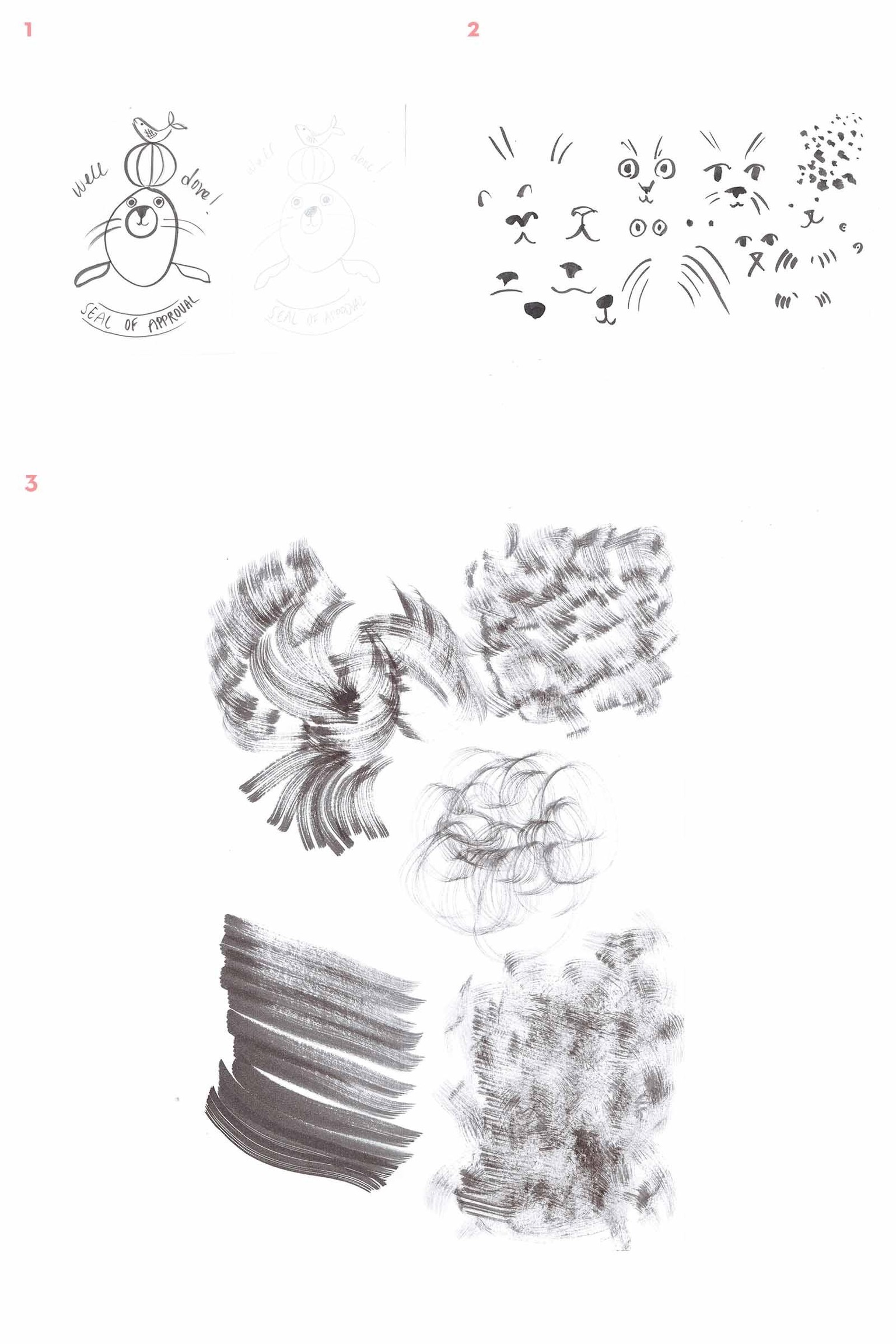
01. Sketch & Inky textures
I made quite a lot of different sketches and textures (not shown) but in the end I kept the artwork pretty simple as it looked a bit messy once I added in all the details.
02. PS Output
It feels a little ‘flat’ and missing the human quality some of the other examples have. I’d love to see how it would look on a more grainy background - does anyone know how this can be done? Is this a filter I add?

03. Proof
Fun to learn something completely new. Thanks for taking the time to teach us this part of the process. It was easy to see the flaws in the design when everything was black. E.g. the right flipper looked too thin compared to the left one and the alignment of the copy was a bit off. I'll take this learning with me to Ps! I'm not sure why the resolution is so crap for this image but there you go...