Play-Place for Autistic Children Style Guide
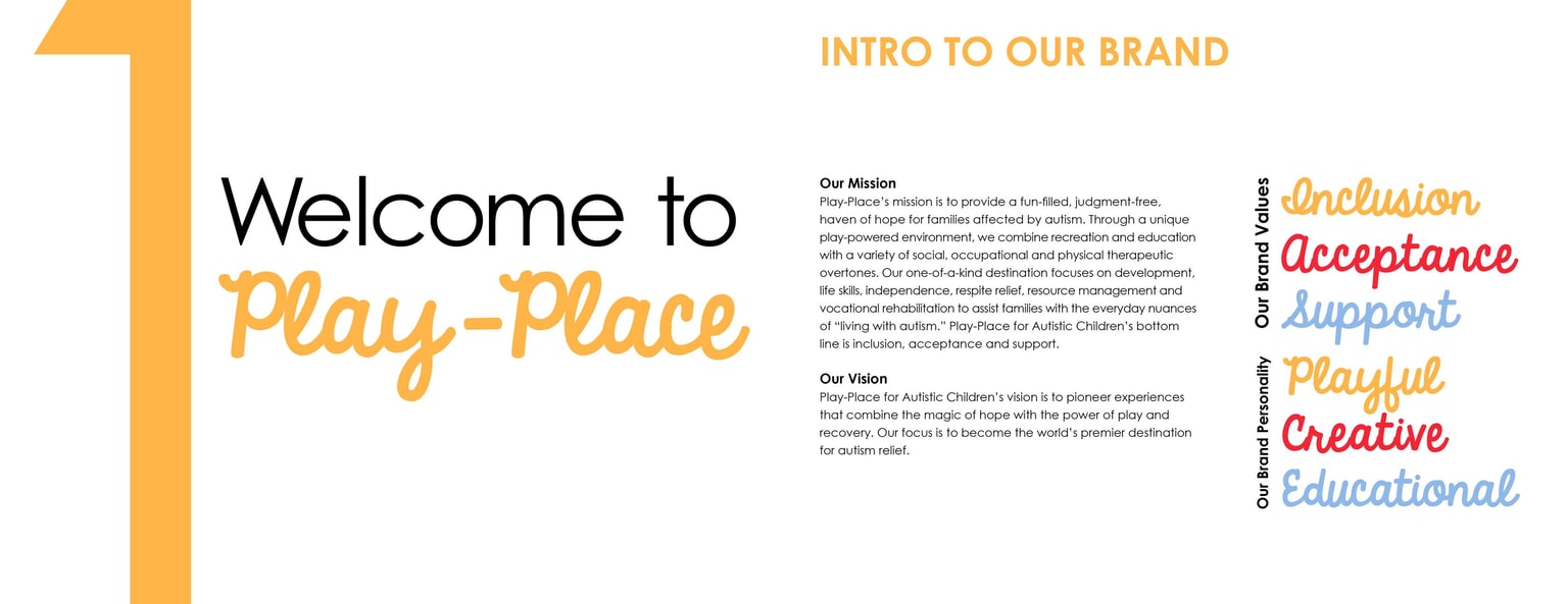
Play-Place for Autistic Children is a 501 c(3) nonprofit located in metro Detroit that is creating a 25,000 square foot facility for children and families affected by autism and other special needs. We have been likened to a mini Disneyland for special needs, and (once we open) will provide an array of programming and activities that include the whole family rather than just the affected individual.
I recently started here in May as a Media Design Specialist. One of the first things I noticed was the inconsistency in design with Play-Place's materials. A style guide is something I know was very much needed here. I wanted to do my research first, before diving in so I spent a few months researching style guides, what I liked and disliked about them, how they were put together, what information to include. I really struggled with it because there are already so many things in place in our branding that are ultimately out of my control.
For our style guide I tried to piece together some of the missing elements and create a "whole" because this wasn't a project I was able to completely do on my own from scratch. I found it a lot more challenging than if I were able to start it from scratch.
This is my second attempt at a style guide, so if you have any feedback I would greatly appreciate it!
Has anyone else been in a simialr situation, having to create a style guide using elements that are already in place? If so, how did you handle that project? What steps did you take?