Pentagram Mandalas
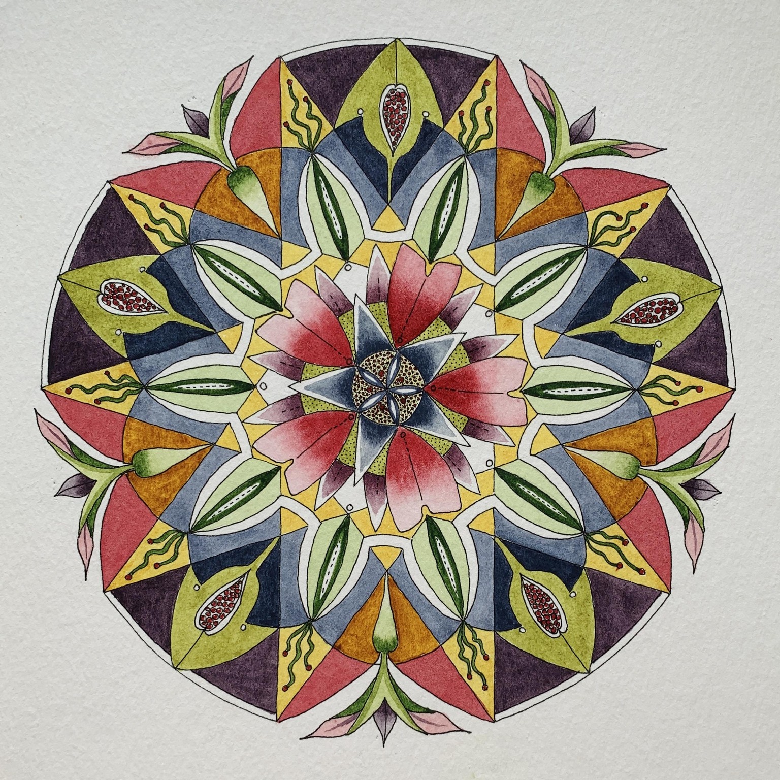
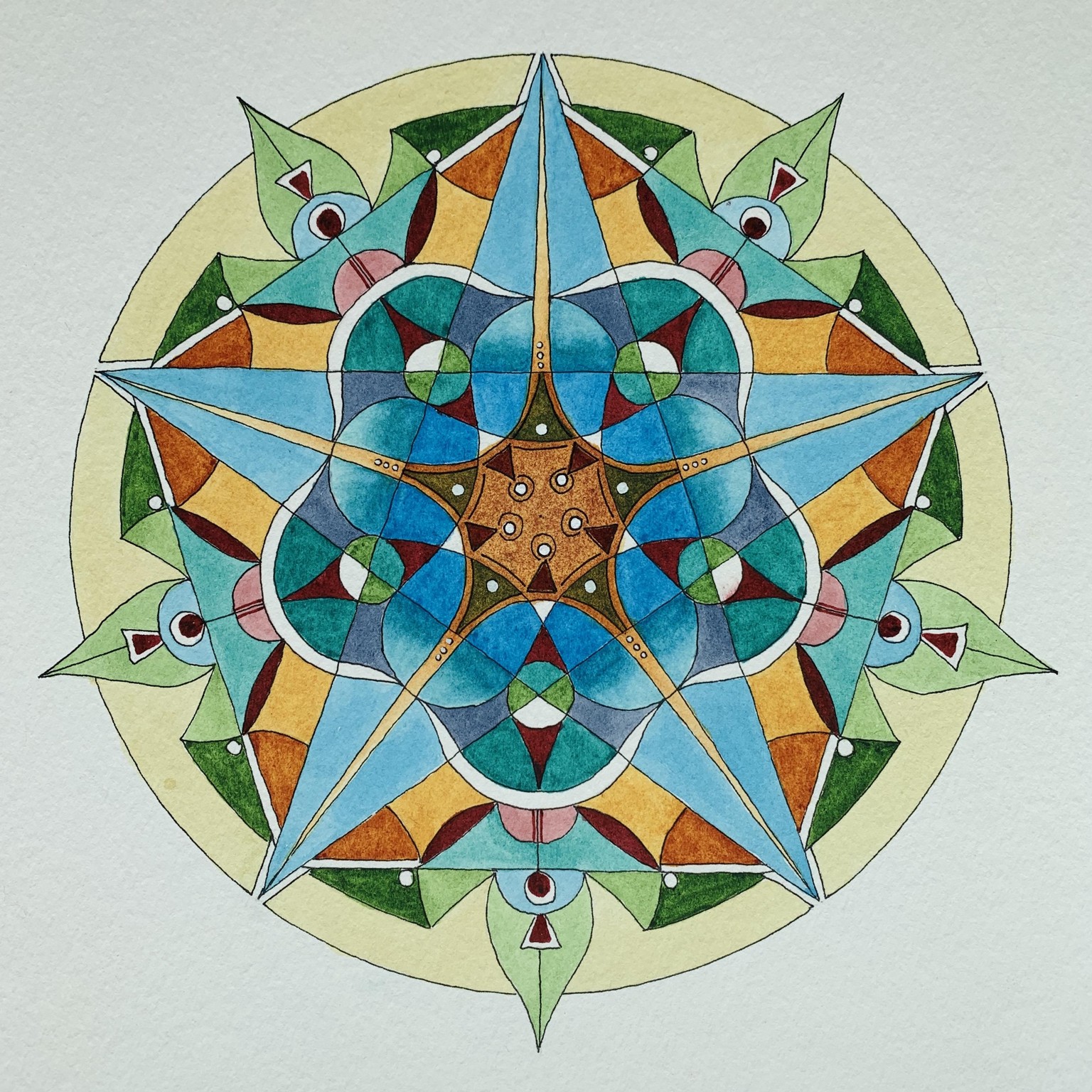
08062020: Decagram 4 in this series
Not sure how/why I am stuck on 10 but I seem to be...although I think I will drop it back to eight for the next one. What did I learn in this project?
- Don’t choose a palette late in the day of a storm when the electric is out. The colors looked a lot more muted under those circumstance! I ended up making colors about the same value in a lot of places and had to go back in the end and take color off in enough places to get it to work.
- I combined the other ink mandala class with much more detail in it, with the mandala exercise in this class. Actually, it wasn’t a conscious decision to do, it was the influence that happened from doing the others. This was fine, but it was way more challenging to not only paint, but to harmonize the whole design.
- I wanted to use gray in the design and it complicated things a lot but I now have a better grasp on it.
- The “fish scale” in the points ended up (for me) not particularly working with the design. I had painted them in a more varied way to start with and had to tone it down as it was attracting so much attention. If I was going to use them again, I think I would choose to think about how they integrated with the design more.
I think I need to take another pic, this doesn’t show the color very well.
The title of this piece could be: Sunny Raspberry Delight
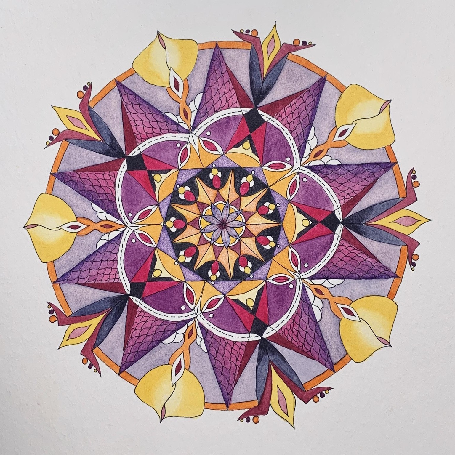
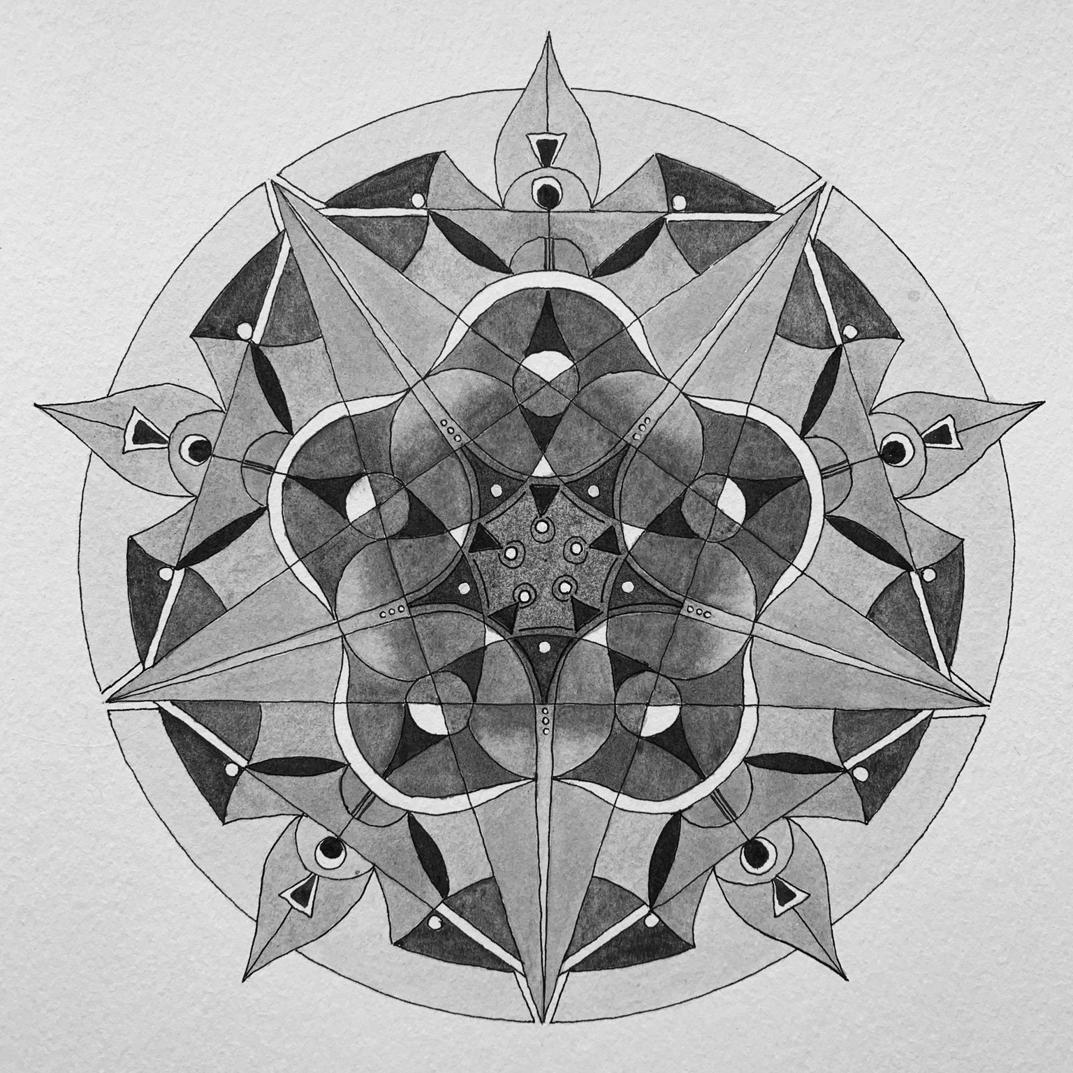
07112020: Pentagram 3
I am either done or almost done with my next pentagram. I actually made two pentagrams - what is the name for ten points? Anyway, I am posting the gray scale of what I have right now. I did this as a check on how the values were doing. My eyes keep finding the two different pentagrams and then also the straight lines across that make a rectangular shape with two points. Will post the color one once I get “sign off” from the need to sleep on it...It is mostly about the “carrot” shape that is white... : )
Side note: I found another mandala class on Skillshare quite by accident last night. Done in B&W with mostly very thin markers - like Pigma Micron. A totally different approach to the design. More repetitive with much smaller shapes based on nature. I was in the design process of this mandala and found the smaller details crept into this design. It meant some pretty careful painting and fun choices of color/value to make it coherent.
Color scheme: Same Nickel Quin gold, Manganese hue, Alizarin Crimson on Strathmore paper, 500 series.
Made a few minor changes- here is the color version.
07082020: Pentagram 2
Same watercolors with a slightly different choice of colors to work with. Mostly another #6 scheme with changes to the colors - like the red which is a little neutralized. I also added a small amount of a light blue/gray.
It is amazing how much I learn with each of these, the challenges that arise during painting in color and design. In this one, I did the same thing that I did the last time: I started with a dark value in the center! I had to go back and fix what looked fine until the design developed. So I did go into “fix the center mode” but was hampered by the fact that the Quin gold is a staining color and I couldn’t lighten it all that much.
Pentagrams are a whole different animal than hexagrams. Wow, that was profound (not). : )
I find that some of the things I used regularly in the hexagrams with an even number of spaces, just don’t work with the odd number. It means discovering a new language of color. Pentagrams also have much more of a kaleidoscope feel to them which I find intriguing...it makes me want to have more small spaces to have that happen but it also makes it more challenging.
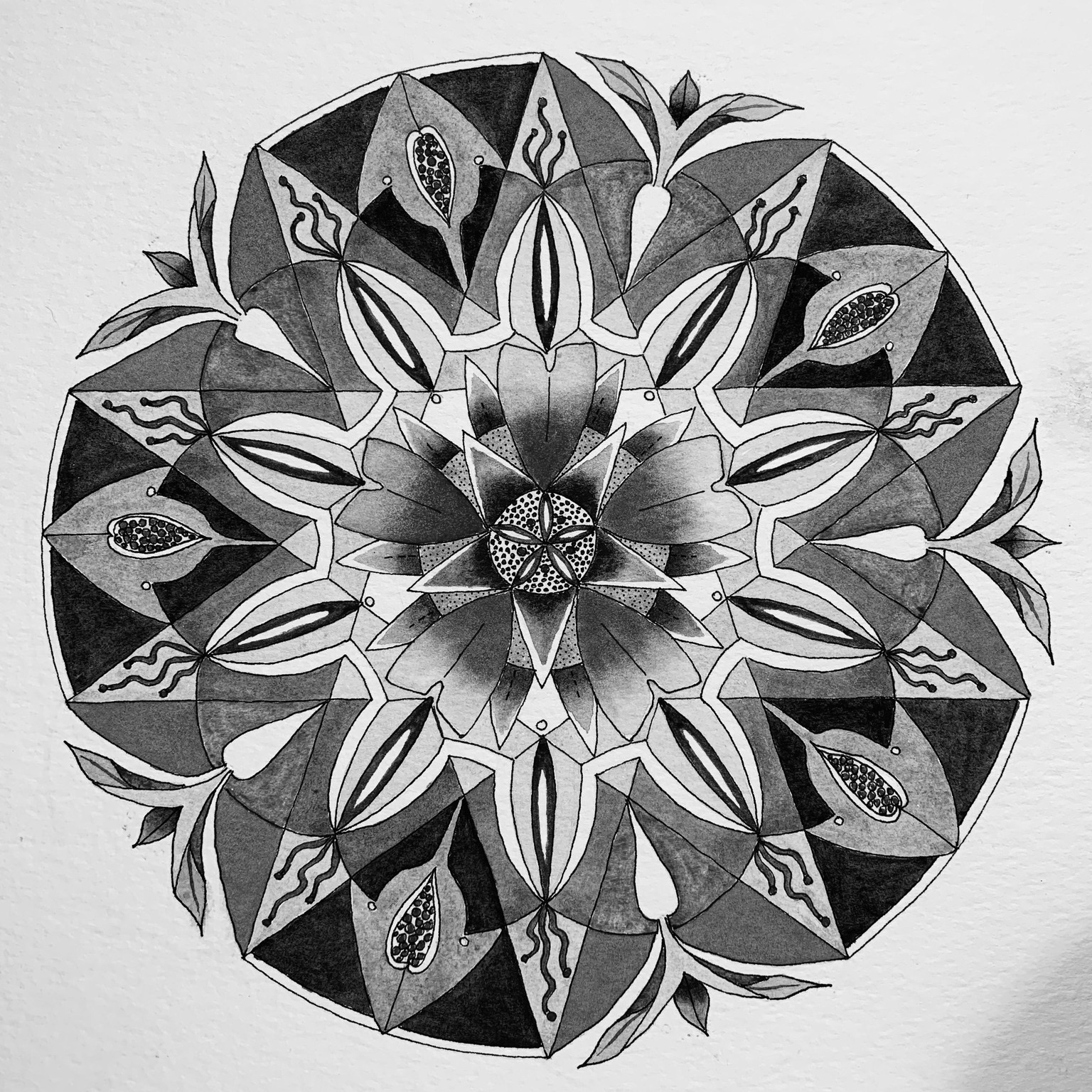
I am including a gray scale image. I am thinking about doing a gray scale pentagram.
After uploading, I am struck by how different the first and second mandalas feel!
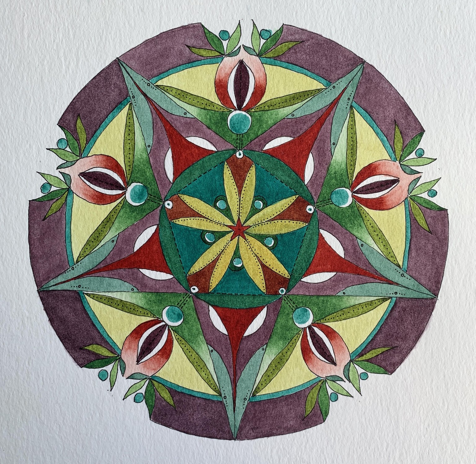
07052020: Pentagram 1
My first pentagram mandala...I have used the same palette of colors Chris, Vesta and I have been talking about with the exception that I am using Nickel Quin Gold (M Graham) along with Alizarin Crimson (DS) and Manganese Hue (DS). Additionally, I played the color game that Chris has on her website...well, at least partially, to pick my color scheme for the mandala. I used the 3 analogous colors with split complements (#6). So yellow green, green and blue green with red orange and red violet.
This turned out to be harder than I thought it would be and ironically I used the blue green in the center and then when I had so much trouble balancing out the saturation I used in the center, I remembered that Chris had used a very similar color in the background of the demo. Subliminal influence!
I made the mistake (I think this is what made it harder to balance the mandala) of using very saturated/dark aqua as the first part I painted. In retrospect, it would have been better to leave the center less saturated and add to the color with another layer once I knew that is what was needed.
The other thing that continues to bug me on and off is that I find granulated colors hard to paint evenly - pulling the puddle well helps but I get drawn into trying to make it more even and then everything goes to heck in a handbag. In this case the outer rim in red violet was painted over with water after dry to redistribute the paint and in some cases remove areas where the paint was thicker. Can you hear me grumbling?