Namaste
My sketch: I decided to use a lowercase n and e because they flowed better within this lockup. and the rounded As mimics their shapes.
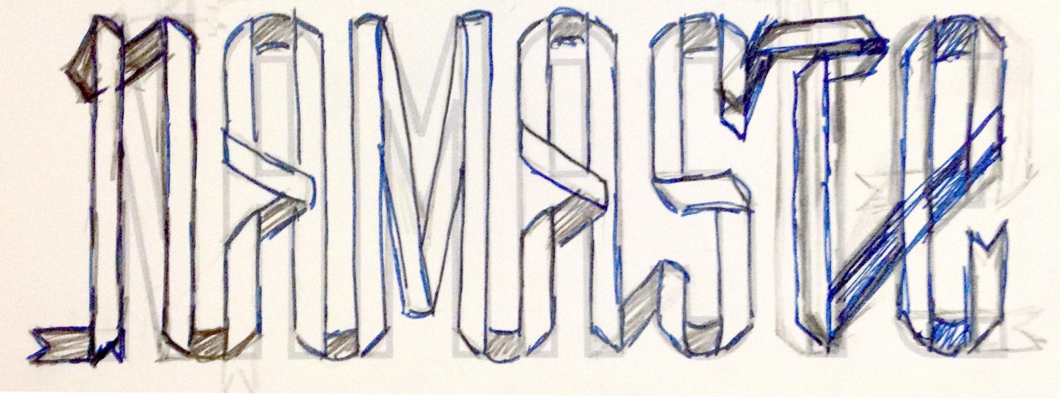
I think I might need to reconsider the A crossbars. And I think I might try connecting the T from the lower crossbar first before the top one which would mean carrying the vertical over both. Worth looking at the options. I did try horizontal A crossbars matching the T but the diagonals look more lively.
Overall I think I need to soften the turns in the ribbon so they are more curved, less flat.
Looking forward to the next step, because I don't usually work in Photoshop so it should be fun.
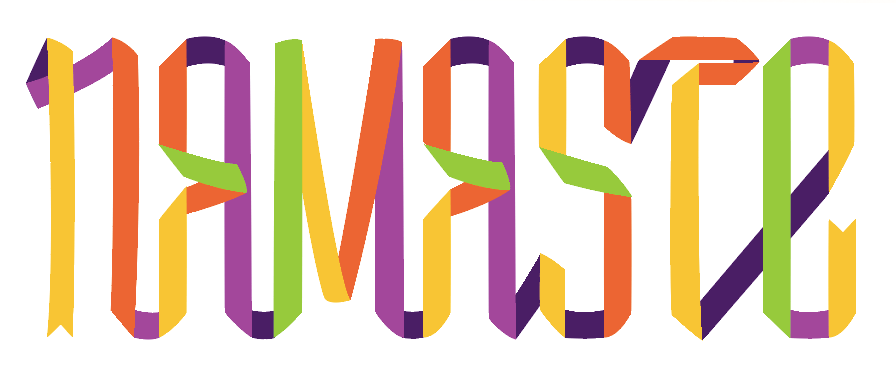
Updated lettering. I narrowed the letters and opened up the letterspacing. I condensed the A crossbars. I redid the T and overall rounded the ribbon turns. I am happier with it now and I think it is ready to go into Photoshop for finishing. Unless anyone has any suggestions.
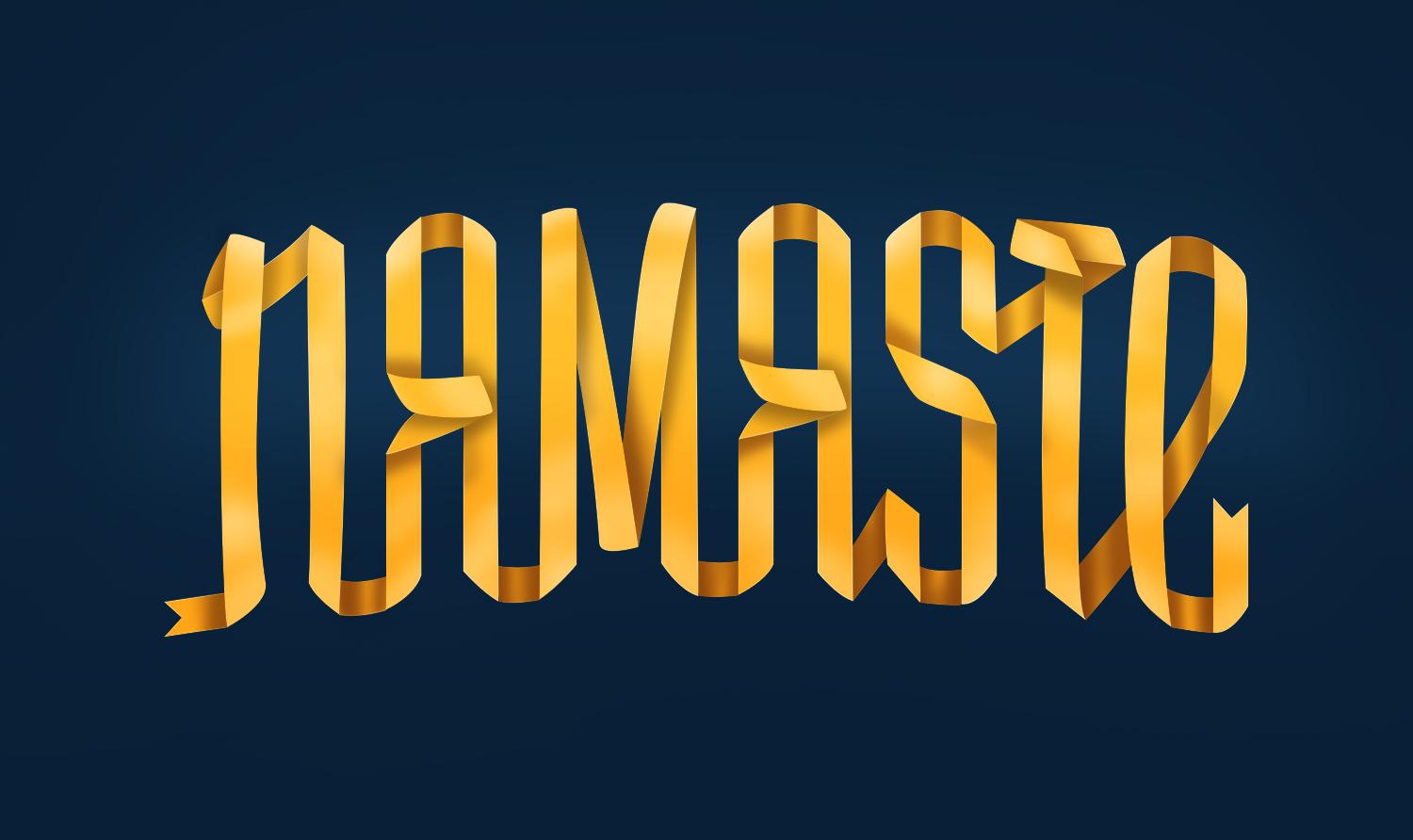
Here is the photoshopped version. I like it.
THANKS Luke Lucas for a well designed class.