My three logos
Hey there!
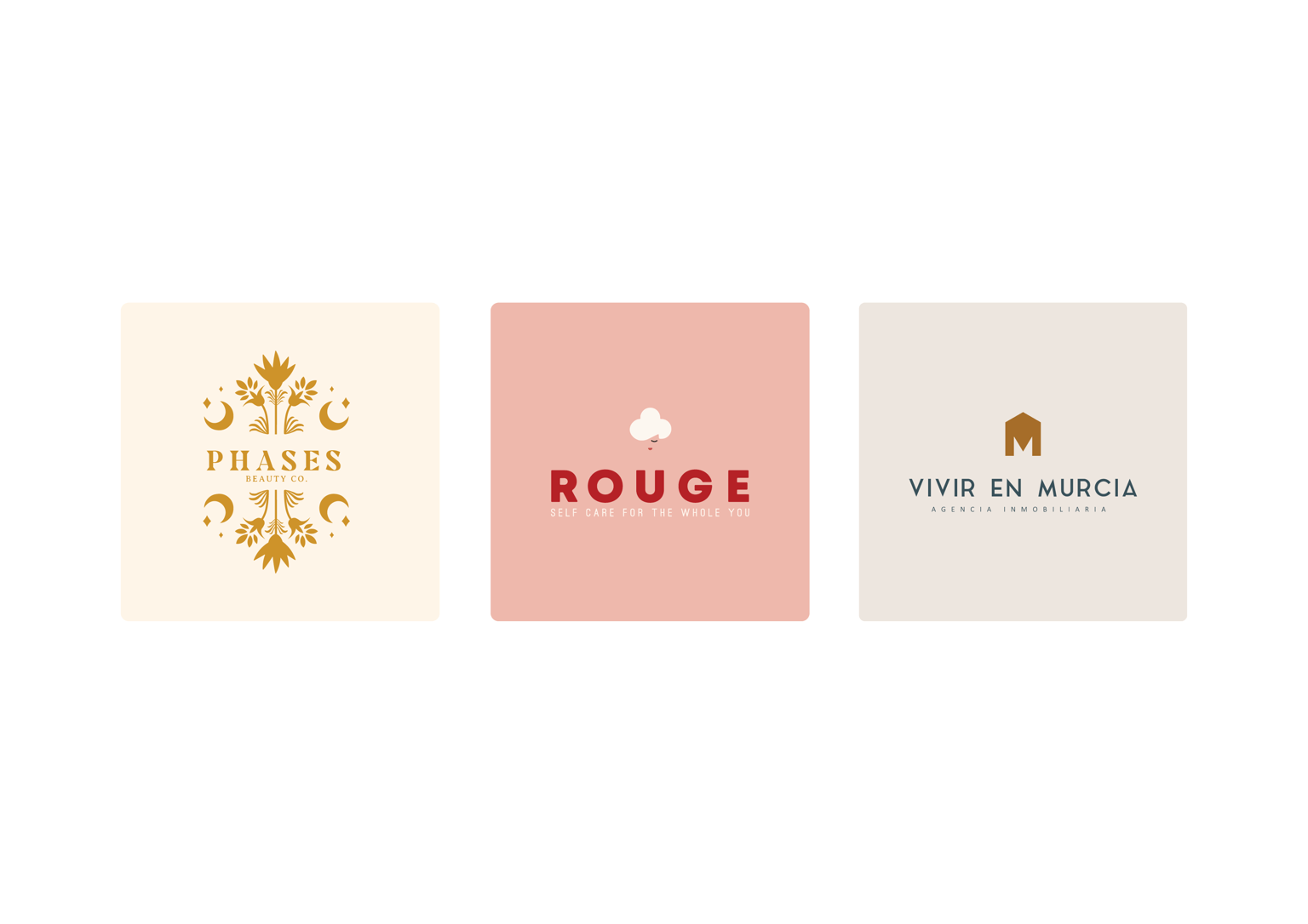
I am a beginner graphic designer and these are my three logos I picked for this lesson and I already can tell that I have chronic disbalance in font weights and some of the taglines I can't even read properly.
1. PHASES is a beauty salon.
- not sure about font choice here,
- love the color, but I am afraid it's my personal preference and has nothing to do with a brand, so I guess that should be changed as well.
2. ROUGE is a brand that sells organic cotton hygiene products for women (tampons, panty liners, etc.)
- I like this one a lot, but it's too much of a contrast between fonts I guess.
3. VIVIR EN MURCIA is a real estate agency in Spain, Murcia region.
- I like the simplicity of this one, but again - the tagline is too small and light.
Any comments / recommendations?
Thank you so much!