Moody Practice Piece
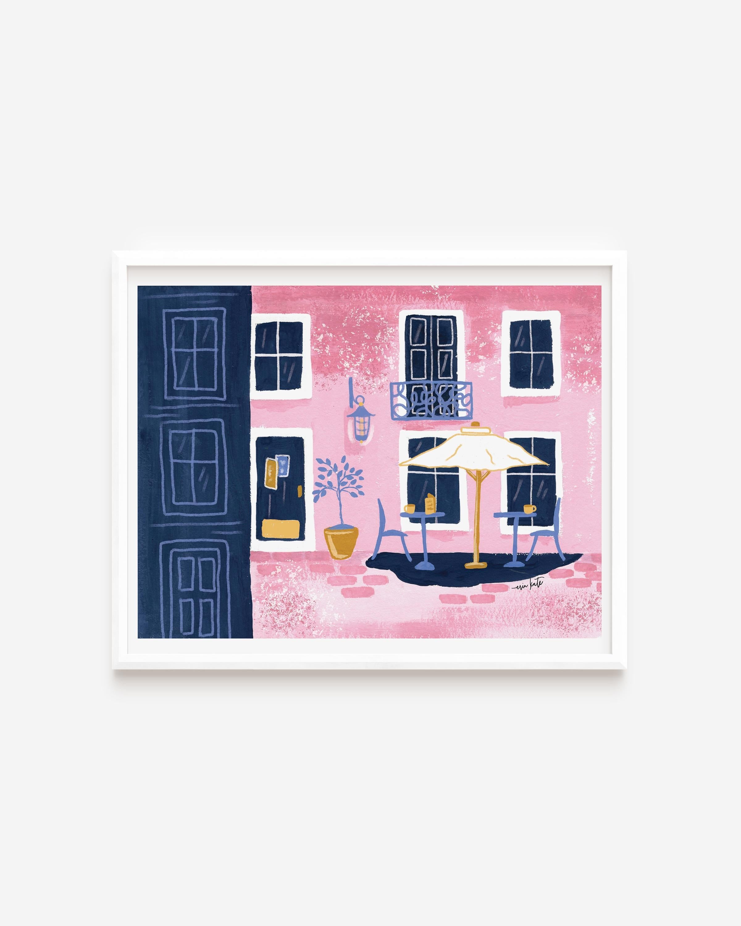
My work tends to be mostly buildings and urban areas, so I wanted to try and bring more of the contrast and moody drama of Mary's work into my own.
I think the darker dry brushing helped, but I think I missed the mark on the colors here- something feels off and flat.
Should the road have been blue for more of a "moody" element? Or should the dry brushing have been blue/payne's grey for more contrast on buildings and road?
Loved the class, will try the small world project next!
This project is gouache on 6x8" bamboo mixed media.