Moodboard for an ice cream store
Hi everyone! First of all, thank you Courtney for this class! I had to face the challenge of creating a moodboard for the first time in my life, and you class was exactly what I needed! I didn’t have much time for it, but I want to share it here cause any feedback will be very much appreciated, and I’m sure it’ll help me next time I have to create a new moodboard (which is kind of addictive!). Thank you all in advance!
So, the assignment was to create a moodboard for a class project. The project is to design a logo for an ice cream company located in New York, and their target audience are mainly teenagers. The keywords (or words that could describe the tone) were given to us, and they are translated as HAPPINESS, FRESH, CASUAL, OPTIMISTIC, SUMMER and MISCHIEVOUS (the original assignment is in Spanish, so I did my best to translate it into English. Sorry if something sounds a bit odd!)
First of all, I took a lot at their competence. The most ‘trendy’ ice cream shops in NYC have logos with a minimal design, because they are targeting a different kind of audience. This firm is looking for something happy, fun, kind of breaking the rules. So I’ll try to explain what I focused on and how I tried to represent each keyword in the moodboard. Take next image as an example of the idea I had in mind (Summa Vibes is the name of the store).
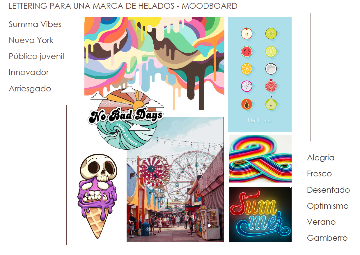
I wanted to come up with something colorful, to represent the words Happiness and Optimistic. Fruits represent fresh (at least in the context of an ice cream shop). For a casual and mischievous tone, I looked for references in the world of graffiti, both illustration and lettering. For summer, I used pictures from Luna Park in Coney Island, (an amusement park also falls into other categories, such as Happiness). Finally, neon logos also make me think of NY, so I wanted to include them in the moodboard too, although the final logo may not be a neon sign.
I gather roughly 150 images, and since the assignment was to come up with 3-4 different moodboards, I decided to arrange them by colors. Each moodboard has the elements described in the previous paragraph. Here they are!
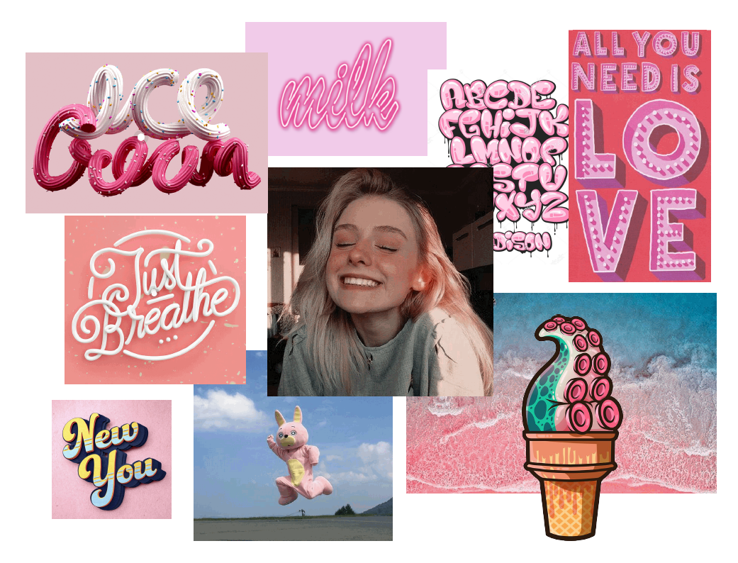
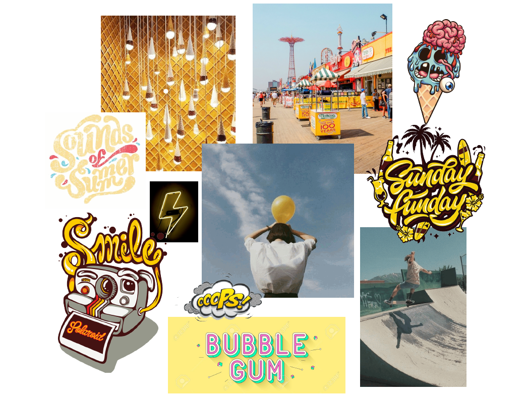
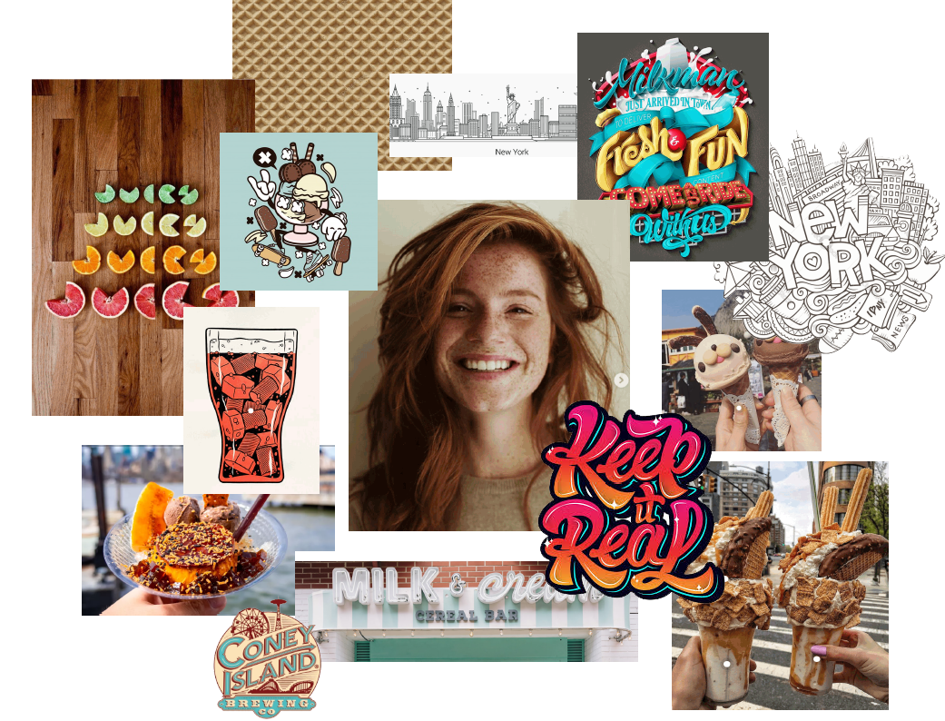
(Last one is my favourite)
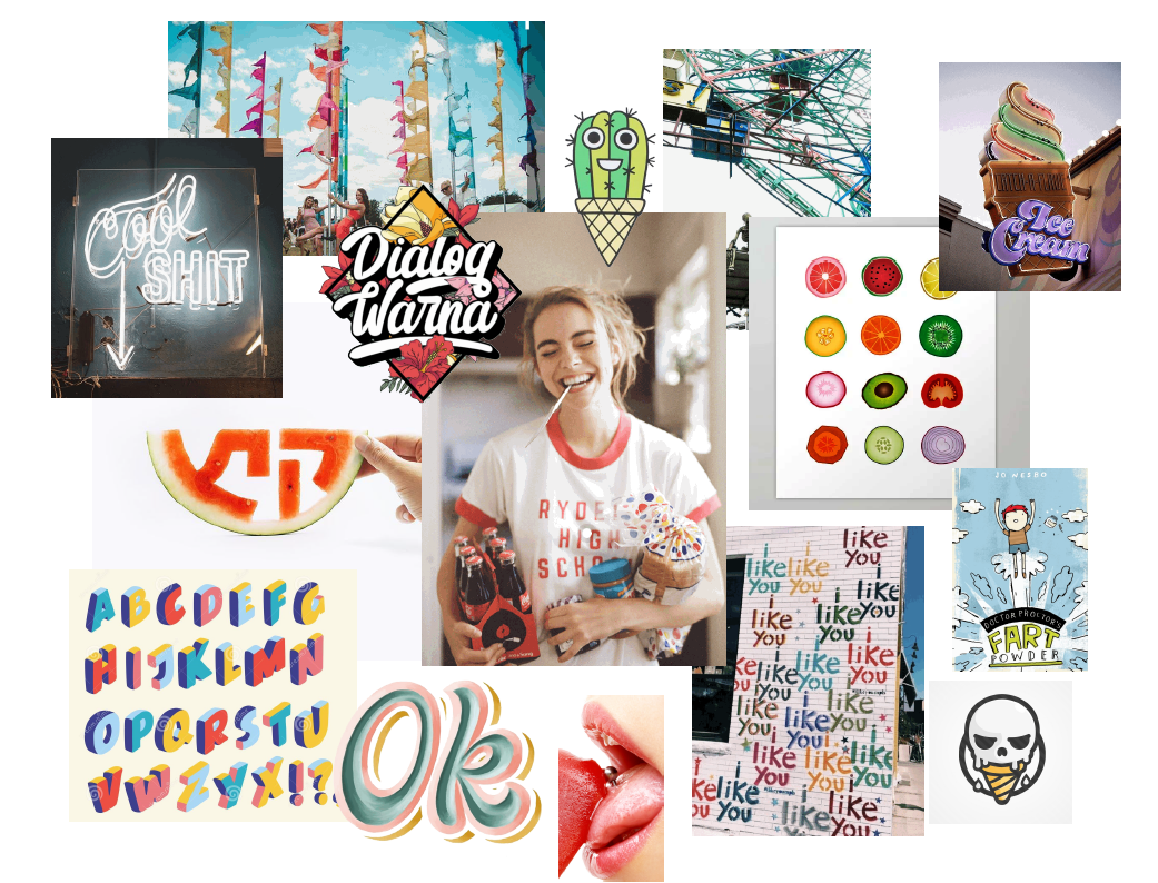
After comparing them with other students' moodboards (it’s a lettering class, by the way), I think I should have tried to incorporate different lettering references, such as interlock or Psychedelic letters, which could also work with the tone this brand is looking for. I’m also aware that there’s a lack of textures, but all I could think of was the pattern of the ice cream cone!
I’d love to know what you think about them :) Do you think they represent the tone? What kind of images would you have chosen for the keywords provided?
Again, thanks a lot! And congratulations Courtney, I’ll definitely check your other classes!