Memory
I actually did some prints using masking techniques a few months ago for my stationery company (you can see examples of some of them here in the Etsy shop - F As In Frank Paper Goods Co.)
But I've never heard of the method used in the first few videos here, so I'm planning to do another version testing out that technique with a more complicated photo and adding some depth.
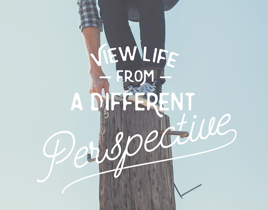
This is an example of one of the ones I did with gradient masks to fade the lettering out and create a bit of shading on the letters.
UPDATE - June 13 -
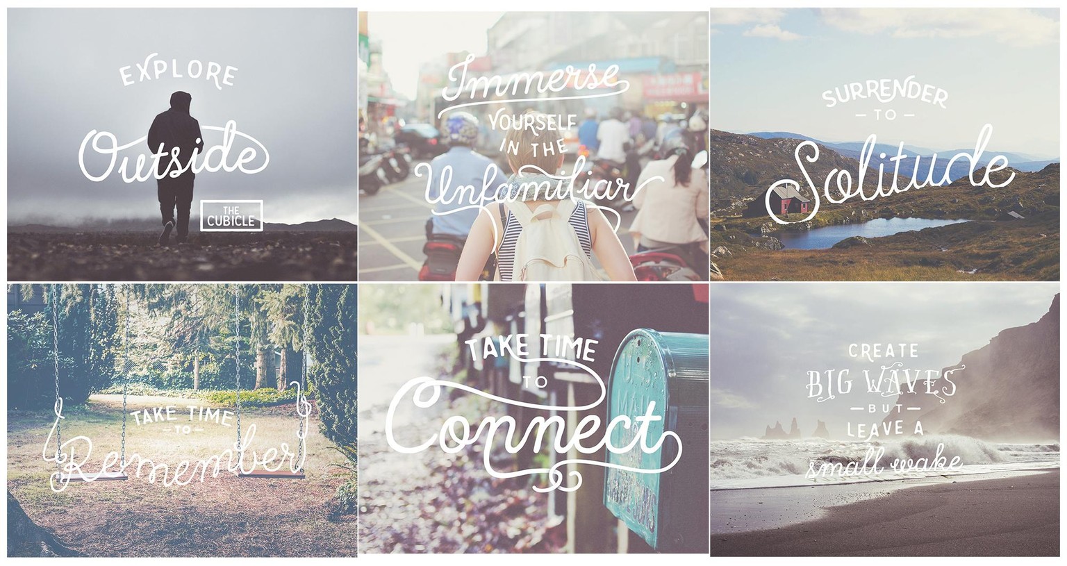
Thanks everyone for your likes and nice comments! I decided to post the rest of my series that I created with masks a while ago (before taking this class). All of these started out with fonts that I then went over with my own handwriting and vectorized so that the swirls of the letters interacted with the characters and scene.
In order to use the Color Range tool taught in this class, I did a new project using a photo from Unsplash and a quote from 'Eternal Sunshine'.
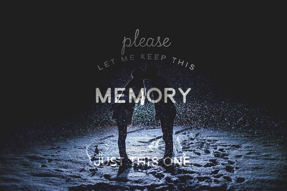
It didn't seem to work that well, but I think it's because there's so much black maybe? I still liked the way it turned out, so I added a bit of a glow and played with the text layers to get them to look like they were caught in the moonlight with the couple.
I'll try it again with something that has a bit more variation in colour and see how that goes.
Update: June 27
One more attempt. This time i tried to get the woodgrain that is the same colour as the coffee to stand out through the letters. Then I added a bit of distressing texture.