Lemonade +
#1, 19-12-13
Hi :)
In Mary Kate's first class I chose the phrase 'when life gives you lemons, make lemonade'. You can find my project here.
Here's my final inked sketch:
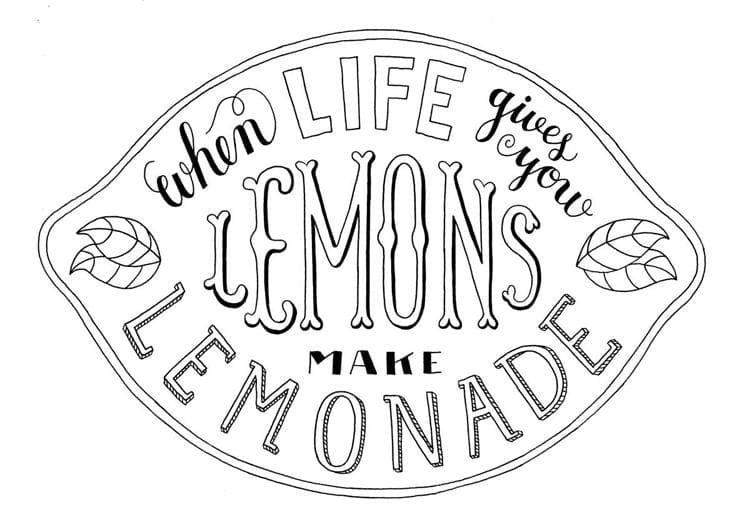
I made a second layer sketch before (of the lemonade drop shadow) but I used different paper than I used for my final sketch. So I have to retrace that one again on the right kind of paper - and then I will start digitizing!
#2, 07-01-14
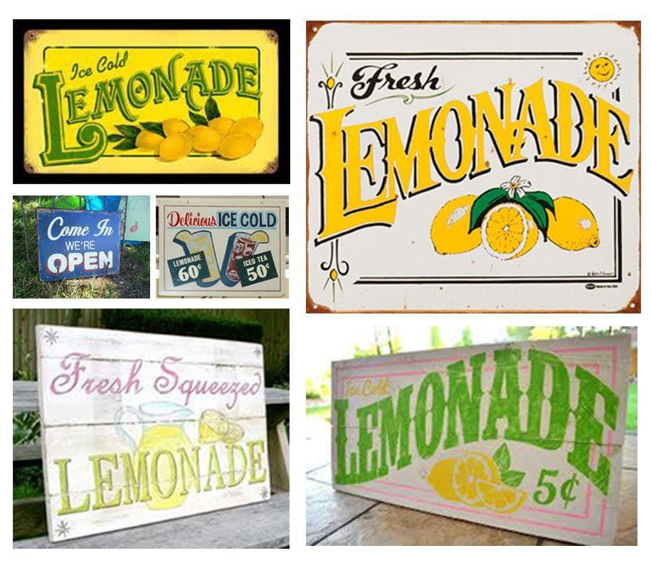
Back again! Here are some inspiration images I used when I picked the phrase in the first class. Now that I see them again, I notice that only few colours are used in every sign. I don't really like the feeling of these colours, to be fair.
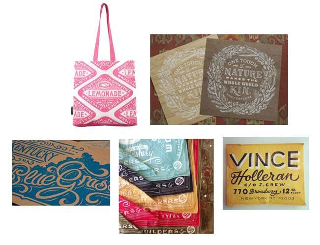
I focussed more on composition than colour in the images above, so I picked a few new ones where I like how the colours are used.
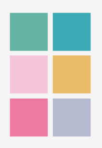
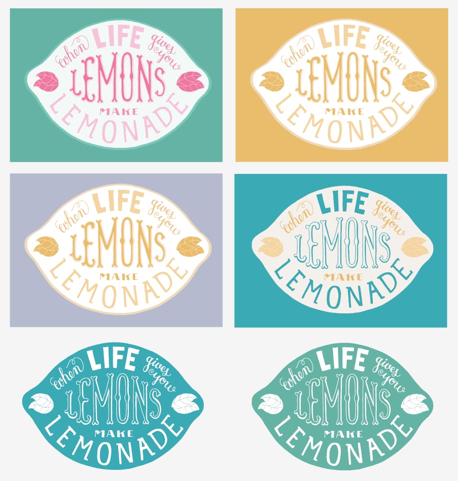
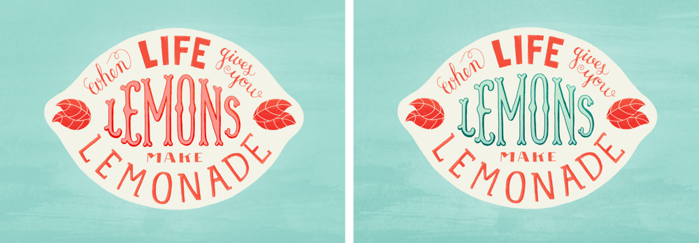
I already tried a lot of different colour options (just exploring in Illustrator), and I think that with my design, when I use more than 3 colours, it just looks too busy. That's why I will focus on only 1 to 3 colours instead, maybe some shades of the same colour.
#3, 09-01-14
I only want to use a few colours, so I picked some I like from the moodboard and experimented with them.
Here is what I tried so far. I think I like the combination of 2 colours the most.. They are all really simple, maybe too simple? Any suggestions? :)
#4, 22-01-14
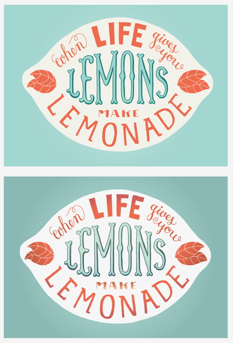
Thanks for the feedback everybody, it's really helpful! I tried more different colour combinations since the last time, and tried to become more familiar with Illustrator, it takes some time.. I think because I didn't keep in mind from the start what colours I could use and how I would use them, it became more difficult to give this illustration a bunch of different colours and still keep it balanced.
I'm quite satisfied with the following two images.. The bottom one may have a bit too much gradients, haha. I lost control while figuring out Illustrator ;)
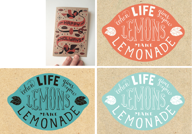
I also thought more about the presentation of my illustration. The colours above could work well just on white paper as a poster, but I would also love to print this on a greeting card and maybe on cotton tote bags. I came across this cardboard greeting card (image below, top left).
I like the warm feel it has. I think it might work well with my quote. I thought of the cardboard colour as an extra colour, and I tried some options. This is what came out!
#5, 04-02-14
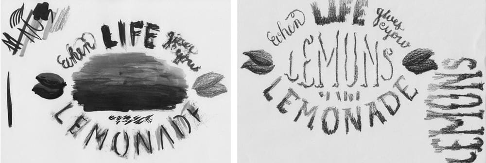
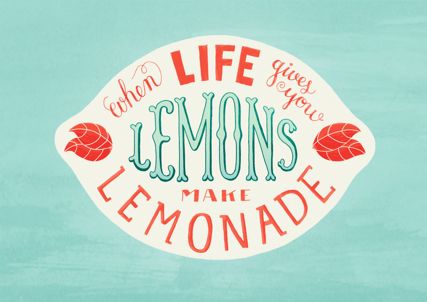
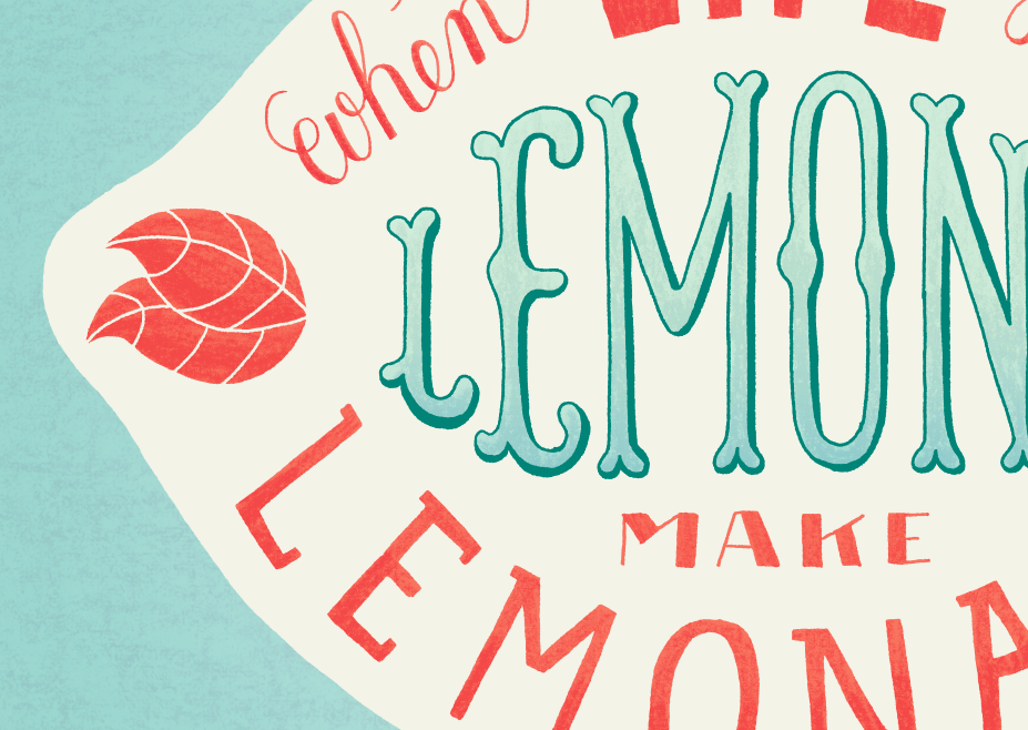
Hi! I tried a few colour combinations with yellow, but they all just feel too obvious, too lemonny. So I decided to stick with the orange/blue one (at least, for now), and move on to the textures. I used crayons and ink. I applied the inky one on my letters. Feels a bit sleek now, not sure if it fits with my quote. I'm going to try a rougher version too.
#6, 06-02-14
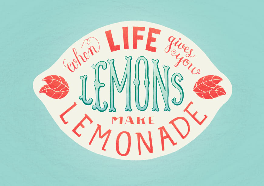
And here's the other version!
Thanks for sharing your knowledge, Mary Kate! I also really appreciate the feedback that everybody gave. I still have to experiment a lot with textures and colours, but now I have a solid basis to work from! :)
#6, 11-03-2014
Available as a giclee print on Hahnemuhle Museum Etching paper, in my Etsy shop!
Thanks for the kind words everybody :)