LC Monogram
Hello everyone! Will, thank you for this very interesting class! I love the way you teach: your explanation is quite concise.
I'm participating in the "2 Weeks. 1 Monogram" Challenge (Deadlines are my friend).
The letters for my monogram are L and C: Those are initials of my husband, a designer and tattoo artist. We are thinking to put the monogram on his new business card. I hope I can create a convincing piece in two weeks!
------------------------------------------------------------------------------------------------------------------------
04 August 2015
PART 1: INSPIRATION - moodboards and photo hunt pictures
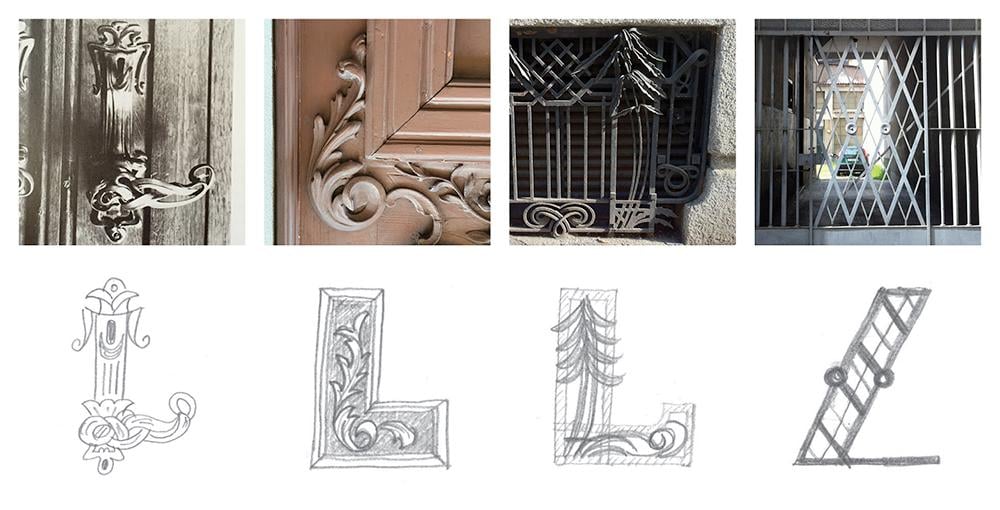
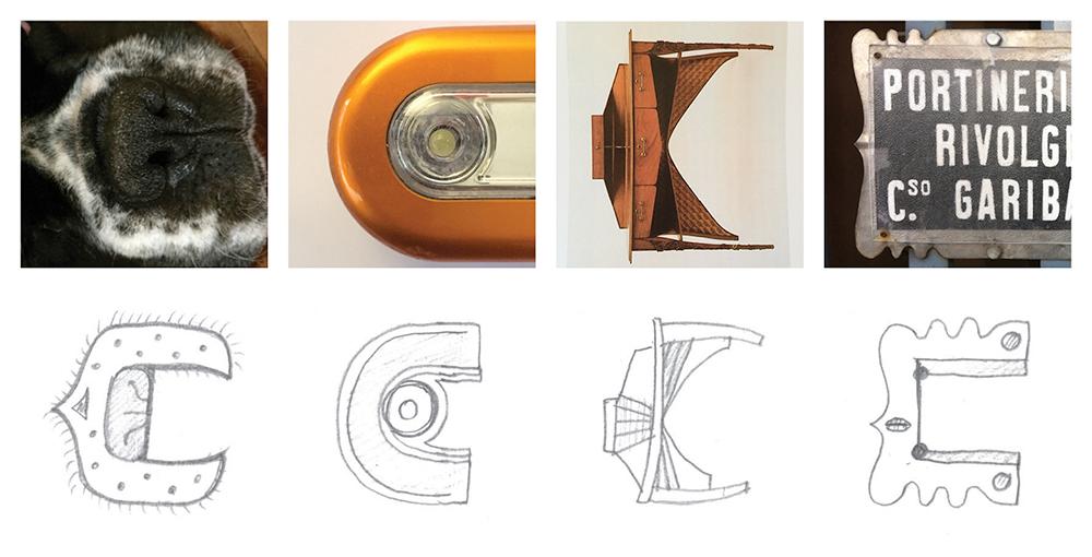
MOODBOARDS: L/C
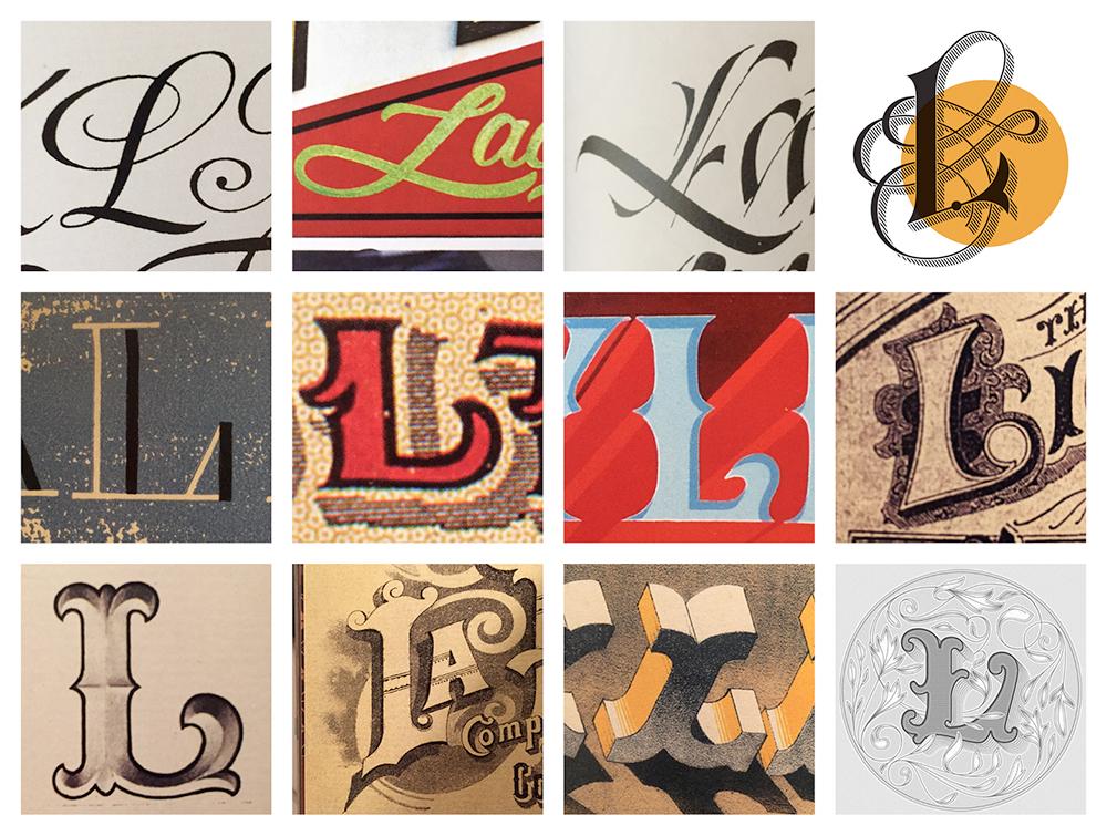
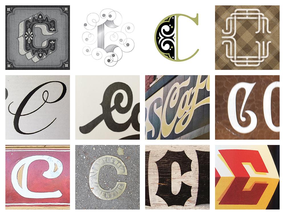
PHOTO HUNT PICTURES & SKETCHES: I looked for references at home as well.
09 August 2015
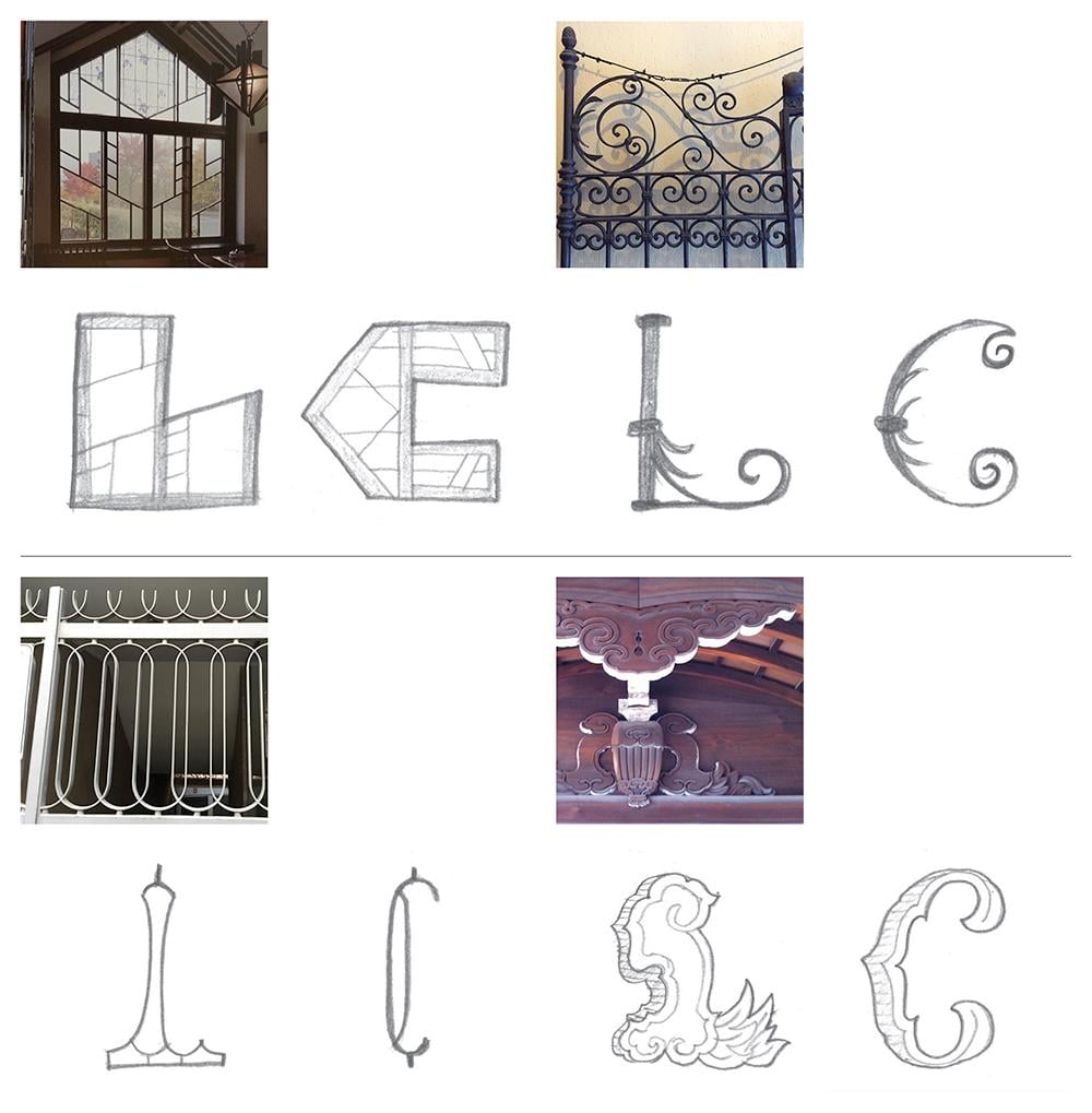
PART 2: IDEATION - concept and sketch
For this project, I want to create something clean and bold/dynamic in script, blackletter-inspired, or geometric style. Here are my early sketches:
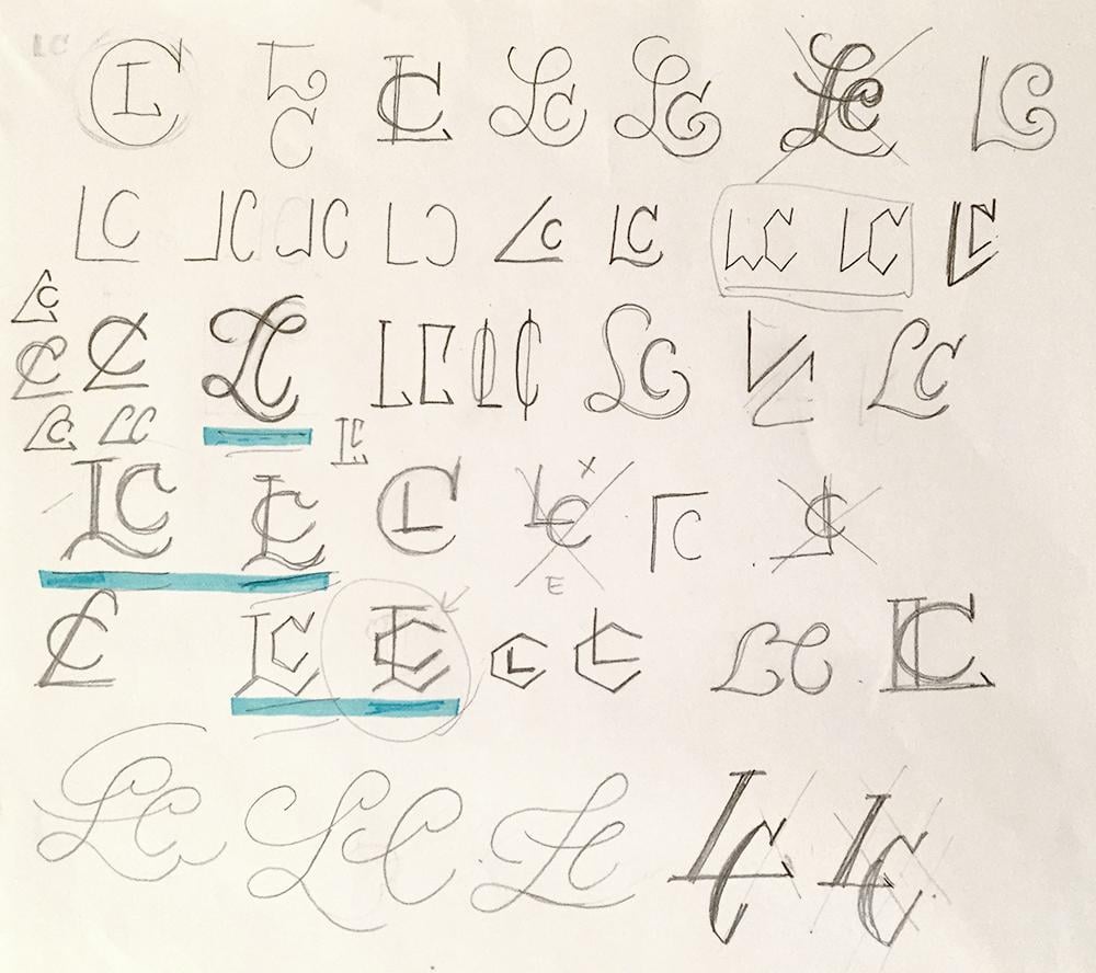
As I mentioned at the beginning, this monogram is for my husband, Luca. So I asked him which ones he likes the most (marked with blue lines), and I went on further development as follows:
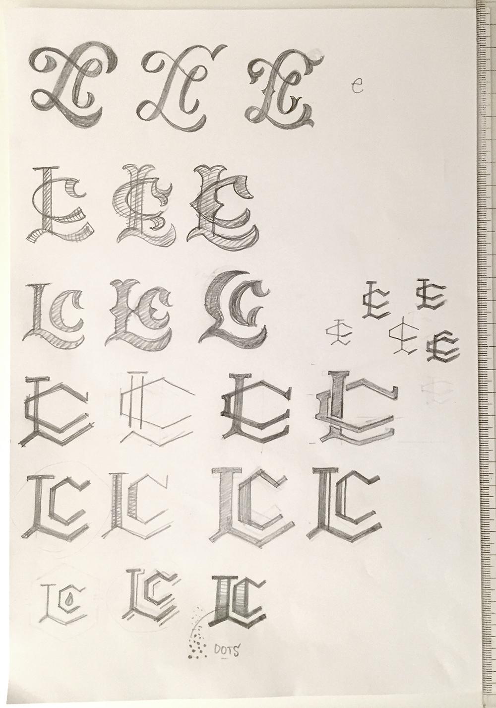
Script piece turned out to be more like “L” and “e”, and blackletter-inspired piece simply didn’t convinced him. On the other hand, considering his passion for electronic/industrial music and love for helvetica design, the geometric piece are the perfect match. Thus, I kept on working the geometric piece with crossed “L” and “C”.
I put some space between “L” and “C” so that they look like “crossed” not just “layered”, and more dynamic. Now I’m not sure if it works well, I’m kind of starting to see a “T”... I’ll try some more to make it work, or I’ll go back to the original, without space.
In the meantime, comments and feedbacks are greatly appreciated!
15 August 2015
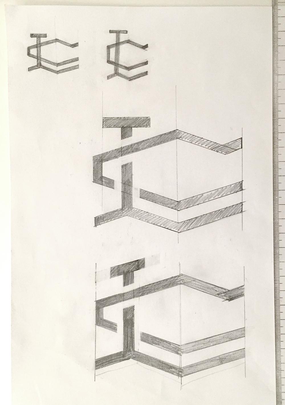
PART 3: EXECUTION - refined sketch, digitization, and final monogram
SKETCH - Considering the feedback/suggestion from Will, I worked on some more sketches.
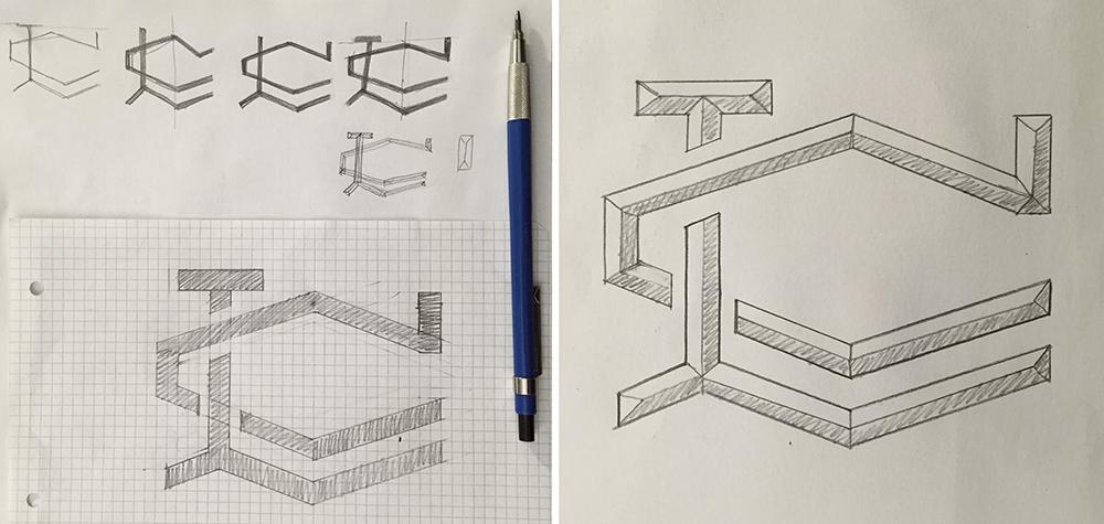
Here is my refined sketch:
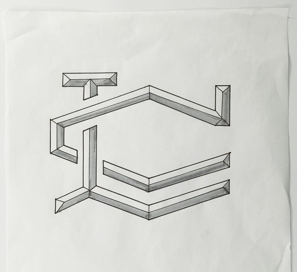
DIGITIZING - My process is as follows.
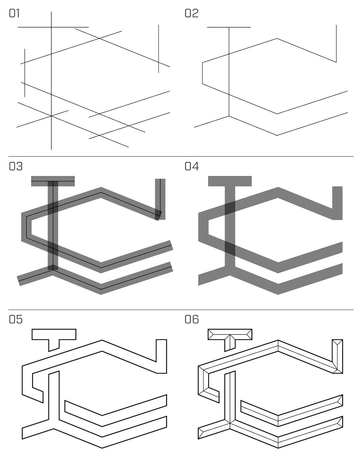
- 01/02: Draw strokes based on final sketch
- 03: Add thickness
- 04/05: Outline Stroke and Clean up
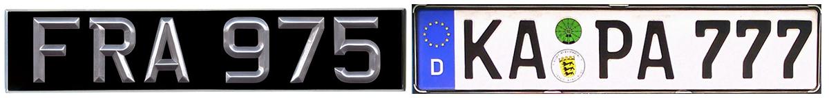
- 06: Added inside lines to give a emboss look like UK vintage number plate*
*By the way, I love number plates and their typefaces! Everywhere I go, I always check them. My favorites so far are UK vintage plate and German plate.
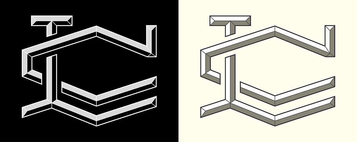
FINAL PIECE
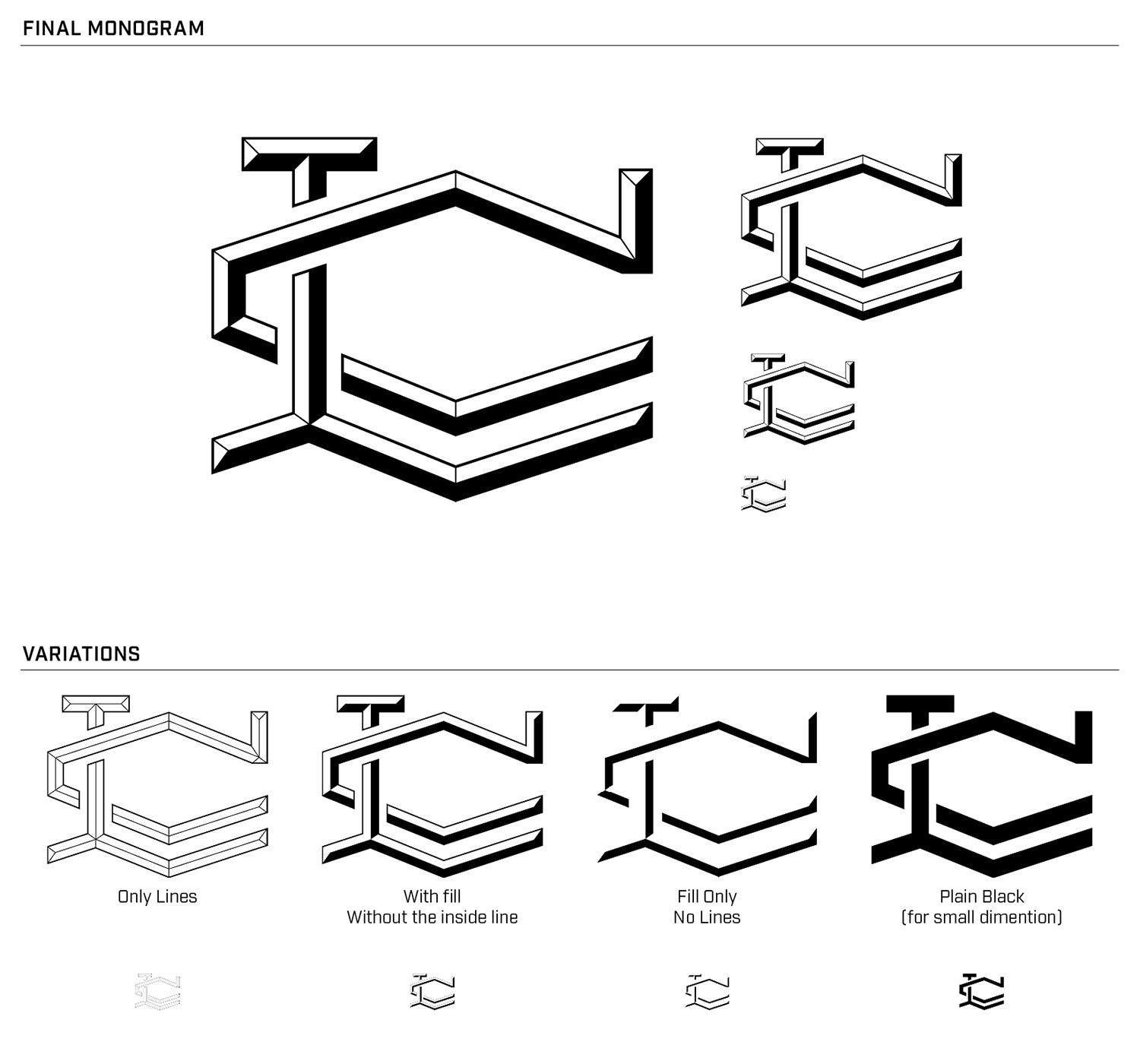
Depend on the occasion, it could be used in different way as you see in "variations". In case it is used in small dimention, plain black version should be used for the maximum visibility.
EXTRA: A REAL WORLD APPLICATION - COMING SOON!
It's work in progress! I'm working on a business card as I mentioned at the beginning, but most probably I won't be able to post it by the deadline of this challenge. I'll post as soon as it will be available. Stay tuned!
------------------------------------------------------------------------------------------------------------------------
Anyway, I'm happy with the result, but I still need to examine a little bit whether it works in every occasion or not. By working on business card, I'm already wondering if the line should be a little bit thicker in order to have the best result on both print and video.
------------------------------------------------------------------------------------------------------------------------
Thank you everyone for taking a look at my project!
Will, thank you again for this great class, I really had fun doing this project. I'm sure what I learned will be pretty useful for my future projects!
------------------------------------------------------------------------------------------------------------------------
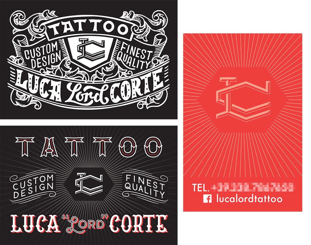
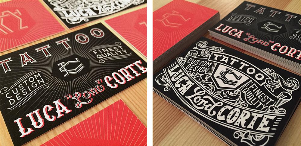
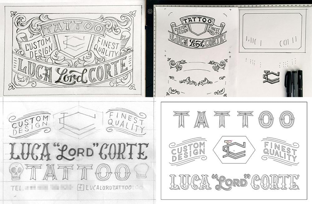
04 February 2016
A REAL WORLD APPLICATION - Business Card
I was asked to create two versions of it: one with hand-crafted look, and the other one with cleaner vector style.
Here are the images of the process:
SKETCH, INKING, & DIGITIZATION
FINAL PIECE