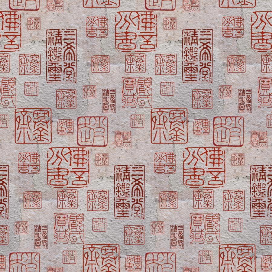
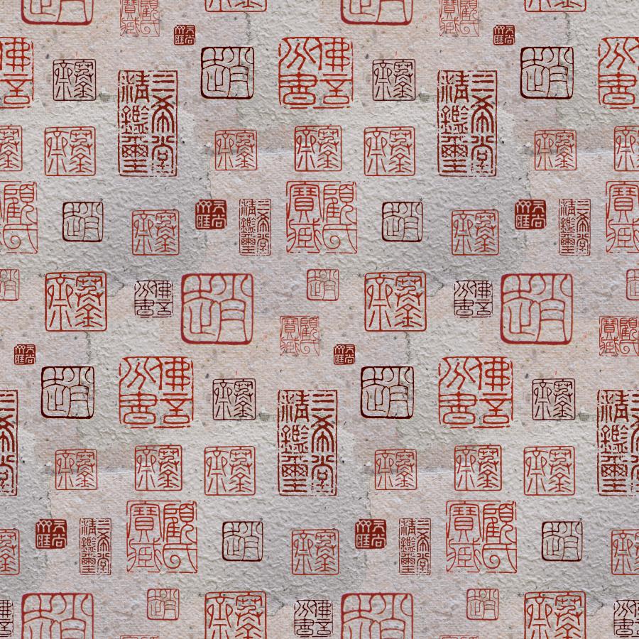
Inkan
I was hampered by not wanting to rotate or flip the patterns, as they are a form of text, and I wanted them to remain in their original, proper-for-reading state. I could have rotated them slightly, but I decided to do a little respacing, and adding a third, much darker shade of red. Although the changes were small, I think they had some impact. Of course, looking at the improved design, I see where I could have done better spacing between some of the Inkan impressions. I am extremely new to surface design, and I want to go on to the next class I have chosen, so I am letting this be enough. (perfection is the enemy of done/good.)