Independent People
When I travelled through Iceland, I saw this book everywhere. Written by Iceland’s Nobel Laureate Halldór Laxness, Independent People is the saga of a man coming out of debt and, from my perspective, his relationship with his daughter. I don't think enough people know about this book, but it is timeless. I imagine it sitting in a Monocle coffee shop, or a travel store.
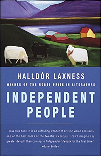
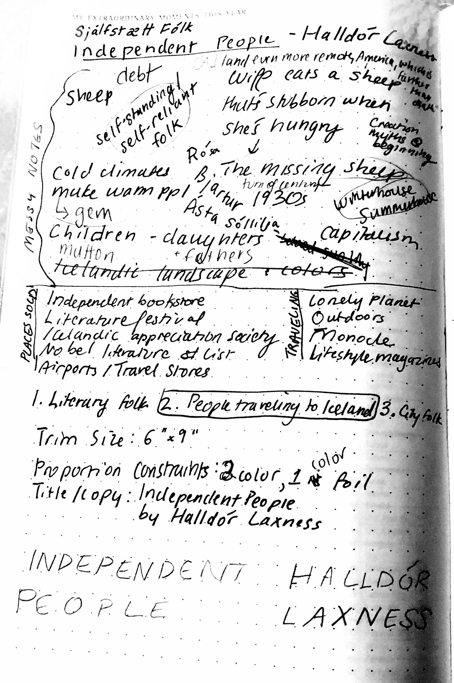
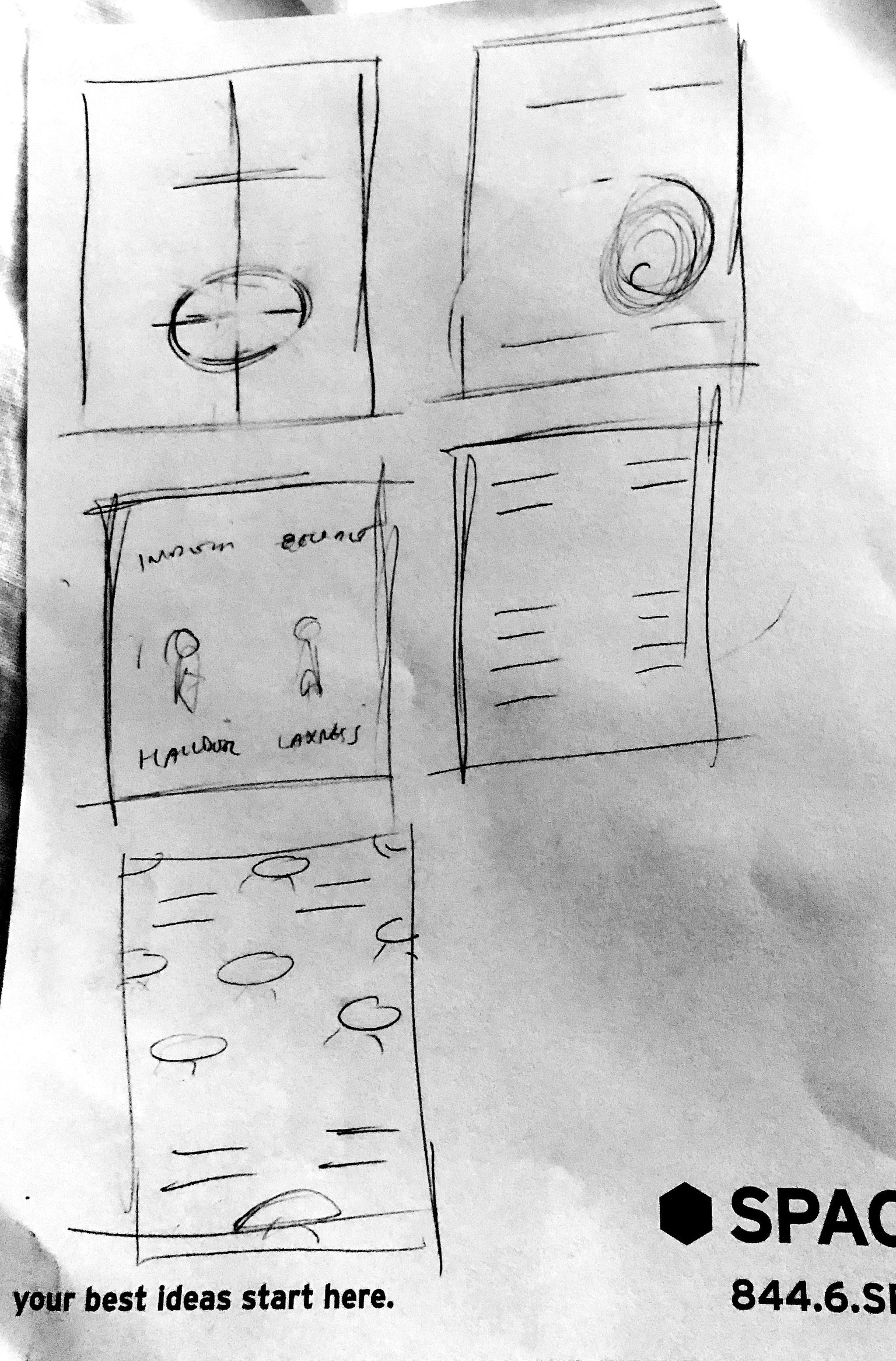
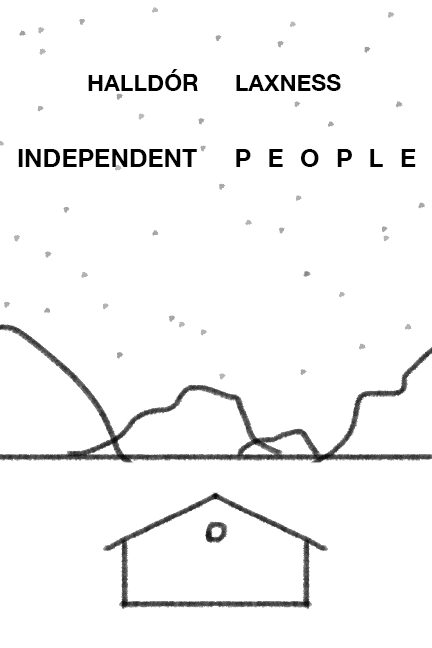
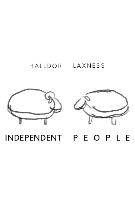
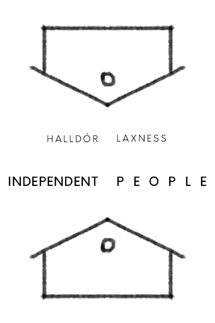
I started the project off by brainstorming. The story is stark and sober, in a reality of a harsh climate but with tender imagery. The book cover I found captured its beauty quite well, but I felt could use a modern update. I felt that there could be lots of imagery around the sheep, the barns (summerhouse and winter house), and family. Below is my brainstorm session:
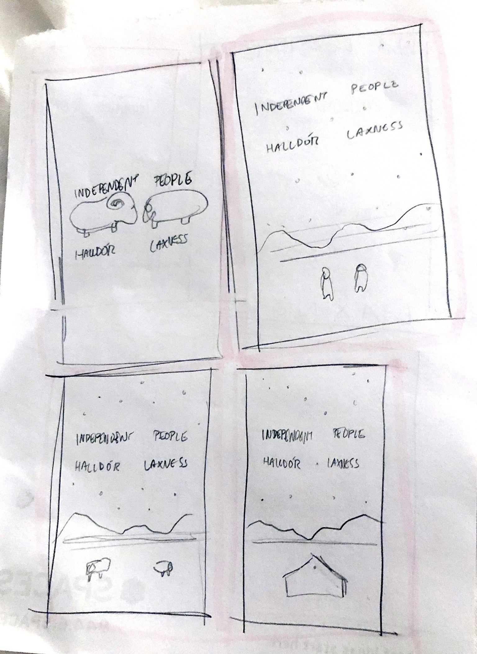
Next I sketched some layouts. I read a transliteration of the title as “Free standing people”, so it made sense to me that the composition be based on a vertical flow line.
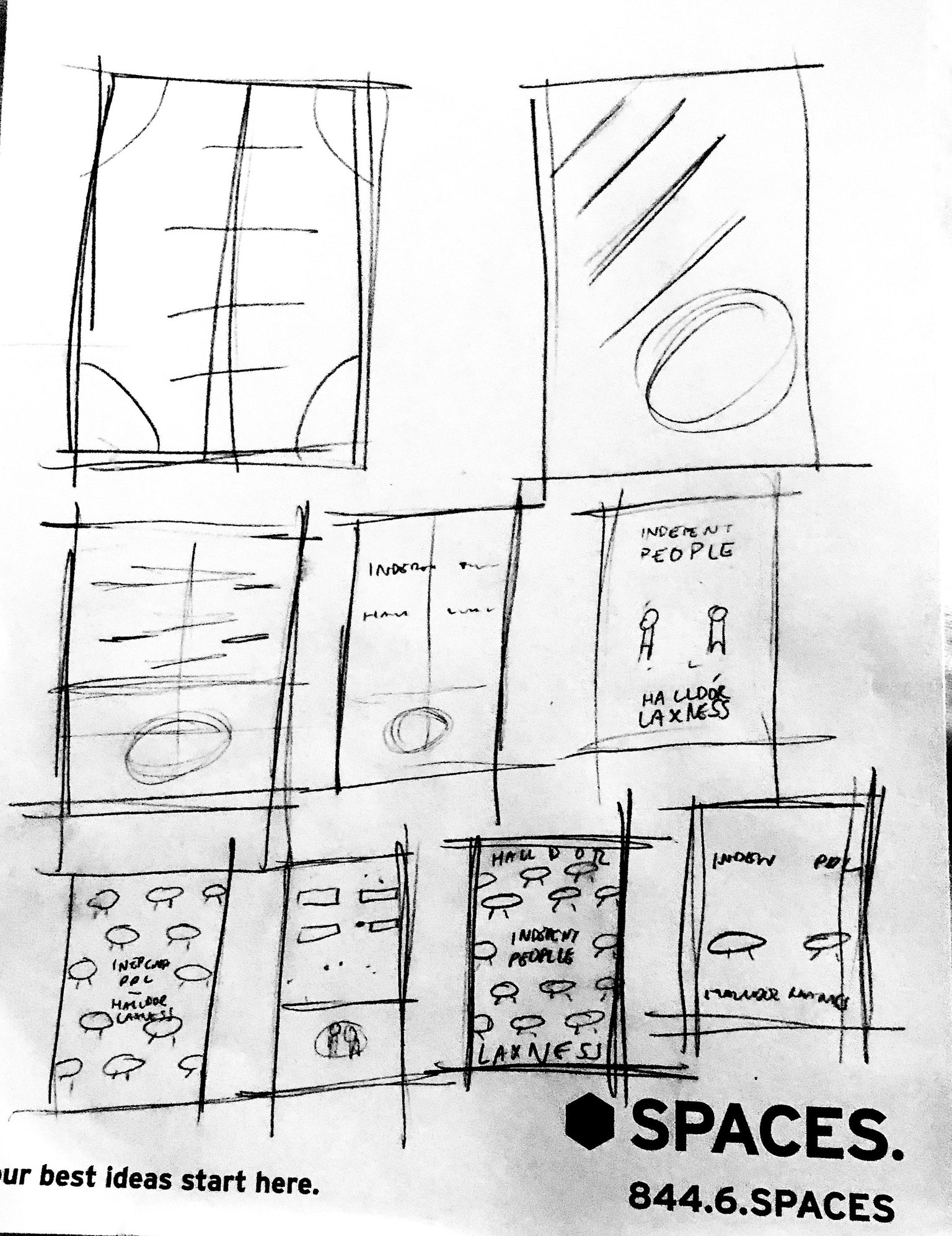
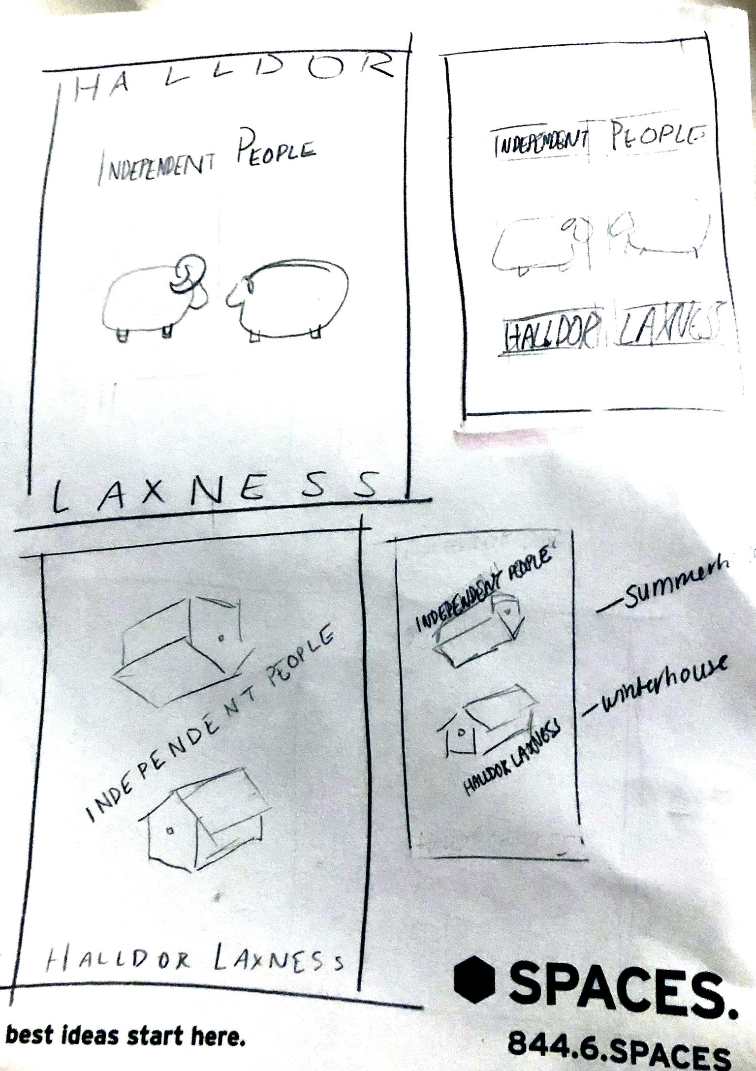
After that I elaborated on some more of the concepts, and circled the concepts I wanted to sketch up.
Next I sketched out my layouts in Photoshop, using some textured brushes.
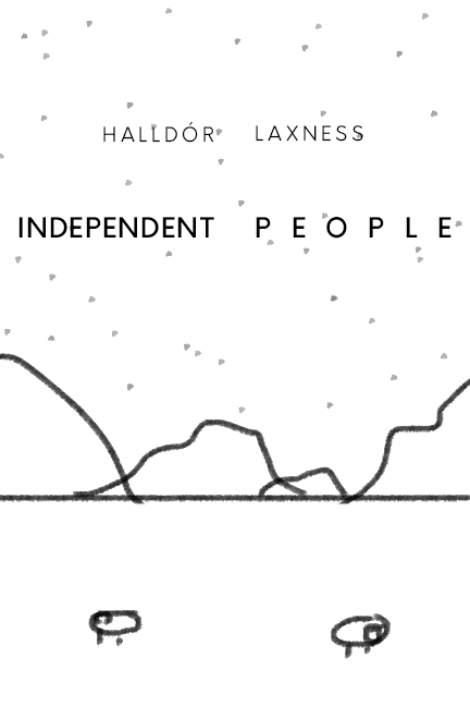
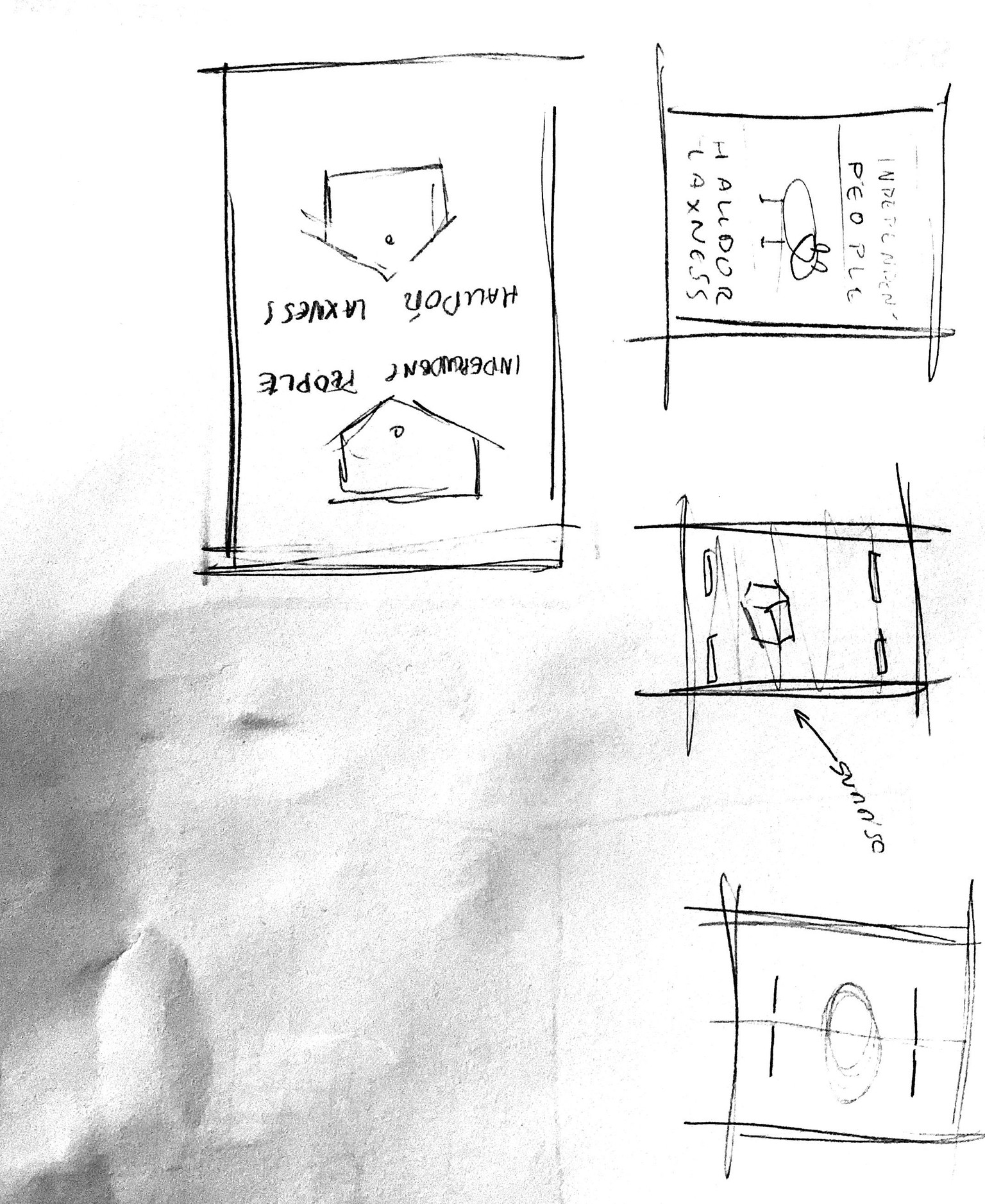
Eventually I came down to these simple, sparse concepts:
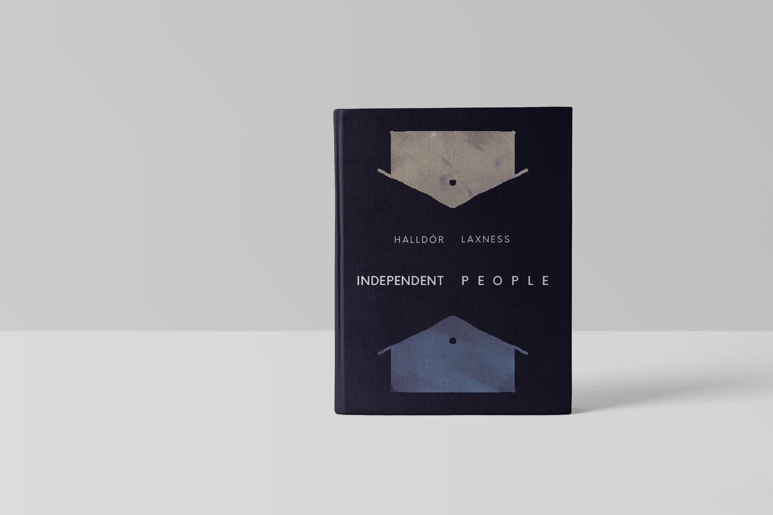
I knew that for lettering, I wanted to go more towards the simple and minimalist than the decorative - I don't think decorative would have worked for this book. I also felt that the tone of the book suited a modern san serif, since they bore no frivolities.
When it came to coloring, I wanted to draw in Iceland's dramatic landscape. It has a lot of earthy tones, but also strange streaks of vibrancy - much like the characters in the book.

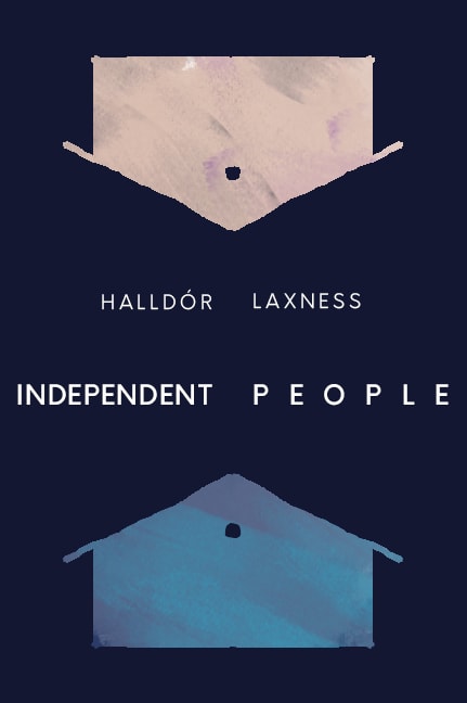
My final rendering: