First time for everything - right?
Fonts, calligraphy, hand lettering and the alike have been on my radar as an area I’d like to develop. Like pattern design, typography has slowly begun to work its way into my portfolio. I guess I like to draw everything and a challenge is always stimulating to me.
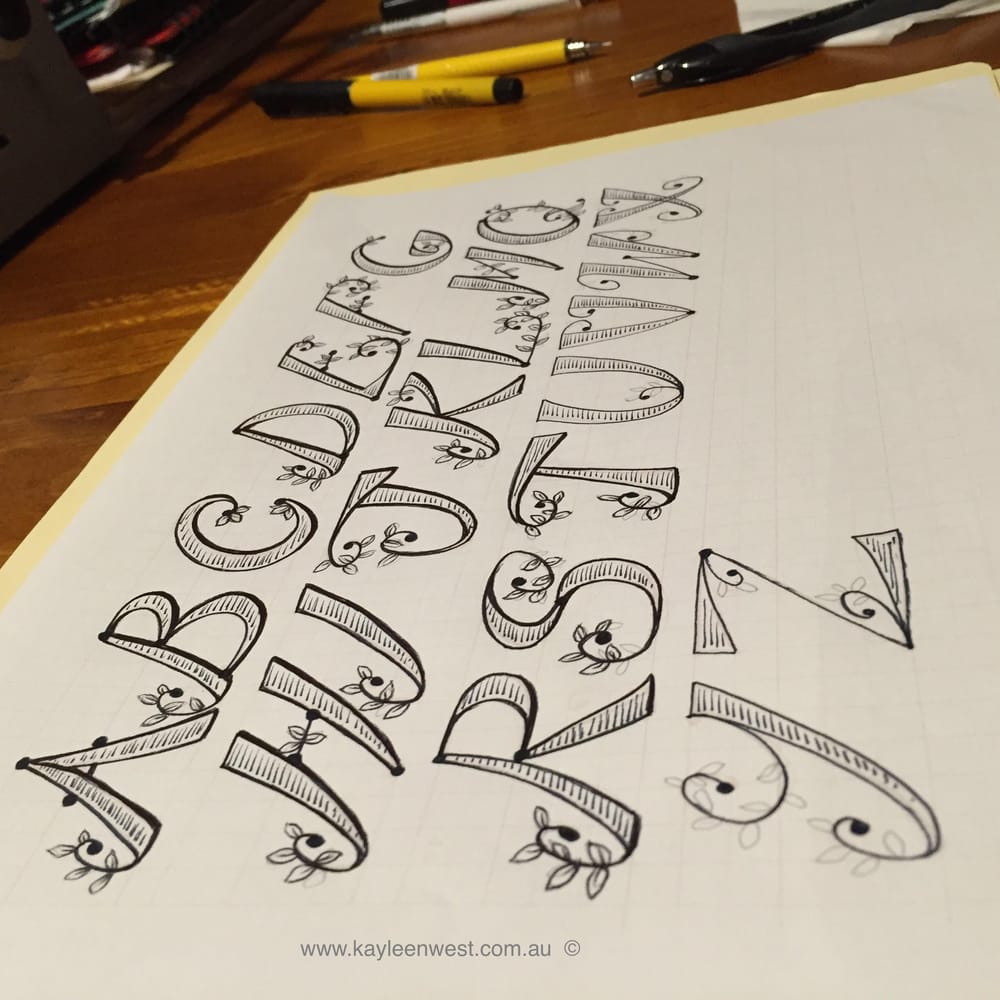
Jennifer recommended we begin by drawing a font without reference and use your handwriting as a beginning if you are not sure where to start I wasn't so that is what I did. I don’t write quite as twirly and ornate as what is below but I do write on an angle and like to draw rounded, ornate and curly shapes when I doodle.
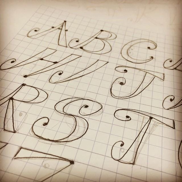
I used a HB 0.3 mechanical pencil on a blue graph paper grid I found on line and printed out. I didn’t draw the P or O as they are going to be an edited version of the R and Q. After scanning and stepping back I noticed my X needed widening. I then traced over the letters in a softer pencil; a 0.5 2B mechanical pencil.
You can see by the second image I altered a few things like the centre point on the W, the base of the K, R, U, and V and I turned the point upside down on the T’s stem.
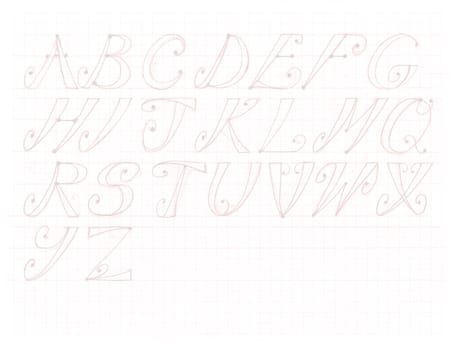
We were instructed to trace in ink, but I opened it in Photoshop, colourised it red and adjusted to make it semi-transparent. I then printed out ready to trace in black ink. However I think it may be quicker to trace directly in Illustrator with the blob tool. It will still look hand writtten I think.
To Do:
I noticed the C was too fat before the dot points so when I trace it I'll alter that.
I'll return to watch the video again and read the handy print out so I can try importing my fonts and making my very own REAL USABLE font!
Update:
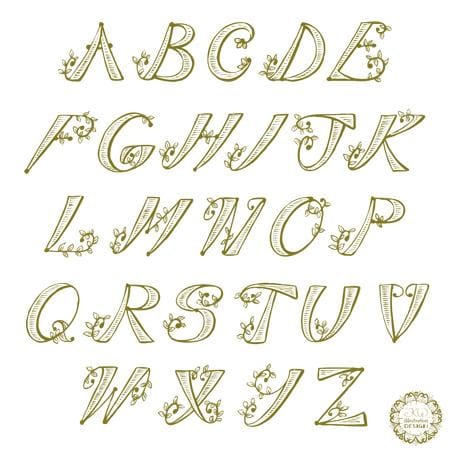
I have traced my lettreing, making adjustments as I go. I aslo imported inot Illustrator and traced it.
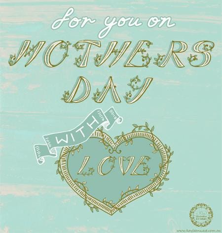
I have been experimenting with the lettering for a Mothers Day Card. Mothers Day is very soon so I played in Photshop with the lettering but I still have to attempt using the program to make a real font.