E is for Esther
R E S E A R C H
On the Type & Flowers Pinterest board I found some examples of single letters embellished with flowers. I really like the idea of making a card or some other product with my initial on it, so that's what I set out to do.
S O U R C E I M A G E S
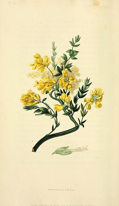
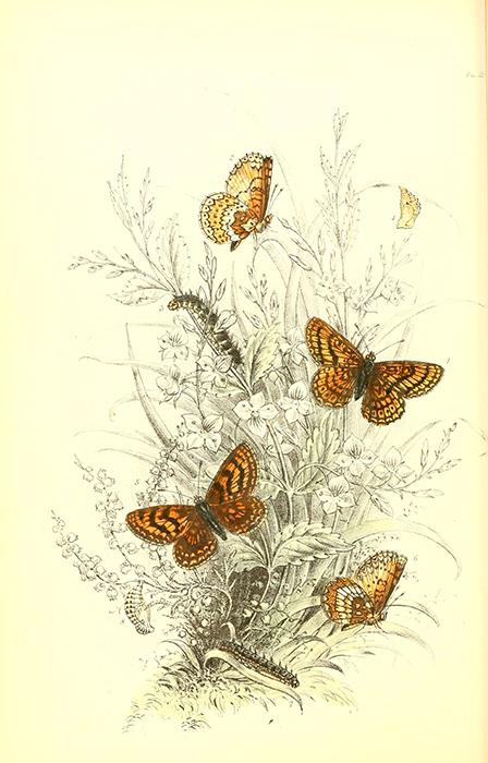
I found two nice botanical images on the Biodiversity Heritage Library on Flickr.
P R O C E S S
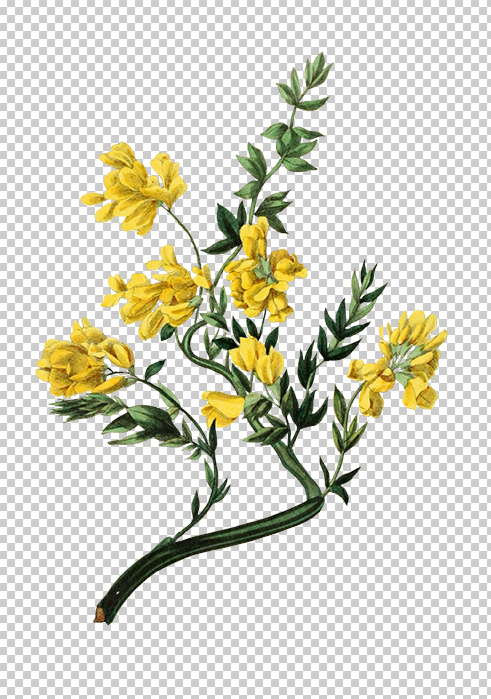
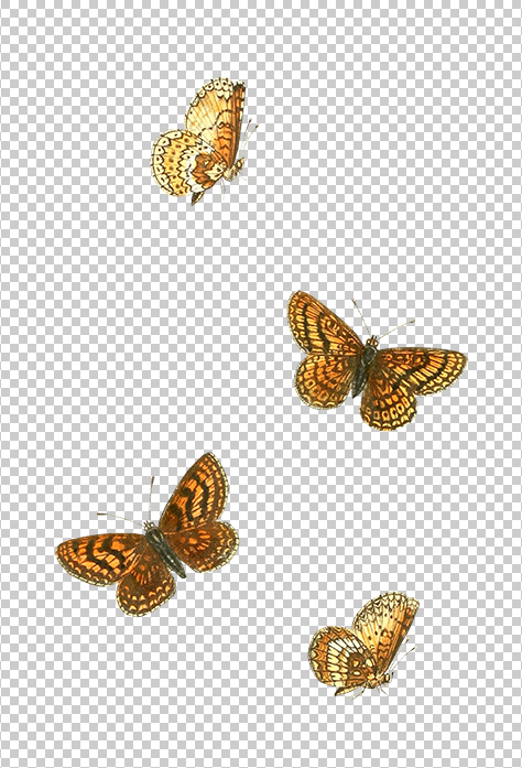
Cutting out the images proved to be quite a laborious task. I selected the polygonal and the regular lasso tools in Photoshop, put on some music and got to work. Here are the extracted images. I skipped cutting them up in even smaller pieces because I figured I could wing it once I got to the stage where I intertwine my images with the text. I'm a little lazy like that.
C O L O R V A R I A T I O N S
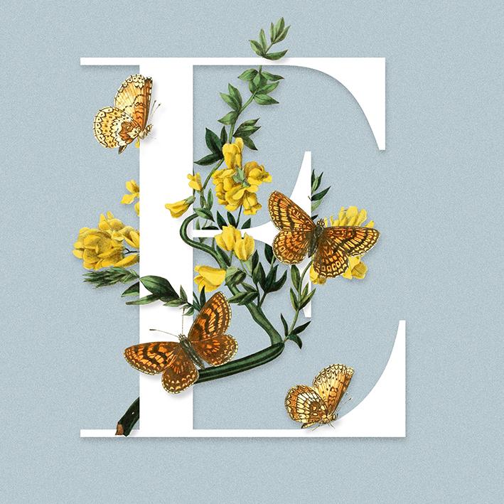
My first attempt was to simply put the images together and add a blue background. I also added some subtle drop shadows to make the piece come alive.
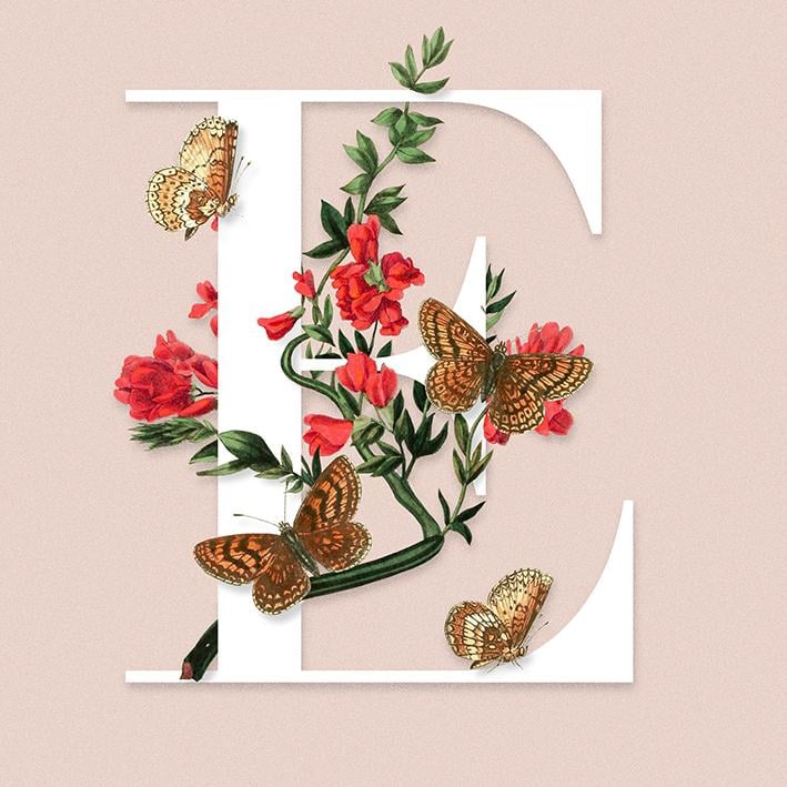
Using the color replacement tool I played around a bit with various colors for the flowers. If you want to change just a small part of your image, I can really recommend this option.
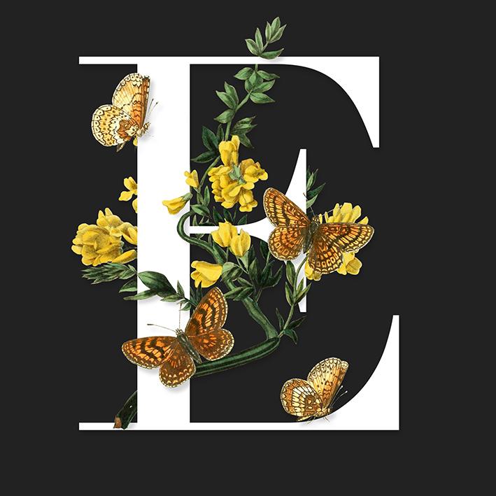
Testing to see what it looks like on a dark background... Looking good.
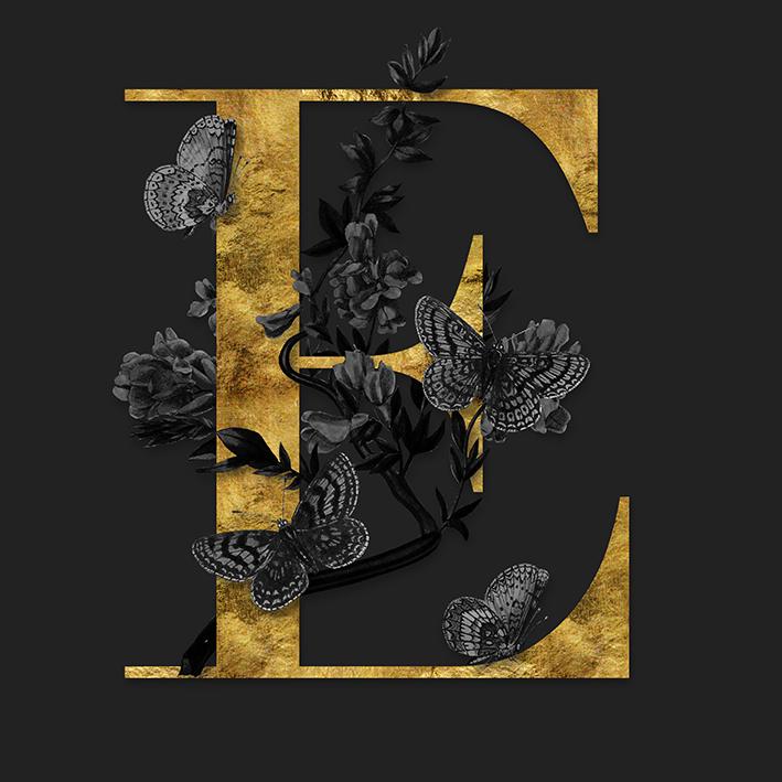
And then I went full dark with desaturated images and shiny gold text. I think it looks kind of mysterious and elegant.
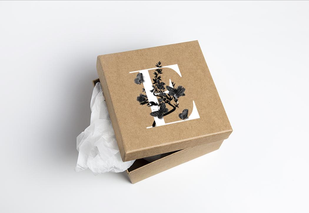
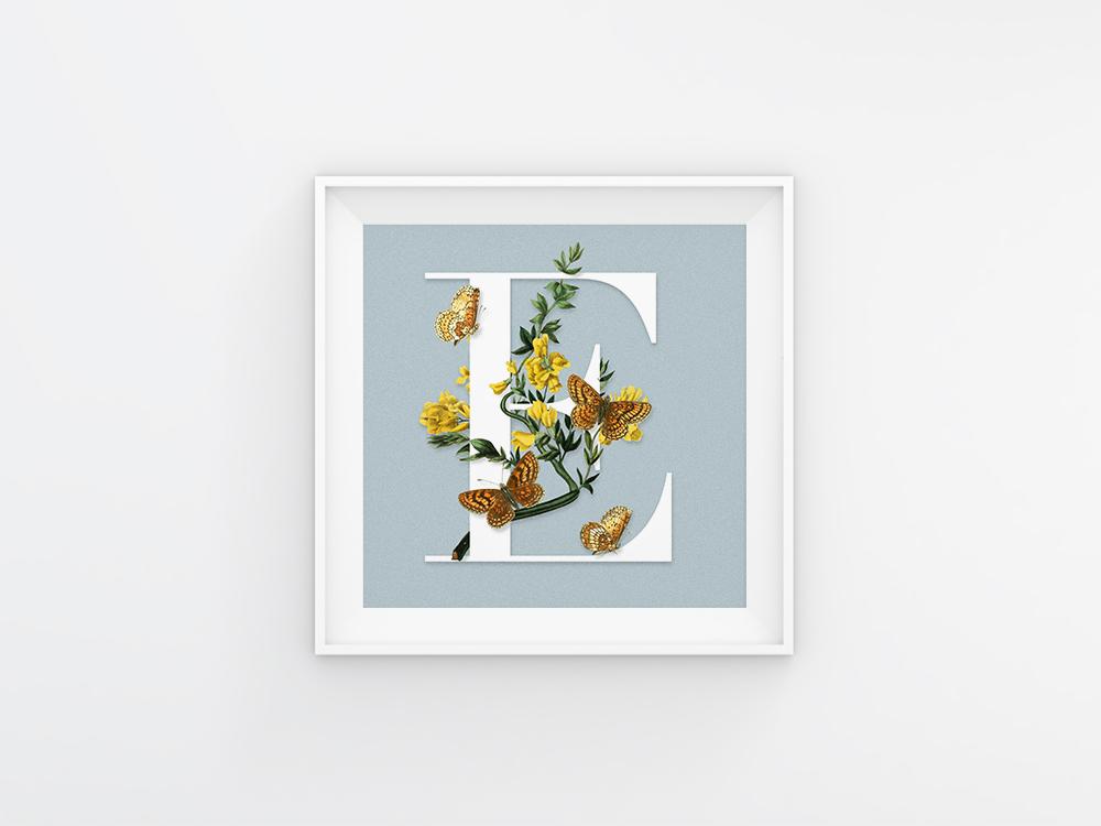
P R O D U C T M O C K U P S
Sometimes it can be fun to mockup your design to see which one you like best. I googled some free mockups of square products and found this beautiful cardboard box and a simple photoframe. I really love how the box turned out. I think something like this could work really well for something like a cosmetics brand.
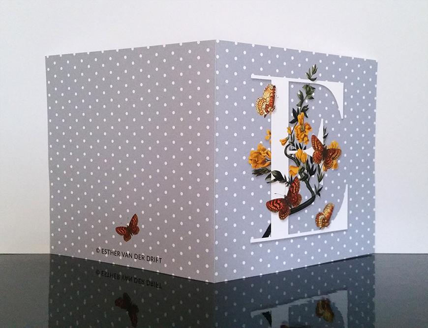
F I N A L C A R D
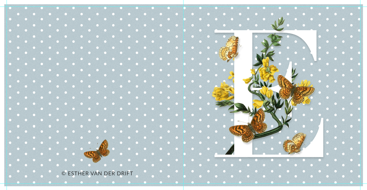
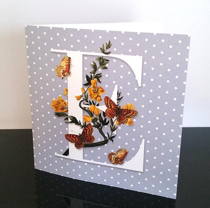
For my printed card I chose to use the one with the blue background. I also added a cute polka dot pattern to my design and placed one of the butterflies on the back. Here's a screenshot of me preparing the file for print.
The photos I took of the final card were taken in poor light conditions (the blue really isn't this purple), but you should be able to get an idea of the final product.
I N C O N C L U S I O N
In this class I learned how to cut out images, overlay and intertwine them with text and prepare my file for print in Photoshop. I don't think I'd actually use this card for anything, but I had a lot of fun creating it though. I might try something similar in the future using my own illustrations!