Developing a Wedding Brand Suite
 This is the overview of the things I've made. I added a few things, most importantly the inside of the wedding invitation. I tried a few different ones.. the 2 I liked the most are embedded in the overview.
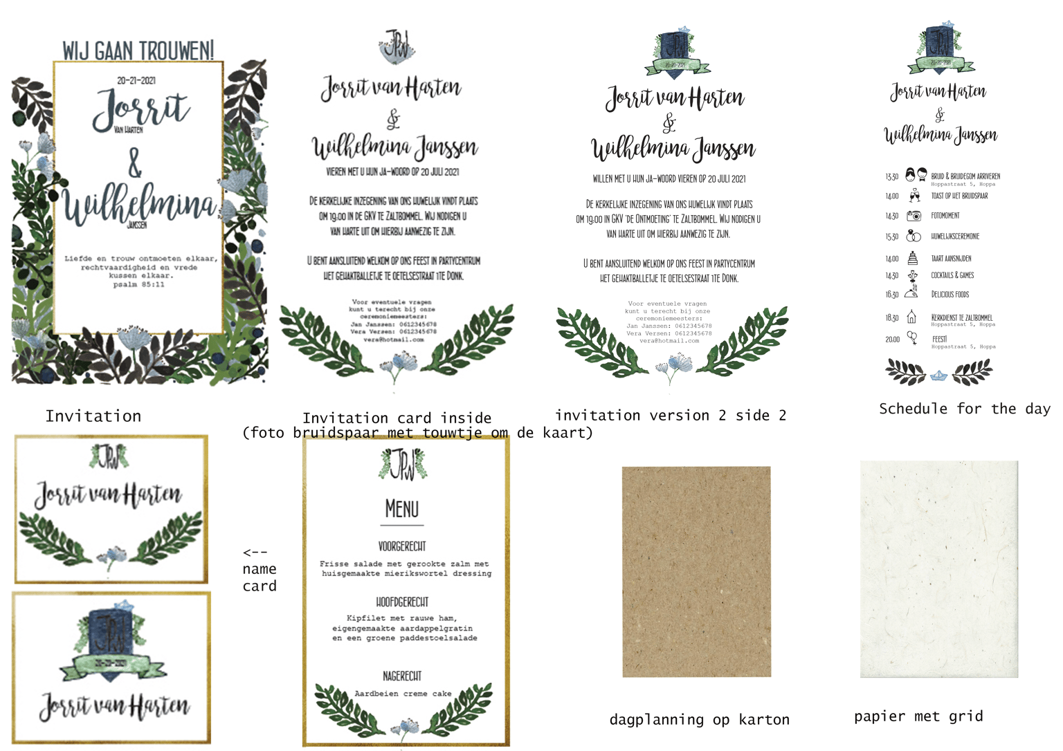
Wedding invitation. The light green is too bright here, in illustrator it isn't!
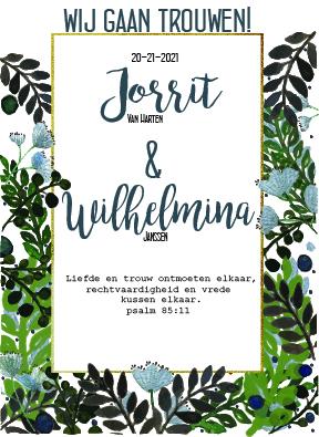
 Version 1 inside wedding invitation
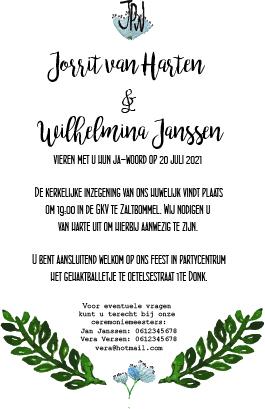
 Menu in dutch ;) I might change the green flowers next to the JPW. Maybe too much leaves?
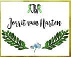 I prefer this namecard. (maybe less leaves?)
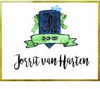
but this one is quite fancy (the dark blue is too bright here).
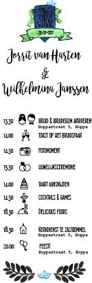
Schedule of the day, preferably on cardboard.
Too bright here, but a orange version of the card. I love autumn! But the blue oen is more fancy.
Not getting married yet though ;), but this was a very fun exercise to do!!
Does anyone have recommedations for classes on how to print this on fancy paper? How to export this with the right colors etc. ?