Davidson Honey - Class Project
Class Project 01: The Brief
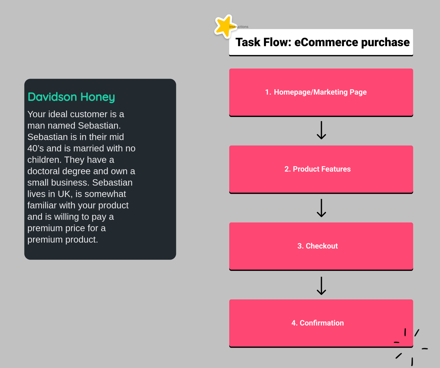
Class Project 02: The Wireframe
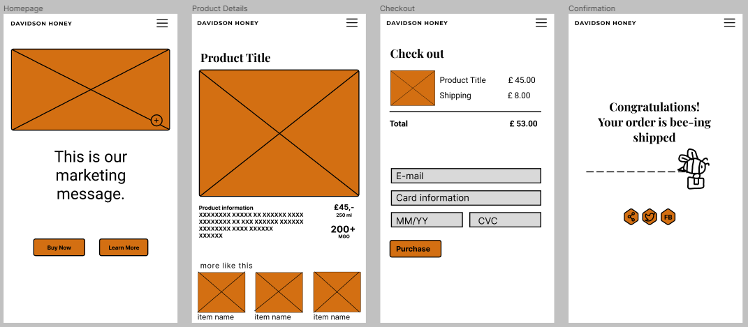
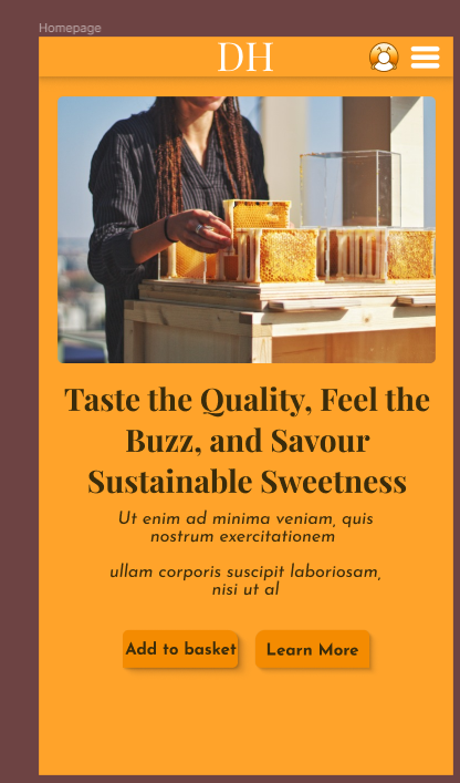
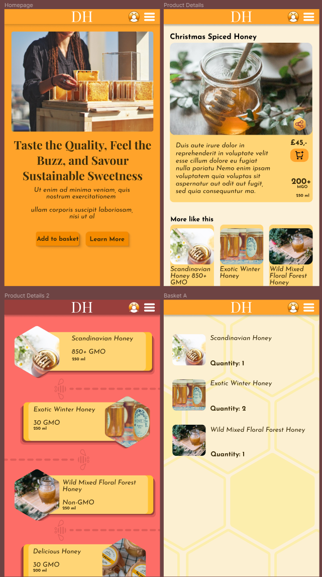
I adapted the wire frame from the class project as I felt I couldn't let people comfortably buy a product based on a list of small info and images, and would rather let people see the full details of a product first, with other options just below it. This is also since my project is for a luxury honey shop, seeing as there's not a lot of difference between honey types, I wanted to showcase the main showstopper product when people select "Learn More". I'm tempted to make an additional screen with a full catalogue which I'd insert between the homepage and the product details page, but as this is not part of the task flow, I'm not sure how far I'd wish to deviate from this course, perhaps after I finish I'll make additional wire-frames and expand on this idea.
Class Project 03: The Icons
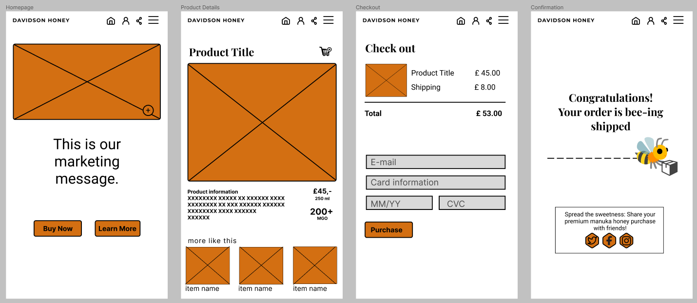
I chose to use Twitter, Facebook and Instagram as my brief is a man in his 40's, but is a small business owner, so he would have experience with social media.
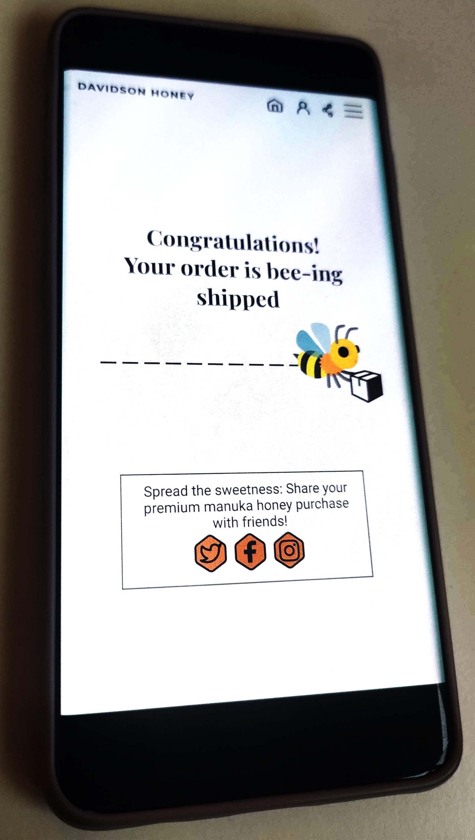
Class Project 04: Testing on Mobile
Class Project 05: First Animation
Class Project 06: Moodboard
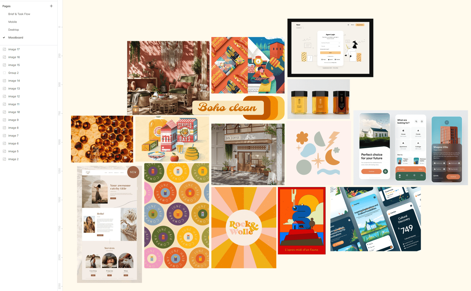
Class Project 07: Colours & Columns
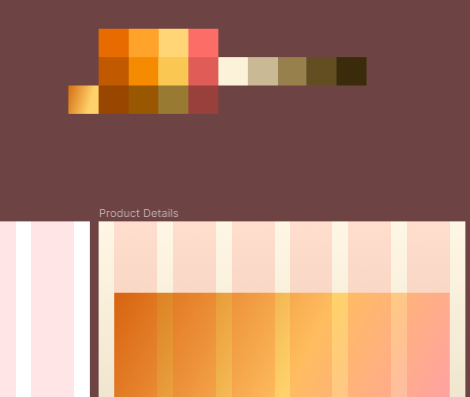
Class Project 08: Text
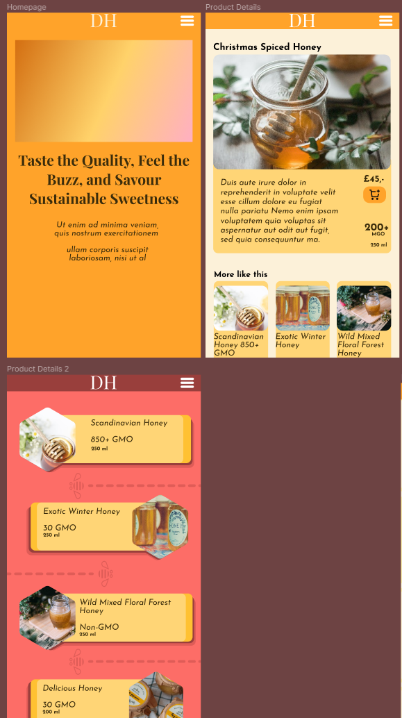
Class Project 09: Making stuff
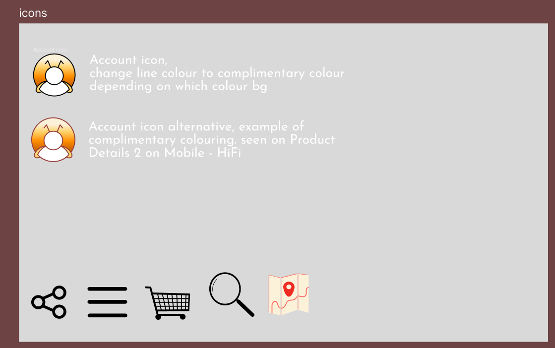
I ended up creating an Account icon, Share Icon, Burger menu icon, Shopping cart Icon, Search Icon and a Map Icon. This process took me an hour and a half after trying to imagine if these icons would fit the vibe of my design.
Class Project 10: Images
Class Project 11: Buttons

Class Project 12: Responsive Design
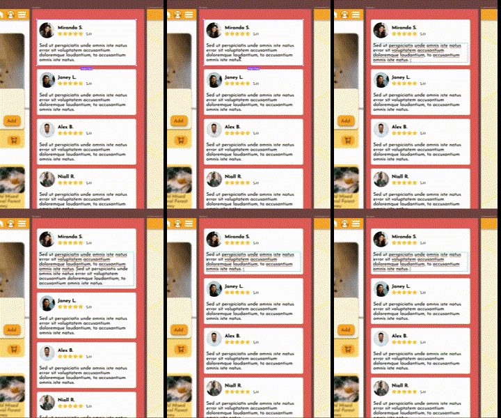
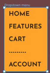
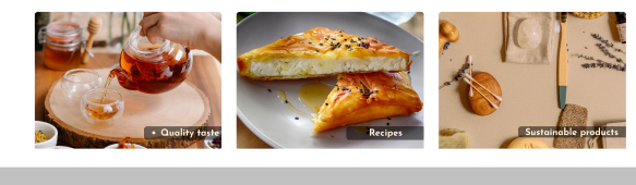 I've also decided at this point to make some improvements to the design on my pages, and see what felt right for my product.
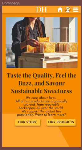
Class Project 13: Effects
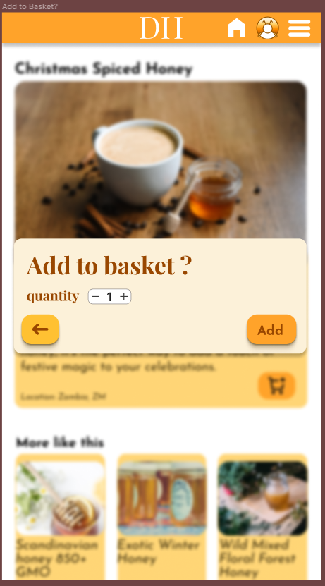
This was fun to make, I took some time to play around with different shades, and decided taking the Primary colour and picking a range that was almost black from there, in order to create the shadows so it's easier on the eyes.
I've since corrected the text colour to be white for clarity.
Class Project 14: Components
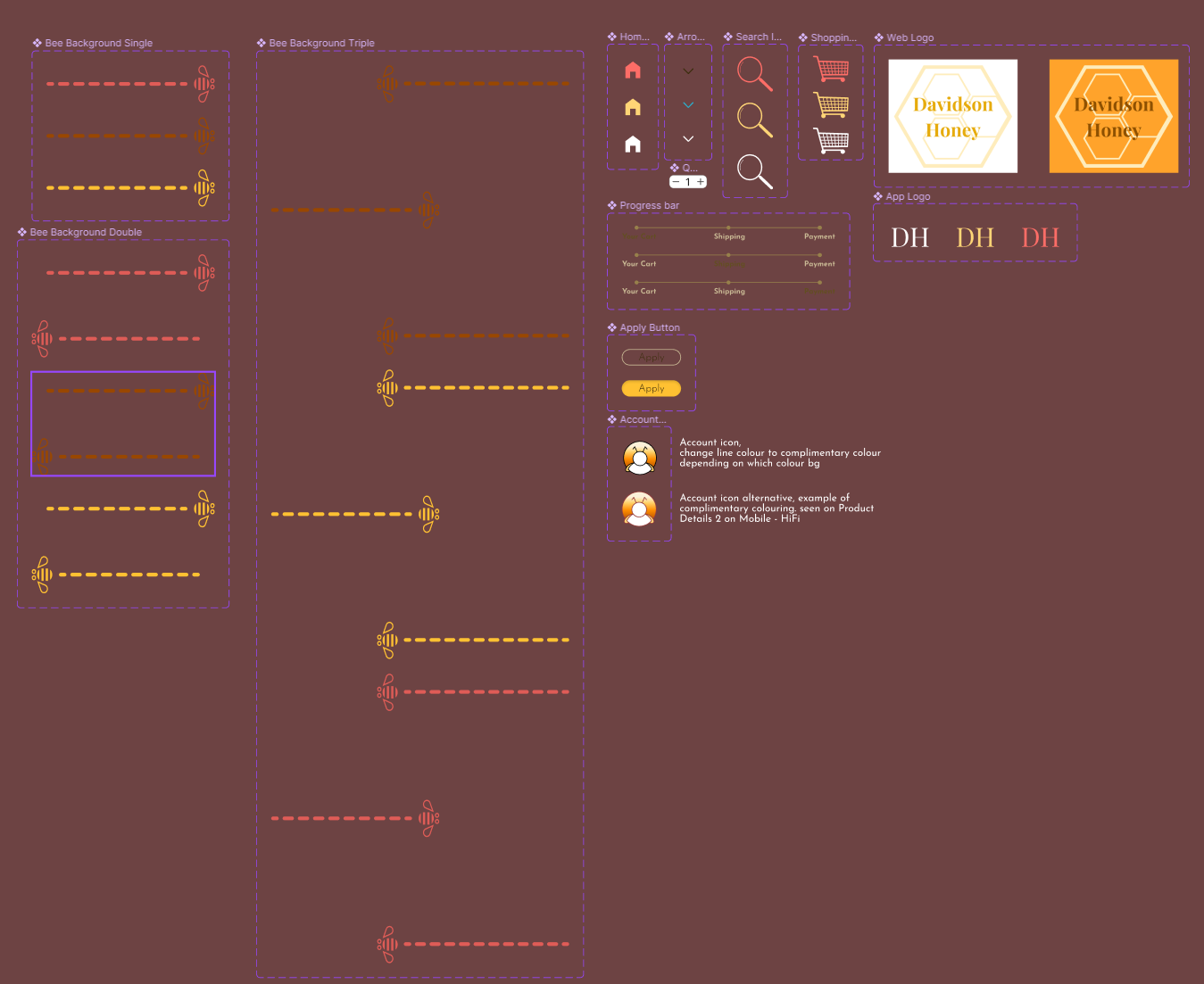
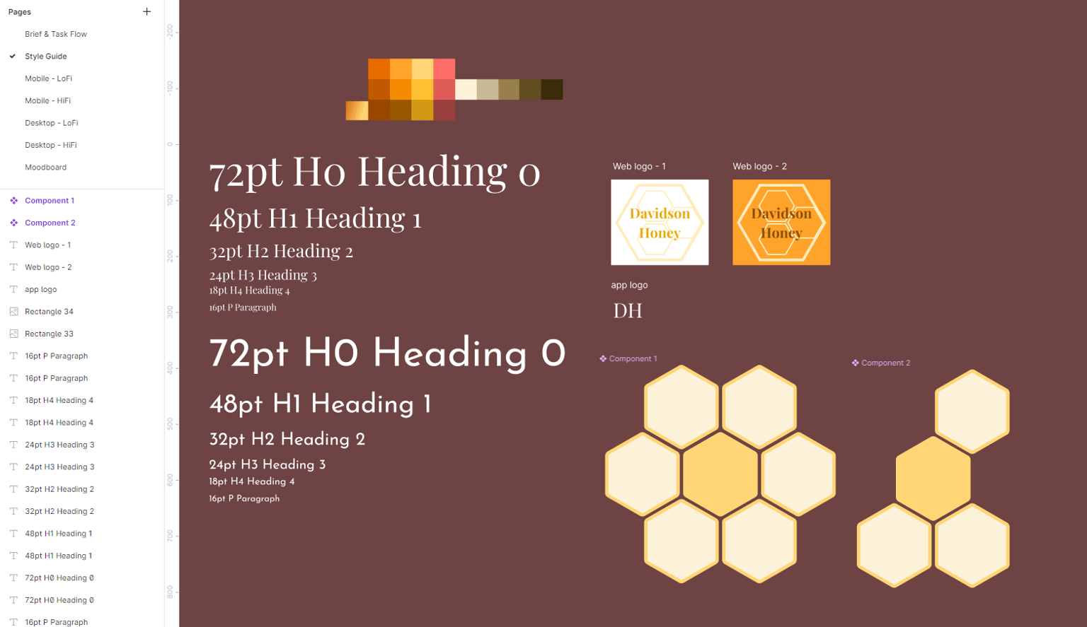
I loved creating components, so I created a bunch more, pictured is about 50% of them. Since the logo for the app is quite simple, I kept it separate from the web logo versions.
Class Project 15: Variants
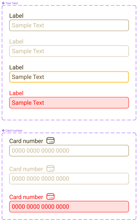
Class Project 16: Form
Class Project 17: Prototyping
Class Project 18: My Second Animation
Class Project 19: Page Transition
Class Project 20: Micro Interaction
Class Project 21: Finish your Design