Colourful Boba App
I'm a UX/UI Designer with limited experience in app design, so this course was a great exercise in designing a fictional app with multiple user flows.
I chose a bright colour scheme and a san-serif font family with plenty of weighting options. I followed along with Aaron's designs, and then interpreted the app's architecture, style and user flows in my own way.
p.s.
- To see my app in action, scroll to the bottom and watch the video.
- Keep reading to learn about some of my favourite Figma tips.
Aims:
- Design and prototype a colourful boba tea ordering app;
- Adapt an existing app concept (i.e. skip straight to Prototype stage in Design Thinking framework);
- Use Figma's rich tools (Components, Variants, Frames, Auto-Layout, Styles) to create a responsive and scaleable app;
- Take the time to keep my Figma file tidy and organised.
Final Exports:
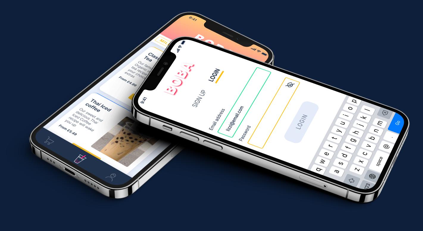
1. iPhone mockup - Login and Shopping screens
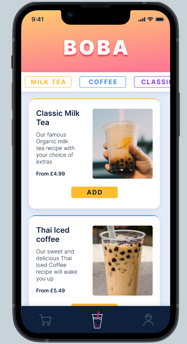
2. Shopping page
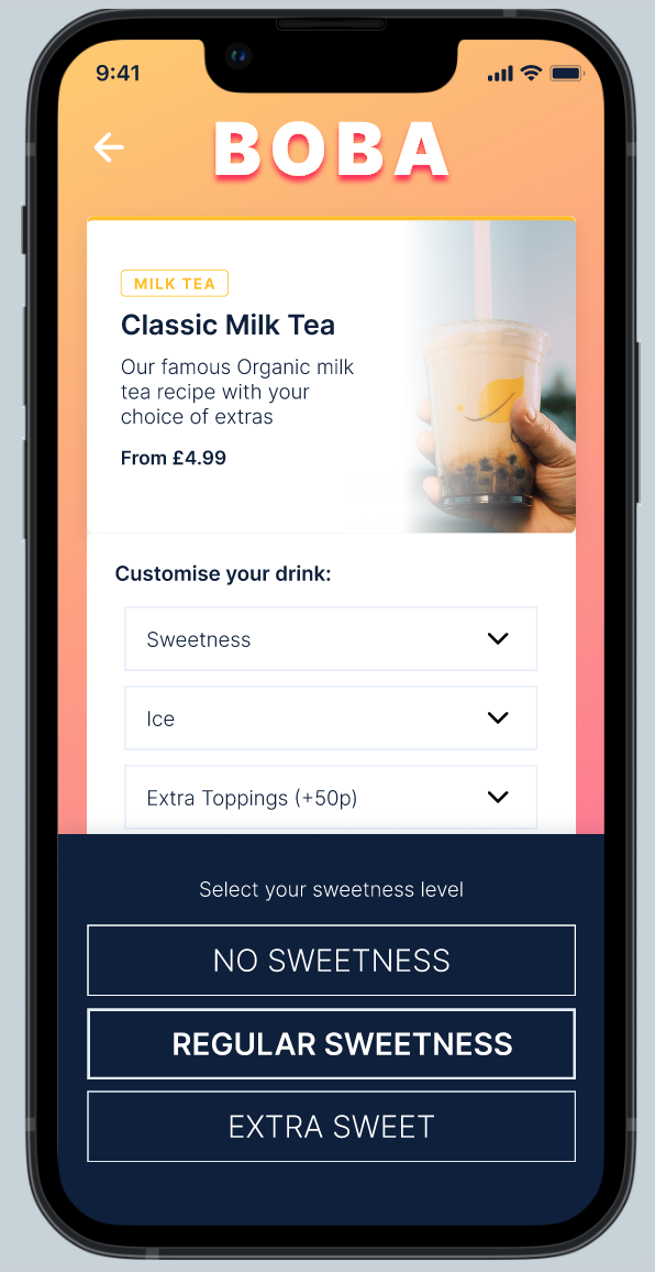
3. Product page with Sweetness selection overlay
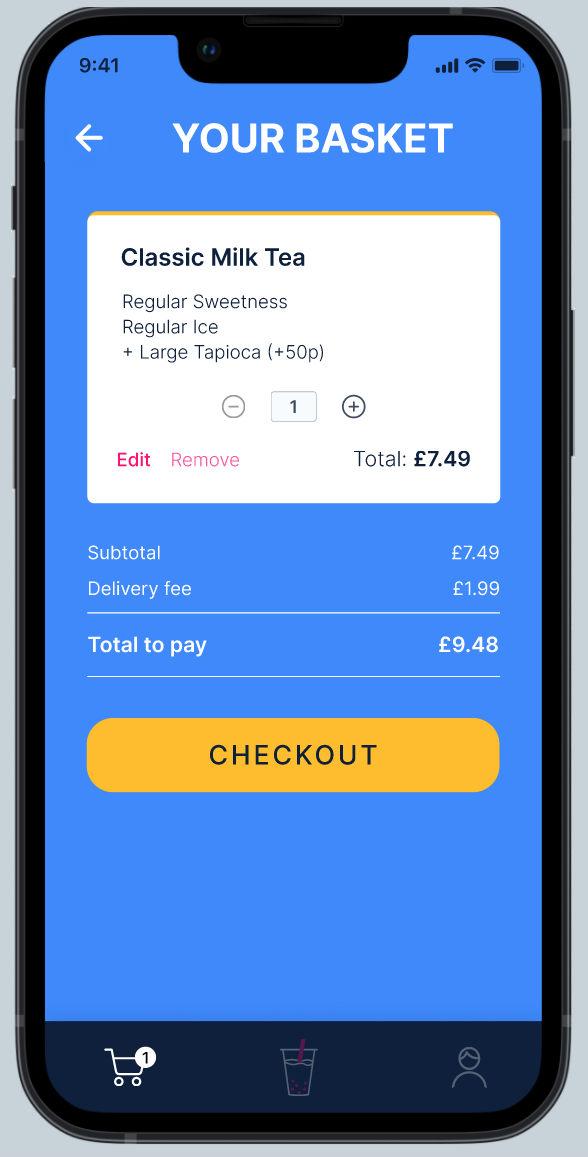
4. Basket page
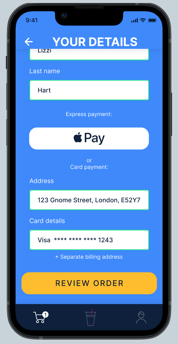
5. Checkout - Your Details
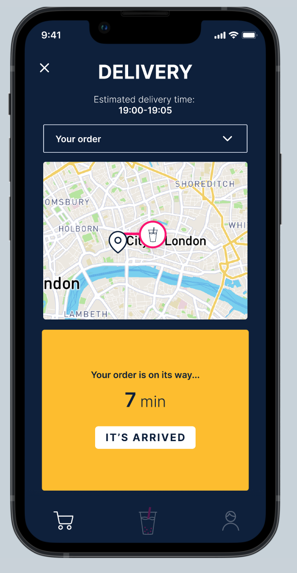
6. Delivery - 7 minutes away
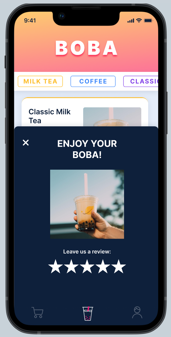
7. Completed order with leave a review overlay
Some Figma tips to add to your knowledge:
If you've read this far, you deserve some bonus tips that I personally couldn't live without:
1. How to organise components:
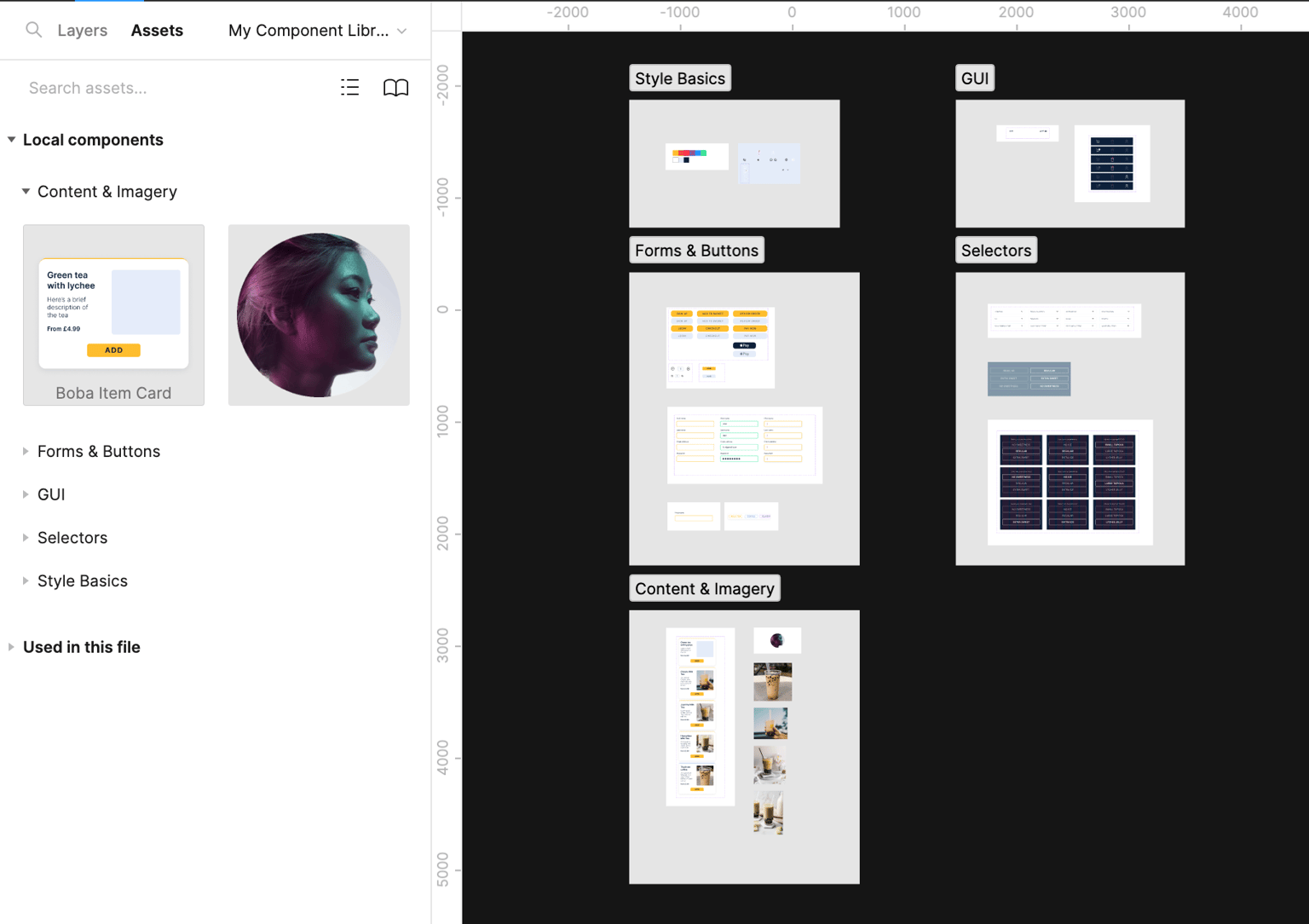
Using Sections and/or Frames to group and categorise your component library means your Assets panel is nicely organised. (see Fig 2.3 for an example)
2. How to organise Local styles:
When creating Text and Colour styles, trying using a slash "/" to nest a style within a group of your creation.
e.g. if I name my text style "Light/Body" or "Bold/18px" the text style will appear within the group 'Light' or Bold' and its name would be either "Body" or "18px" (see Fig 1.1 and 1.2)
3. Learn auto-layout:
It's very powerful once you know how to harness it! It will also make you a better designer and help you to understand how developers build products (i.e. The Box Method). The keyboard shortcut is Shift + A on mac and its one of my most used, alongside Command + Shift + K (create component) and Alt + L (collapse all layers)
Screenshots of my file set-up:
Fig 1.1. How to group text styles in Figma
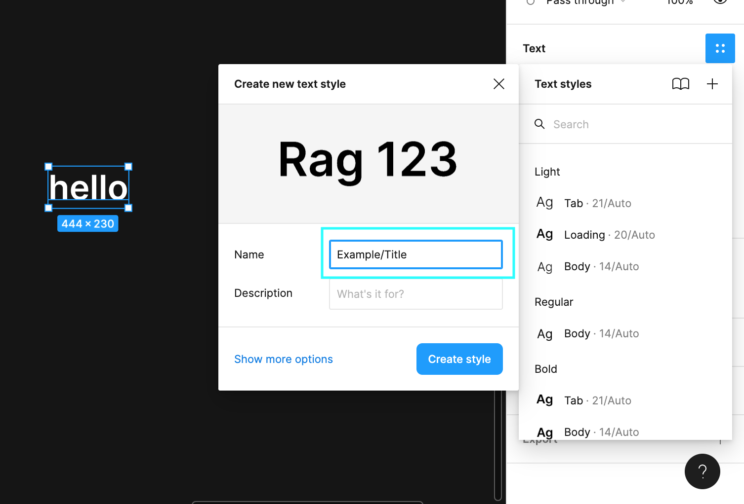
Fig 1.2. Example of nested text style within the Local Styles panel
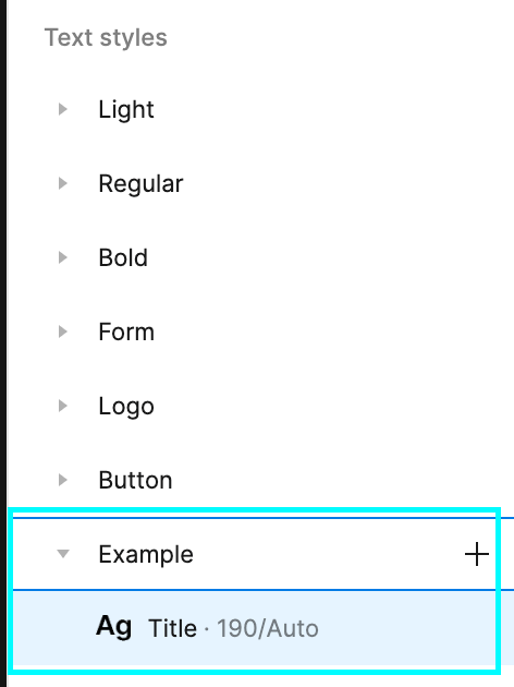
Fig 2.1. File overview - My Designs page 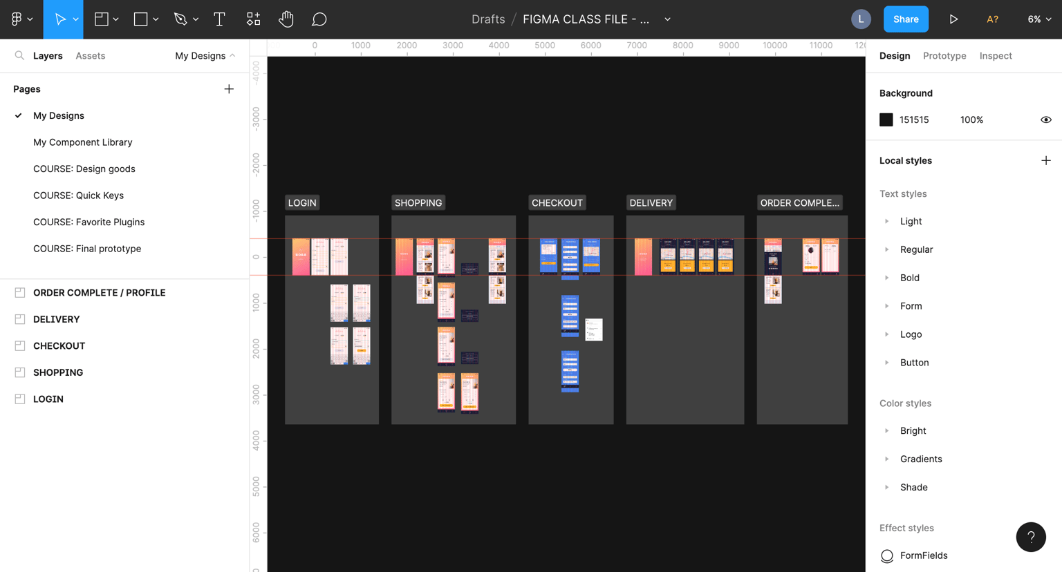
Fig 2.2. File overview - My Component Library
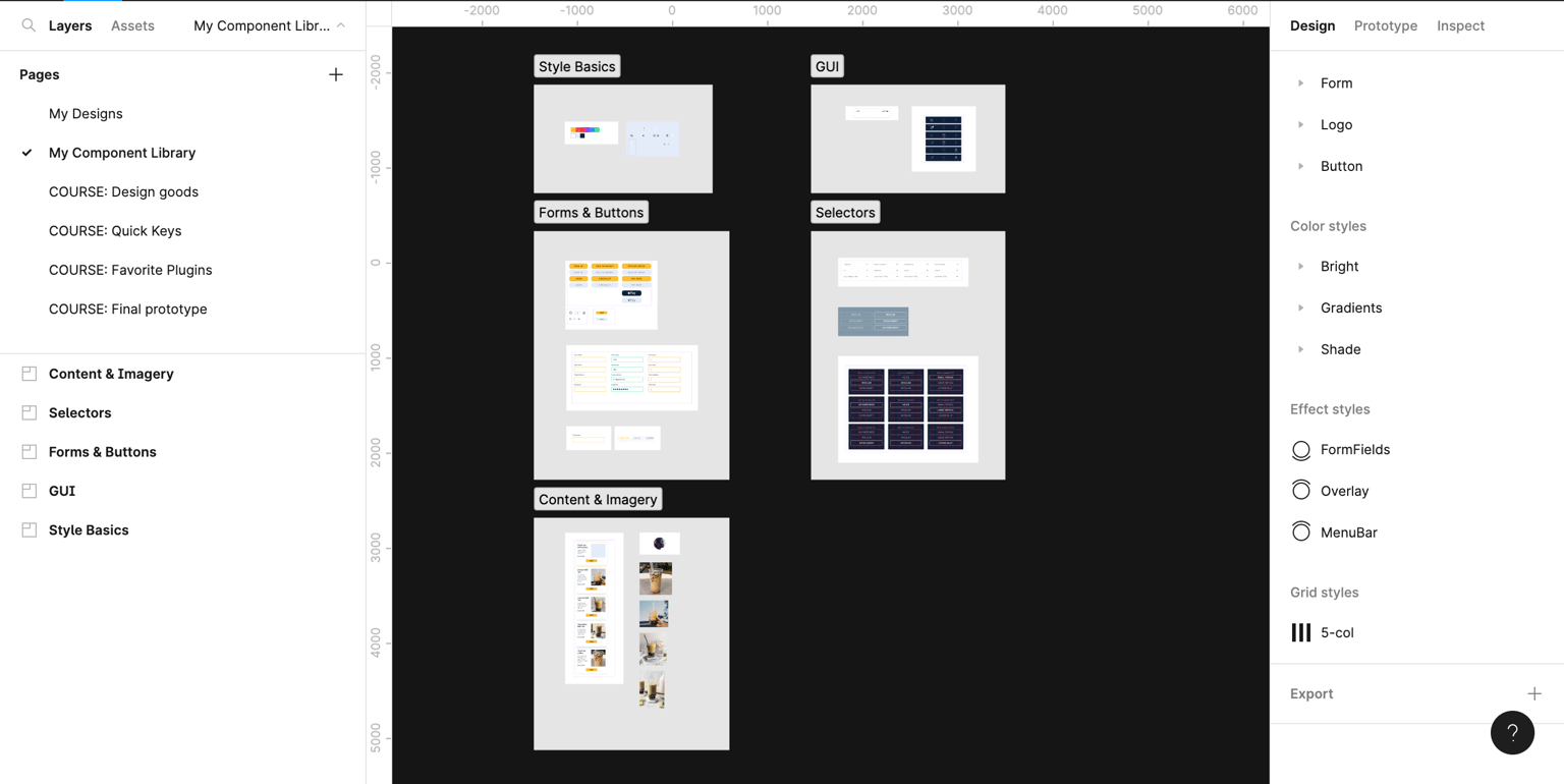
Fig 2.3. Assets panel
Prototype:
I can't share the proto link, as I'm limited by the Figma free plan, but here's a screen recording of the full app experience.
Thanks for reading :)