Color Mixing Challenge
Thank you Nina for this very elaborate class! I had fun painting all the flowers. It was a bit challenging to me with the loose style! Lots of fun with all the splatters for sure, as well as mixing all the different shades!
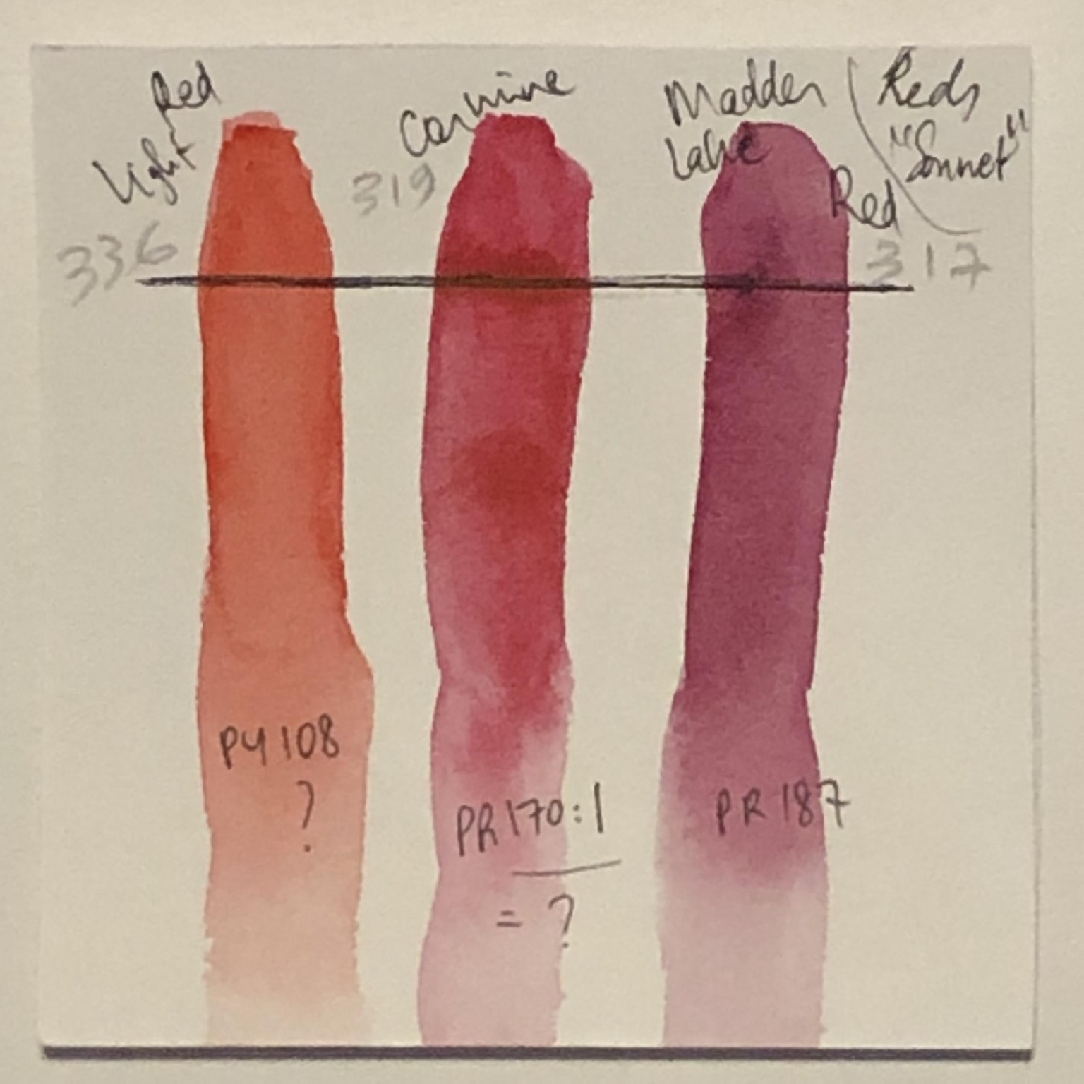
Also, I did some color testing and research on pigments, but that was hard, and I do not have all my answers. I am using 'Sonnet' pan set from Neva Palette, very good and pigmented. All the paints I used seem to be transparent. But Neva palette uses their own code for their paints (penciled numbers), and none of them corresponds to the PR.../PY.../PB... etc.
Here is what I found for the reds: I think this one matches what I found.
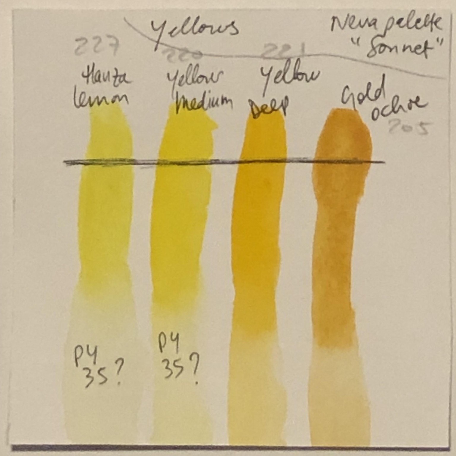
Here is what I found for the yellows: deducted the PY from google searches, but have not found the most warm yellow ones.
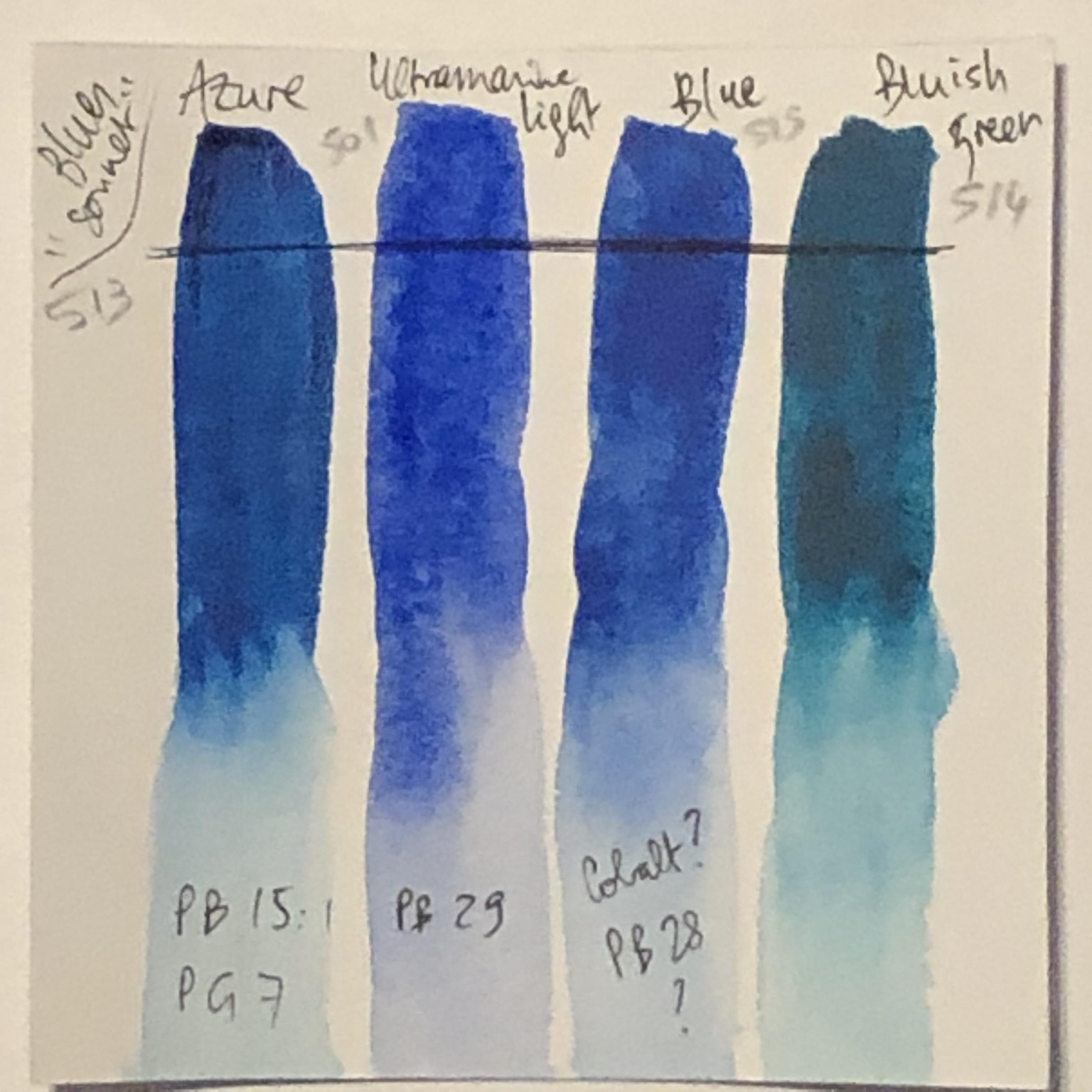
Here is what I found for the blues: the names did not match at all what I found online from sellers' websites or people's research. I did not even find the 'bluish green' at all. So frustrating, because I like these paints!
Anyway, onto the class projects:
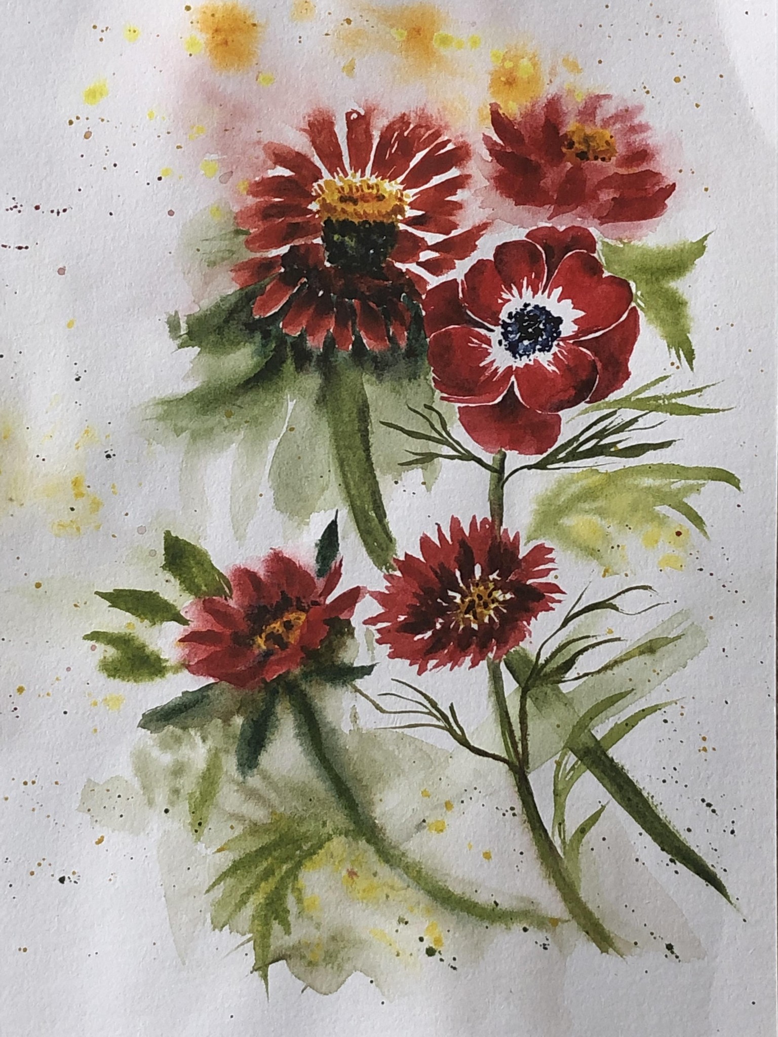
Red: I feel like I messed them all up, except the anemone. Fun playing with all the red shades.
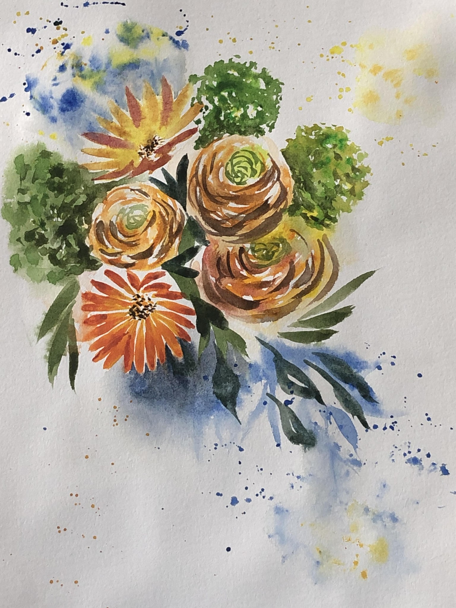
Orange: really loving the green foliage bunches to the sides.
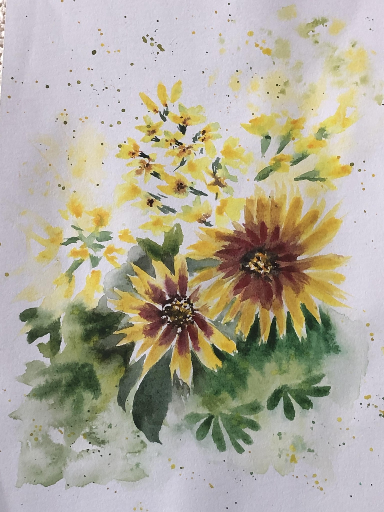
Yellow: this was fun too! The first (top) flowers are a bit too far apart, and the filler flowers a bit faded. Lots of fun with the yellow and red petals of the other ones.
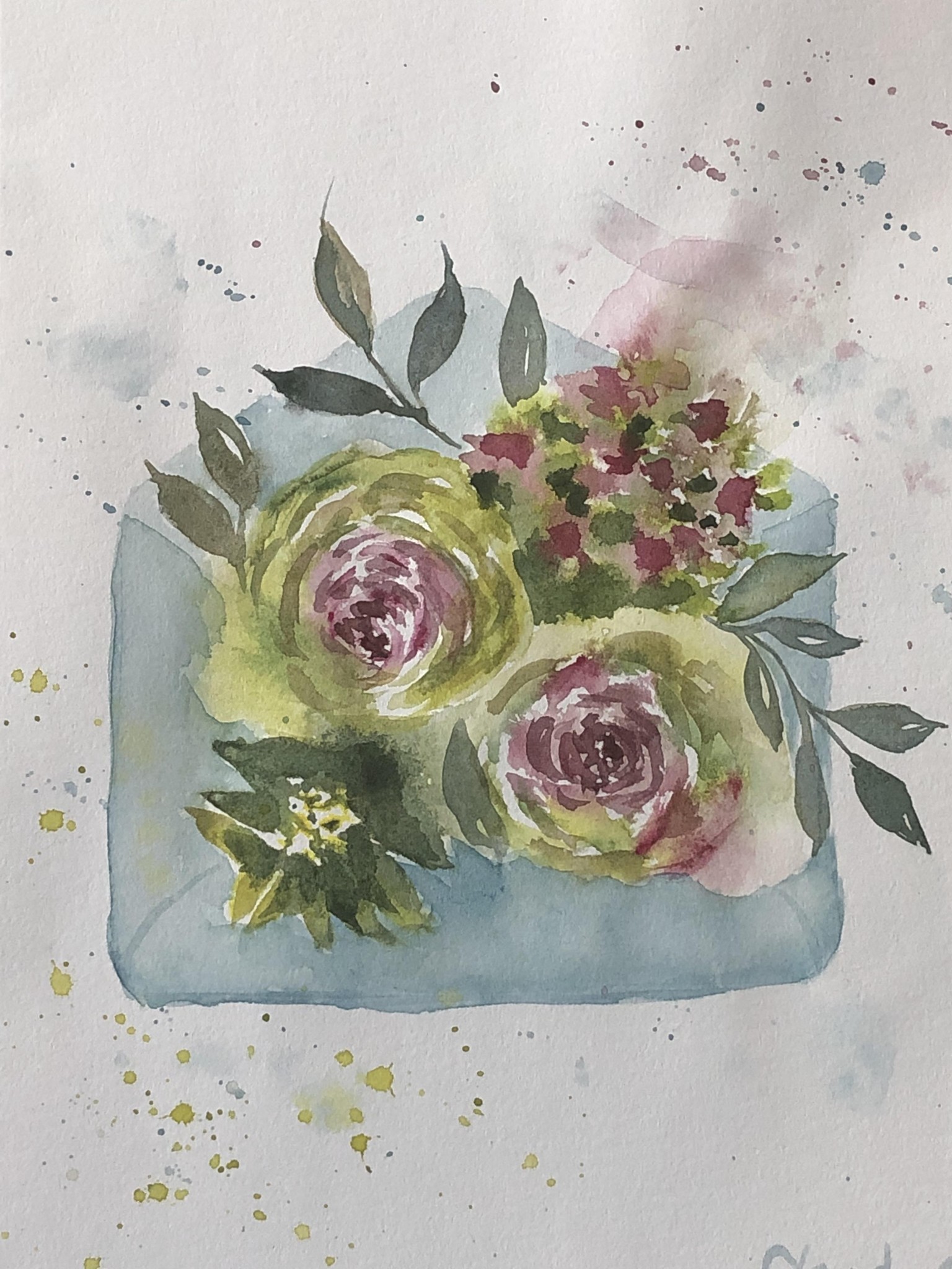
Green: love the idea of the envelope! All shades of green are so pretty together.
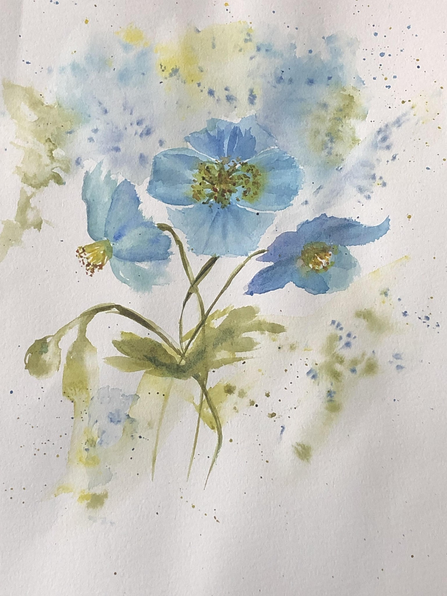
Blue: I love poppies too! Never heard of blue ones, they really look pretty. I don't have electric blue, but I mixes a bit of cool yellow to phthalo blue, and I got this turquoise-teal like color, very pretty here.
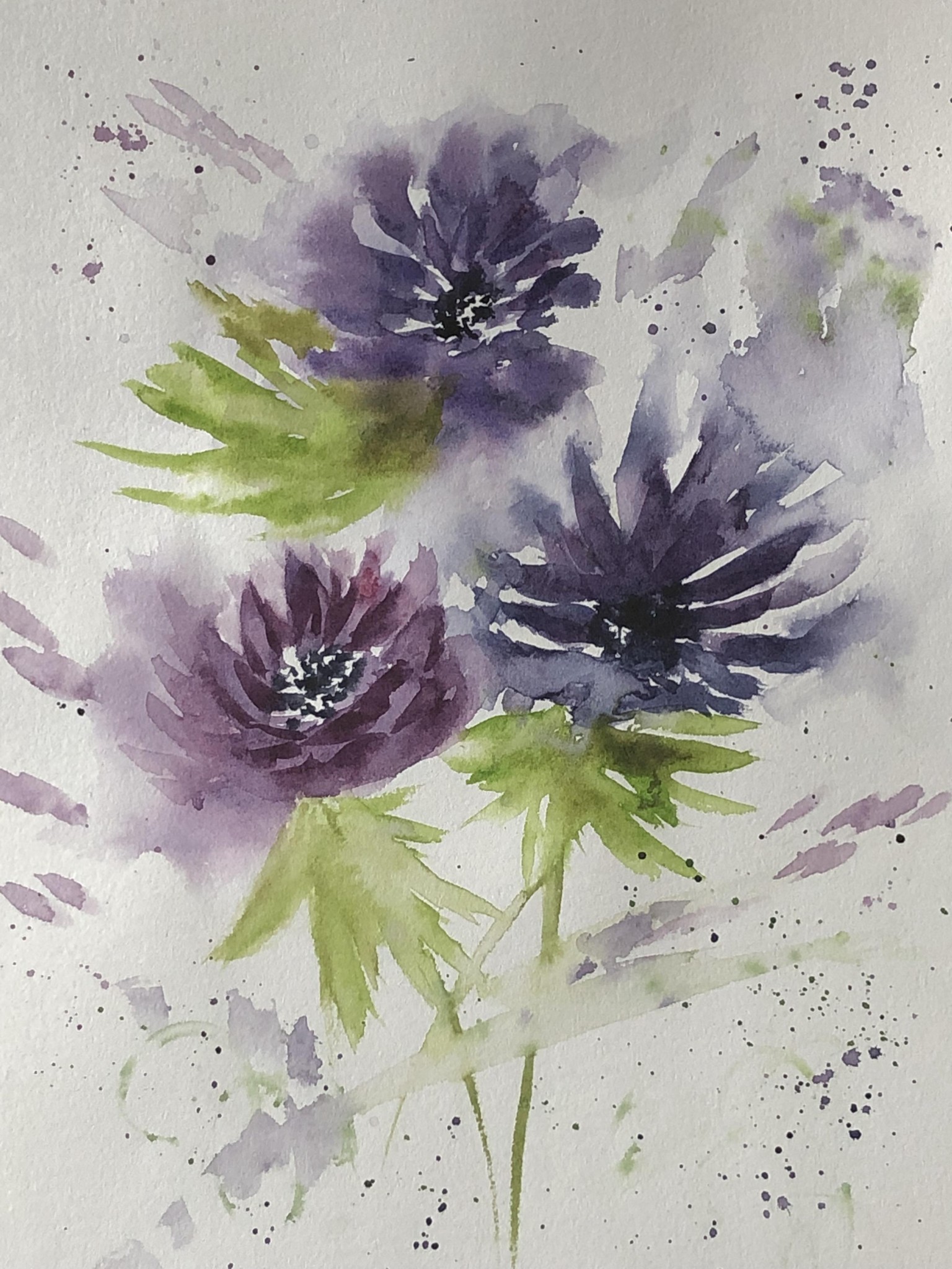
Purple: not sure about this one. I like the warm purple flower ok, the other ones are just too messy. Those colors are mixed like you did, and turns out the 2 purples I own are very close to these! An eye opener, as I find purple very difficult to mix.
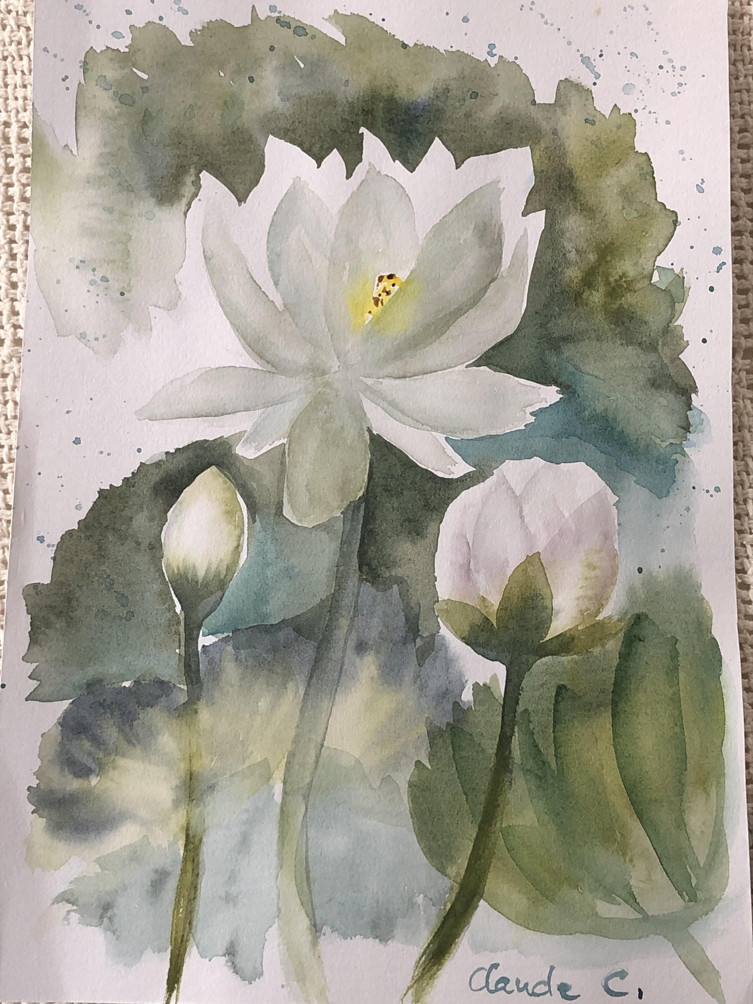
White: love the negative space effect! Especially the buds.