Cocktail Nation - Logo for a Band
This is a project for one of my brother's bands.
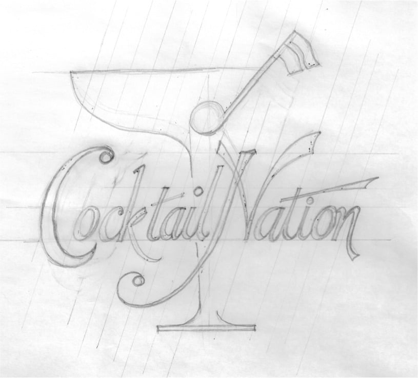
Initial Sketch
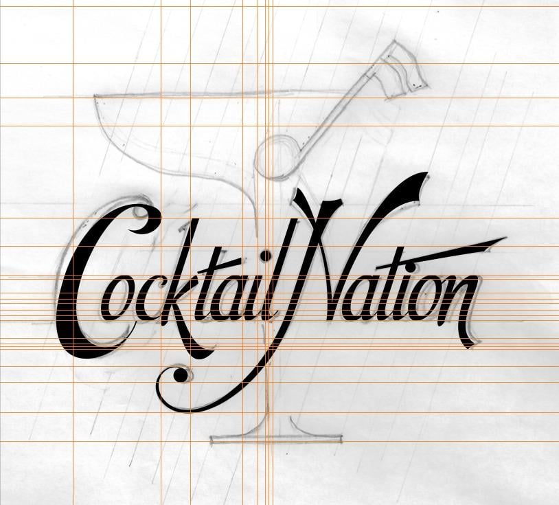
The letter C was the most difficult letter to do. It went through a few variations.
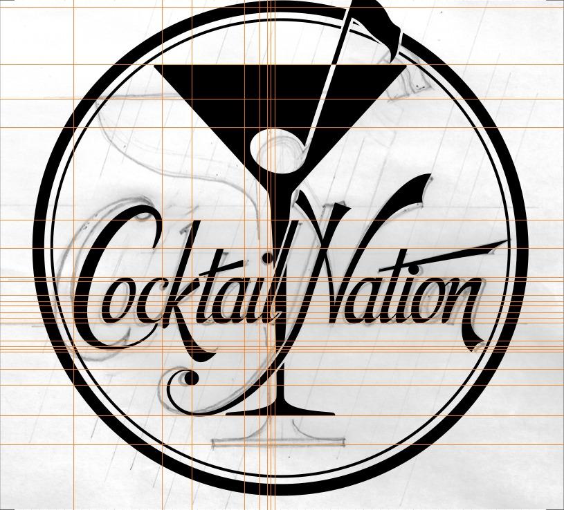
For the glass, I also tried an alternative design.
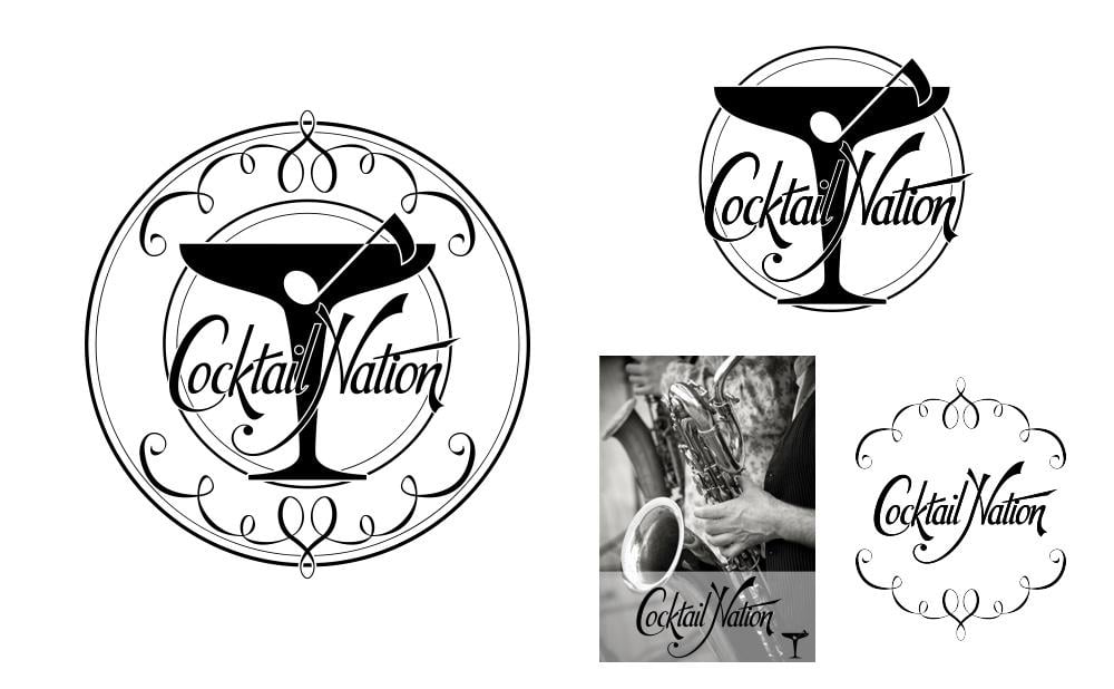
A proportional grid that incorporates the golden ratio was used to set the diameter and thickness of the rings, and to lay out the final lettering.
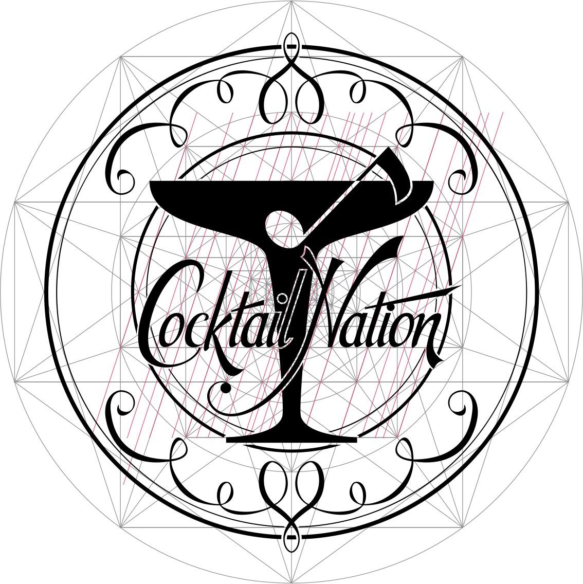
The finished design can be simple or complex as the client requires.
And if you are interested, here's the music: https://soundcloud.com/cocktail-nation